While it's the big features like the Photos app redesign and Apple Intelligence hogging the headlines, Apple's iOS updates always give the company a chance to tweak its UI. And while last year it was the new AirDrop animation that turned heads, iOS 18 is, apparently, all about the flashlight.
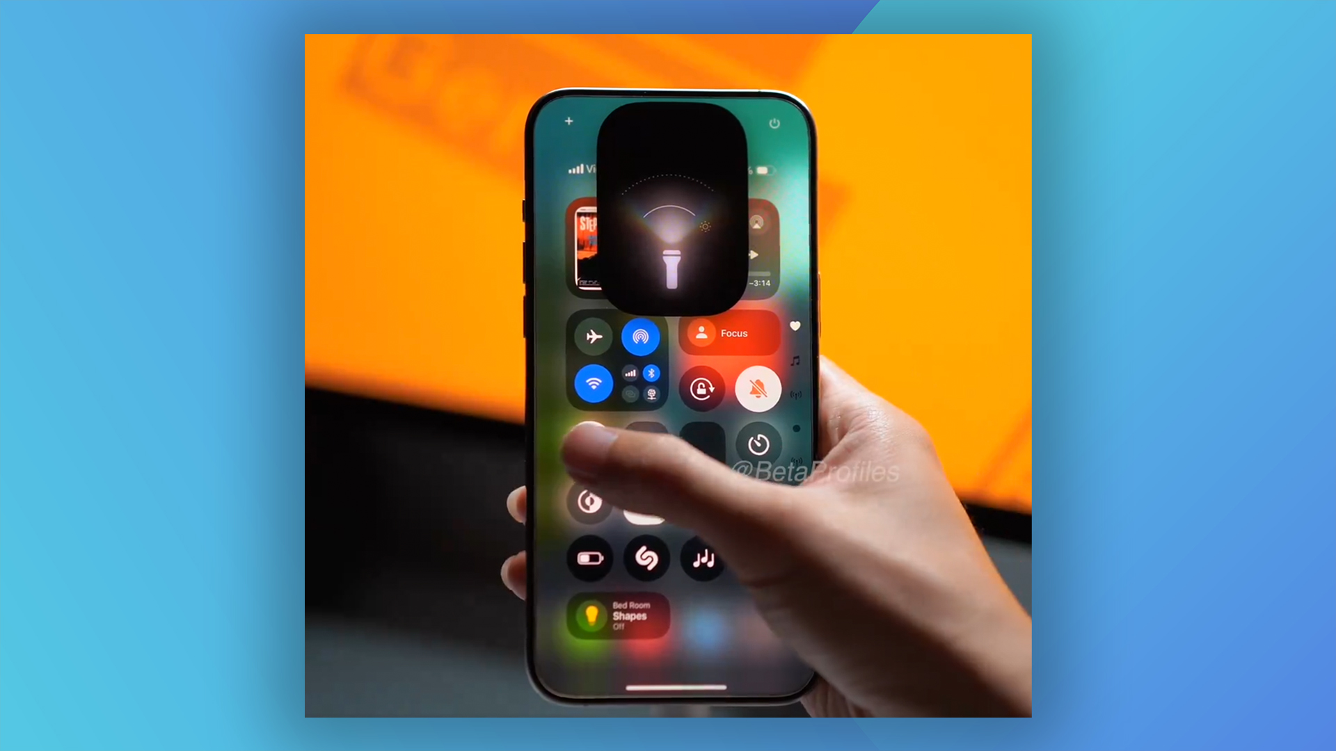
Early adopters currently testing out the beta version of iOS 18 have discovered that the torch, one of the iPhone's most basic features, has been a fair bit of attention this time around. Not only can the focus and intensity of the beam now be configured, but it's also accompanied by a super-smart new UI. (In the market for new gear? Check out the best iPhone 15 deals.)

With the new controls, iPhone users can now adjust the width of the flashlight beam as well as the intensity. When activating the torch, these settings appear via the Dynamic Island (available on the iPhone 14 Pro and above).
Over the course of various iOS 18 beta updates, the Dynamic Island UI for the new flashlight has become more intuitive, and users are particularly impressed with how it looks in Beta 3:
OK this new flashlight UI in iOS 18 beta 3 has absolutely no right to go this hard. Too cool pic.twitter.com/vIyaiBYyHpJuly 8, 2024
iOS 18 Beta 3 flashlight animation is 🔥🥵Wow, Samsung, here's another idea you can gladly copy pic.twitter.com/K6qRSOywWQJuly 9, 2024
Much cleaner flashlight UI in iOS 18 Beta 3! pic.twitter.com/q791RG4VvXJuly 8, 2024
The new flashlight UI in iOS 18 beta 3 is just too impressive. It's so cool! pic.twitter.com/ZVChgOaojIJuly 9, 2024
While details like this one continue to impress beta users, iOS 18 hasn't gone down brilliantly from an aesthetic perspective. Indeed, letting users customise their homescreen colourways is already leading to some garish looks – and that's before the release is even public yet.
