It seems fair to say Apple knows a thing or two about design. The company is famous for its attention to detail, and its smooth, sleek products are pretty much unmistakable. But even Apple occasionally gets it wrong – and here's a UI fail that's been plaguing iPhone users for years.
From the original Apple Pencil to the Magic Mouse, a few Apple products have come under fire for their less than perfect designs. And while it might be one of the best camera phones, when it comes to, you know, taking calls, the iPhone could perhaps do better (this fail could be one for our list of Apple design crimes).
pic.twitter.com/7HsvFdoyWnApril 24, 2023
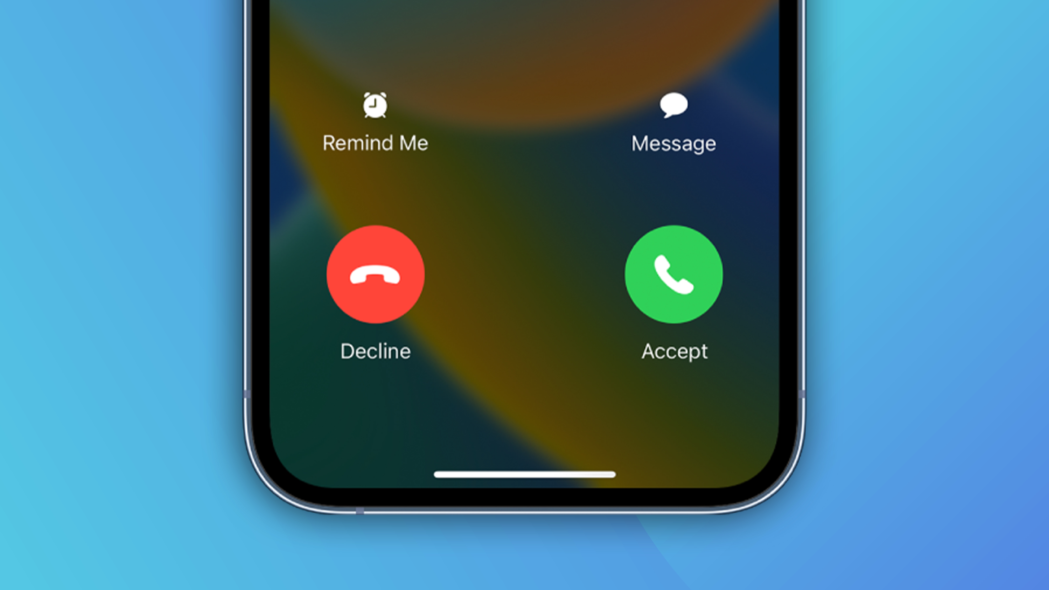
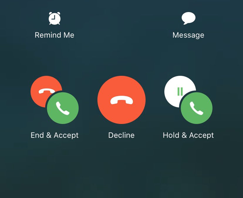
If you've ever received a second call whilst already on the phone, you've probably experienced the sheer panic, horror and terror of having to decide what to tap. And it doesn't help that Apple throws a bunch of icons in your face, making the decision even more confusing. One popular Twitter meme account recently called the second incoming call screen 'garbage' (above) – and it seems to have hit a chord.
"I’m having traumatic anxiety about this even now," one user replies, while another adds, "No kidding. And somehow I end up hanging up on everyone." Perhaps another user puts it best: "disarming a bomb is easier than knowing what to press here".

But of course, this being the internet, there are plenty of dissenting voices too. "Unpopular opinion but this is really easy to understand," says one Twitter user. "It literally says what the icons do underneath, can't you people read?" says another.
But then again – if you're having to read the text carefully, perhaps there's something a little, you know, unclear about those icons. It's clear that the design could be a little more intuitive – and some users have even offered their own concepts for how Apple could improve the interface.
Exploring another idea, to showcase the relationship btwn the two calls that gives more clarity of how a user can proceed before the second call goes to voicemail. pic.twitter.com/J9mJXeHo7sJuly 9, 2021
Yep, judging by the impassioned response, we'd say this is up there with Apple's biggest design crimes. It's by no means the worst, though – that crown still belongs to the Magic Mouse 2. Thankfully, there's plenty to love about iOS – and rumour has it we're in for big changes with iOS 17. Don't fancy waiting? Check out the best iPhone 14 deals below.


