What you need to know
- Android 17 may introduce a frosted, translucent blur UI inspired by iOS 26 across more system elements.
- Google appears to be expanding blur effects beyond notifications to menus like volume and power controls.
- Leaks suggest Android 17 builds on Material 3 Expressive but shifts away from solid color backgrounds.
- The move makes Android's UI feel less distinct compared to Material 3's original vision.
Google appears to be working on the next version of Android, Android 17, and some early leaks suggest we might be getting an Apple iOS 26-inspired frosted, glass-like blur design.
Android 16 brought one of Google's biggest visual overhauls to date with Material 3 Expressive, and it looks like the company is building on that foundation. Right now, Android 16 uses solid background colors across UI elements like the volume panel and app shortcuts, with colors dynamically pulled from your wallpaper.
With Android 17, Google seems to be moving in a new direction. A report from 9to5Google suggests the update will introduce blur across more UI elements, replacing solid light and dark backgrounds with translucent layers that let content underneath subtly show through.
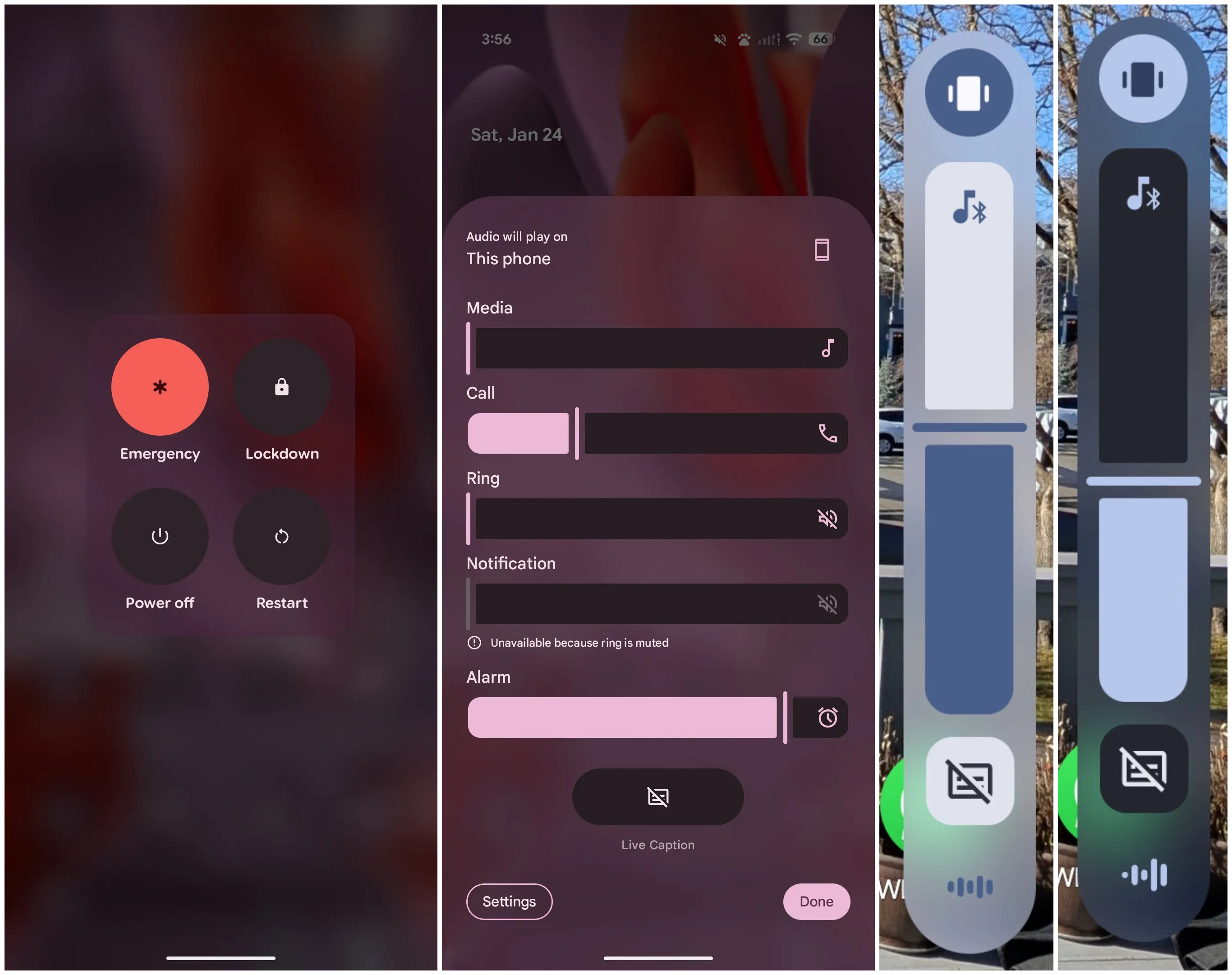
Android Authority built on this with our first look at how the new UI might appear. The leaked images show the blur effect applied to areas like the volume menu, volume slider, and power menu, with background elements clearly visible beneath.
Android 16 already uses a similar effect in the notification shade, Quick Settings, and app drawer, so this looks like Google expanding that visual language across more parts of the OS. The company might even integrate this look to more of its first-party apps.
Of course, things could still change before Google officially unveils Android 17 later this year, but given that the design has already surfaced in leaks, it seems likely this direction will stick in some form.
Android Central's Take
Google adding more blur across Android 17 does not come as a surprise. Many Chinese smartphone makers like Xiaomi, Oppo, and Honor have already leaned heavily into iOS 26-style translucent UI effects, so it was only a matter of time before Google followed suit.
That said, it does feel a bit disappointing. Material 3 Expressive finally gave Android a look that felt distinct, and while this is still very much Material 3 at its core, it is hard to ignore that the UI now feels more borrowed than bold.