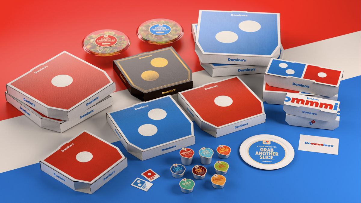
Domino’s Pizza is getting its first brand makeover in over a decade, but people actually love it. This isn’t one of those corporate, bland, and utterly pointless aesthetic changes we’ve seen so many times recently. Instead, the popular pizza franchise is embracing a bold, nostalgic ’80s and ’90s style that feels like a breath of fresh air. The change is simple but impactful, and it’s got the whole internet talking about how it’s time for the boring, minimalist trend to finally die.
The rebrand is actually a few different things working together. You can expect a brand-new font, Domino’s Sans, and a shift to packaging that is much simpler, brighter, and, frankly, bolder. They’re not doing a full overhaul, though; they made sure to keep the familiar red and blue as the primary colors.