Post-war British architecture comes in all shapes and sizes, but there’s a certain pared-back austerity to much of the modern housing of the period that resonates well with the current mood. What’s less welcome, however, is the build and material quality of the era, none of which makes for a comfortable – or efficient – modern home.
The case of a new Peckham house
These were the issues facing Luke Pearson when he acquired a three-storey end-of-terrace house in Peckham, south London. Understated but handsome, the 1953 building was the kind of real estate that tended to get overlooked in an area best-known for its Victorian and Georgian housing stock.
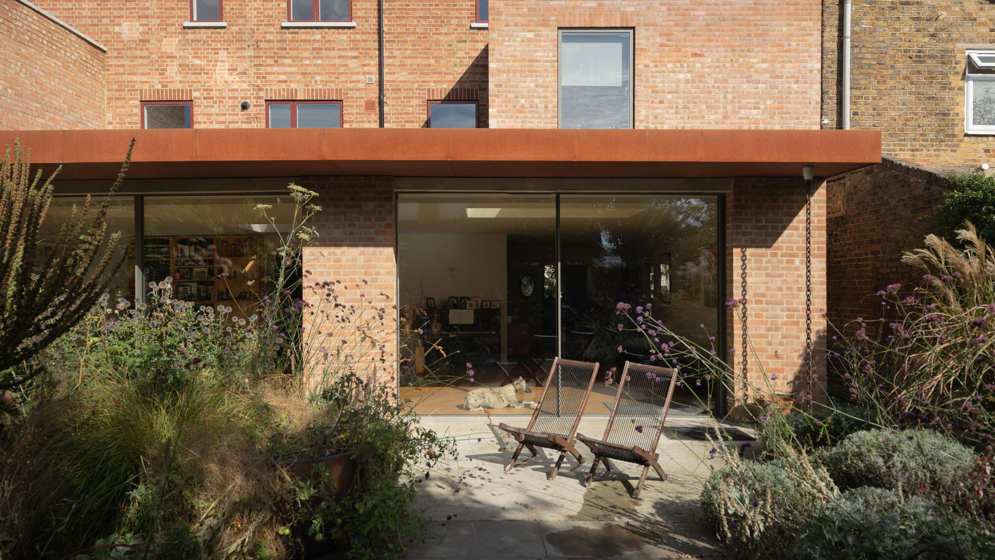
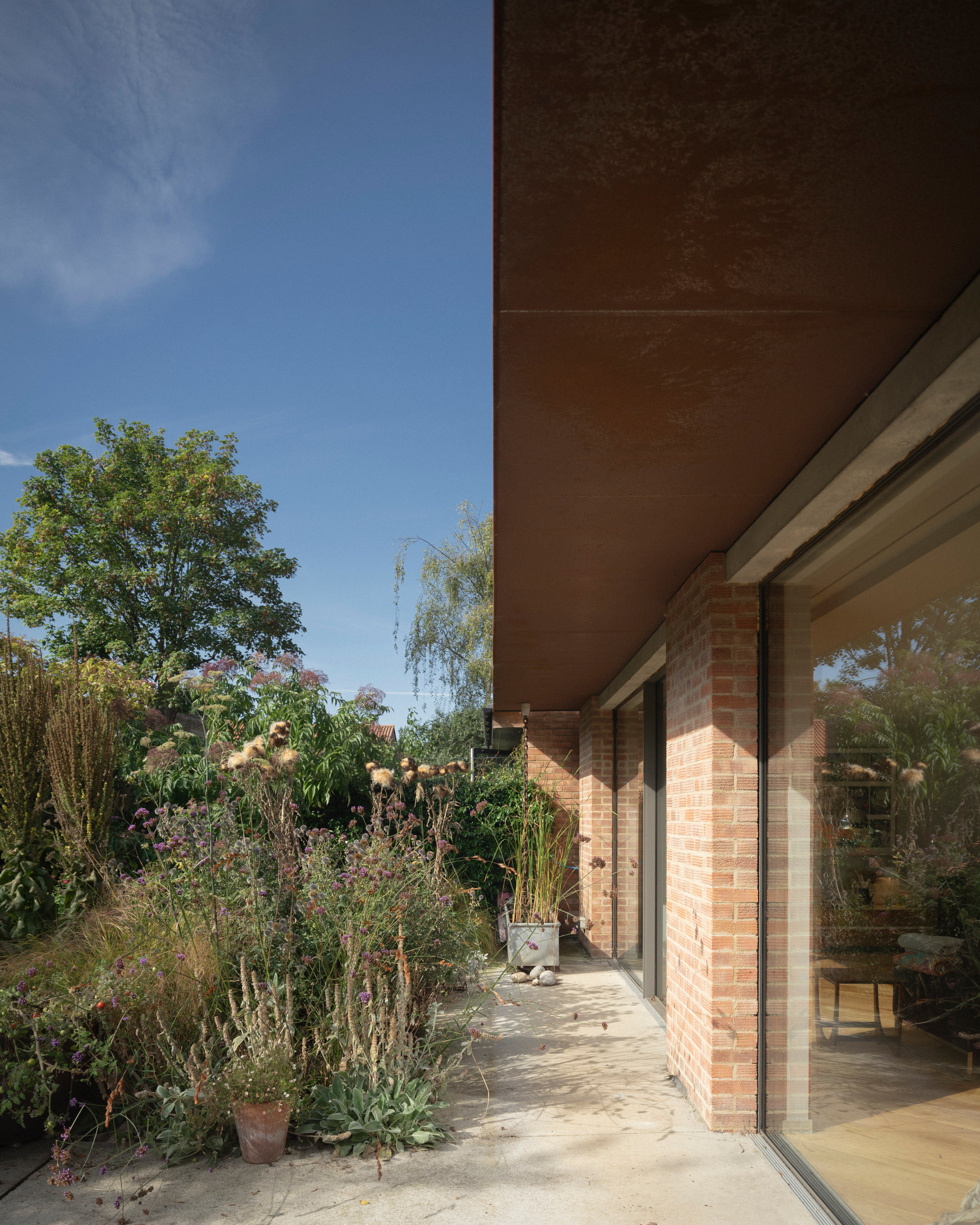
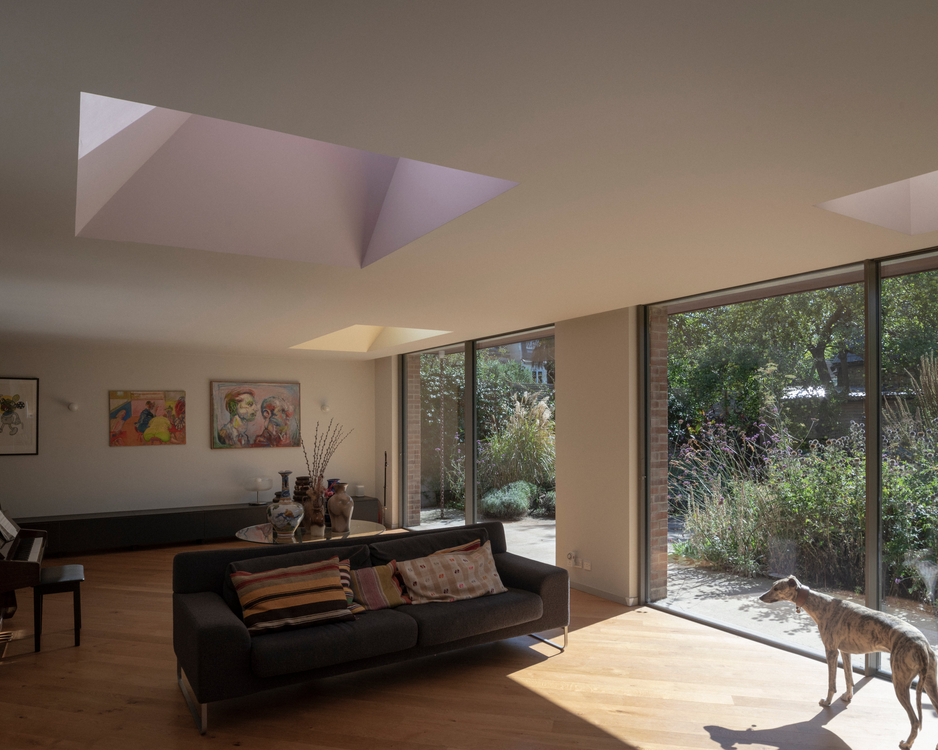
Acquiring not just one but two properties in the terrace offered a huge opportunity. Without compromising the simple, sober front façade (‘it’s very humble on the street’, he notes), Pearson wanted to open up the rear to create one big living room opening onto a large south-facing garden (designed, Pearson points out, with no input from his brother Dan, an esteemed landscape designer).
Pearson came to Sandy Rendel Architects’ award-winning work via the Slot House, a tiny infill structure adjoining Rendel’s own family home just a couple of hundred yards away. Nominated for the RIBA House of the Year in 2021, its meticulous construction and packaging appealed to Pearson’s product design experience. ‘It was a tiny space but highly valued – I could see he was an architect interested in detail and precision.’
As a founding partner at Pearson Lloyd, Pearson’s experience runs from shaping Lufthansa Business Class seating to office furniture, as well as interiors for Virgin Voyages and other places where limited space was a driving force behind the design. ‘The idea of doing a small space very well felt quite natural,’ the designer admits.
‘The plan was always to separate [the two properties] in the future,’ says Pearson, explaining how the services and structure have been set out to make a sub-division as painless as possible. ‘I thought it would be more interesting to treat it as a temporary intervention,’ he adds.
For Rendel, it was almost a novelty to find a client who wasn’t seeking to make a big spatial statement. ‘Most people’s expectations are different,’ he says, ‘[Luke] was even more comfortable with things like a smaller bathroom and kitchen.’
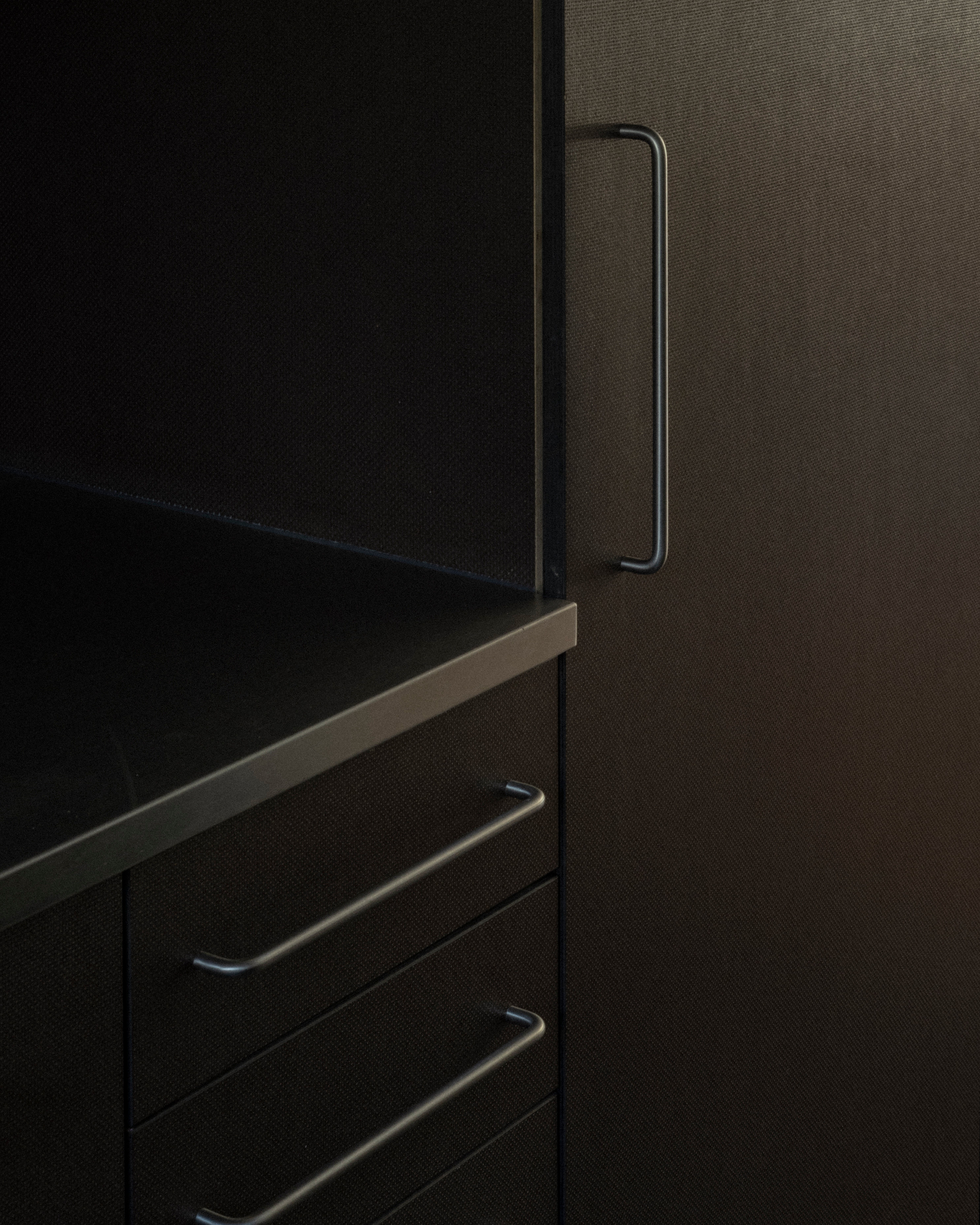
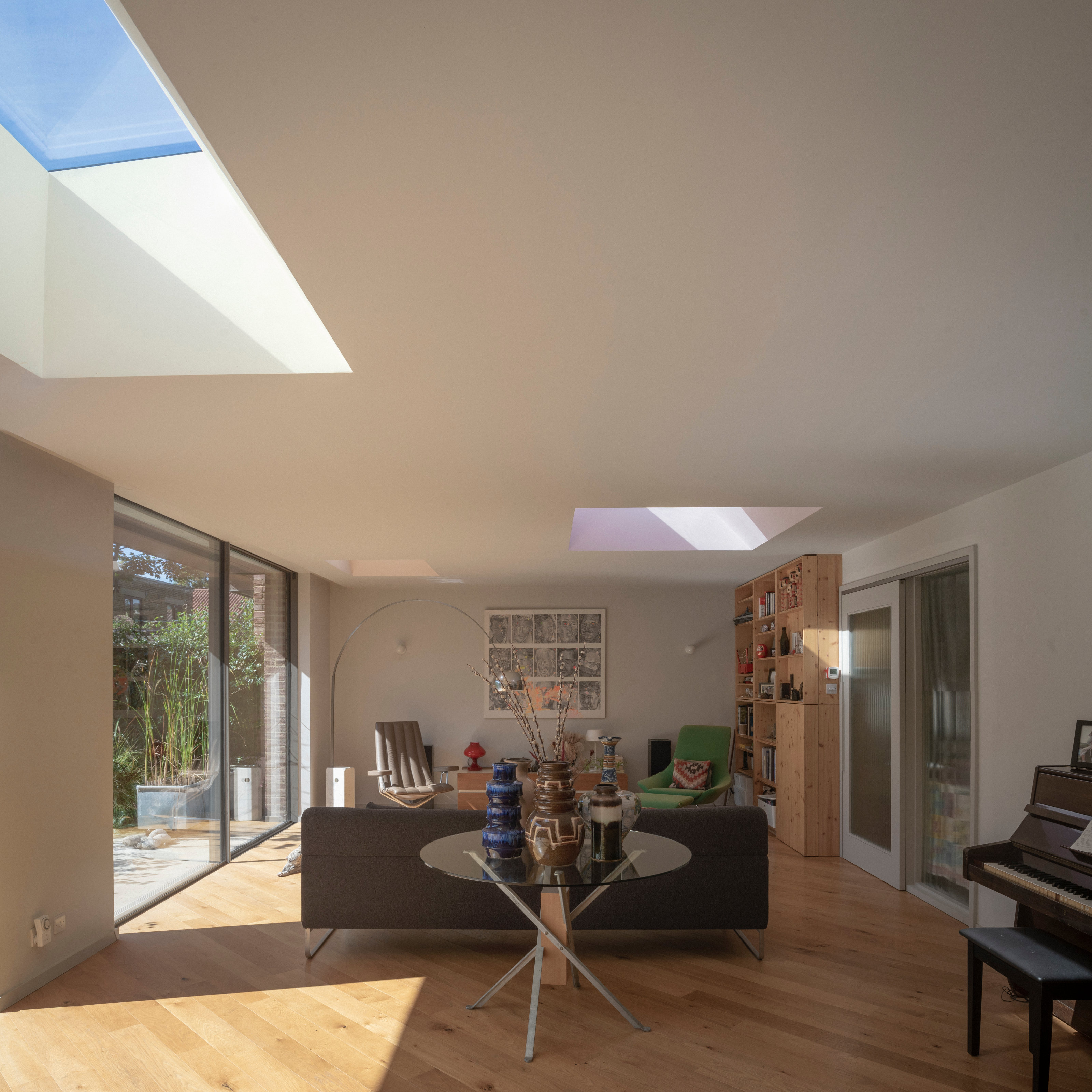
With one eye on future requirements, the job was, in Rendel’s words, about creating a ‘series of nice, considered moments’. The modest galley kitchen, which overlooks the street, is just as large as it needs to be, for example, allowing a downstairs WC to be placed in the hallway. The kitchen opens onto the L-shaped living room, with its wall of glass and triumvirate of subtly coloured skylights.
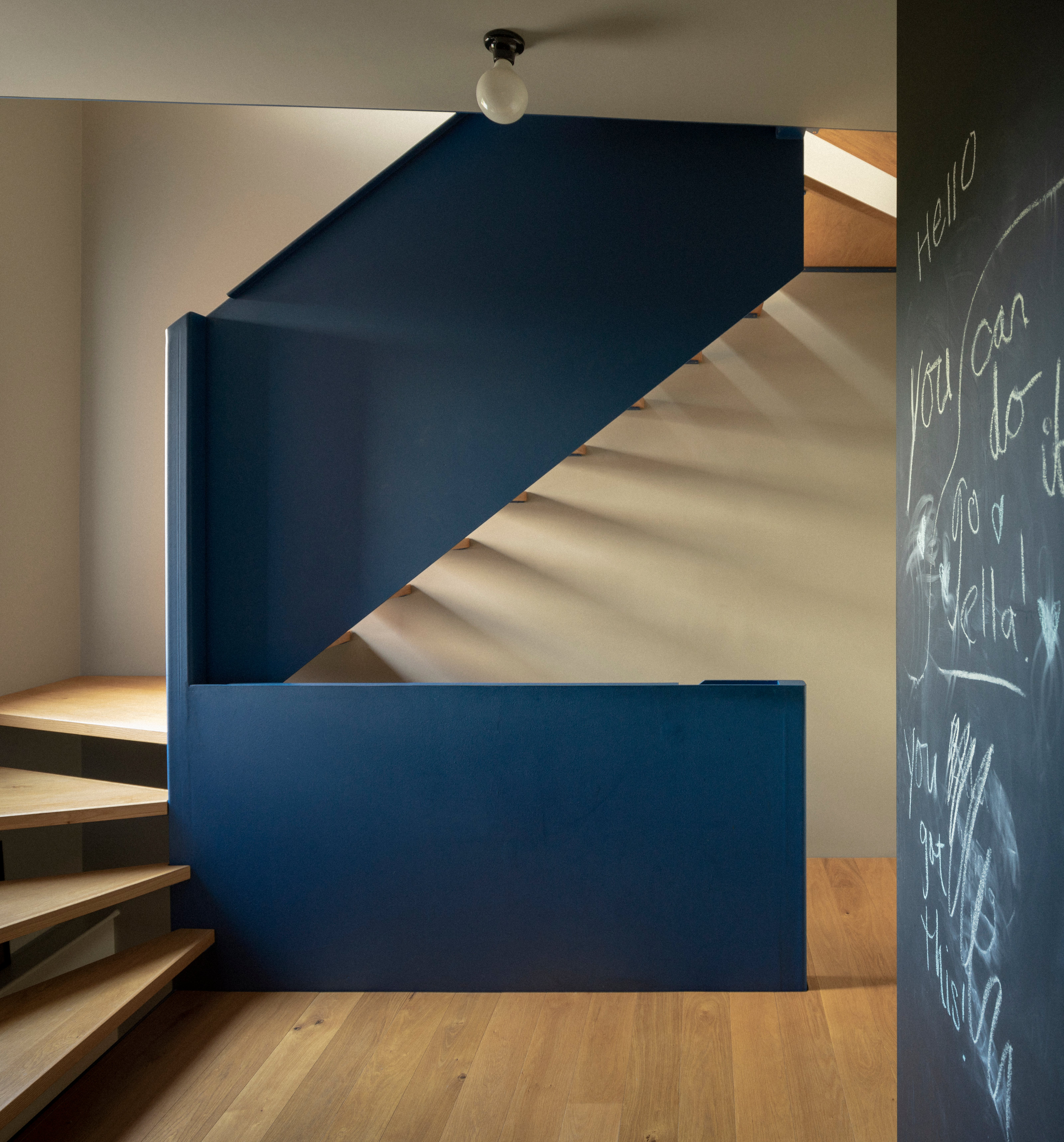
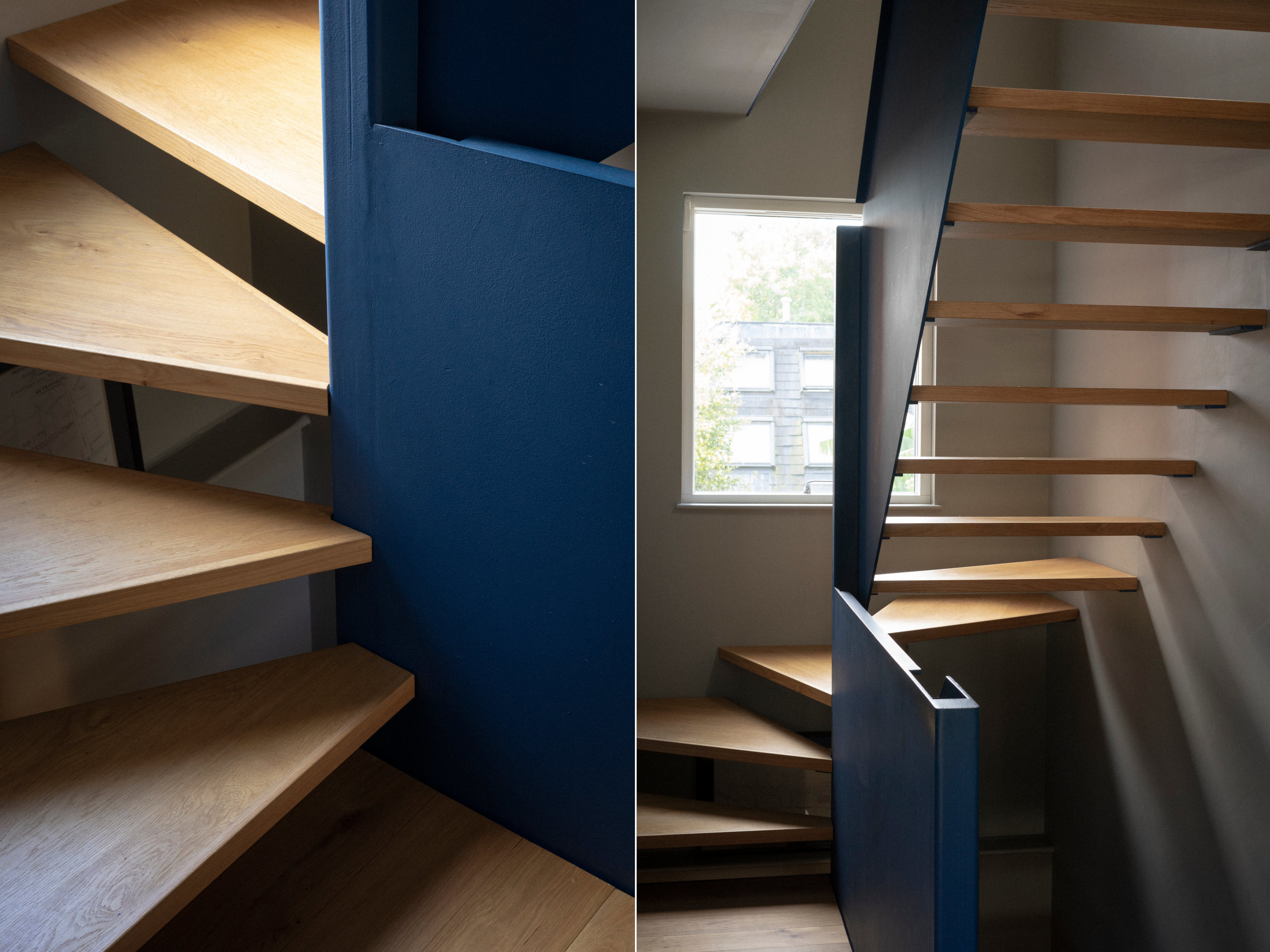
Also on this floor is an office space and guest bedroom, with a new staircase serving as the pivot around which the rooms are arranged. Made from oak and folded blue steel, the new staircase ended up being akin to a three-dimensional puzzle connecting the three floors of the house.
‘I’ve always loved ships and I wanted a [nautical-style] steel staircase, so it could be thinner,’ Pearson says. ‘It was a very collaborative process.’ He continues, ‘With product design, you are literally going to be touching everything; in comparison, architecture has a spatial element. But they must work together – all our products have to fit into spaces, for example.'
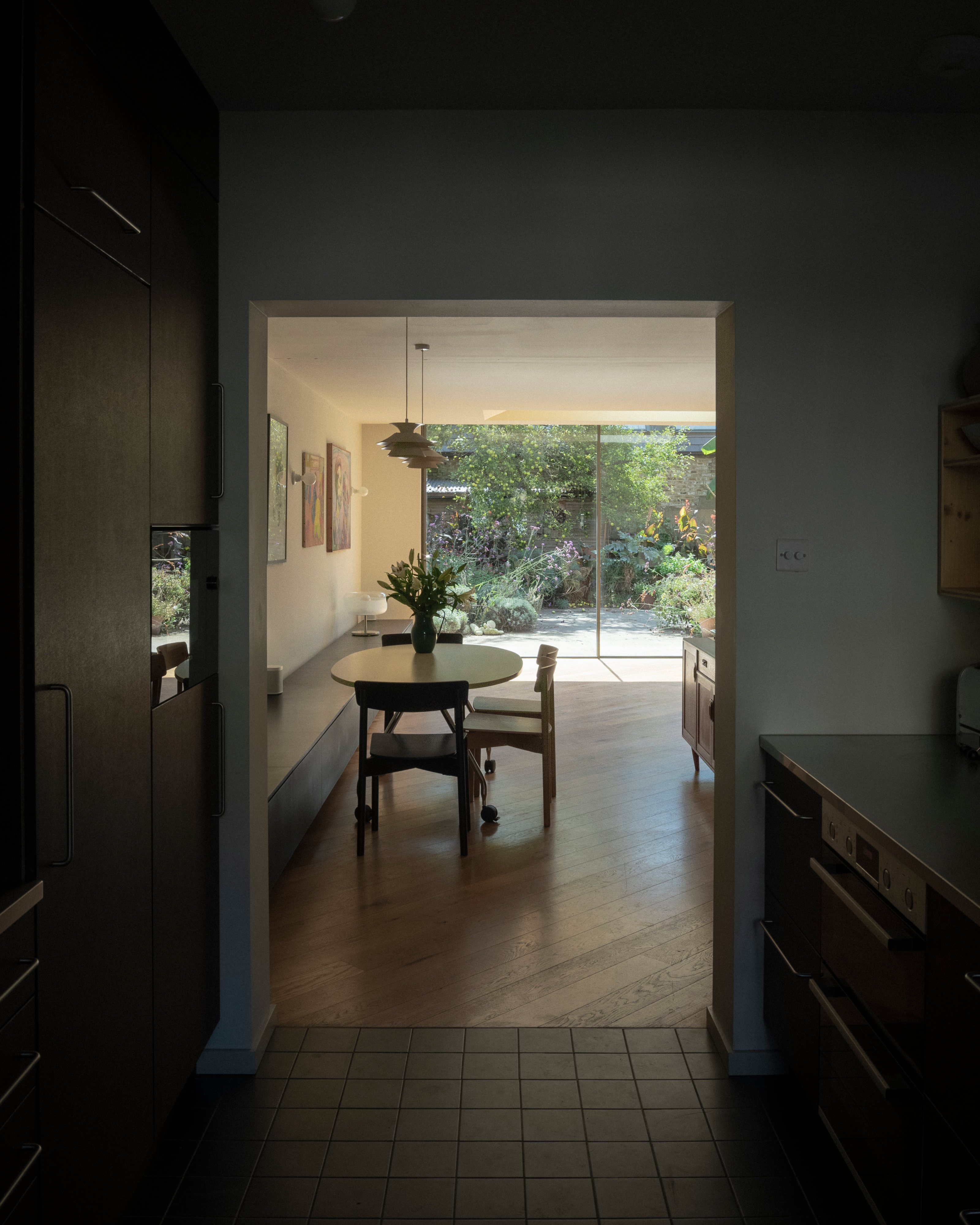
Throughout the process, Pearson was very hands-on, but not in a way that would make an architect quake. His interest in compact spaces and familiarity with prototyping meant that a lot of the rooms were mocked up at full scale using timber frames and cardboard 'walls' in order to get an idea of the space. ‘As an industrial designer, I don’t want to be doing the architecture,’ he admits, ‘but I wanted the same quality as the Slot House, which is such a crafted, private space, a bit like a Japanese house.’
The project offered plenty of challenges. ‘We always like a proper brief rather than a blank canvas,’ Rendel says. ‘You want constraints in order to give you structure.’
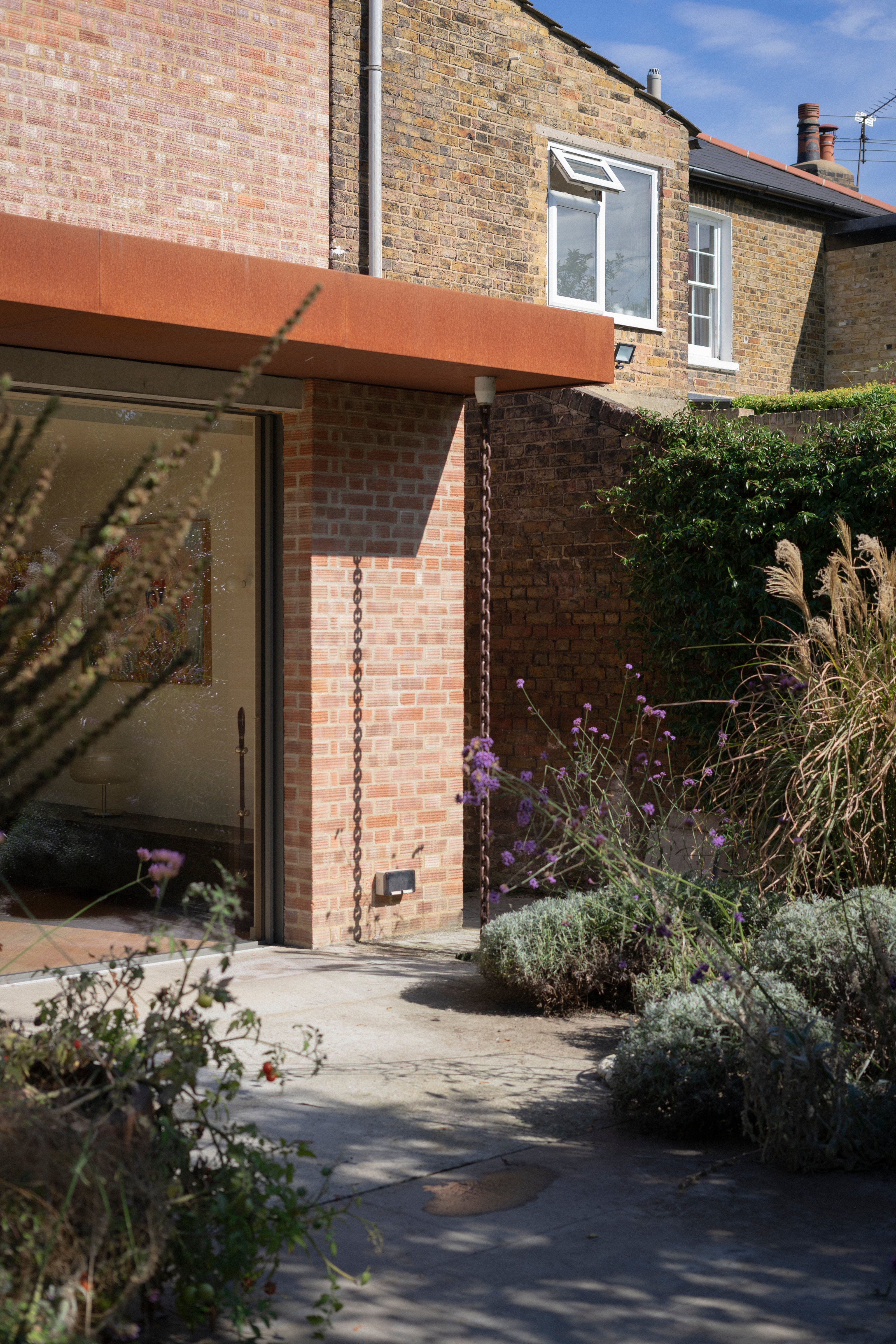
One example of the collaborative nature of the project was the rain chains that drain off the flat roof on the rear extension. ‘They don’t always work brilliantly,’ says Rendel, ‘but Luke prototyped a number of different spouts in order to make them work more efficiently. He also drove a huge amount of the spatial arrangement.'
Pearson absolutely relished being a client who could spar creatively with his architect. ‘It was exactly what I wanted,’ he says, ‘someone who could say “yes... but”. I genuinely think that it’s a much better house because there are lots of voices involved.'
Upstairs, the end-of-terrace site was exploited by cantilevering the first floor out across the side return, giving a generous landing that leads to a bathroom and two large bedrooms, one at the front of the house and one at the rear. The additional space was hugely welcome.
‘You’re normally going to a lot of effort just to squeeze in a box room,’ says Rendel. The third-floor accommodation consists of a bedroom and bathroom, with far-reaching views across south London.
The upper floors of the second house are given over to a self-contained flat with its own entrance; it’s only the ground floor than benefits from the double-width space.
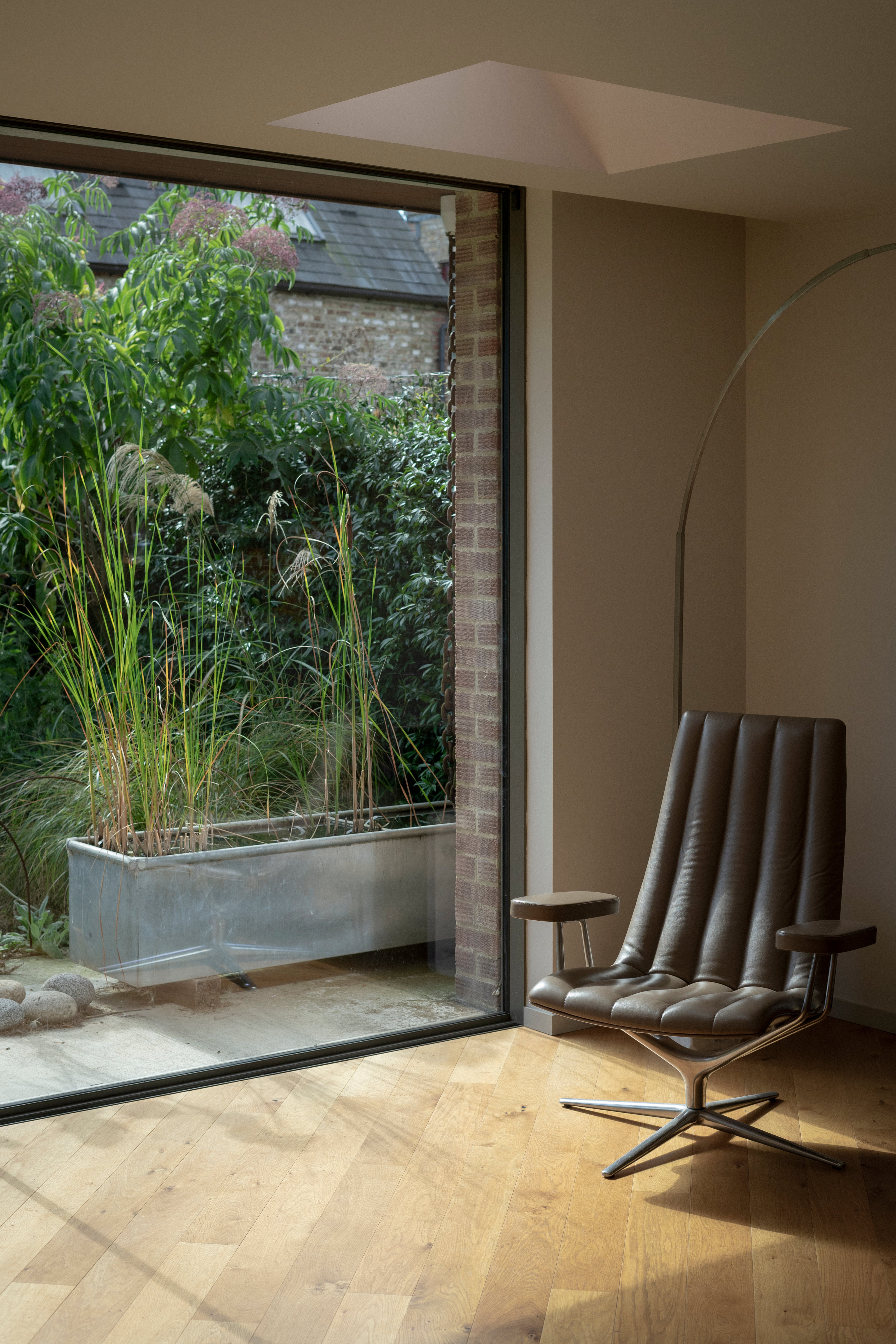
There, the large living room provided other opportunities, not least in the way it was lit. In addition to Louis Poulsen light fittings and a long, low storage bench, the space is not in any way prescriptive – it can be used in many different ways. The three skylights are subtly angled to catch the sun, especially as it gets lower in the sky in the winter. The colour choices, a soft lemon yellow, orange and magenta, are so subtle as to be almost imperceptible in certain lighting conditions.
That sense of a conversation extended to materials as well. ‘The rear extension was originally going to be built using specialist architectural bricks, for example,’ says Rendel, explaining that Pearson’s late father encouraged him instead to celebrate the original. ‘So we have the standard cheap post-war brick – you would never normally use them for a job these days.’
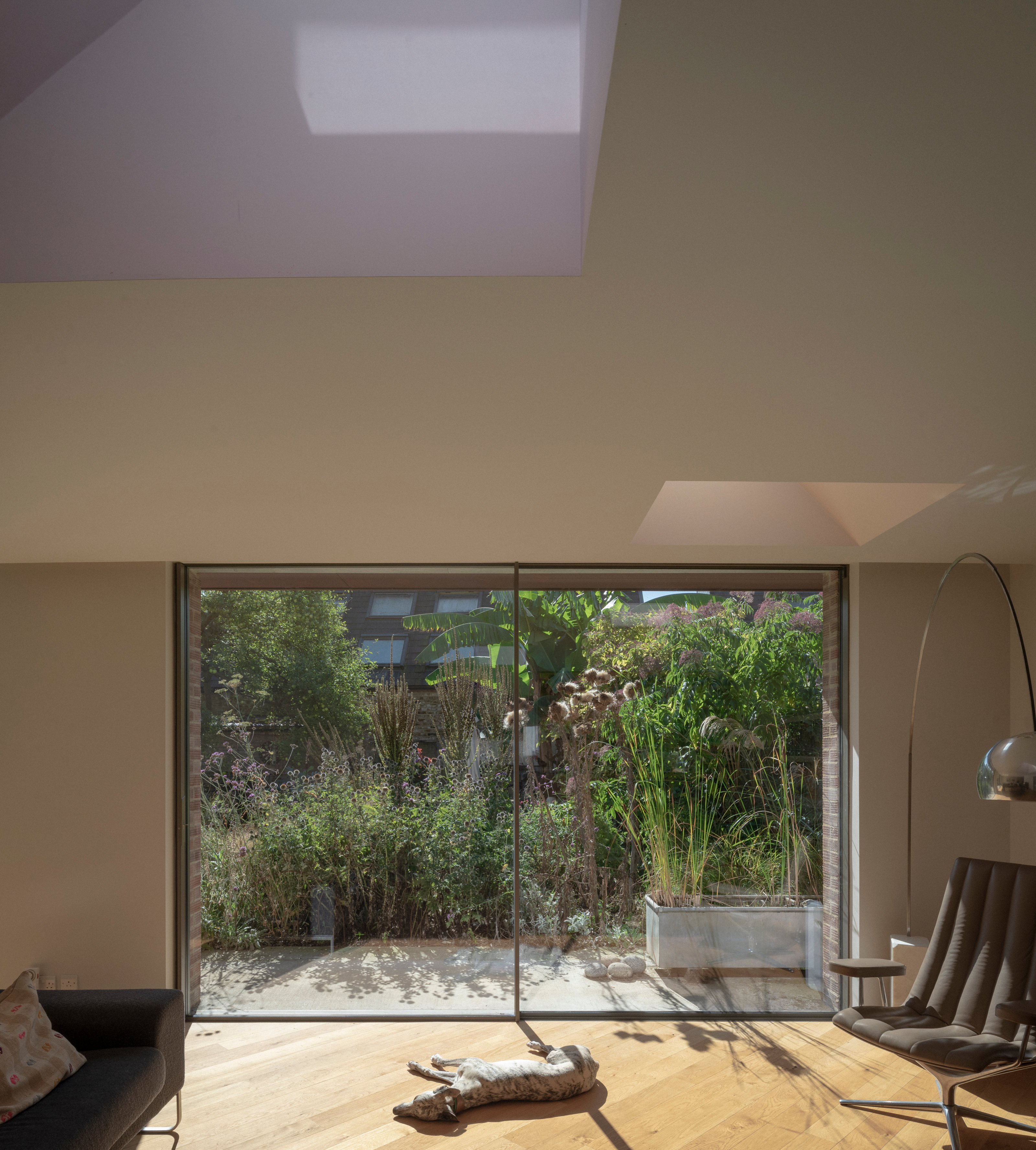
The two standout extravagances are the staircase and the expanse of rear glazing, both of which are fundamental to the sense of the space. The protracted build process, hampered by Covid but also helped by Rendel living just down the road, hasn't been 100 per cent completed, but you get the sense that this is a space that will forever be tinkered with.
Rendel set up his studio in 2010 after working with James Gorst and Tony Fretton. Recent projects include a barn conversion in West Sussex and a new country house in the South Downs; the latter has been shortlisted for the 2024 Manser Medal.


