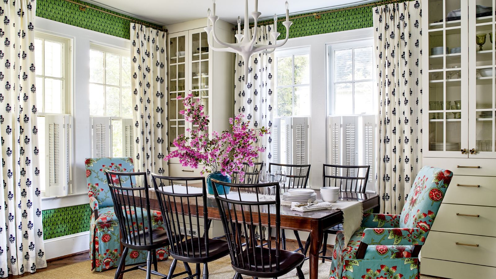
In the Palisades district of Washington DC, where the typical house design is historic, stately, and occasionally a little somber, one home sparkles with color, pattern and fun. Built in 1928, the house had been renovated in the 90s and stripped of some of its character and period charm.
The owners, a couple with two young children, turned to designers Lathem Gordon and Cate Dunning of Atlanta-based Gordon Dunning Interior Design to restore the home's charm and bring it up to date for their busy family life. The results are colorful and quirky and add a contemporary edge to this historic property. Take the tour.
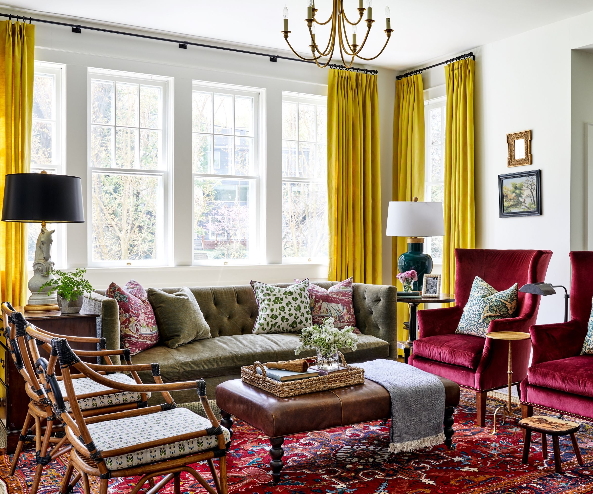
Designers Lathem and Cate renovated most of the home, including moving walls to improve the layout of the main level – dining, kitchen, and living room – and all first level flooring.
Living room ideas for this space, as for the rest of the house, needed to serve two realities, explains Lathem, 'Practicality for family and elegance and style for entertaining. Color and classic was the name of the game. A mohair fabric was perfect for the sofa. Equestrian lamps upped the style a notch and are a great juxtaposition with the chartreuse Jim Thompson drapes (our favorite part).'
'Layering pattern and color in this space was a real joy,' adds Cate. 'The clients were both trusting and adventurous, and that left us with a lot of freedom to mix, match, and take risks. Simultaneously, we were keeping a two-part focus on the reality that this space was to be used for daily living with two kids and dogs, so the material selections needed to be durable, but the space is also the main entertaining space for adult parties, so it needed to suit that aesthetic.'
The couple own a pair of antique equestrian judging chairs that they are particularly fond of, and the designers specified new cushions to bring them into the room (fabric by Alex Conroy).
The horse lamp is from Bradburn Gallery, sofa from Lee Industries in Sabina Fay Baxton fabric, and chairs from CR Laine with Schumacher washable silk velvet.
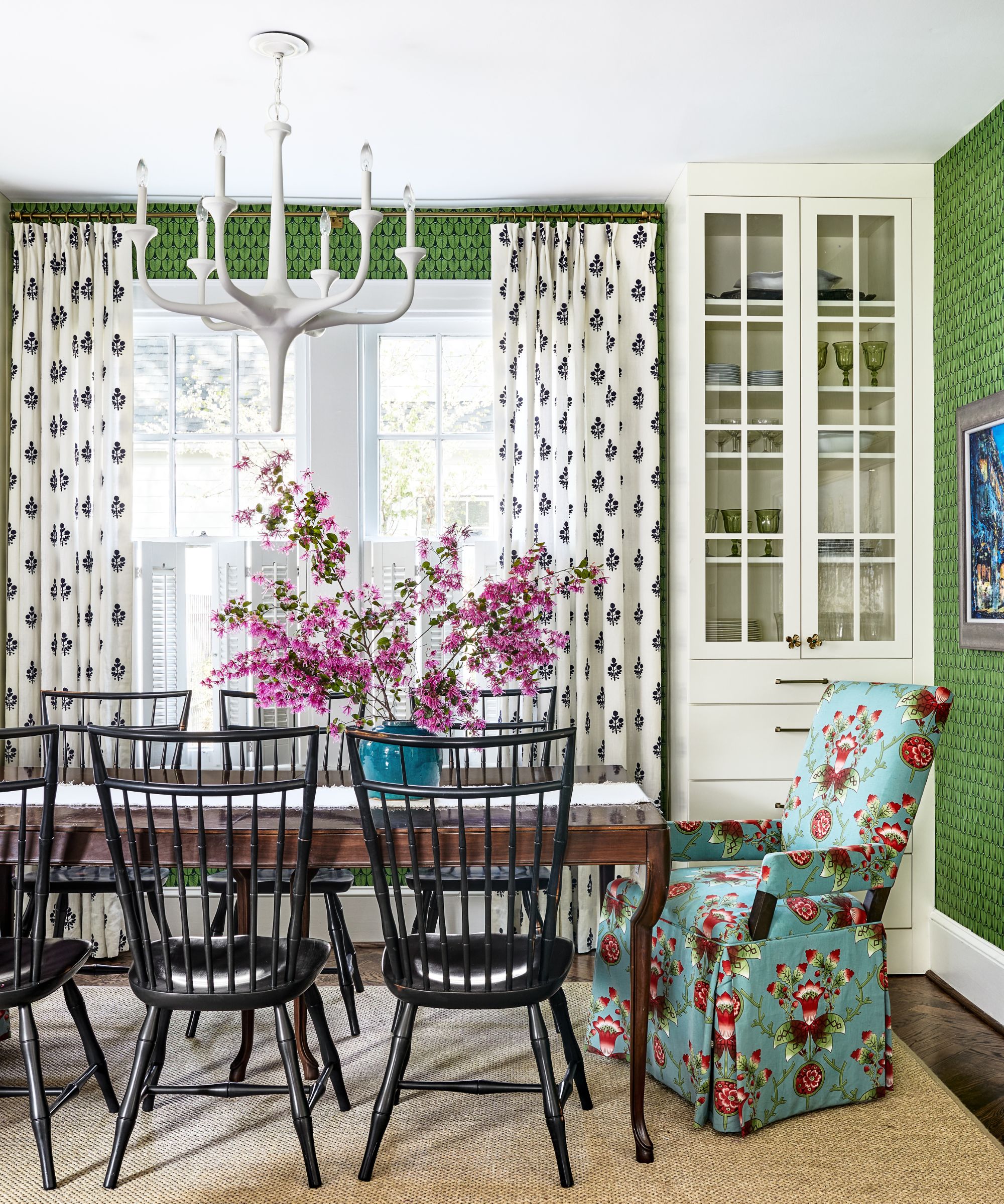
The existing downstairs layout was problematic, and the original dining room was cut off from the kitchen, opening the space up was the major focus of the team's dining room ideas.
'Part of the new design objective was to make the flow from one space to another more entertaining-friendly. The new dining room is open to the kitchen but is its own unique space,' explains Lathem. 'We wrapped the window-filled space with Cole & Sons wallpaper, flanked the center window with built in china cabinets for storage, and added charming drapes. The table and chairs are a practical mix. The dining room serves as casual and formal dining. The chairs are birdcage Windsors, which give a classic Colonial American feel. We love the look along with the wipe-ability for little diners.'
The head chairs are from Lee Industries and upholstered in Tulu Fabric which adds to the room's kaleidoscope of pattern and color. The table is from Hickory chair
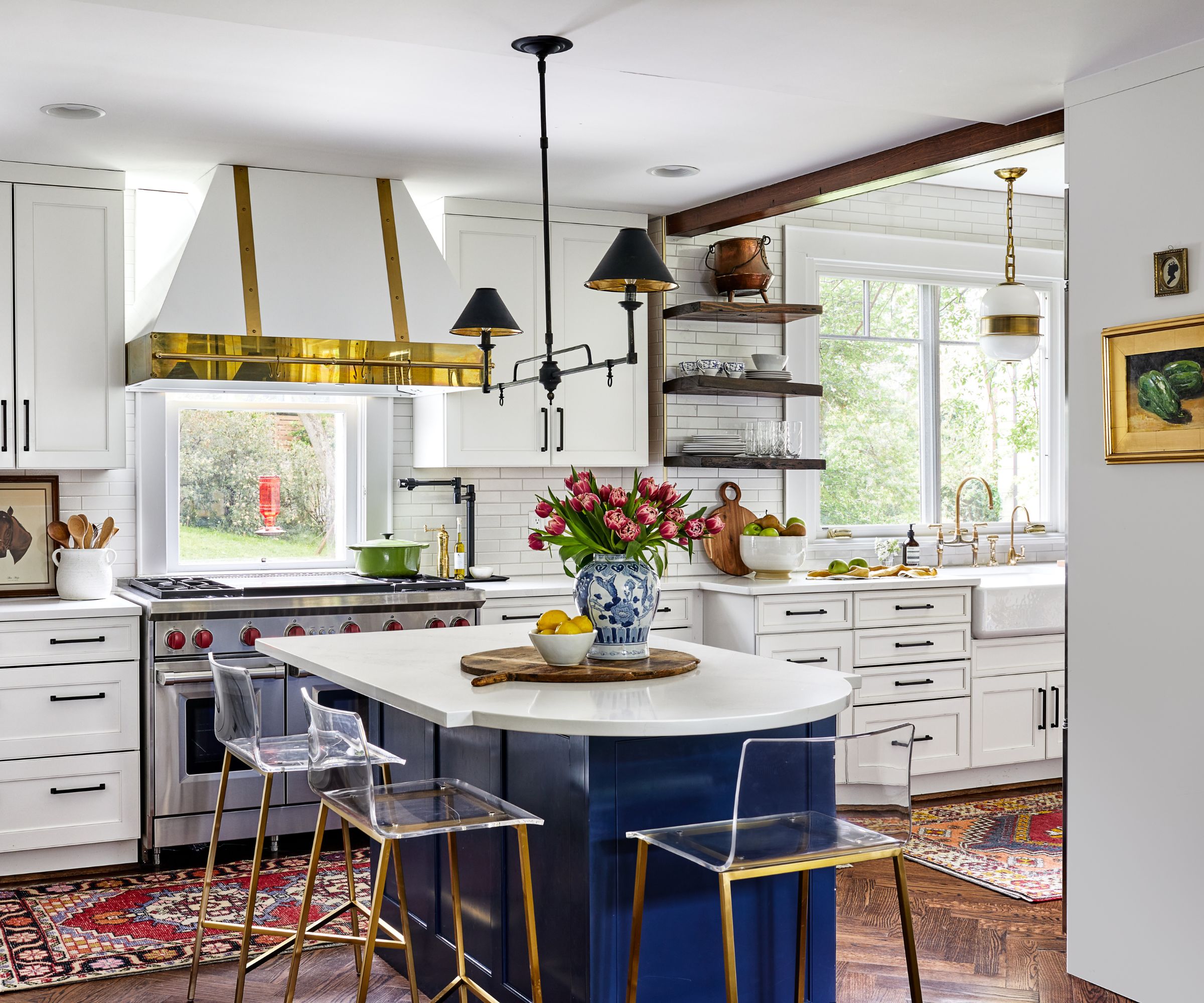
The design duo's kitchen ideas again centered on improving the layout, but involved a complete gut renovation.
'This kitchen was quite the transformation,' says Cate. 'We opened up the kitchen into the original breakfast room so that this wild family had space to cook and dance in the kitchen!'
The brass-trimmed range hood is from Vent-A-Hood and gives a traditional aesthetic, along with the Currey and Co lighting over the island.
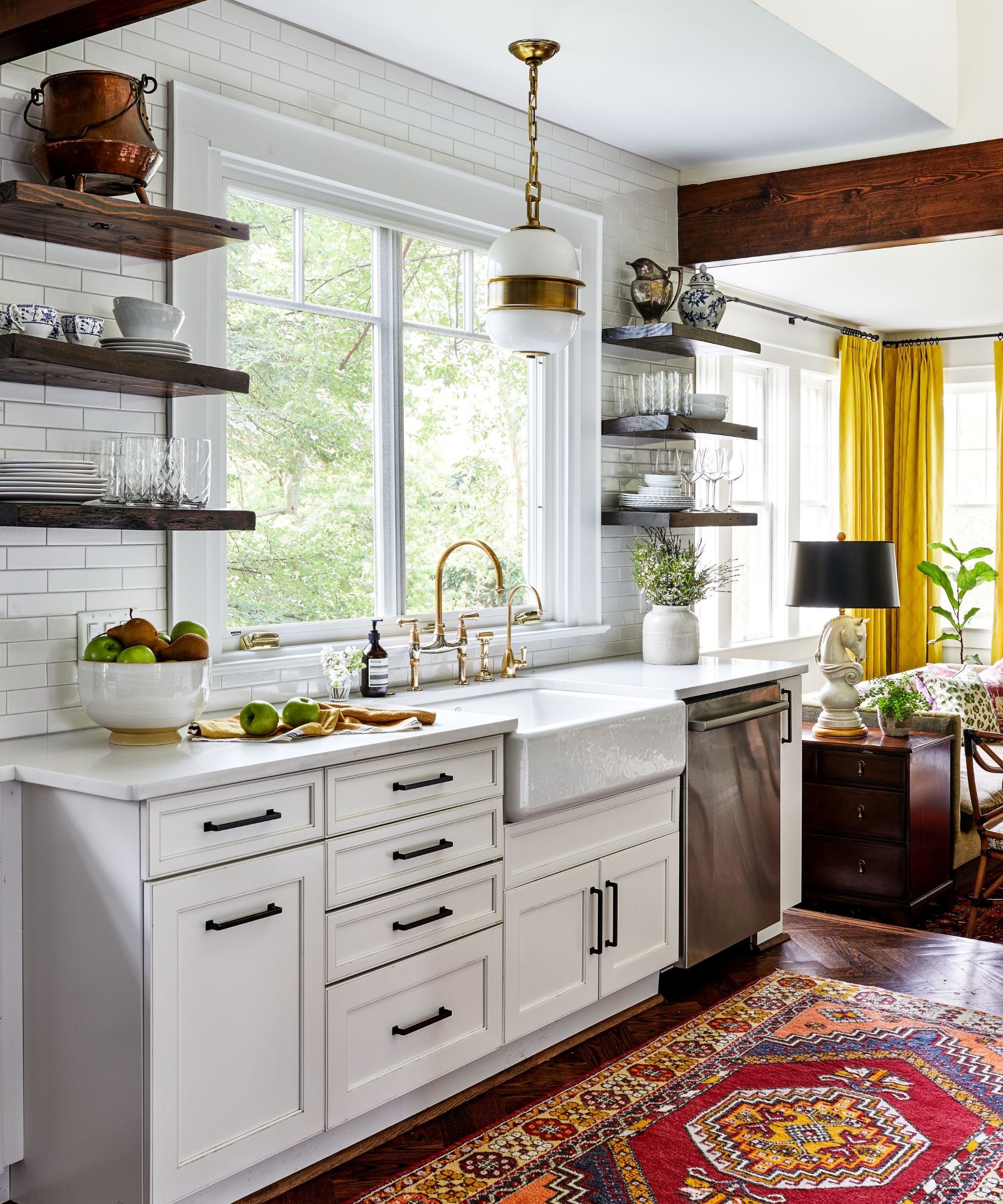
'The puzzle of carving this kitchen layout out of this unusual shape was a really fun challenge,' adds Lathem. 'We utilized the space under the stairs for storage drawers and were able to just squeeze in an island so that they could use it for entertaining. We always love a creative space-planning puzzle! Aesthetically, we also enjoyed playing with the classic elements mixed with some funk in this space.'
The lighting over sink is from Visual Comfort, and the faucet is from Newport Brass.
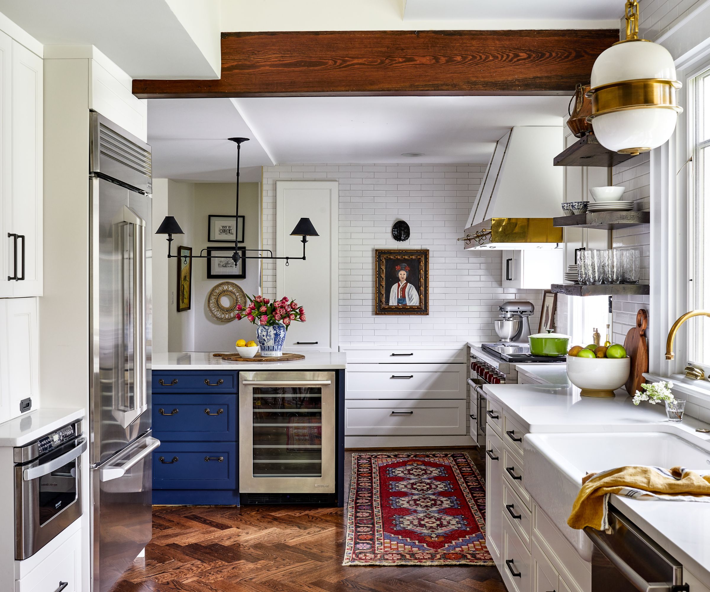
'The clients wanted a home that was interesting, exciting, told their story, and accommodated their busy, people-rich lifestyle,' adds Lathem. 'They entertain often and he enjoys cooking, so the kitchen was always a key space.'
Cate and Lathem were delighted to be able to include in the kitchen, and around the home, treasured artwork and case pieces that the couple had collected from the southeast of the United States where they grew up. Decorating with art in this way adds to the individual character of the home and brings it to life. It's great to see cherished pieces displayed around a kitchen like this.

This isn't a huge house and the primary bathroom is compact, but the designers came up with a great solution for a smaller bathroom. By keeping things smart and monochrome, but adding interest with a small-scale floor tile topped with a rug, the lack of space isn't an issue.
'It was a tough squeeze, but we were able to make two vanities, a shower and toilet happen in this little space,' says Cate.
Interior Design: GordonDunning
Photography: Stacy Zarin Goldberg,
Styling: East & Lane


