The Samsung logo has the tough gig of representing one of the most well-known and iconic technology brands of all time. Samsung is famous for many things after all – its Galaxy smartphones and tablets of course, but also televisions, smartwatches, monitors and more handy pieces of tech than we could list here. Coming up with distinctive branding that flows across all those different sectors was clearly a pretty tall order.
Fortunately, the firm has proven itself up to the challenge. With an emphasis on simplicity and clean but distinctive typography, the various Samsung logos that have been used throughout the company’s years of operation are well within their rights to be considered in the same breath as some of the best logos of all time. And as any seasoned designer knows, a simple logo doesn’t always mean a simple design process. If anything, the opposite.
Here, we’re taking a look at how Samsung’s logo has evolved into its current form, starting all the way back at the company’s founding in the 1930s. It’s quite a way from there to here – and if it gets you inspired, don’t forget to check out our guide to the best logo designers.
1938: fishy beginnings
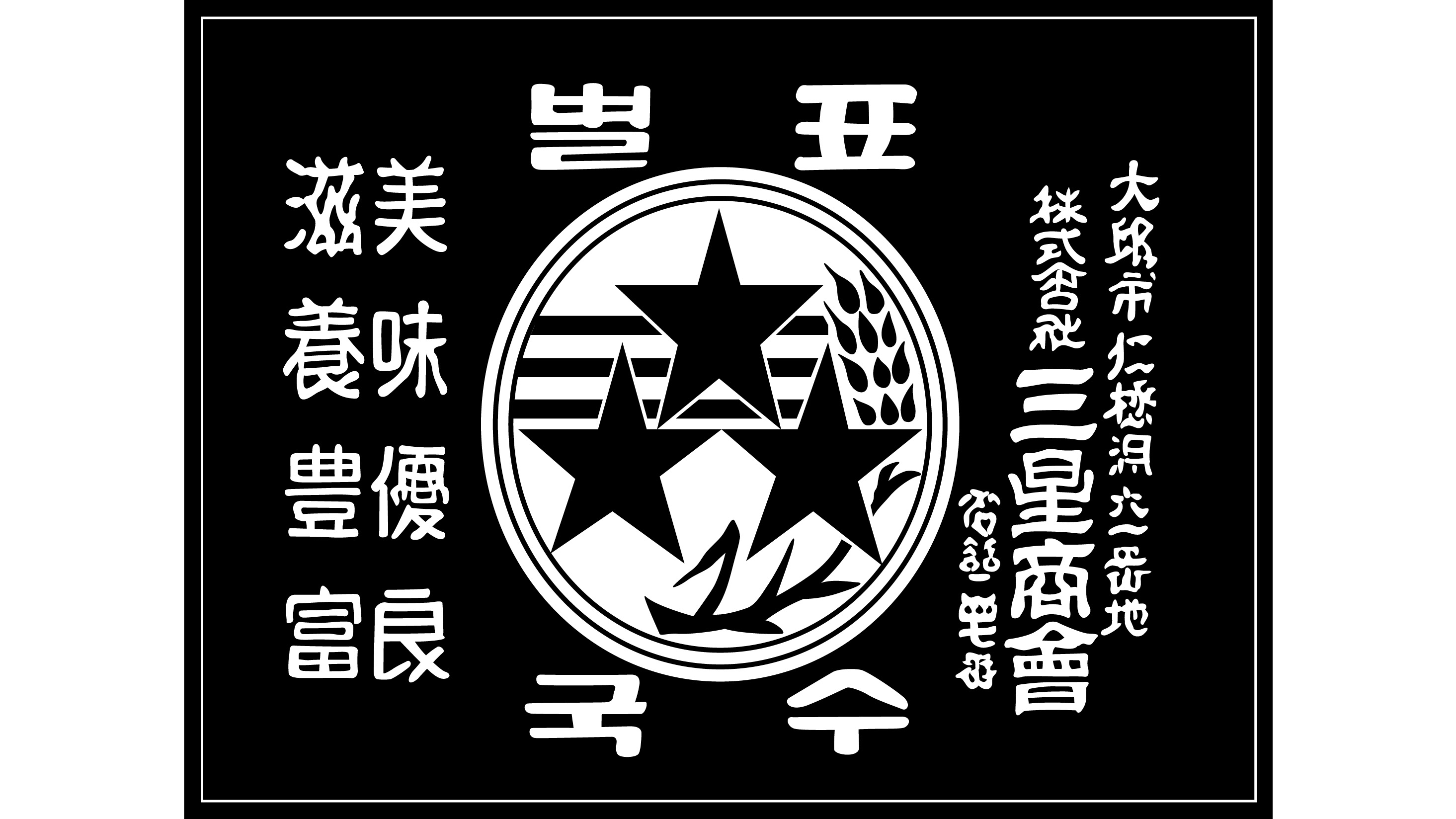
In 1938, a young Korean entrepreneur named Lee Byung-chul founded Mitsuboshi Trading Company, also known as Samsung Sanghoe, in the city of Daegu. He started with around forty employees – none of whom, if you’d asked, likely would have guessed that the company they worked for would one day become a global giant of electronics. Because the Samsung of 1938 didn’t deal with any such thing, but mostly sold dried fish, as well as other local produce and noodles.
The logo is quite unlike those that would come later, with Korean lettering, a stripe motif and a stylised ear of wheat in the central circle, signifying the firm’s agricultural trade. Keep an eye on those three stars though, as they would remain part of the Samsung brand for a good few decades to come. Some have also speculated that the three stripes are supposed to symbolise rice noodles – which, as mentioned, was an important part of the business at that time.
As emblems go this one is definitely on the complex side. As we’ll see, while Samsung’s business would grow ever more sprawling and diverse, its logo would consistently get a good deal simpler.
1969-1979: the move to electronics
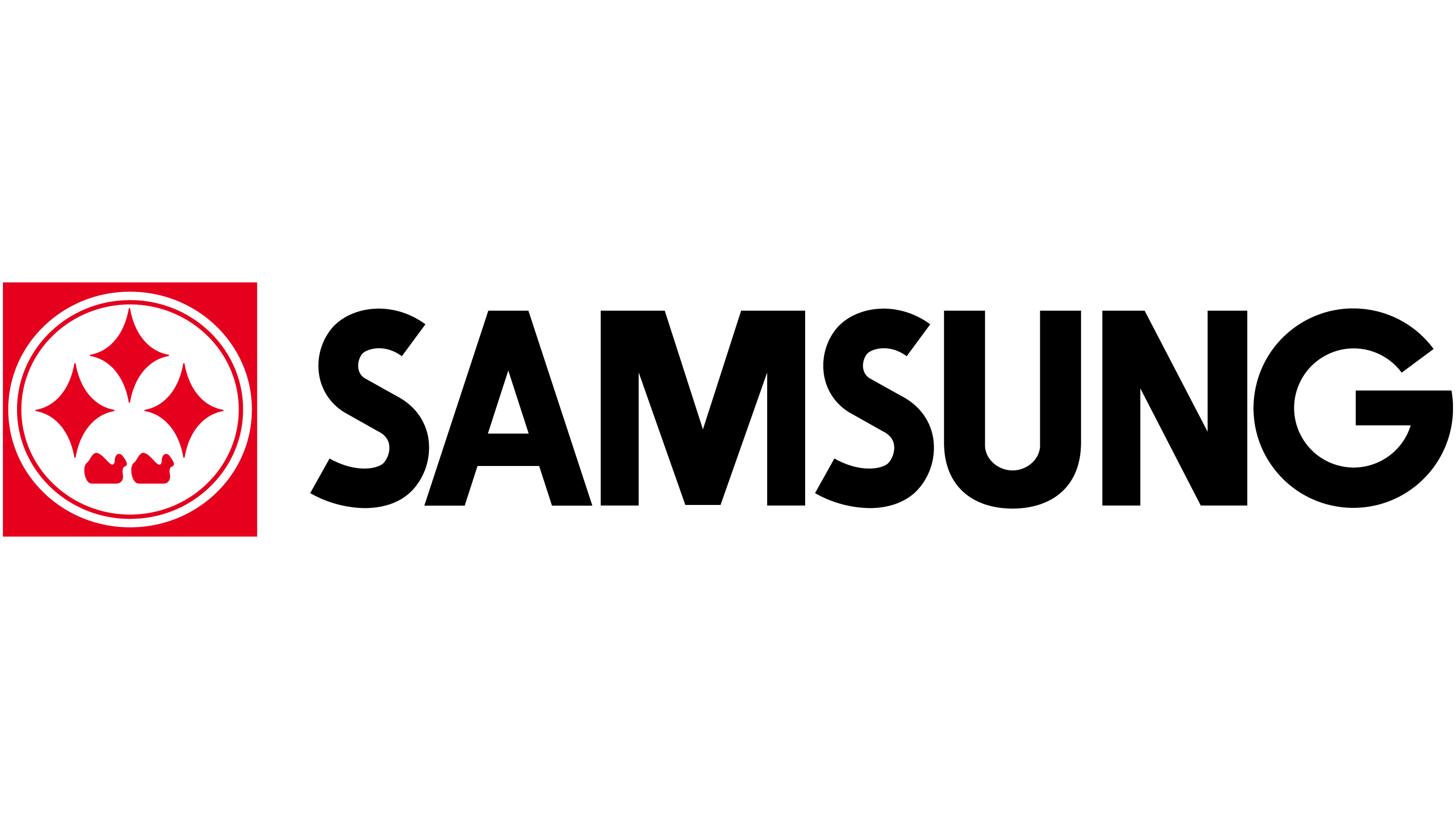
Lee Byung-chul’s company would continue to prosper and expand, in the post-war years, even after the outbreak of the Korean War. Samsung diversified into retail and insurance, among other areas, undergoing several changes in name and personnel as key people came and went. At the end of the 1960s, Samsung Group made its pivotal move into electronics, with Lee establishing Samsung-Sanyo Electronics – and with that, came a new logo.
At first glance, this mark may look nothing like the flag-style logo of the 1930s – but a closer look at the emblem on the left-hand side reveals the three-star motif has survived the transition. Beneath the stars, you'll also see what looks like a pair of waterborne birds like ducks or geese – history does not seem to have recorded what these were a reference to. The company’s name dominates in a striking, black, all-caps wordmark – and it’s now rendered in English, reflecting the company’s obvious global ambitions by this point.
You’ll notice the aforementioned three stars are encased in a square frame. The reason for this is that one of the first electronic products that the new Samsung Electronics firm sold was black-and-white TVs, which at the time of course were square – a far cry from the ultra-wide 4K and 8K TVs that Samsung sells today.
1980-1992: ten million televisions
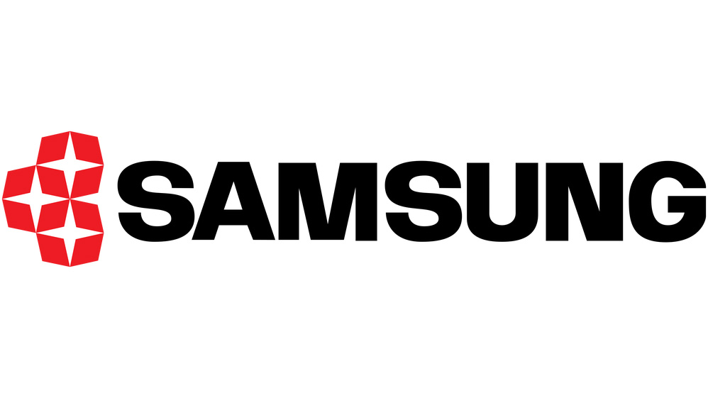
Samsung Electronics proved a success – by the end of the 1970s, the firm had manufactured more than ten-million black-and-white televisions and had expanded into the semiconductor business. The change of decade heralded an update to the logo.
The wordmark remained black, but was rendered in a thicker font. Meanwhile, the three-star motif broke loose from its frame and was simplified, with each star contained in its own small square. The mysterious birds have also disappeared, never to return.
1993-2005: you’ll recognise this one
Here we go. If you’re at all familiar with Samsung products or the brand as a whole, this logo is likely familiar to you. Introduced in 1993, this refresh of the Samsung logo threw more or less all the previous design elements out of the window for a stylish, attention-grabbing new look that signified the company’s ambition to become a global brand.
The faithful three stars, present since the 1930s, are consigned to history. The wordmark for Samsung is now stylised in a unique font that omits part of the ‘A’, and is rendered in white within an angled blue ellipse, essentially being carved out of negative space. The calming blue of the logo contrasts starkly with the vivid reds that came before – it suggests calmness and constancy.
There’s a pleasing sense of precision in the way the edge of the ellipse just brushes against the outer edges of the first and last letters in the name. It’s also notably brave that Samsung chose not to replace the stars with any other kind of symbol or emblem, relying simply on the minimalism of that striking font within that smooth shape.
A risky decision perhaps, but one that certainly paid off – thirty years down the line, and this logo is still indelibly associated with Samsung in the minds of electronics consumers around the world. While the business itself would have its ups and downs, with Samsung’s venture into mobile phones initially taking a rough start, this logo would remain an effective constant.
2005-present: half of the ‘S’
Samsung further refined this iconic logo in 2005. Since simplicity had worked so well last go-around, it’s little wonder that the firm chose to pare things down further. This new version retained essentially the same lettermark, but sharpened its edges a little for a cleaner, more modern look. The colour scheme is now a good deal more versatile – as well as classic Samsung blue, the logo is also frequently rendered in white and black.
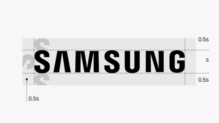
According to Samsung, getting the typography just right was something of an exact science. It involved, “an evolution which took into consideration how the human eye perceives visual cues. We carefully designed the spacing and height of our lettermark so that they would create visual harmony through even distribution of letters.”
The company has created a simple rule to ensure this is the case – the logo always needs a minimum spacing of half of the ‘S’ around every edge, like so:
Samsung – admittedly with something of a bias – describe the wordmark as, “Simple, iconic, timeless.” And that bias notwithstanding, it is hard to disagree.
For more on logos, see our logo history page.


