This historic Upper East Side apartment at 635 Park, with its high ceilings and views of the Armory, has undergone many changes over the years; the newest is a total renovation by Andrew Magnes of AMA, a Brooklyn-based practice known for its custom-tailored buildings and carefully thought-through renovations.
The apartment, a four-bedroom home spread over an entire floor, is located in the building that was originally created in 1912 by JER Carpenter. One of the leading architects and developers of his time, Carpenter redefined luxury apartment buildings in the city with his elegant, refined Georgian style and clearly defined layouts with ample space for entertaining.
Inside 635 Park apartment
When the homeowners – a couple with young children who wanted to relocate uptown to be closer to family – purchased the property, it featured Le Corbusier-inspired apartment interiors with glass blocks, white curves and columns by the late Charles Gwathmey, the architect also responsible for the 1992 renovation of Frank Lloyd Wright’s Guggenheim Museum.
Unfortunately, the existing floor plan didn’t work for the new owners and their quickly growing family, so Magnes was tasked with a full update of the apartment. ‘Though we were sad to see the Gwathmey chapter end, we were honoured to be part of the next one,’ says the architect. ‘The challenge and thrill for us was tastefully planning for modern spatial relationships in a prewar building. We worked around the existing conditions to make the residence feel contemporary, fresh and inevitable.’
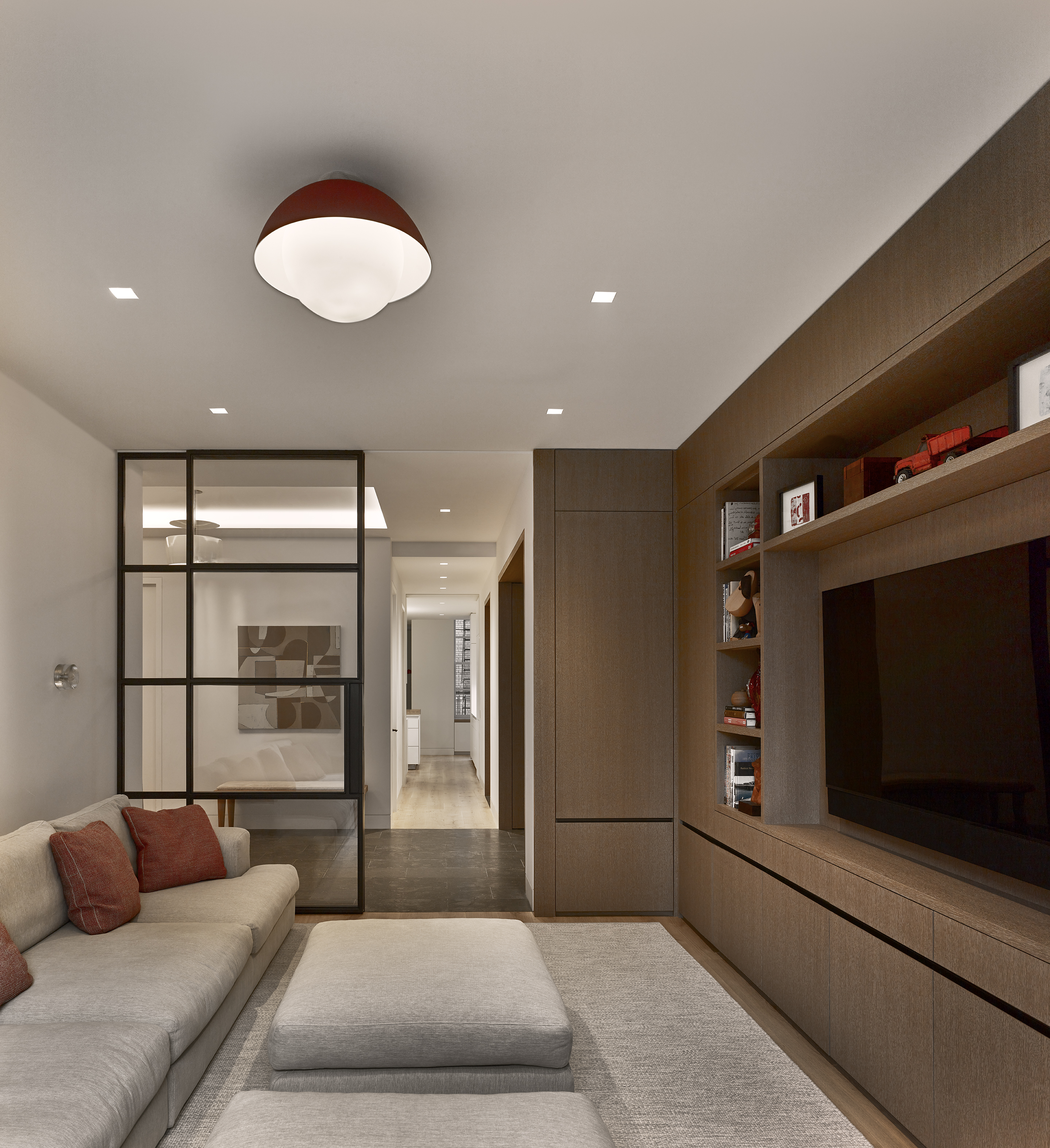
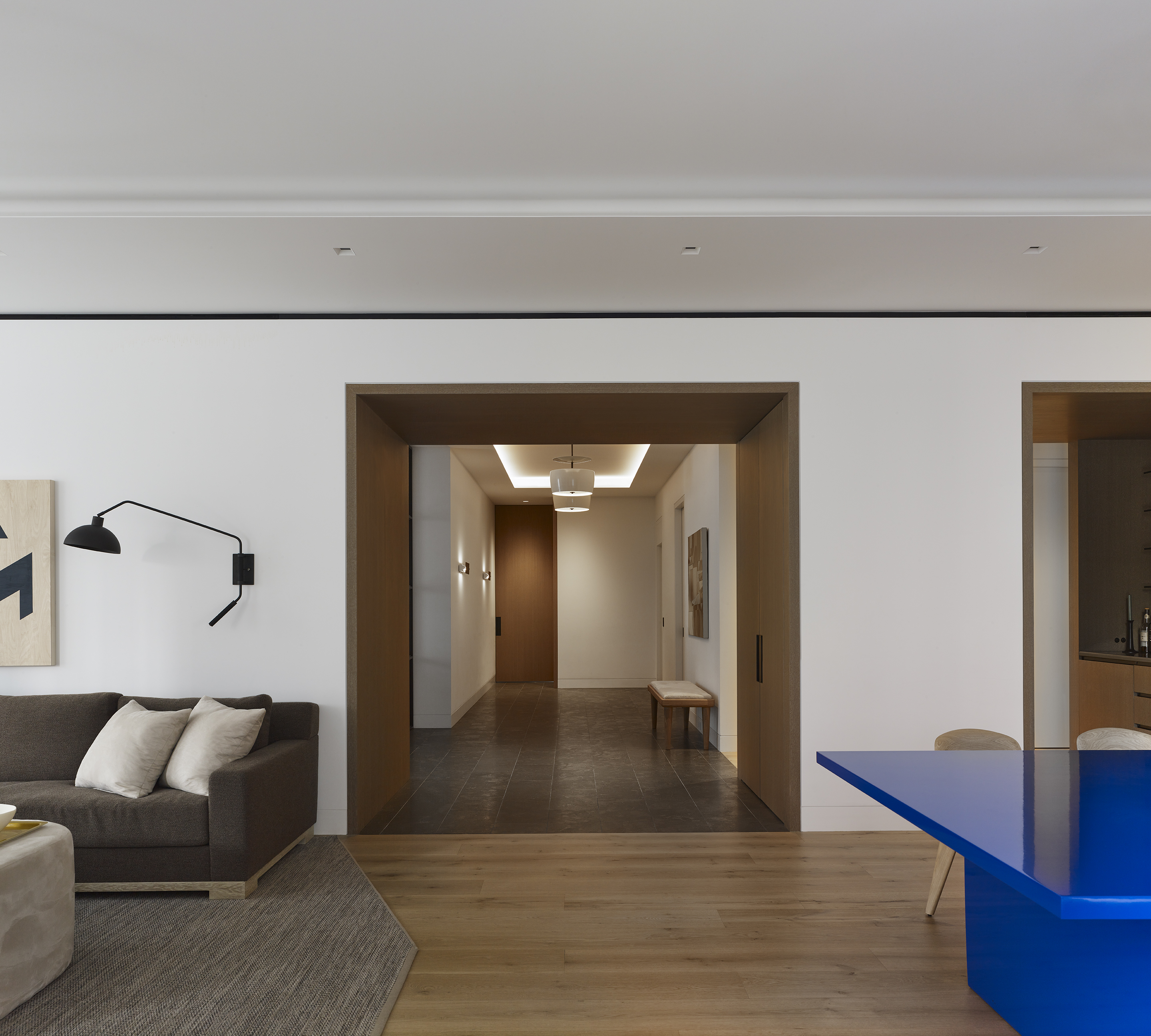
The brief included providing for ‘a less formal, more open lifestyle’ with spaces for everyone, from a children’s playroom to a large and welcoming kitchen where everyone could congregate. The resulting layout is a series of spaces that flow into each other, organised around a central spine that acts as a threshold between spaces but also contains storage, a mud room and a servery/bar.
‘We rarely start a project with a fixed notion about the end product,’ explains Magnes. ‘Projects reveal themselves through the process of drawing, modelling and discussion. Curiosity and courage are key ingredients in our design process.’
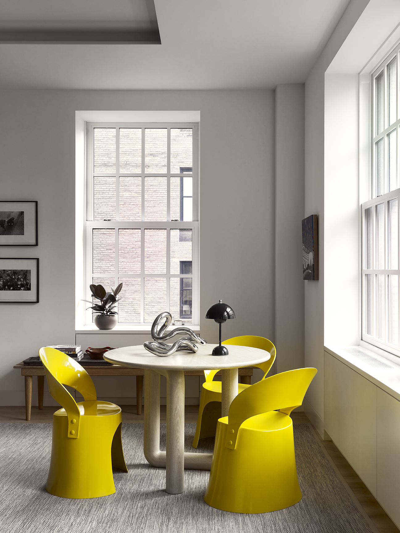
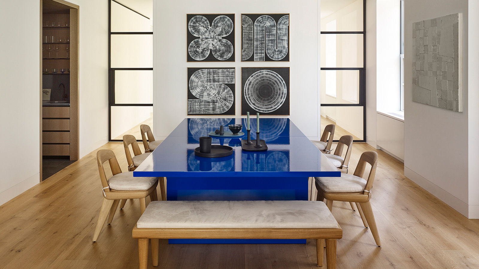
To the south side of the apartment, the large formal dining room and living room were merged to create one vast living space, with a large seating area near the fireplace at one end, and a dining table by Chris Lehrecke that doubles up as a ping-pong table at the other. Furnishings include ‘Brutus’ chairs by BassamFellows from Suite NY, as well as a round ‘Mono’ table from Objects & Ideas, which is paired with Nanna Ditzel’s classic ‘Space Age’ chairs for Domus Danica, refinished in bright yellow.
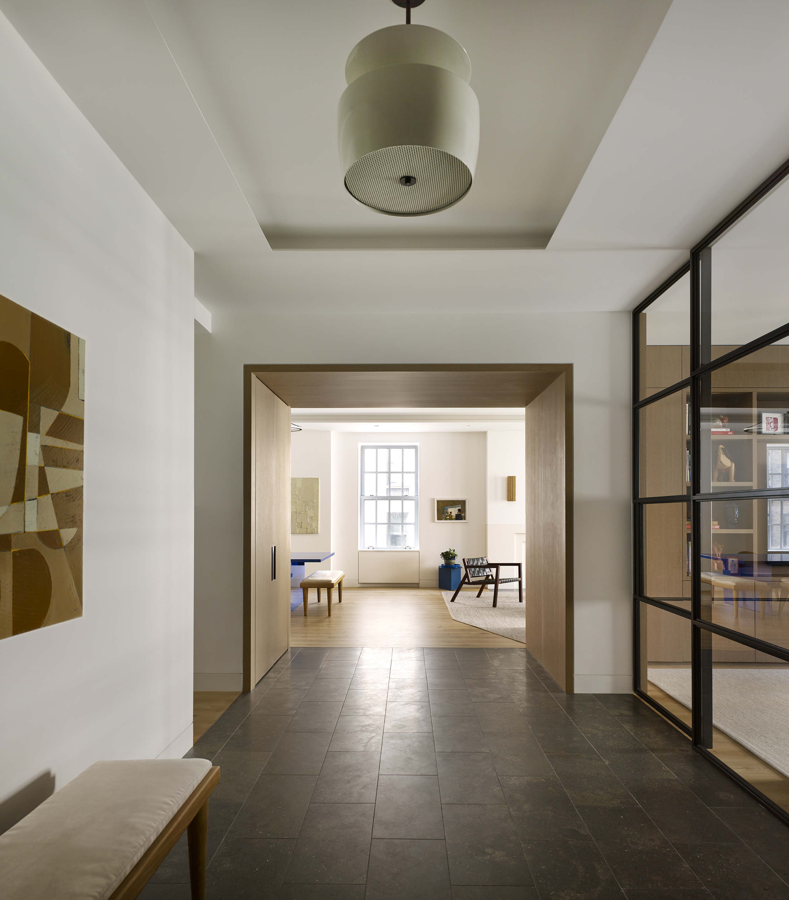
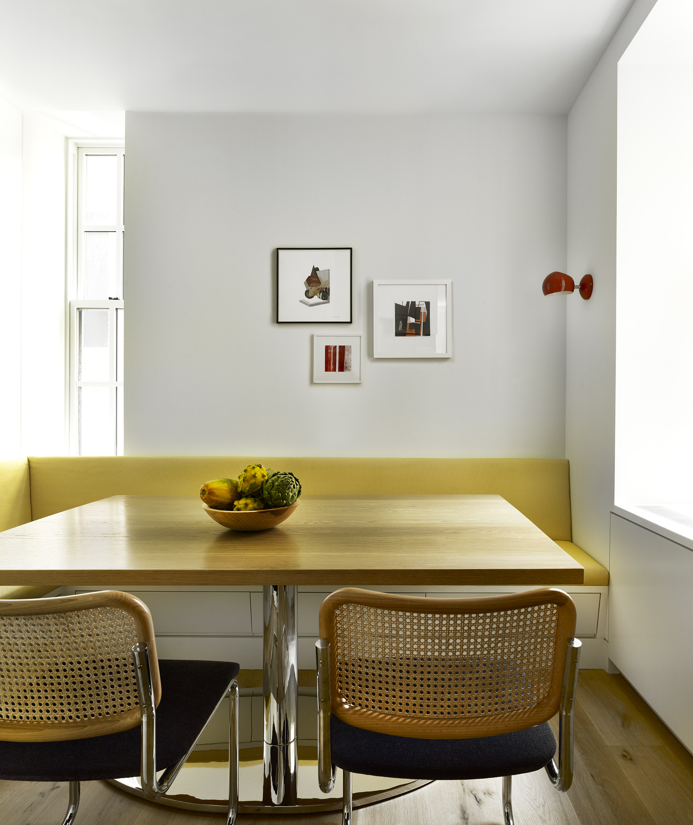
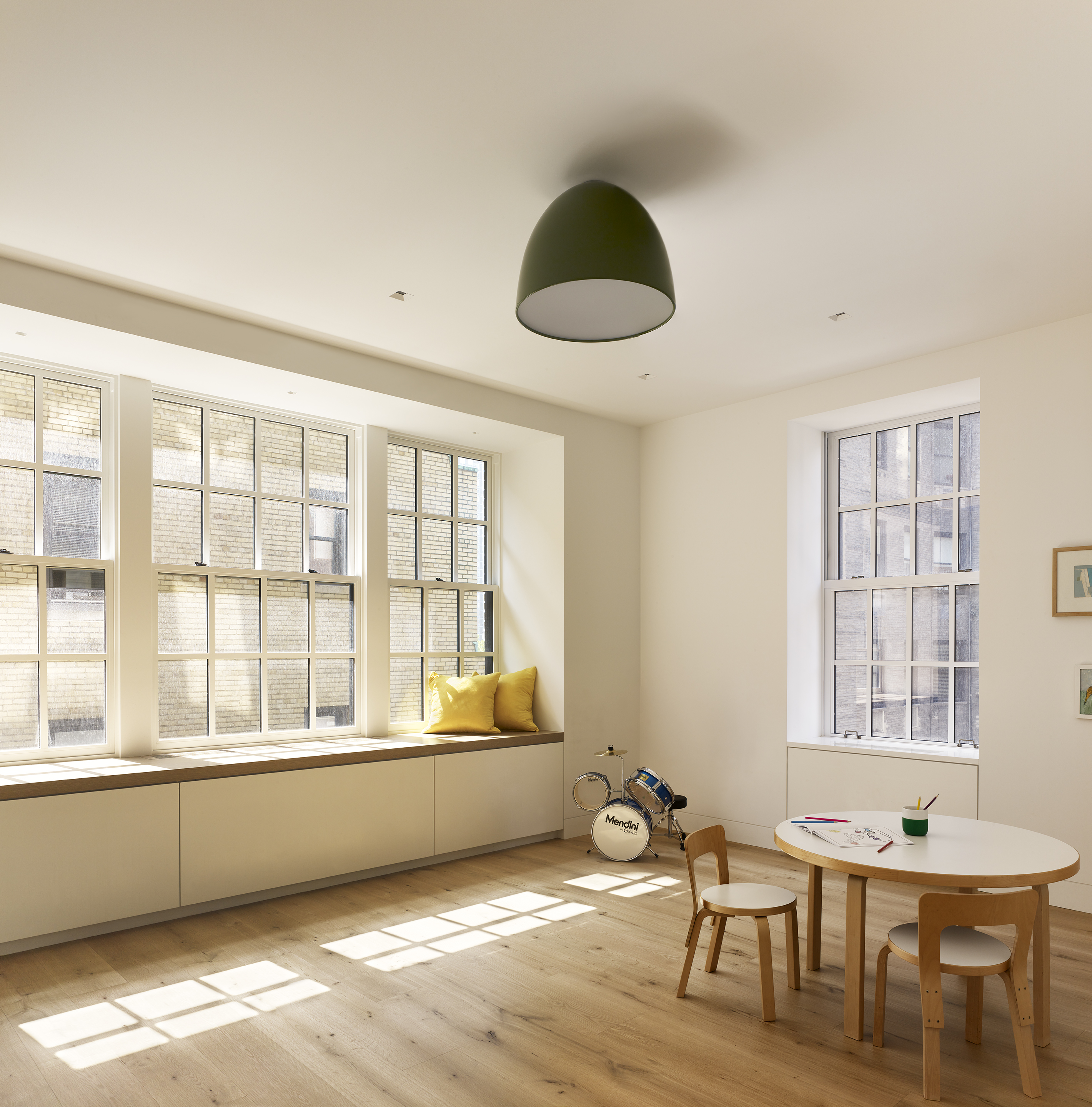
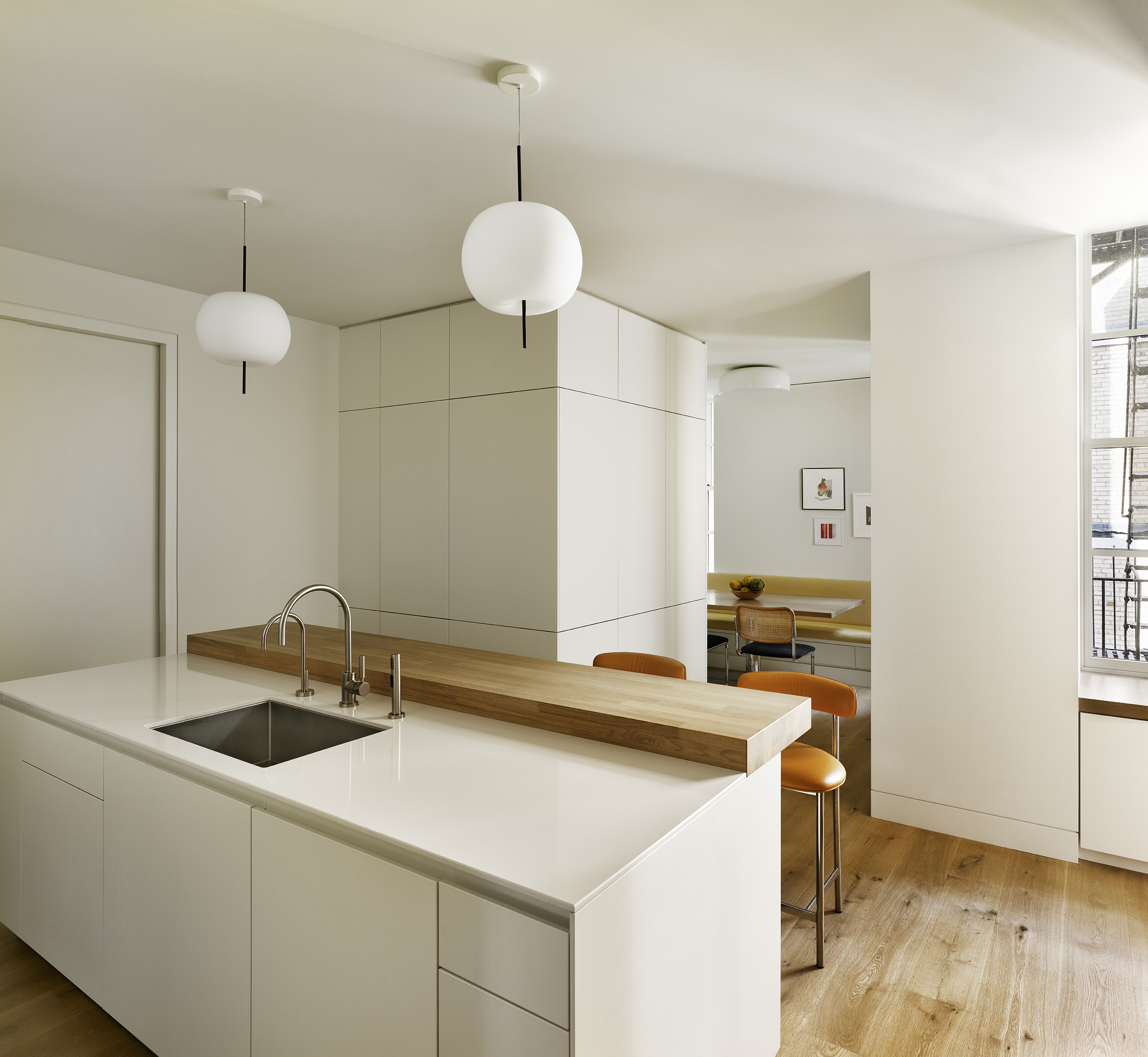
This allowed the architects to carve out a large, light-filled playroom on the east side of the apartment, which sits next to a Bulthaup kitchen with white quartz countertops countertops, island seating and a welcoming breakfast nook. Both the playroom and the open family room can be closed off with pocket doors and custom steel and glass partitions to keep the noise levels down.
The north side houses a row of four en-suite bedrooms, with the main bedroom overlooking the Park Avenue Armory. It is connected through a small study to a large bathroom/dressing room with white painted cabinetry and a large island vanity at its heart.
‘The space is designed around a centrally located vanity with double sinks,’ says Magnes. ‘We hung the medicine cabinet – a custom, blackened stainless steel piece with built-in storage, mirrors and lighting, fabricated by Stratford Steel – from the ceiling.’ Like the rest of the remodelled apartment, the resulting room is bright and airy, but also totally unique.
