Given the amount of color and pattern making their way into interiors, even the most devout minimalists among us might find themselves prone to maximalist leanings of late. If brighter shades aren’t your usual go to when it comes to decorating, it can feel daunting trying to work out how best to inject some stronger color into your home. The living space is a great place to start, particularly if you steer clear of investment pieces, such as a new sofa or expensive art. A lick of paint can always be updated if you feel unsure about the color choice, as can smaller or more affordable accessories, such as soft furnishings.
Another thing to remember is that all shades are intensified when placed against a pure-white backdrop. ‘Rather than adding bright colors into a white space, which will make every color in the room that much louder, try starting with a tonal base,’ recommends New York interior designer Becky Carter. ‘This allows you to work with stronger colors in a more controlled way.’ Becky’s advice extends to ceilings, too: ‘Paint the ceiling! A white ceiling makes all the other colors in the room feel more intense. Painting the ceiling the same color, or a lighter version of the wall color, helps the brighter shades settle in more.’
Ruth Mottershead, creative director at Little Greene, agrees. ‘Ceilings have become an increasingly important part of design schemes. It is often the largest expanse of color you will have in a space, so it will have a big impact on how the room will feel.’ For a cohesive, color-drenched look, Ruth advocates continuing a coordinating color across the ceiling. ‘Alternatively, add a contrasting shade to create a dramatic focal point. Painting your ceilings is a great way to finish off the look of a room and create instant impact,’ she concludes. Discover more expert ideas for integrating bright shades into your living room color scheme below.
1. TEMPER BRIGHTS WITH TONAL HUES

Bright colors can feel too bold and energetic in isolation, but paired with complementary calming neutrals and more muted tones, it can bring this energy down. ‘We wanted to make the house feel rich, tonal, and fun,’ says interior designer Becky Carter of this Arts and Crafts home she designed in Berkeley Hills. For the blue living room, ‘we started with a deep blue for the trim, which we lightened and desaturated for the walls, to the point where it became almost powdery.’
‘Using a lighter blue for the walls and ceiling gave us a canvas that could hold brighter, more ‘opinionated’ colors without conflict,’ Becky explains. ‘We took this same approach to the decor: larger pieces in the room, like chairs, rugs, and tables have a single color palette of green and gold, which allowed us to bring in rich and varied brighter shades in smaller doses; namely the artwork and pillows.’
2. TRY A JOLT OF ORANGE
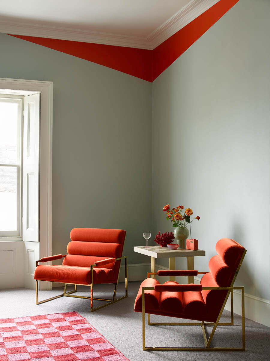
Alongside other vibrant shades at the warmer end of the color spectrum, orange has been enjoying a resurgence, notably in the form of room-boosting accents: think orange velvet sofas and small but punchy hits of color. ‘Even in small doses, orange is a great statement color. Be brave and rebel against decorating rules. It takes confidence to ‘paint outside of the lines’, but it’s one of the easiest ways to make an impressive impact,’ says Benjamin Moore’s Helen Shaw.
‘Use masking tape to play with angles and introduce unexpected geometry to a corner, creating your own modern take on coving in a fearless, eye-catching color. Pair with furniture and accessories in the same shade to lock the scheme together.’ This paint idea for walls is a clever way to add bold color in a small volume.
3. ADD BRIGHT ACCESSORIES
If you’re searching for a way to lift a simple scheme, but don’t feel ready to commit to a bold wall shade, then injecting pops of color through living room wall decor, soft furnishings and accessories can feel like a more approachable option.
;Using bold and colorful art or a striking rug as a focal point is a great way to anchor your space and build a microcosm of color in an otherwise neutral or monochromatic room,’ says Lauren McGrady of Chicago studio Rider For Life. ‘You can enhance the vibrancy even further by using the color story in your artwork or rug to inspire elements like pillows and objects scattered throughout the space,’ she adds.
4. CONSIDER A BOLD WALLPAPER
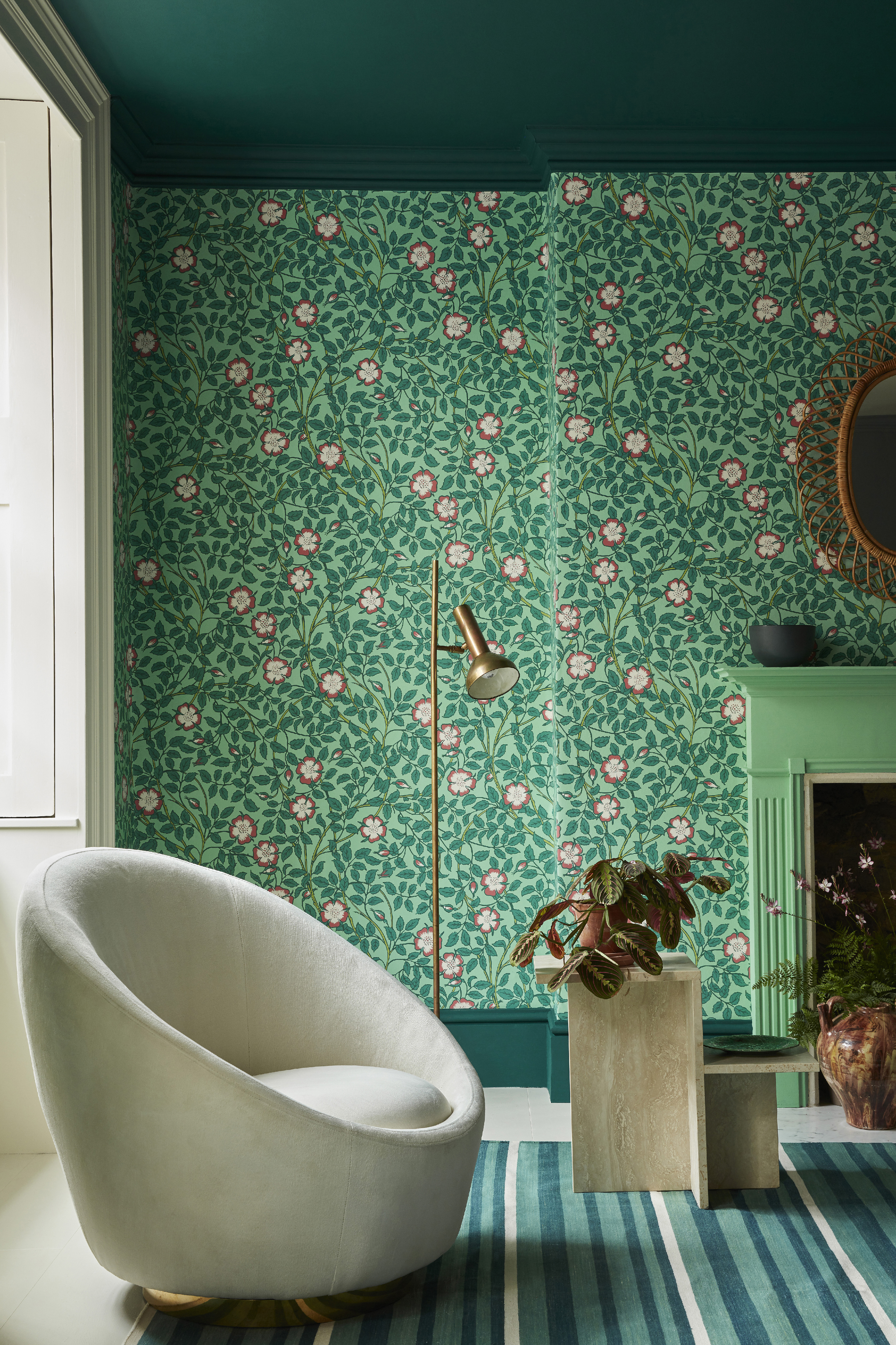
‘As well making a design statement, a colorful wallpaper can provide a sense of intimacy and comfort,’ explains Ruth Mottershead, creative director at Little Greene. ‘Richly colored living room wallpapers can be used in combination with vibrant, contrasting colors for a dynamic interior, or they can be pared back with complementary neutrals for an elegant and refined finish.’
For a cohesive and contemporary feel, Ruth advises steering clear of bright-white paint for trim. Instead, she suggests opting for darker colors in coordinated shades such as Little Greene’s rich ‘Mid Azure Green’ paired here with ‘Briar Rose’ wallpaper in ‘Green Verditer’.
5. GO FOR WALL-TO-WALL COLOR
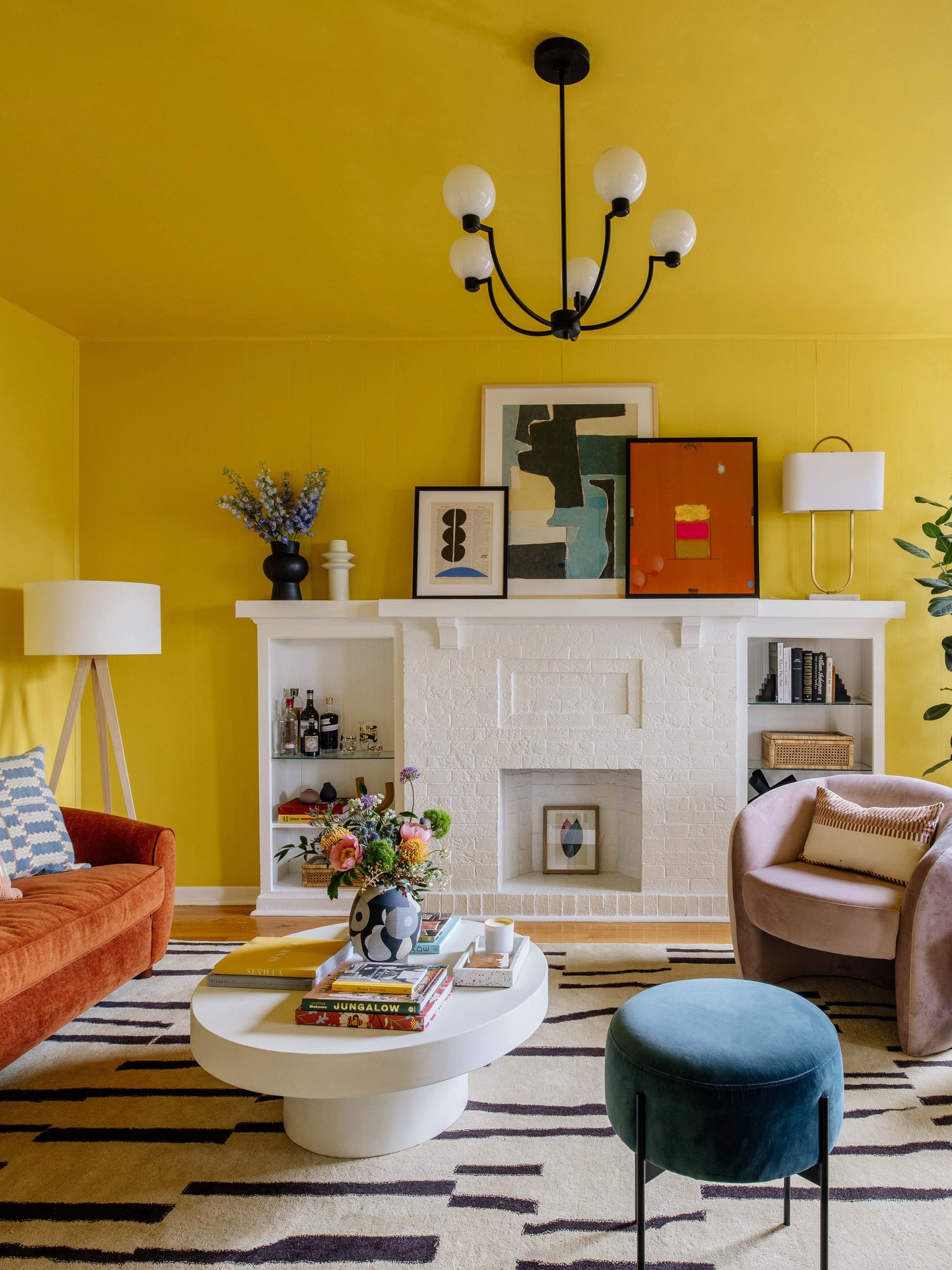
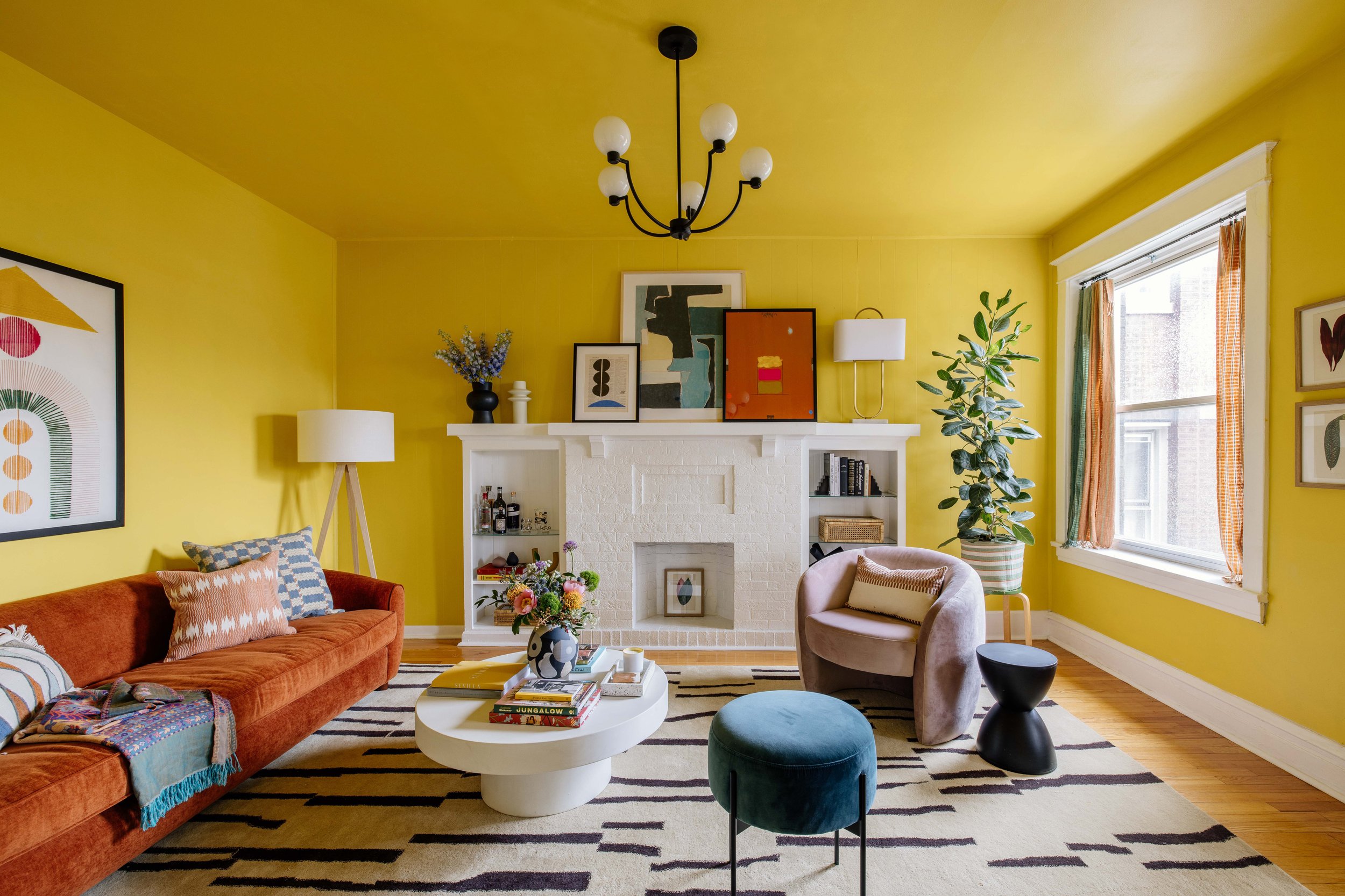
As we've already looked at, if choosing a bright color for your paint, the best idea is to paint the walls and ceiling the same color to avoid a stark contrast between the two. When designer and artist Dabito was tasked with overhauling this formerly grey-walled living room for a friend, the brief was to create a summery, laid-back space. ‘One of my friend’s favorite colors is yellow, which made my job easy,’ says Dabito, who selected Valspar’s cheerful ‘Sunday Brunch’ for the room.
‘And not just for the walls,’ he adds. ‘We also painted the ceilings to make the living room even more bold and dramatic and left the big fireplace white for a bit of contrast.’ Furniture and artwork in rust and a mix of blues complete the palette.
6. DRAW SHADES FROM NATURE
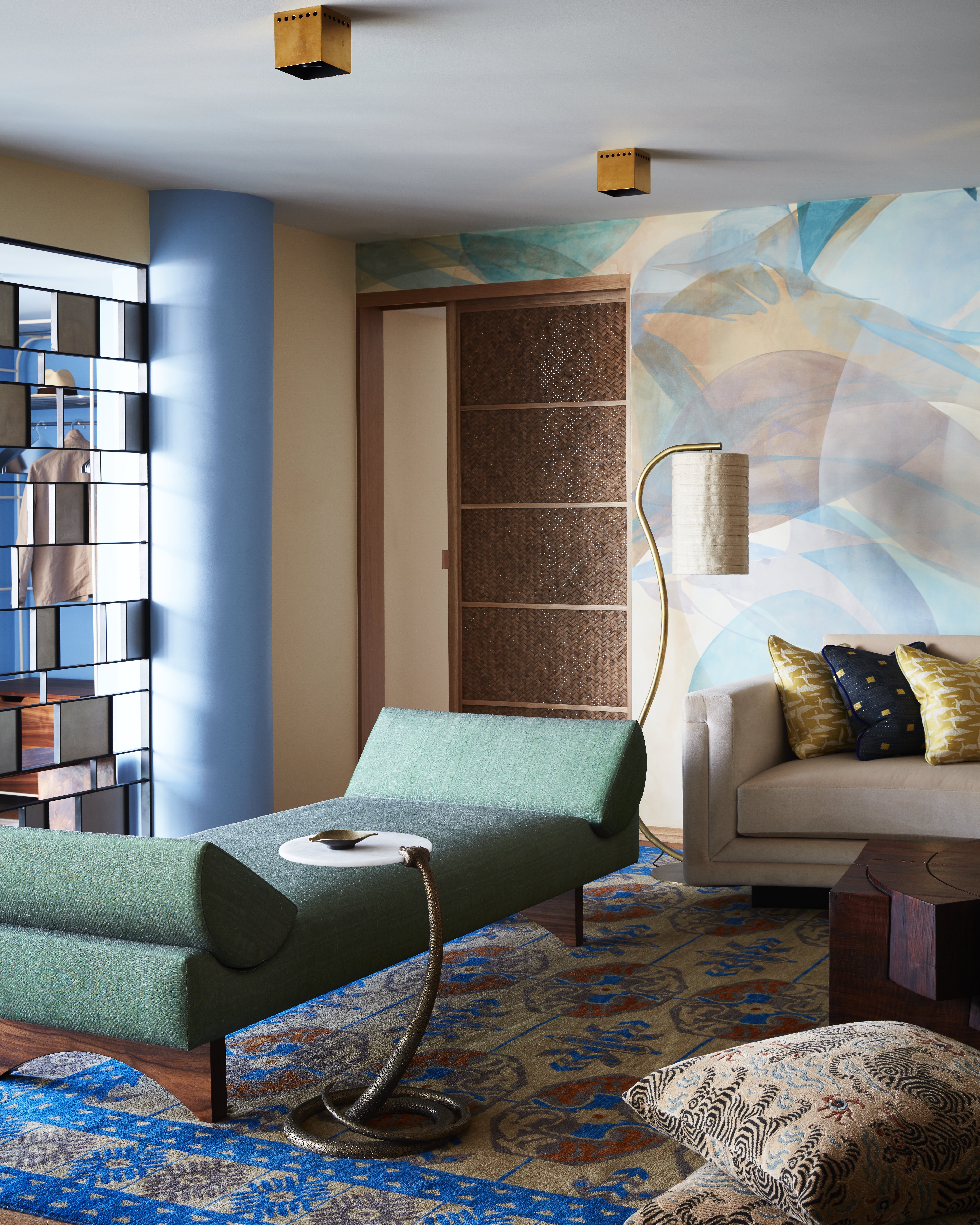
A natural palette can still be vibrant, as this Malibu apartment proves. Commune Design tasked artist Louis Eisner with creating a wall mural for the living space, inspired by the coast it overlooks. ‘The client very much wanted to bring the outdoors in, so Louis created what is essentially an abstracted view from the apartment,’ says studio principal Roman Alonso.
‘The colors for the interior were inspired by Le Corbusier, and more specifically his palette for Maison La Roche,’ Roman continues. ‘We are always inspired by the colors of nature and in this case, the California coast. Combined with a Corbusier-inspired palette, it evokes the South of France, a place that the client fell in love with on a visit years ago.’
7. ZONE WITH STRONG COLOR
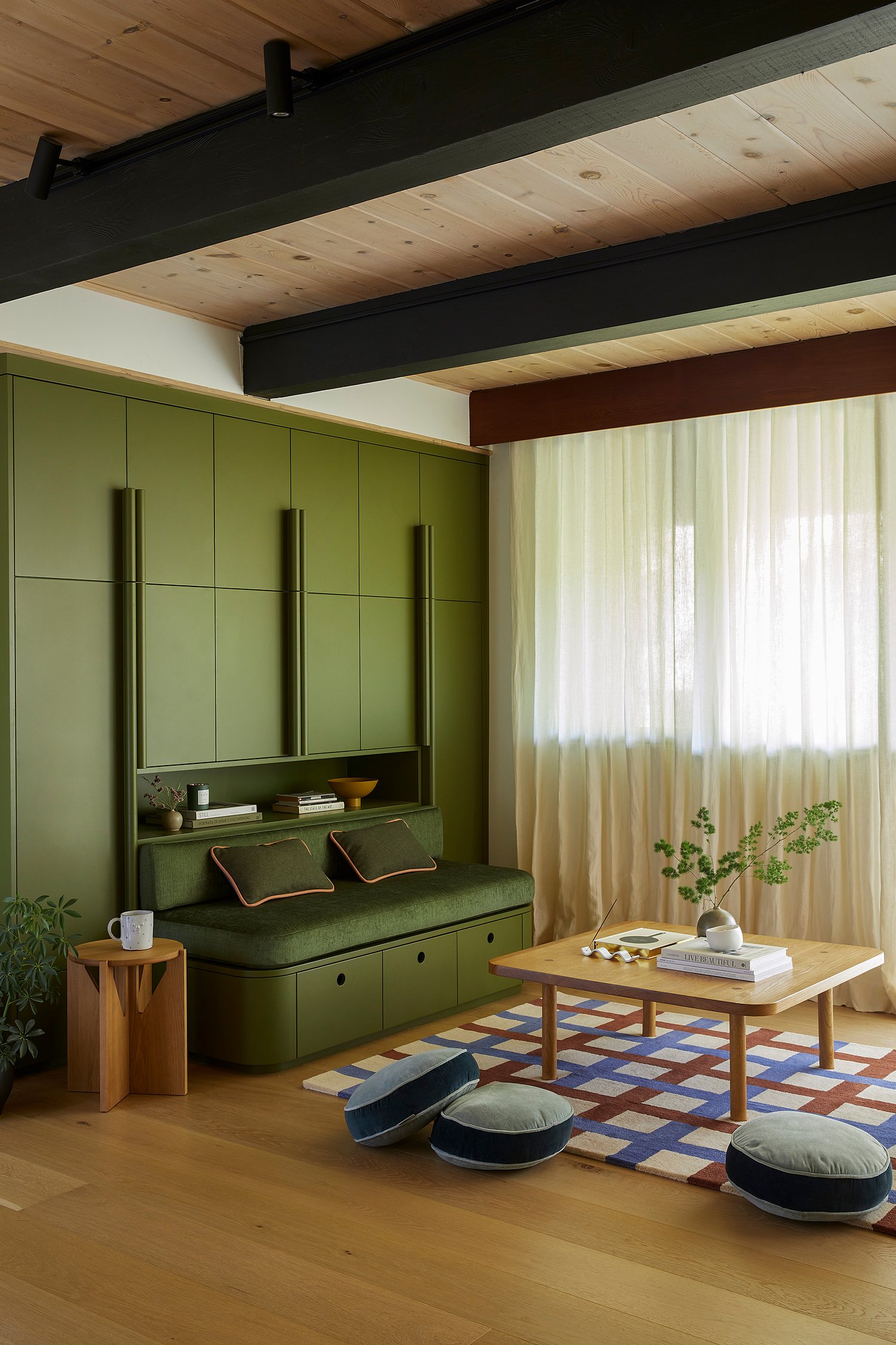
Interior designer Cathie Hong used a deep yet impactful green to give this corner of a living space some definition in her Californian home. ‘For this floor-to-ceiling built-in storage unit, we opted for an olive green shade to marry the indoors with the forest setting outdoors.’
‘I love the look of monochrome, whether it's a full room or one wall, so we decided to do an upholstered sofa cushion in a matching olive green Knoll fabric to blend it seamlessly with the storage unit,’ says Cathie, who chose rug in a striking blue-and-red checked design that gives the space a playful edge.
8. EXPERIMENT WITH CLASHING HUES
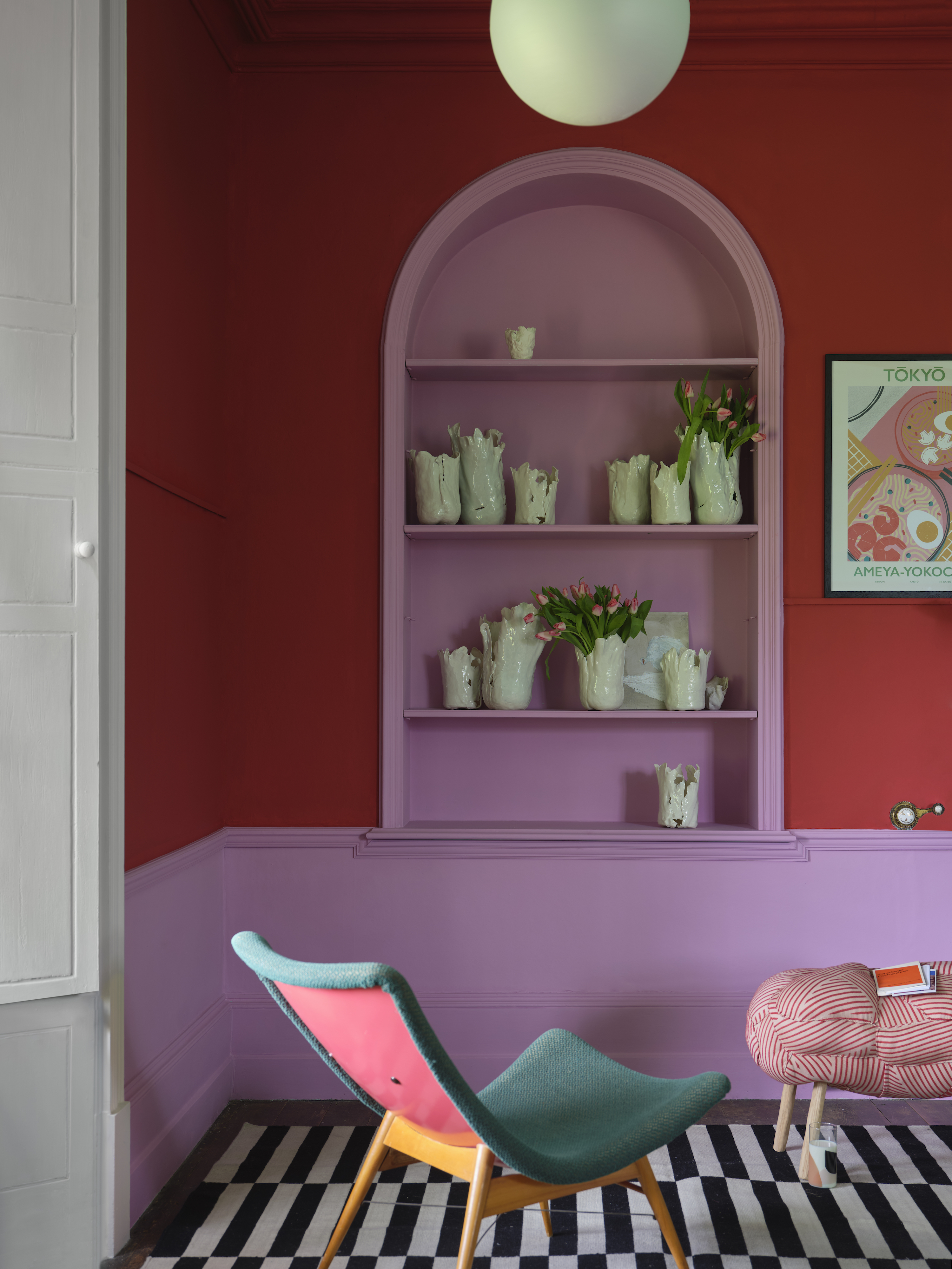
If you're more than comfortable with bold color and want to create a scheme that really stands out, try combining clashing shades or unexpected color combinations in bright or richly saturated hues. This proudly loud living space features Farrow & Ball’s brilliant red ‘Romesco’ on the walls, while shelves and skirting are painted in ‘Shallot’, a purplish pink.
Both shades are from the brand’s Carte Blanche collection, a collaboration with Christopher John Rogers. ‘I want people to feel empowered and emboldened to express themselves, and mix and match the collection however they think best,' says the fashion designer. 'You could do a whole room in Romesco or just a border in Lobster. It’s up to you to decide how you want the space to feel.’
9. CONSIDER SHERBET SHADES

While color trends from the 70s and 90s have been seeing a resurgence, it’s easy to cast the 1980s aside as a less desirable decade; however, there’s definitely some inspiration to be found if you’re a fan of bright color, as this 80s-influenced living room shows.
Sherbet-yellow walls combine with lime-green upholstery and a bespoke candy-pink rug, which was designed by Alex Proba of Studio Proba. ‘The large custom rug anchors the living room of this photography duo’s eccentric LA home,’ says Alex. ‘The palette is a monochromatic bubblegum pink, with pattern and texture infused through debossed, overlapping rings.’