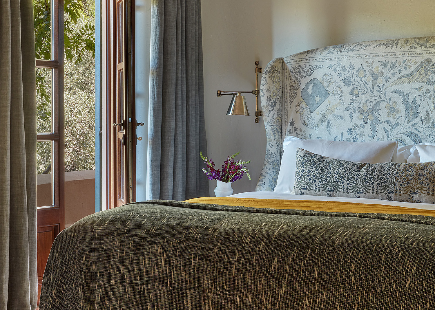
Coastal color palettes have moved on since the days of the bright white and the navy blue dominated every beach shack from here to Nantucket. Now they're a shorthand for the feeling you get at the beach, that moment where the shoulder drop, the lungs fill with sea air and life just feels fantastic again.
Modern coastal palettes feature a lot of blue, sure, and some white. But they also fold in yellows, pinks, greens, pale woods — all the colors you get you get on the shore. 'It needed to feel like a beach house over looking the ocean,' said Azar Fattahi, one of the co-founders of the design studio LALA Reimagined, to justify the color palette she chose for a project in Malibu (more of which, below).
It's an enticing mood, a way of life we can all want, and is easy to achieve if you follow these designer suggestions that play on a modern approach to color theory to devise palettes. The beach, decoratively speaking, is this way.
1. Mustard, gray and cream
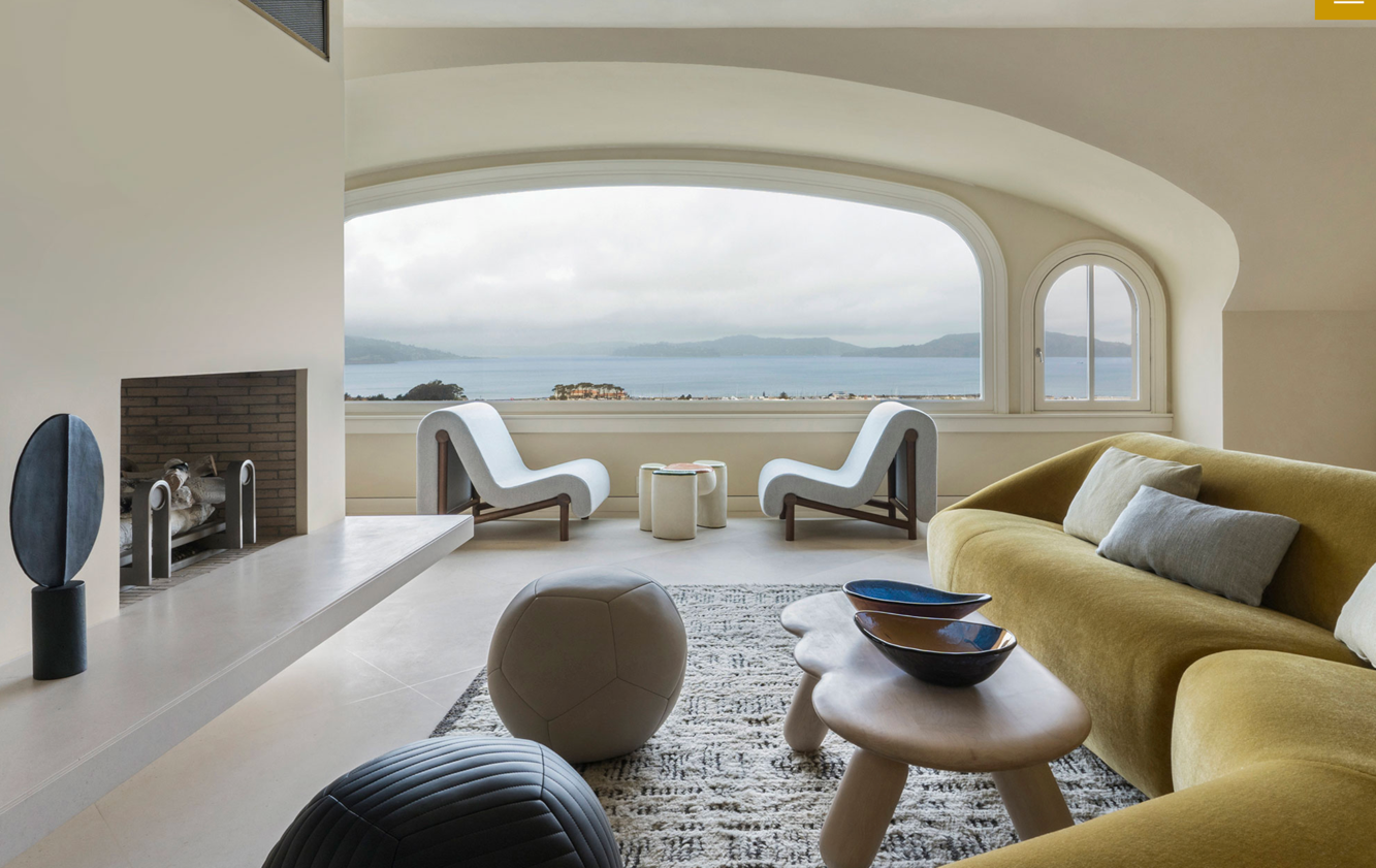
As the view beyond the window of this San Francisco project by the interior designer Heather Hilliard serves to remind, coastal isn't always sunny. And within the moody palette that the sea and the sky above it often displays is a very grown up take on beachside decor.
'This mustardy/ochre yellow fabric has a jewel-toned quality that underplays the yellow hue and keeps it from overpowering the space,' Heather says of her decision to tone down her choices rather than go for sunny brights for the living room sofa. 'We paired it with other neutrals — gray and cream tones and bluish grays to further ground the room.'
2. Blue and rattan
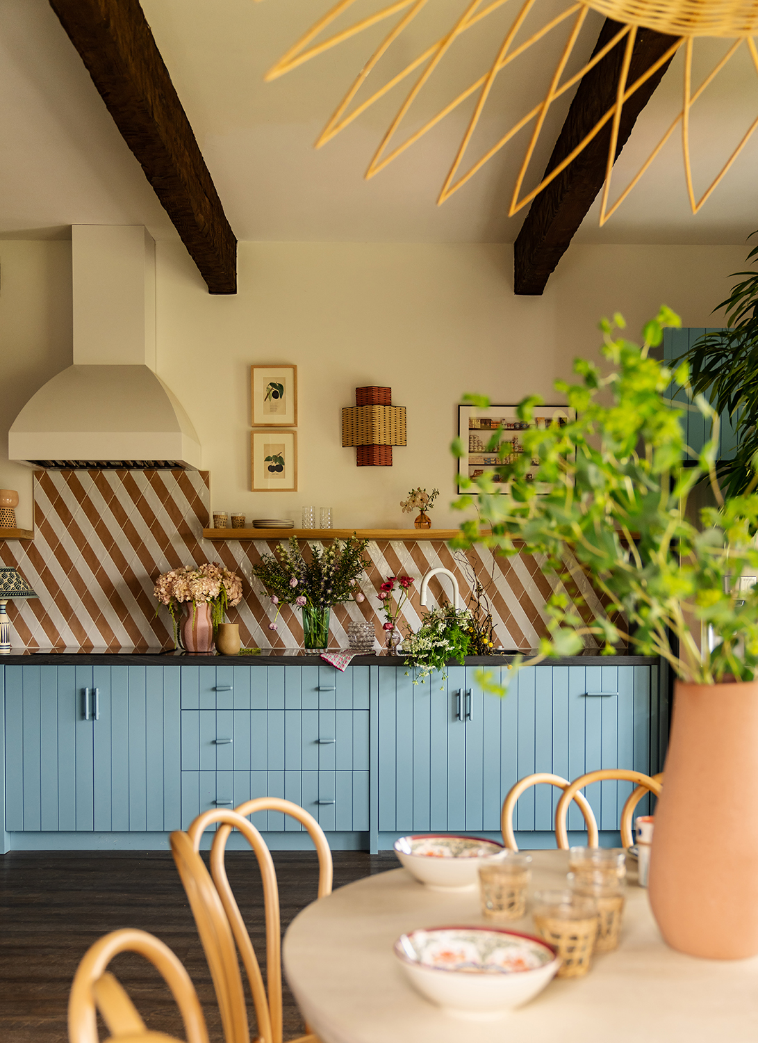
Rattan is a classic coastal trope, seen in beach shacks and luxe designer spaces alike. It provides a downbeat moment which can be used to link other, more dominating colors, and makes every space feel that bit more casual. More coastal.
'Rattan is timeless, you just can't go wrong,' says Lia McNairy, co-founder of the Los Angeles-based studio LALA Reimagined, who created this modern kitchen in Malibu. It somehow makes the soft blue seem even more beachy, and can be used as liberally as seen here on the chairs and light fitting to a wonderfully summery effect.
3. Blue, white and gold

Blue and white may be the classic coastal color palette, but the addition of gold reinvents, reinterprets and re-modernizes the approach to make it seem right for now. This dining space was created by Angeline Guido Design and has the grandeur of an urban home mixed with the airiness of a coastal one, thanks to a modern approach to decorating with pastels.
'Because the room is flooded with sunlight, we really wanted to lean into a pastel palette to keep the setting bright and airy,' says Reno Grossi, the studio's principal designer. 'We wanted to avoid dark or moody colors, as to not draw the eye to anything specific but instead allowing the room to be experienced as a whole.'
4. Pale blue, pale pink, pale yellow and green
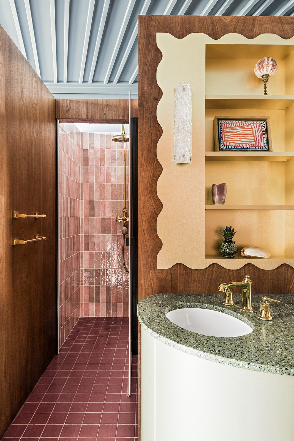
Pale blue is given another modern update, this time with pale pink, pale yellow and green in this bathroom color idea by Batiik Studio. How does this manage to remain a coastal color palette? Because it takes all the colors seen at the beach, from the rough tufts of grass on the dunes to the changing pink of the sky at sunset and blends them into one relaxed and informal space.
The addition of the wood veneer, with its whorls and grains like the character of driftwood washed up on the beach, only adds to the effect.
5. Gray, yellow and dark green

Looking at this bedroom color scheme makes you feel (or at least wish) you were on vacation. But it's not just the open double doors letting the sunshine in, or the cool white that the ceiling's timber has been painted. In fact, it's because of the coastal color palette design studio Charles and Co has employed for the styling.
'Mixing patterns and introducing different color was all about keeping this guest bedroom casual,' says the studio's co-founder Vicky Charles. 'We didn’t want the room to be too formal or take itself too seriously, the yellow throw brings in the sun and reminds you that you’re somewhere magical.'
6. Soft pink with a mix of blues
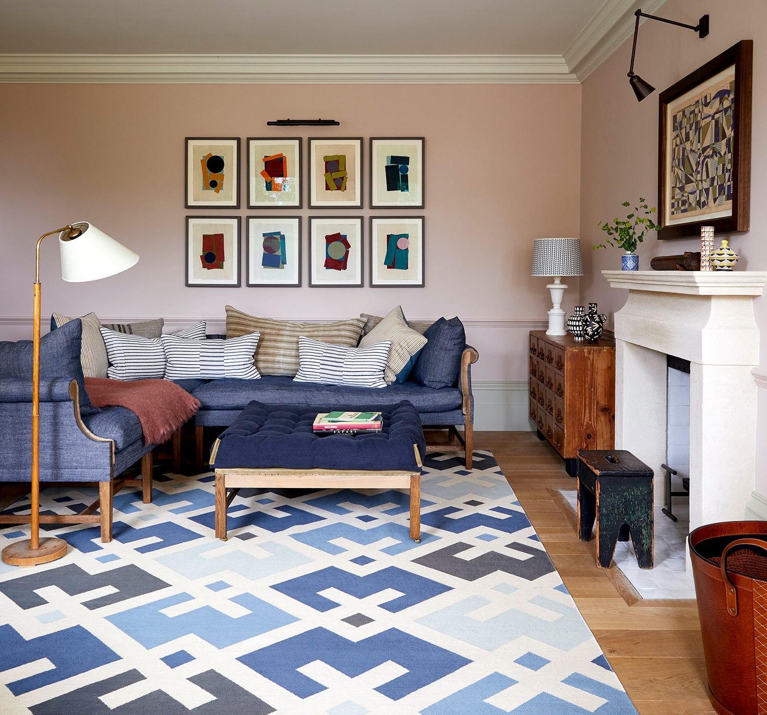
A loose take on a coastal color palette, this shows how you can take the tenets of beachy decor and apply them to a more formal urban space — and why you'd want to. For her own home, British designer Nicola Harding has used a myriad of blues seen in the sea and underpinned them with a grayed-out pink for a look that is about 20 minutes after golden hour has subsided but before night has fully set in.
'[The paint brand] Pure and Original have very high levels of color pigments in its paints - you don’t tire of them because there is so much depth to them,' Nicola says. 'If the colors are true to what you find in nature, it does something to you on a subliminal level. I adore Old Rose which I painted my own living room in, paired with a couple of pistachio green sofas. Meanwhile Old Romance looks a bit gray at first impression but then you notice it has deeper, pinky tones which are wonderful.'
7. Pale gray, pink, red and wood
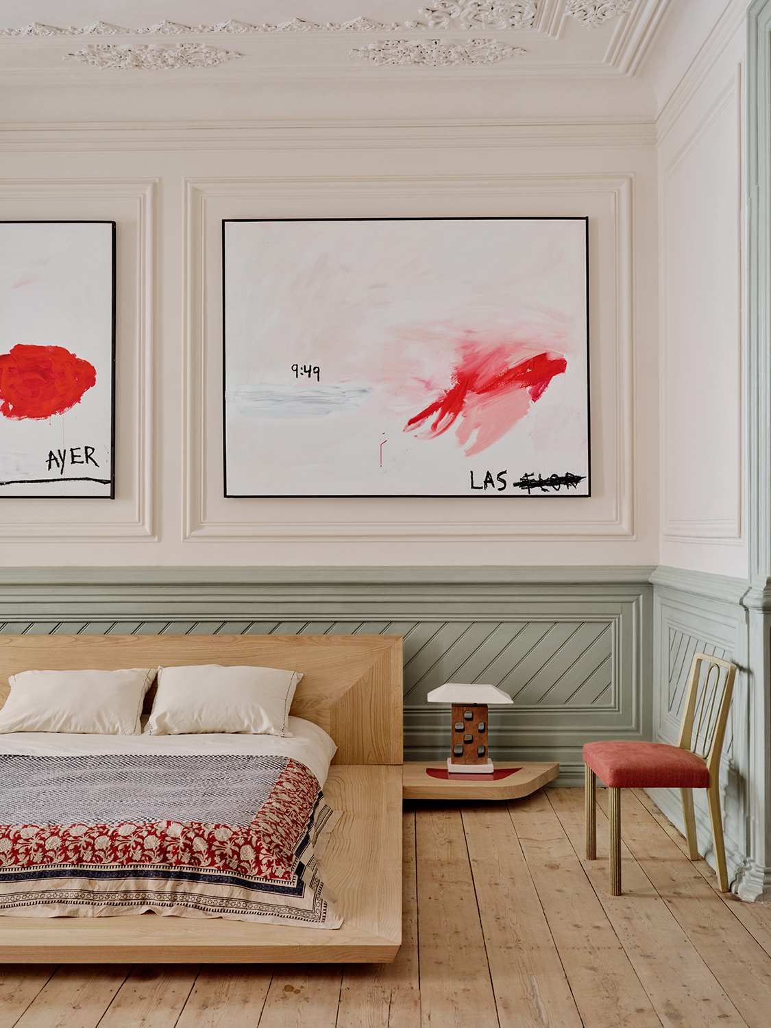
One of the reasons designers choose coastal color palette is for the serenity that is inherent in them. The body wants to relax in them as it does when you arrive at the beach. Design studio Garcé & Dimofski took the tones of driftwood and the sea on a gray day and added in dashes of red so as to give them a contemporary flavor — an unexpected color that goes with gray well in this soft interpretation. It's the untreated wood that keeps this squarely in a realm of being a coastal palette - it keeps the dial set to relaxed and informal in the way a varnished wood never could.
'The concept of this room was to blend a traditional Portuguese color palette within a classic interior, harmonising it with a contemporary and stylishly furnished space,' say Olivier and Clio, the studio's founders.
8. Royal blue and primrose yellow

Amping up the classic coastal blue (which tends to be softer) creates a jolt of joy in this apartment by La Macchina Studio. It also shows just how coastal color palettes can be made to feel contemporary, by increasing the saturation in a way that only works how we're decorating now. What keeps it calm, however, is that the yellow it has been paired with has been amped down, eschewing sunshine bright for a subtler, pale primrose. It makes a perfect color that goes with blue in this bolder shade.
‘We chose a bright but also deep shade of blue, intense but flat, opaque but which could change according to the light,' say Gianni and Enrica, the studio's co-founders. 'We think that this type of blue can give emphasis to single elements – such as arches, wardrobes or kitchens – thanks to its attractive power.’
9. Rust, blue and white

You'll rarely see a beach shack that isn't decorated with blue and white in some description. But add in some rust, as seen here in the living room by Studio DB, and you'll get a very contemporary coastal color palette. It has all the calm of a day the ocean but with a bit of heat that you'd hope to encouter, too.
‘On each project, we look for themes that work their way throughout the entire project, creating a sense of cohesion from room to room,’ says Damian Zunino of Studio DB. ‘While we also like the tension between unexpected design decisions, there is always a consistent theme, be it a shape, color or texture.’ Here, the white is picked out in the walls, the accent chairs and the rug's fringing, helping to frame the bolder colors in the palette. It's a neat way of decorating with big shades and stopping them from feeling busy.


