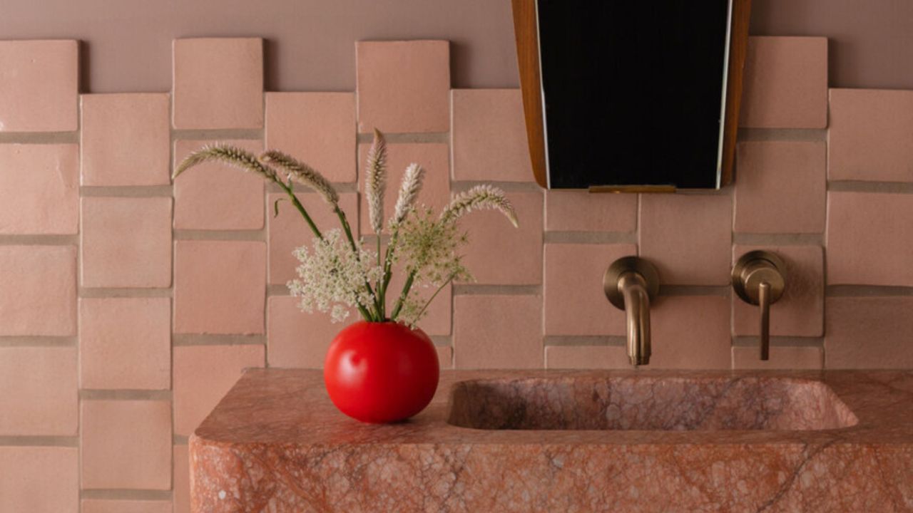
Color is what brings a space to life, but when a palette reads as jarring rather than considered, it can turn an interior primed for vibrancy into one that feels unsettled. Choosing how and when to use certain hues — and in what combination — is a careful calibration, one that can make a room feel enveloping, surprising, and memorable.
Nuances like saturation, a room’s lighting, texture, placement, and pairing all come into play when using bright paint colors. Whether you’re decorating from scratch, reworking a small space, or simply looking for inspiration, I asked designers to share the mistakes to avoid when decorating with bright colors — and how to fix them.