Redesigning your bathroom and knowing which bathroom layout mistakes to avoid is an understandably intimidating and high pressure decision. The results tread a thin line between awkward encounters in front of the sink each morning, and effortlessly enjoying the experience. You want to be able to navigate the space without thinking too much, but it's not always so easy to achieve.
Whilst we’ve previously explored inspiring bathroom layout ideas, it's almost more beneficial to ask interior designers about what 'bad' looks like, and, more importantly, how to avoid making these mistakes. A lot center their advice around understanding your architectural footprint and the flow of movement in the space — ask yourself: where does your journey start and end?
Ultimately, the designers we spoke to emphasized a considered and careful approach, ensuring it's a room that celebrates your daily rituals, rather than causes anger and frustration. So let's get into it — here are the bathroom layout mistakes to avoid.
1. AVOID ANY LAYOUT THAT LEAVES YOU WITHOUT SPACE TO MOVE

Any bathroom layout that promises everything, may in return deliver on nothing. The New York City natives and designers at Sugarhouse emphasize the importance of conscious design that prioritizes what is possible within the space.
“My main peeve is when showers are connected to a built-in bathtub or when spaces are laid out so tightly that they lose their functionality just so a space can be advertised as a ‘spa’ or 'primary'" says Jess Nahon, co-principal of Sugarhouse. "Not everyone needs or wants a bathtub, but everyone needs a functional shower.”
This approach is brought to life in their charming powder blue bathroom that features a compact yet clever layout that offers guests a clear path to the bath shower, toilet, and vanity.
2. TRY YOUR BEST TO KEEP TOILETS OUT OF SIGHT

“I recommend avoiding having a bedroom and bathroom layout where the toilet is the first thing you see when you walk into a room,” says contemporary interior designer Ghislaine Viñas.
For her Tribeca townhouse project, she created a layout to elevate the best parts of the bathroom and cleverly conceal the less elegant elements. The exotic floral-patterned bathroom wallpaper creates a wonderfully contrasting backdrop for the accessories and lighting to tie into (note the charming and playful monkey pendant).
These are details that we can appreciate without the awkward presence of the ever-present toilet, as it lies behind the wall in a designated corner. It plays a supporting role but doesn’t need to be in the spotlight.
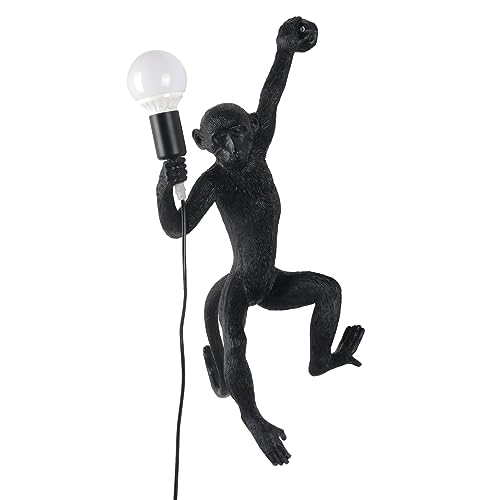
Price: $145.68
Colors: Black, Gold, White
3. AVOID A LAYOUT WHERE THE BATH AND SHOWER DON’T WORK TOGETHER
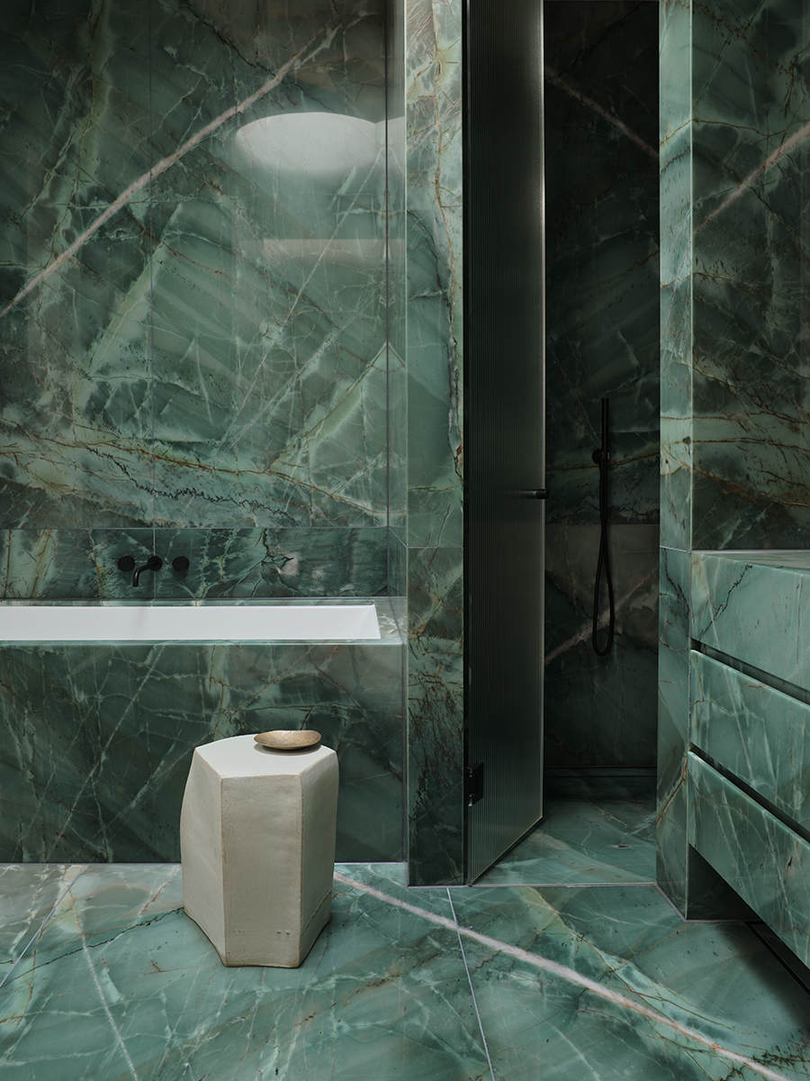
The striking teal tiling of this bathroom imagined and realized by Australian designer Greg Natale effortlessly bridges the worlds between bathtub and shower. The layout is planned in such a way that both seem like they have organically emerged into this space. A key ingredient in any bathroom layout is the relationship between these two features — a sentiment that the designer himself encourages others to adopt.
“Something you want to avoid when designing your bathroom is poor bath and shower placement," he says. "When planning a bathroom layout, be mindful of where your bath and shower will be, or you could end up with a space that’s hard to clean and feels crowded."
A helpful trick he shared was to position the shower along a short wall, which frees up the longer wall for a tub. "In Bellevue Hill House, the shower is tucked behind the vanity’s short wall, creating a modern, integrated look,” he adds.
Overlooking the relationship between these two key features is an easy bathroom layout mistake to make: even Livingetc's own executive editor, Pip Rich, admits that's what he got wrong in his bathroom remodel.
4. DON’T CHOOSE A LAYOUT THAT IGNORE AESETHICS
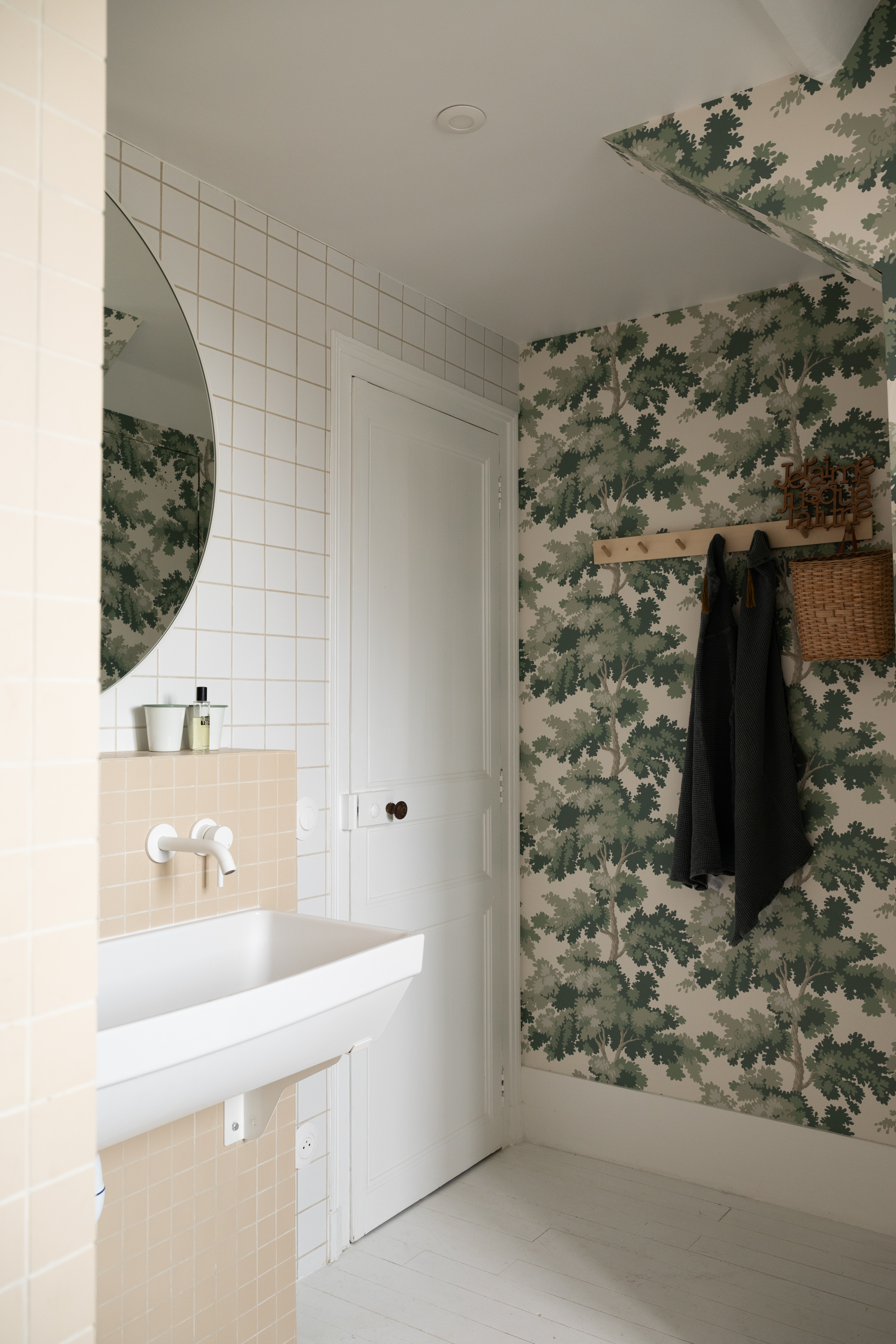
The lush tree-lined wallpaper and soft peach tiles of this calming bathroom designed by Studio Castille appeal to both traditional and contemporary sensibilities. The charming details that we’ve pointed out also serve as proof that one visual impact is as important as the functionality when it comes to designing your interior.
“Don’t underestimate the decorative potential of this room and be daring; you need to combine functionality with aesthetics!" say Mathilde Abeel and France Lepoutre, founders of the French design studio. "It's a room that's conducive to relaxation, and beauty can contribute to this, for example with wallpaper."
Marry these two priorities by considering what atmosphere you want to create within your bathroom, as well as what functions you want it to facilitate.
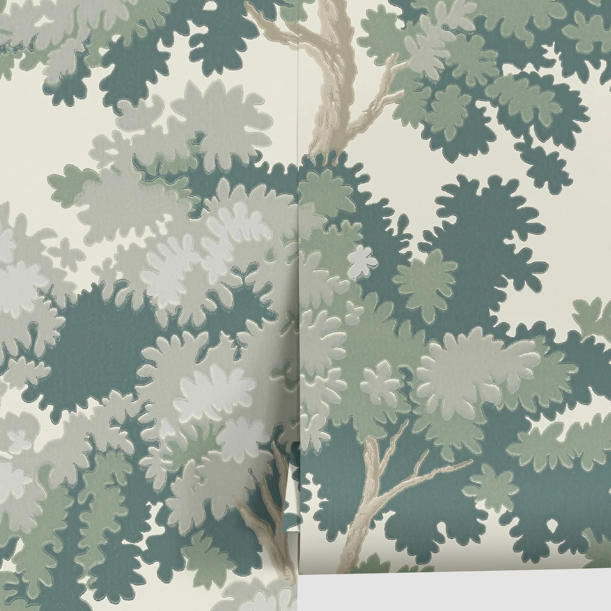
Price: free swatch; $198/roll
5. AVOID A LAYOUT THAT DOESN’T PRIORITISE COMFORT
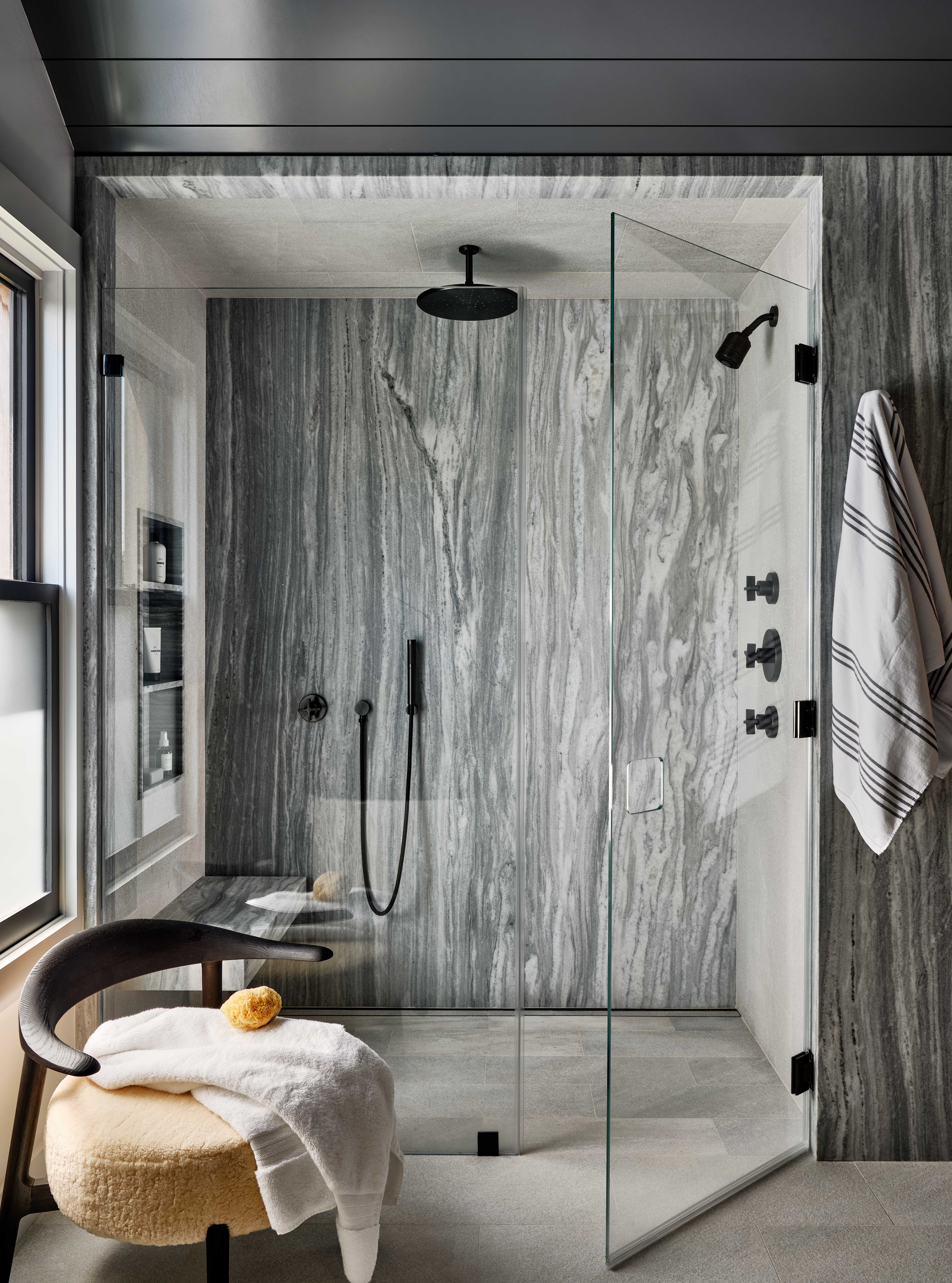
“Having comfortable access in and out of the shower is crucial in a bathroom — especially thinking about how a primary bathroom would work with two people using the space at the same time," says Alicia Murphy, founder of Amagansett-based design firm, Alicia Murphy Design. "By aligning the shower with the commode, you can create a wall of enclosed space — shower/toilet and then vanity across from it on perpendicular depending on your space."
The expansive walk-in shower created for her Glover Street project characterizes this approach and is rooted in a comforting experience, from the built-in shower bench to the placement of the armchair by the window.
6. AVERT ANY LAYOUT THAT DOESN’T CELEBRATE THE BATHTUB

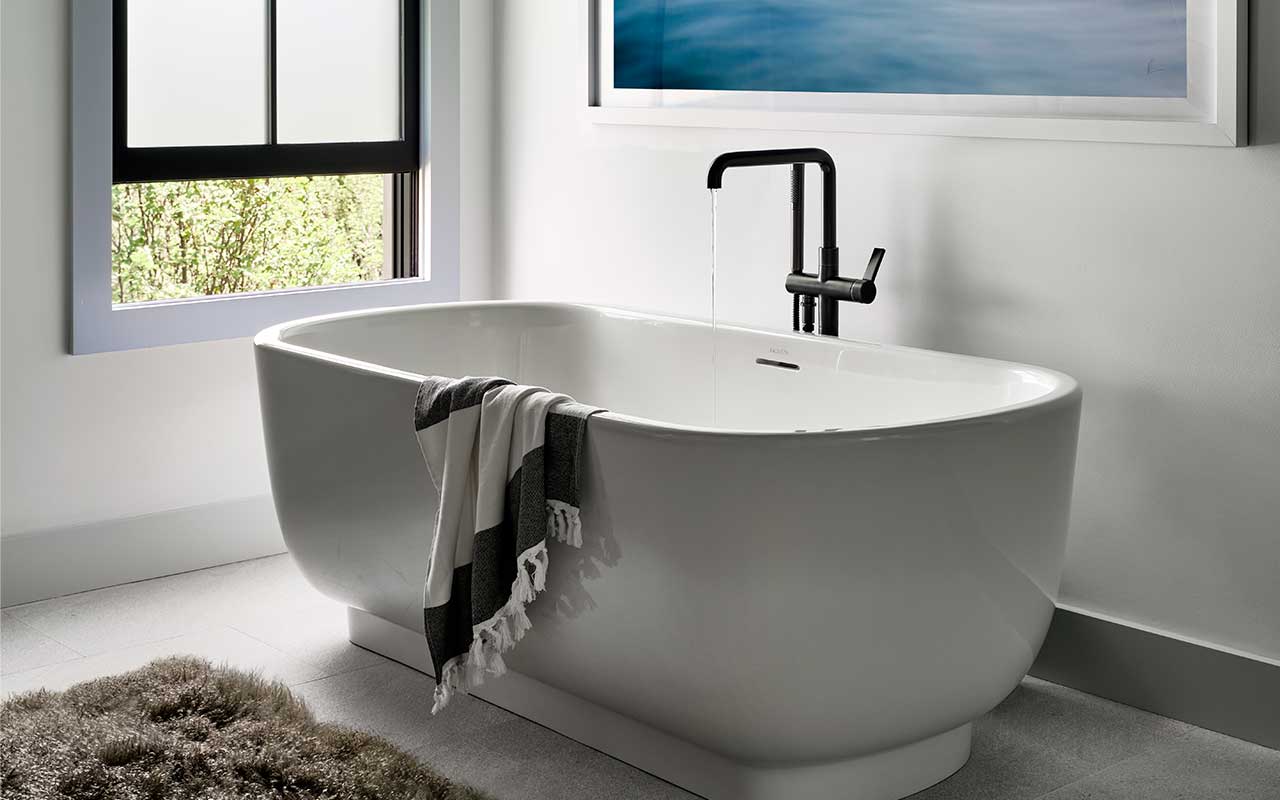
The bathtub is, in many ways, the king of the bathroom. If your layout can accommodate its majestic presence, it should be done in a way that celebrates everything this treasure has to offer. You want to allow for ample room to get in and out of the bath, as well as enough breathing room for it to feel visually proportionate within the space.
Interior designer Marea Clark takes a minimal and beautiful approach to this in her San Francisco project, where the skylight and white walls reflect light around the room and amplify the feeling of calm.
“Consider the windows in a bathroom when you’re planning the layout of a bathroom," she says. "If you’re planning to have a freestanding tub, it’s ideal (if possible), to center it within the room, ideally under a window (or skylight if there is one). Bathtubs are sculptural and usually large, so it’s nice to focus on framing them within a space."
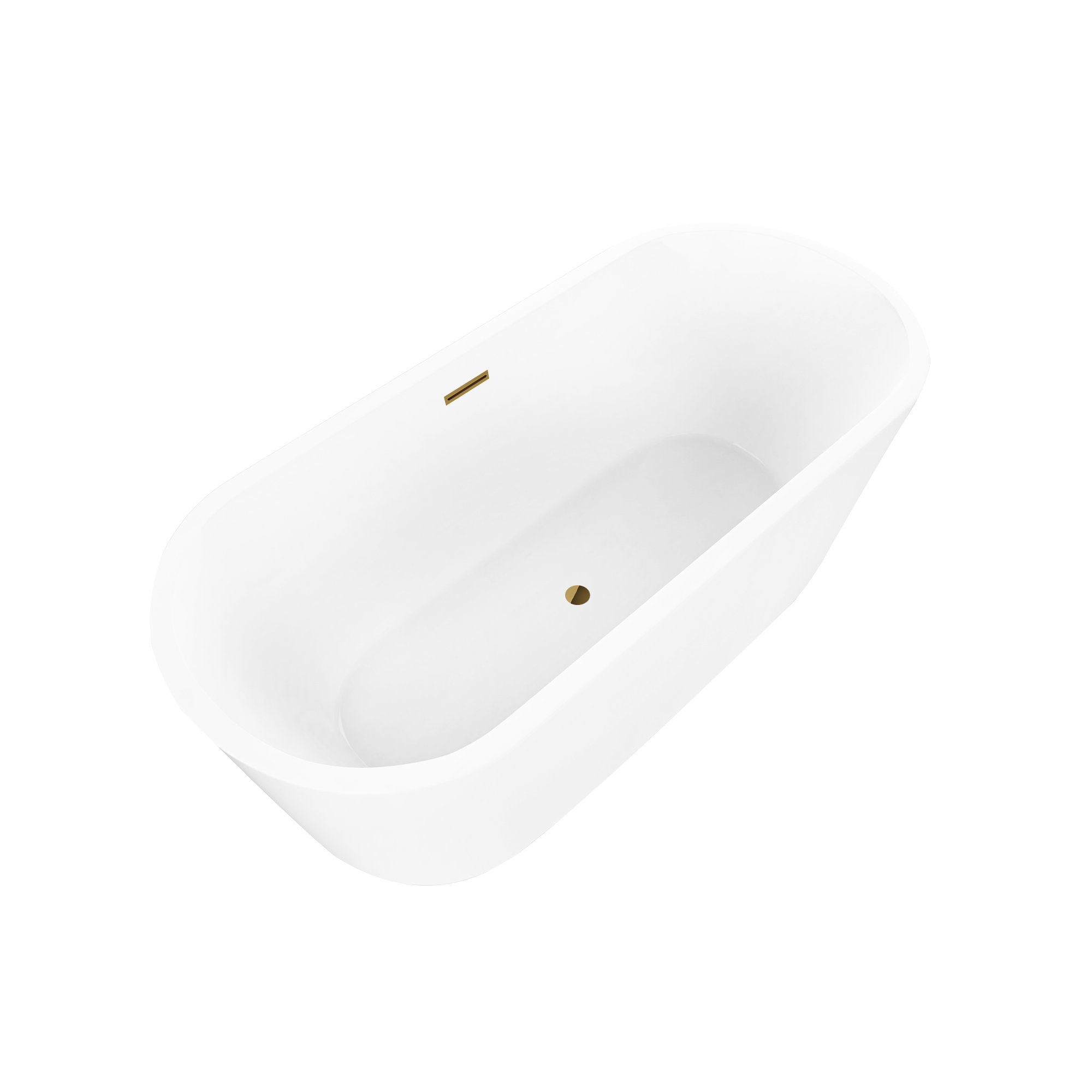
Price: $639, Was: $1,301.54
Size: 59" X 30"
7. ESCAPE LAYOUTS THAT KEEP YOU IN THE DARK
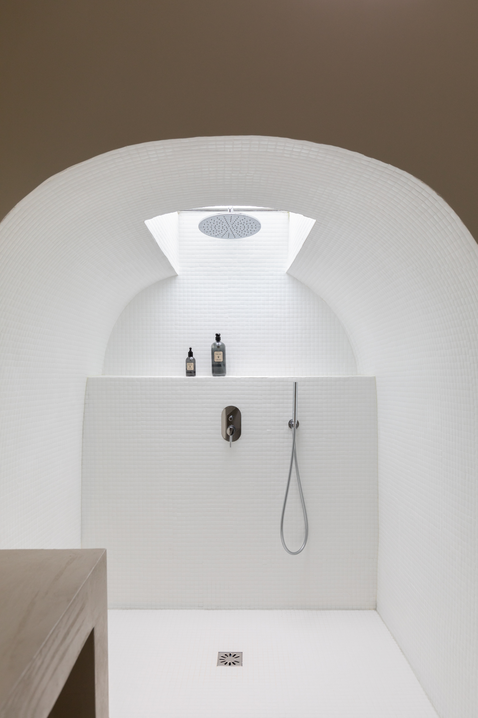
It can be easy to think that your layout is just a puzzle that needs completing with fixtures and furniture, but bathroom lighting mistakes can actually make or break your layout. You want to avoid over-lighting the space so it doesn’t feel like a sterile lab but equally offer enough lighting that you can see yourself in the mirror when getting ready and have a clear path to everything.
This basement shower created by Studio Castille utilizes a skylight to center the shower but also lights the space just enough, emphasizing the beautiful, curved ceiling. “Make sure there's enough light," stresses Mathilde Abeel and France Lepoutre, founders of Studio Castille. "And, if possible, natural light in a bathroom is a real plus point."
Multiple light sources are also proving popular lately, as they allow you to adapt the levels of illumination for each function. Think candlelight for relaxation and calm and natural light to wake you up each morning. Both are key in establishing the right atmosphere in your bathroom layout.
So when it comes to bathroom layout mistakes to avoid, you want to steer clear of anything that will disrupt the way you move and flow around the space. While it's important to make it a space that looks and feels beautiful, as that helps it feel more spa-like, it's more important to have a space that functions.


