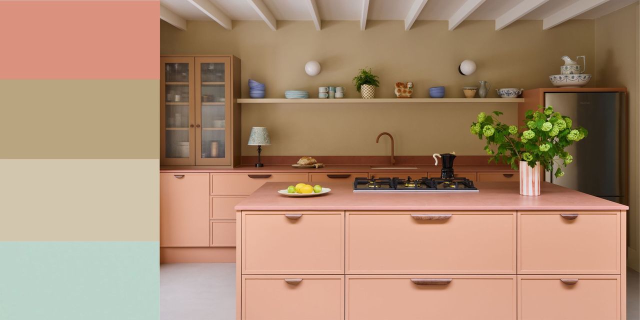
The mid-century design era is iconic for many reasons, but especially its color palettes. A celebration of rich earth tones — peachy pinks, mossy greens, and mustard yellows, to name a few — the defining colors of this era feel as stylish now as they did in the last century, adding warmth and a playful feel to rooms.
But knowing how to pull off a mid-century-inspired color palette without overdoing it is key, as taking it too literally can make a room look instantly dated. "Mid-century color palettes can quickly tip into pastiche if you lean on every signature color at once," explains designer Rachel Robinson. "We prefer to pick one strong color, give it real presence in the room, and then surround it with quieter, warmer tones that let the architecture and furniture breathe."