Knowing the colors that go with copper is a rising requirement for designers, as copper — and copper-colored decor — is becoming more of a color trend. It's a logical next step, seeing as terracotta has been in demand for the last couple of years, and copper is just a slightly more orange-y take on that same tone. Plus it has a warmth to it we all crave.
'I’m very into copper, and the way it patinas,' says interior designer Tom Morris. 'I’m currently doing a kitchen, and using a copper worktop, whereas two years ago I was erring more towards stainless steel. We’ve come full circle and are using warm metals again, as well as warm colors. Even brass can feel a bit too brash.'
That sentiment has heralded the start of a love of all things copper — from the metal, of course, to textiles, pillows, accent chairs and paints. So take a look what designers think are the colors that go with copper, as chances are you'll soon be needing them in your interiors and decor.
1. Silver

Designers have often been quite cavalier about mixing metals, using chrome and brass and copper together in the way that feels daring and unexpected. So perhaps it's no surprise that copper-toned decor go well with silver tones, like gray and stainless steel.
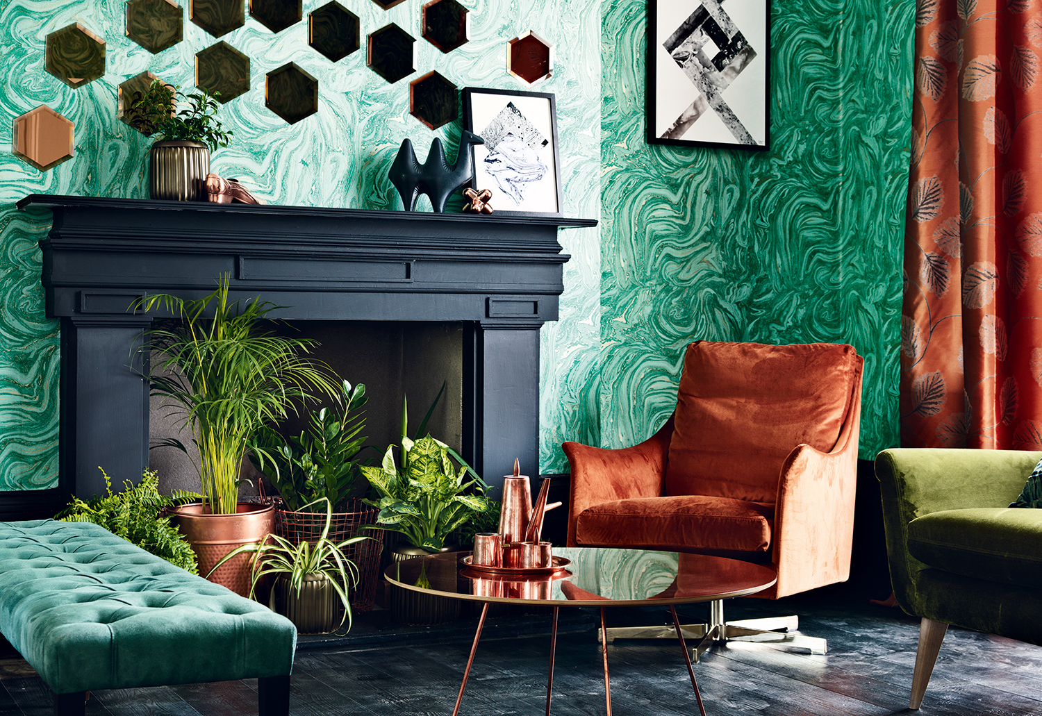
In this project by design studio La Nony Famili, a copper-colored chair is the key focal point. 'While furniture shopping for this project, we fell in love with this velvet armchair,' says Aza Lussier, the studio's designer. 'This rich color perfectly embodies the spirit of the project: warm, comfortable, chic without being pompous. Despite its intensity, this hue easily complements many other colors. In this project, it acts as an accent, contrasting with "colder" elements like the stainless steel fireplace and the glass windows, but one could easily imagine it in a more maximalist environment.'
2. Gray
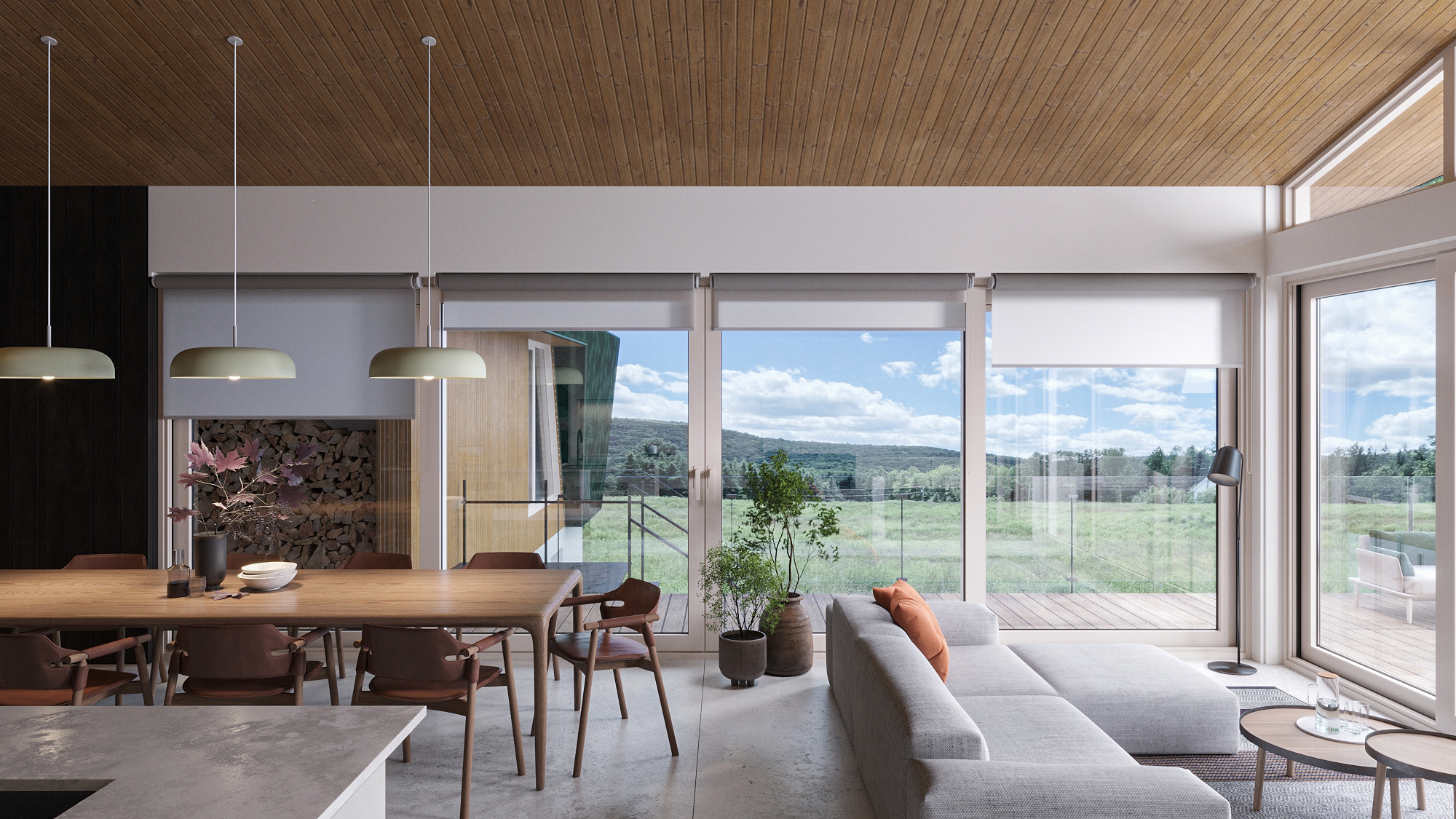
An unexpected copper-toned pillow makes all the difference in this otherwise very minimalist living room by MU Architecture. Without it, this soothing space would lack a focal point — the touch of copper acts like a sort of exclamation.
'Copper is a warm and natural color that gives character to any surface,' says the studio's co-founder Jean-Sébastien Herr. 'It can easily be matched with a variety of other colors and materials, and goes well with more neutral tones like gray to make a bold statement.'
3. White

Another soothing approach to using copper comes in the form of this minimalist bathroom by designer Wael Farran. It's been a far more expected bathroom trend in recent years to have brass wall lights in this sort of space, but copper brings with it a unique sense of warmth.
'The combination of copper accents with a white backdrop in this master bathroom was a deliberate choice to create a harmonious yet striking contrast,' says Wael. 'Copper, with its warm tones, adds a touch of elegance and sophistication to the space, while white serves as a clean and versatile canvas that enhances the richness of the copper elements. This balance between the warmth of copper and the purity of white not only creates a visually appealing aesthetic but also brings a sense of modernity and timelessness to the overall design.'
Price: $20.89/sq. ft
Uses: Outdoor, Kitchen, Backsplashes, Walls, Countertops
4. Bright yellow

How about an unexpected copper credenza, running along the side of an almost neon yellow dining table? It's a smart choice, reflecting the light and making this airy open plan addition seem even brighter and bigger, but the copper tones also act as a way of highlighting the joyful bright yellow table legs.
Copper has orange undertones, meaning it will always work with other oranges and bold yellows. As explained through color theory, complementary tones like this form color families, and can be guaranteed to co-exist happily in a palette.
5. Green

As copper ages, it takes on a natural green patina, known as verdigris. This is part of the appeal for designers like Tom Morris, mentioned earlier, who likes the gentle softening of color that happens to copper as time passes by.
But it also means that copper definitely is a color that goes with green — it's a color seen when copper is in its most natural surroundings. It's easier to use a true green like the wallpaper in this living room scheme than a more yellow-y one, as the cooler pigments in a chartreuse tend to offset the warmth of the copper.
6. Teal

Just visible in the back of this kitchen and dining space is a set of teal dining chairs — a rich, almost peacock-like blue which creates a very regal combination with the copper kitchen island.
This particular shade of blue lends a freshness to copper, giving it a modernity that isn't often associated with the shade. Copper is a color that goes with teal best when both shades are accents, grounded by rich neutrals like dark gray, the perfect base for letting them both shine.