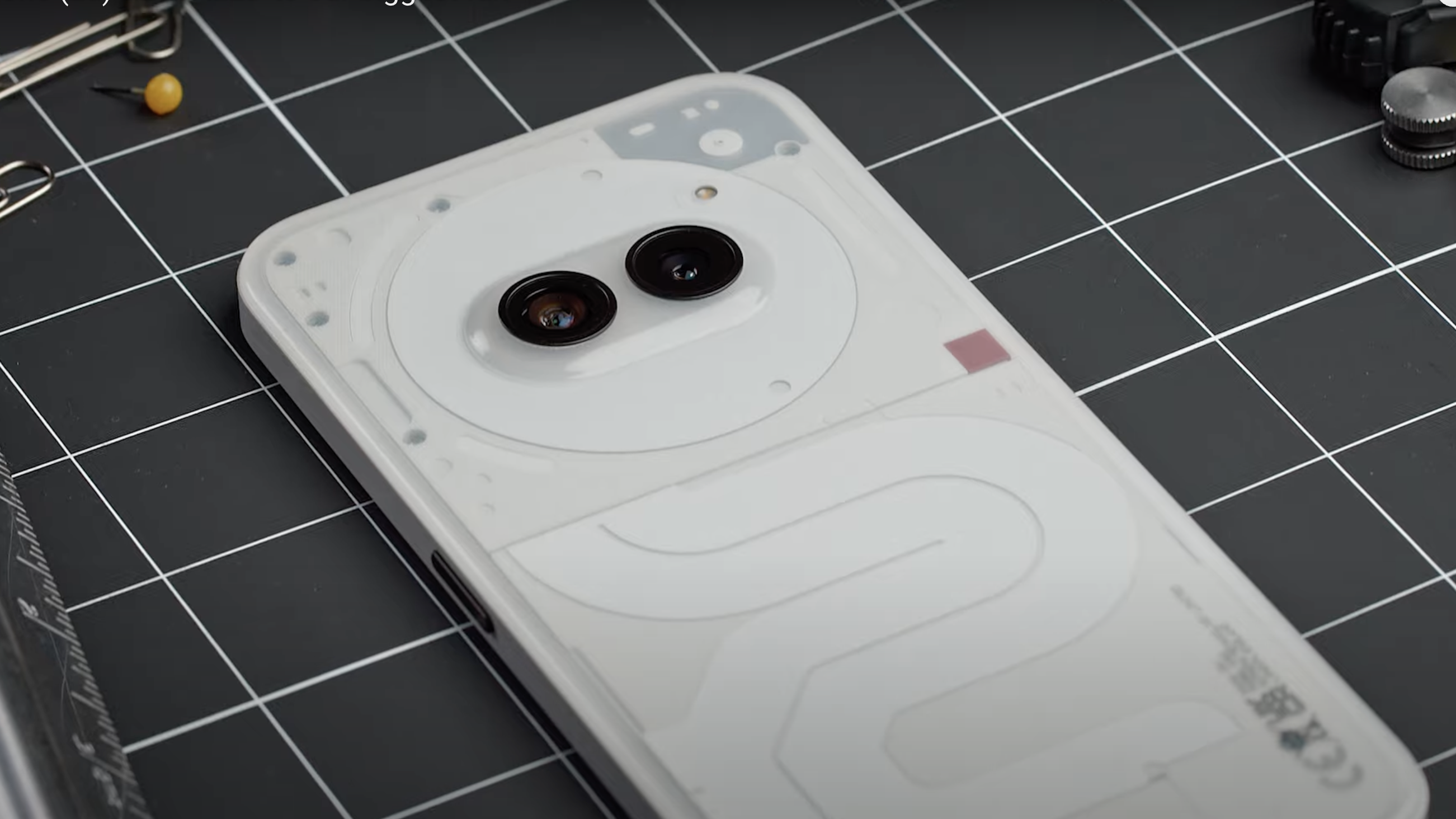
I've been using the Nothing Phone (2a) for over a full week now, treating the phone as my own, learning about its highs and lows – and while a full Phone (2a) review will follow in due course, as I finesse that article, right now I've got five takeaway pointers if you're among those considering buying Nothing's new mid-range handset.
So before you go and drop £319 on a Nothing Phone (2a) pre-order, you've got to wonder – is it among the best affordable phones you can buy right now? There's a fair amount of competition from the likes of Motorola, and in the slightly pricier bracket the big players, namely Google and Samsung, with their respective Pixel 7a and Galaxy A53, jump front of mind.
Nothing is onto something with its standout features, though, with the brand's higher-spec Phone (2) landing a T3 coveted 5-star Award for being such a breath of fresh air. The lower-spec Phone (2a) replaces the original Phone (1) – which it betters in many ways – and has a lot of positive factors of which many of the best Android phones should take note. Here are the headline points to contemplate:
1. I want the Milk finish most of all
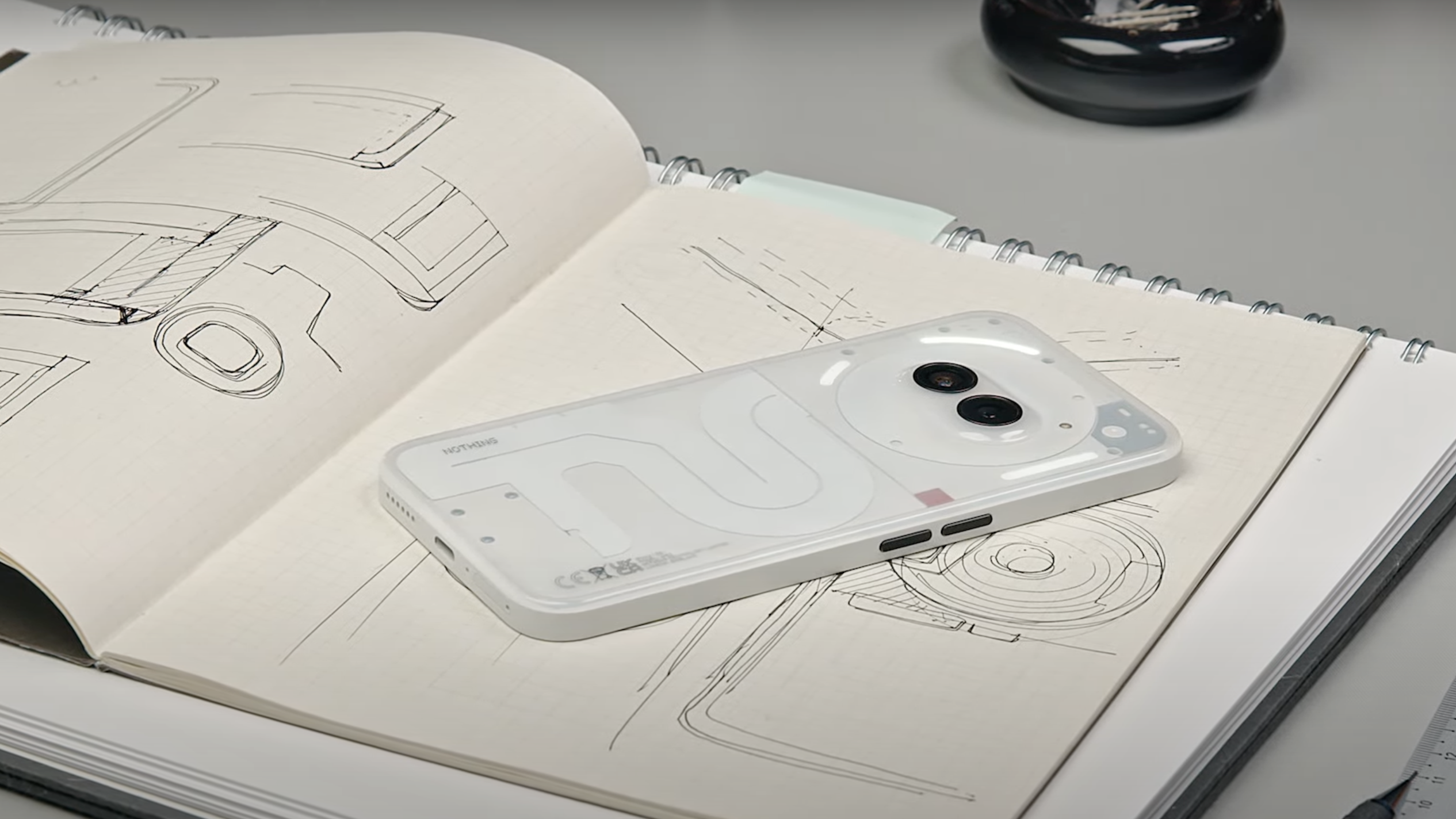
The Nothing Phone (2a) comes in three finishes: Black (which I have for review); White; and a new 'Milk' option. All three are plastic-backed, not glass like the Nothing Phone (2), so do consider that in terms of reflective quality and sheer dust magnetism (it's pretty significant).
It's that last point which would make me skip the Black model, as my pockets are full of lint. Of the three options it's the Milk one which sounds most appealing (I'm yet to see it in person, however) as the typically fully transparent rear panel is instead translucent; a more frosted look that really appeals to me.
2. It has Glyph lighting, just less of it
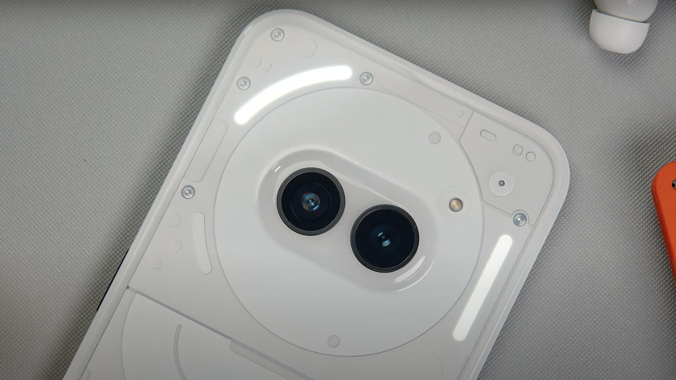
Early rumours had suggested that the Phone (2a) would forego Nothing's Glyph feature – integrated light panels to each handset's rear, which add functionality through patterns and other effects – but that's not the case, as the handset has an arrangement of Glyph lights.
However, it's not to the same standard as the Phone (2)'s fully featured set of lights. The (2a) model instead gets a trio of lights, all of which are up top, so there's not the dynamic light – which would 'fill up' during charging – towards the base of the handset.
Given pricing, however, it's no major loss and certainly an understandable feature to pare down. I'm really glad it's still in tact, as it's such a Nothing signature feature that to forego it would have felt like giving up the brand's identity. The full suite of features – such as Composer and Timer – are available.
3. Plasticky back is a fingerprint magnet
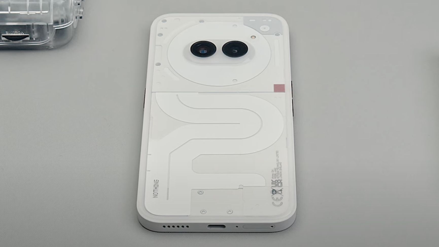
The Phone (2a) certainly doesn't feel as premium as the Phone (2), as that plastic gets easily smeared with fingerprints and the reflections are considerable, but I do appreciate the curved edges which 'soften' the feeling on the device when in-hand.
It's a familiar 6.7-inch size, too, and there are actually some improvements in the (2a) versus the original (2). Primarily that there's less bezel on this mid-range handset's display, giving it a more panel-forward aesthetic and, surely, acting as a stepping stone for the would-be Phone (3) whenever that's revealed.
4. There’s no case or plug in the box (but the cable is cool)
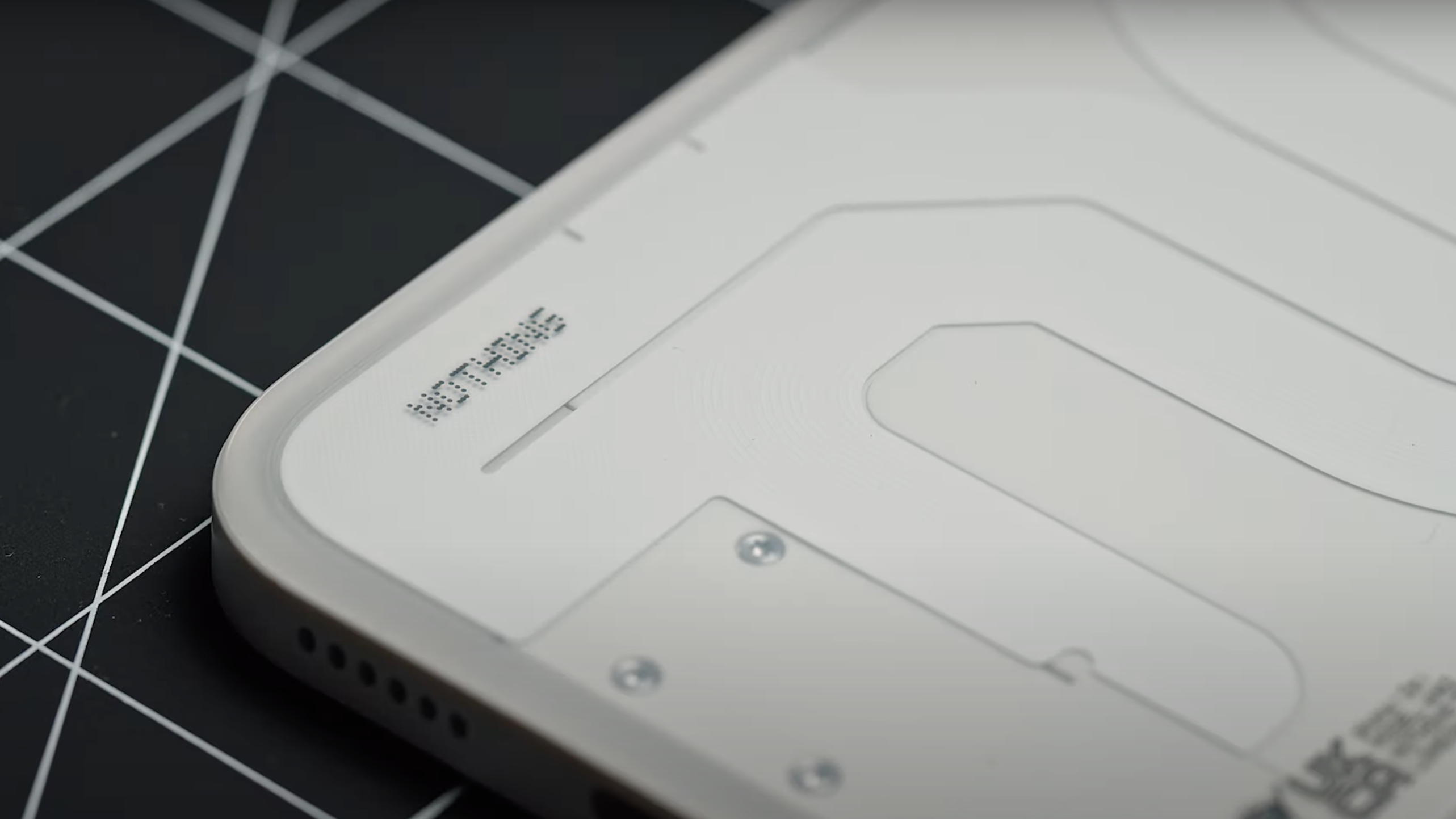
As is typical for most of the best phones these days, the Nothing Phone (2a) doesn't come with a case to protect the device in the box, nor is a plug included – so you either need to already possess one (it can charge at up to 45W too, so keep that in mind) or buy a new one separately. They cost £35 from the official Nothing.tech store.
However, what you do get in the box is a very cool-looking Nothing USB-C-to-C cable for charging, which also features a transparent aesthetic around both port ends, Nothing branding, and a nice-looking white finish (even with the Black handset). It's all 'very Nothing' and goes hand in hand with the brand's design focus.
5. I’m not sure about that camera protrusion, cute as it is
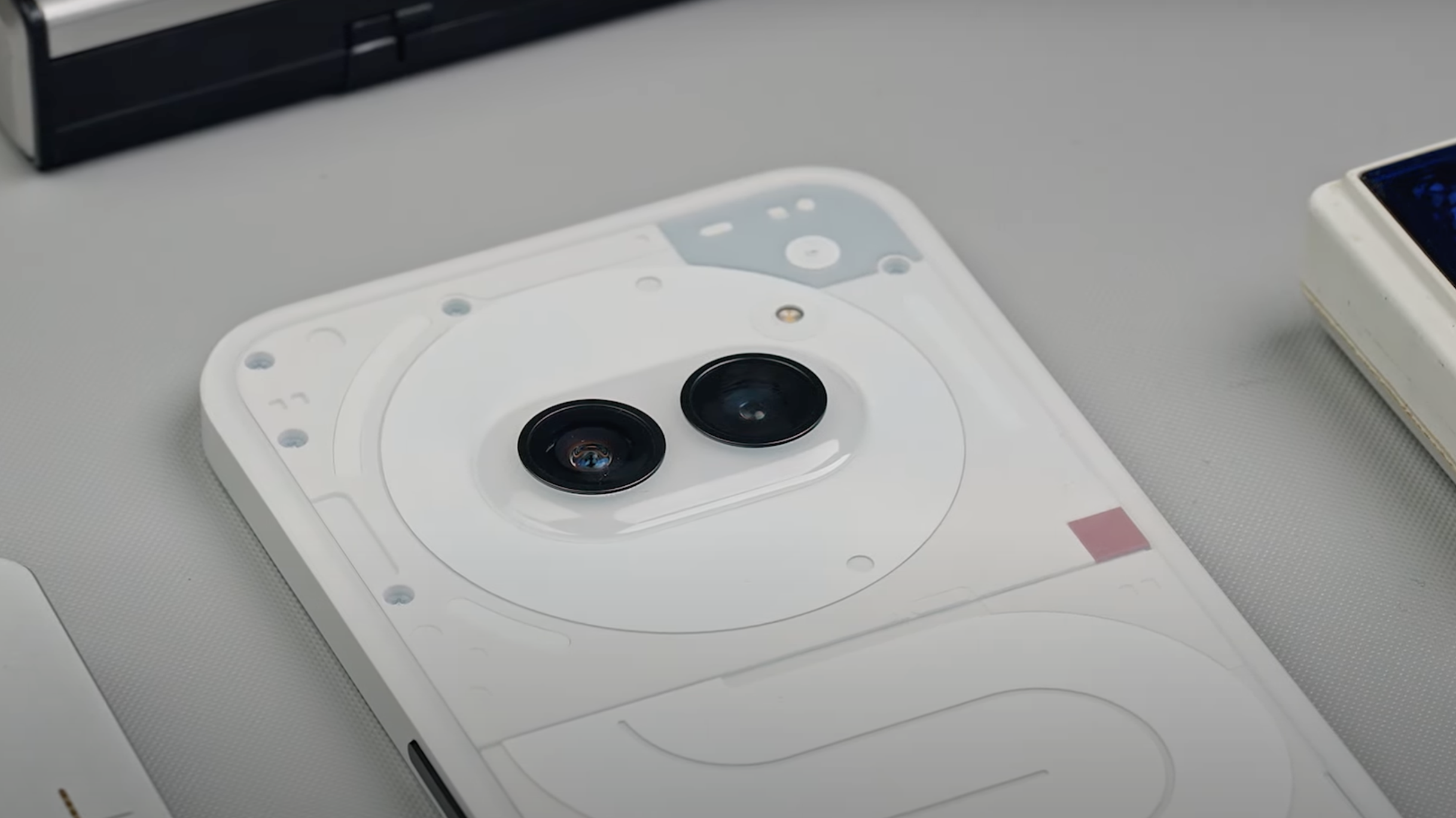
In addition to the rear plastic's reflective quality, plus general fingerprint- and dust-magnetism, there's a standout design feature that I think kind of defines this phone: that dual camera protrusion. The Phone (2a) therefore has a sort-of Wall-E or Minions look about it that's, well, cute – but I'm still on the fence about whether I actually like it.
The downside is the way those protruding lenses seem to 'push through' the plastic rear, which in my handset gives a slightly warped look given its reflective qualities. And unlike, say, the Samsung Galaxy S24 and that phone's distinctive individual circular lens cutouts, the Phone (2a)'s curved transition into a plastic bump, for me, is visually distracting.
I'm sure the Phone (2a) will split opinion in the looks and finish department, therefore, but overall at this kind of affordable price point, and with performance that's top quality for a mid-ranger, not to mention unique Glyph features, there's a whole lot to love about this new Nothing handset...


