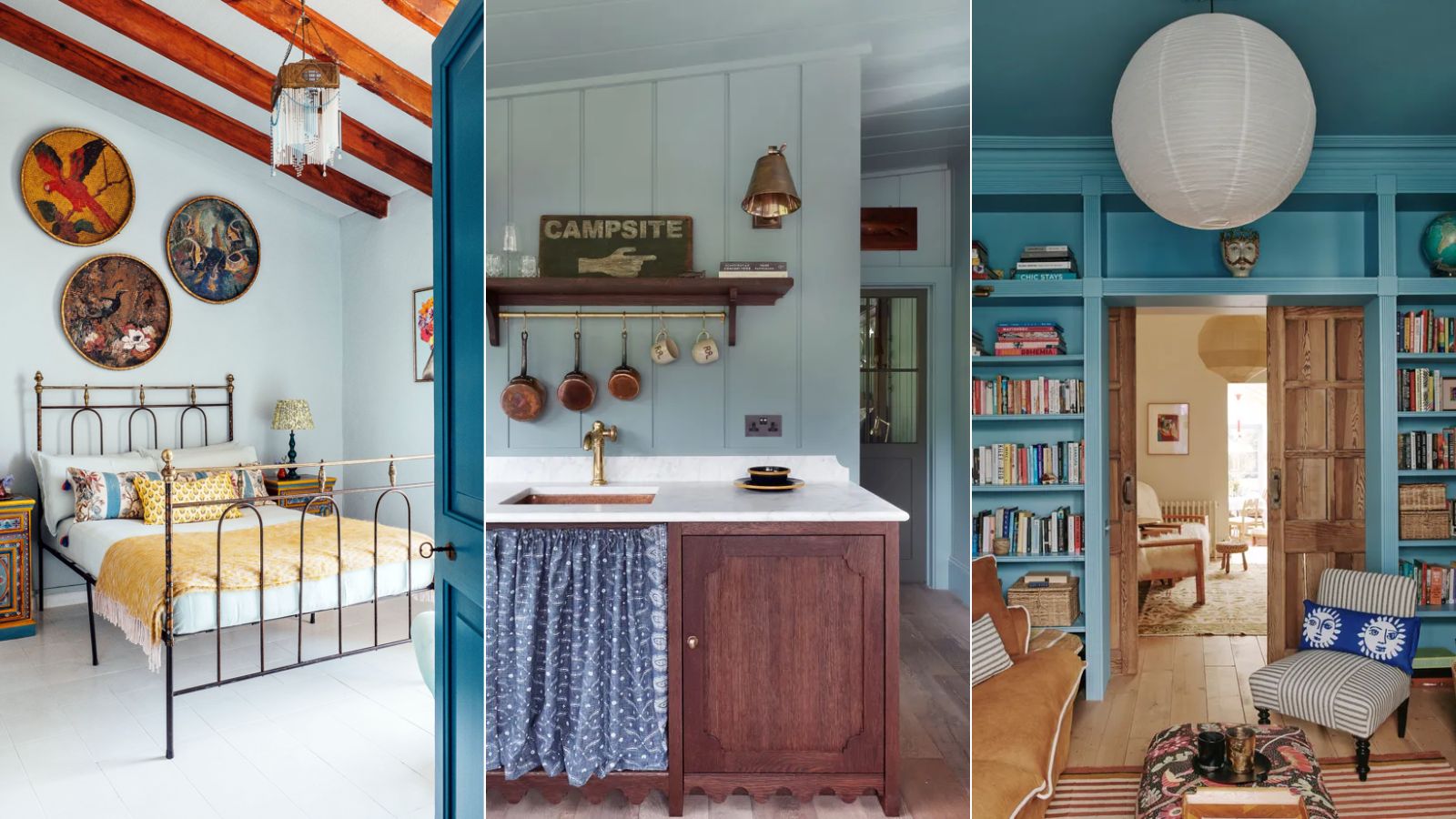
More and more, we're seeing designers and homeowners alike be bolder with color choices. Gone are the days of feeling the need to stick to 'safe' neutrals; we're embracing mood-boosting hues throughout our homes, adding plenty more depth and interest.
One such color is blue, which has been having somewhat of a moment in interiors of late. So much so, we'd go as far as to say that certain shades of blue can work as a neutral in the home since it's a versatile hue that works with many other colors.
And so, we've rounded up a selection of our favorite blue rooms that fully embrace this calming hue, from pale blue to mid-tones, and prove to us that blue can indeed be used as a neutral.
5 rooms that prove blue can be used as a neutral color
From relaxing bedrooms to calming kitchens, these spaces lean on various blue paints from the top paint brands, making us rethink how we decorate with neutrals in 2024 and beyond.
Lucy Williams' cozy sitting room
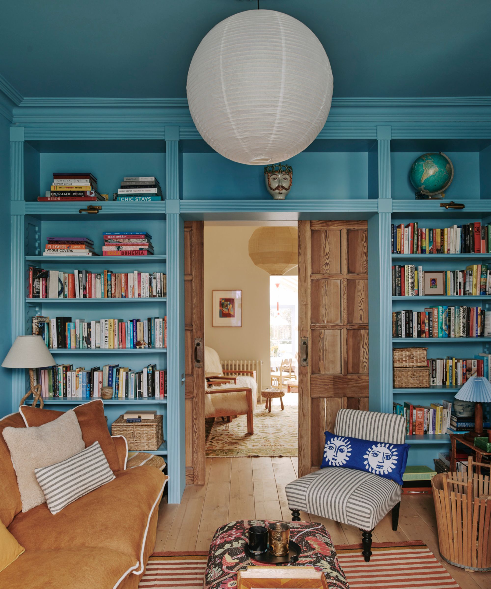
Lucy Williams' much-loved snug room teaches us to go bold with the wall color. The space is color-drenched with Farrow & Ball's Yonder, including the ceiling and built-in shelving in addition to the walls, resulting in a playful and cocooning space that's every ounce cozy.
'Yonder has a lovely vitality and brings a cheerful but sophisticated note to this room,' explains Patrick O'Donnell, brand ambassador for Farrow & Ball. 'What’s clever is how it plays with an ultimately limited palette of natural colors, such as the wood and tobacco cloth of the sofa, while ‘color drenching’ reduces the contrast in the room, allowing the eye to settle on Lucy’s curated objects and furnishings.'
Next time you're considering color-drenching in a classic neutral paint, consider turning to something more unexpected like Yonder and you'll soon see how much depth it can add.
A calming cabin kitchen by HÁM Interiors
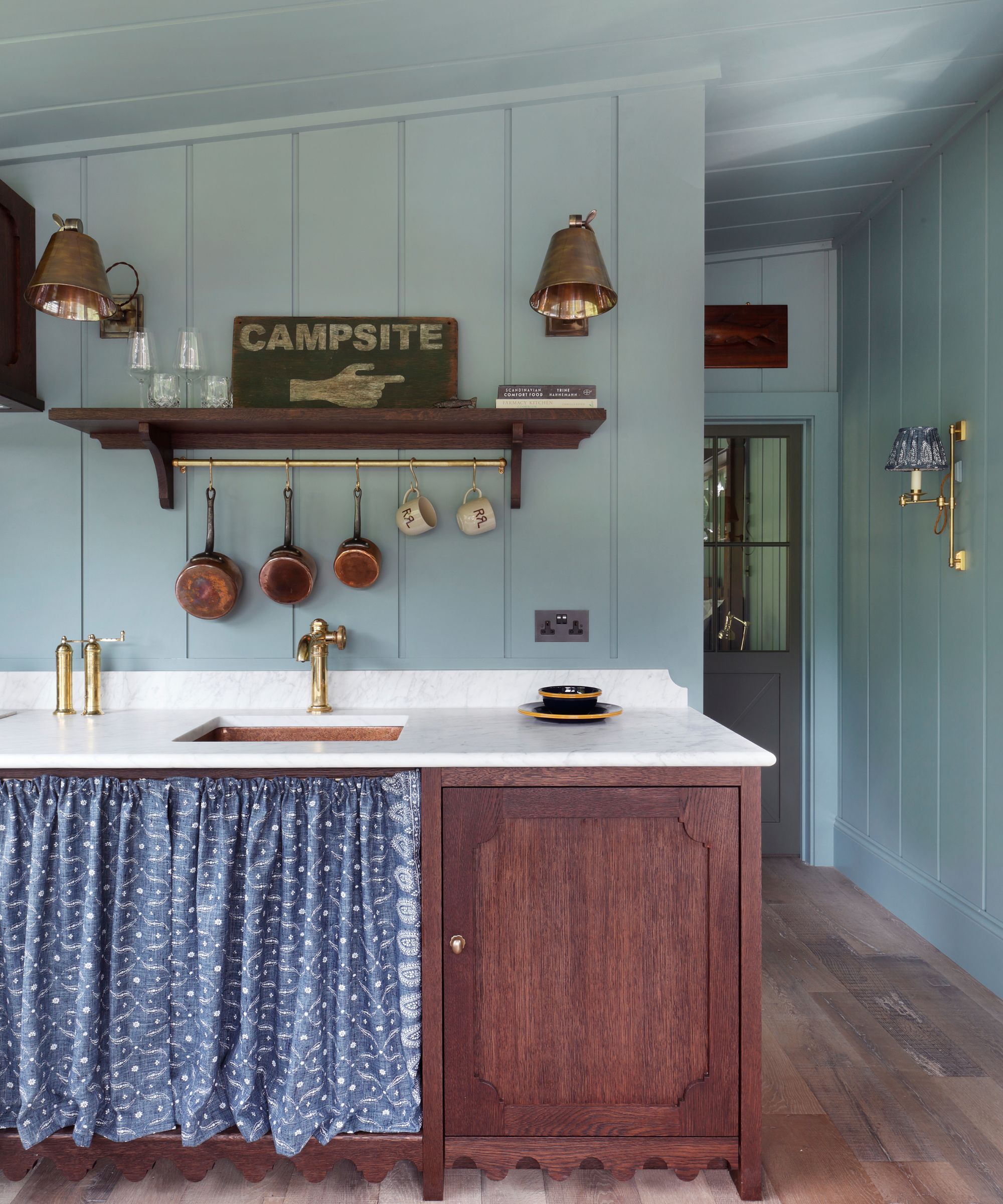
All too often, kitchens are restrained to a palette of the lightest neutrals consisting of white and beige. But who says blue can't work just as well in the heart of the home?
Case in point, HÁM Interiors opted for Farrow & Ball's Oval Room Blue in this cabin kitchen. A theme of blue runs throughout the cabin, and this blackened blue paint gives this functional room a calming, welcoming feel that's not at all predictable.
'Oval Room Blue by Farrow & Ball was chosen for its calm, muted tone, creating a soft backdrop that shapes the mood of the space,' says Tom Cox, founder and principal designer at HÁM Interiors. 'Its rich color pairs perfectly with the dark wood cabinetry, grounding the cabin and connecting it to the natural landscape with warmth and timeless character.'
A restful pale blue bedroom by Matthew Williamson
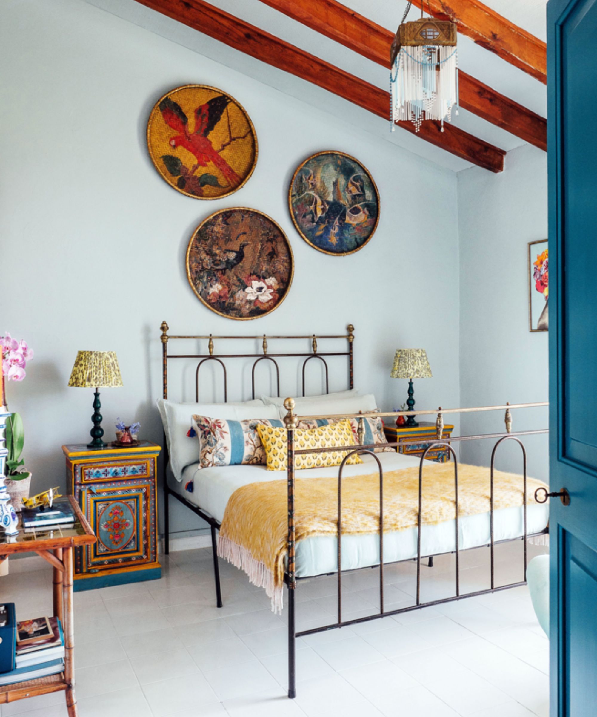
The right shade of blue paint can make for an incredibly restful bedroom – a welcomed change from the likes of light neutral colors. Here, interior designer Matthew Williamson opted for a delicate pale blue paint across the walls, which has a soothing effect and serves as the perfect balance between neutrals and color.
To create a similar look in your sleep space, reach for colors like Farrow & Ball's Borrowed Light which provides the calming quality of blue without venturing too far into the world of color.
A cornflower blue kitchen cabinetry by Nicole Lanteri
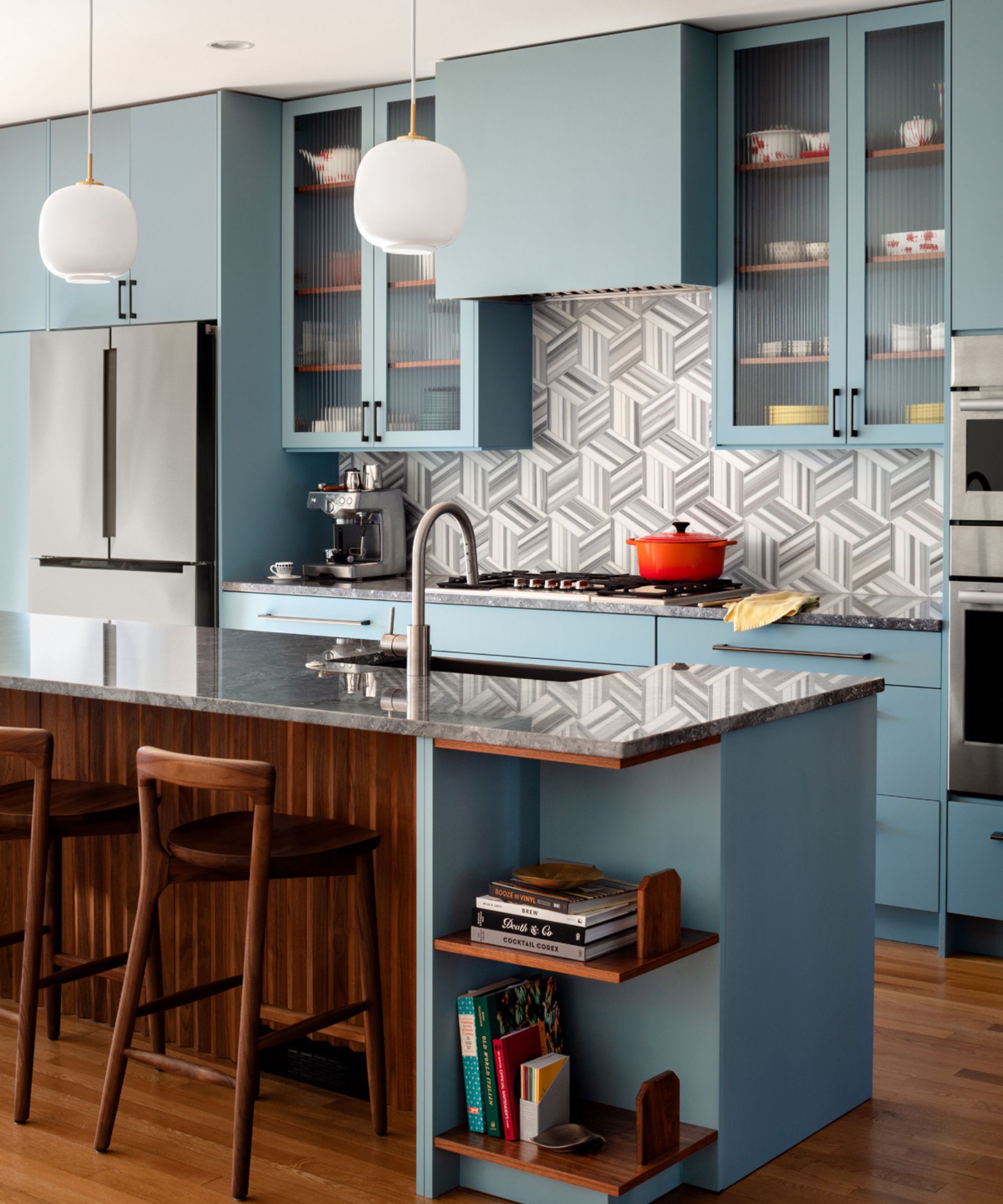
The beauty of decorating a kitchen is that paint colors aren't limited to the walls. The kitchen cabinets provide another canvas to welcome more adventurous hues, and in this case, the cornflower blue works in place of neutrals, adding more interest and personality.
'Benjamin Moore's Jamestown Blue was the right saturation to anchor the middle of the house – too light would have washed it out; too dark would have felt too heavy,' explains Nicole Lanteri, founder and principal designer.
'Cabinetry is a big investment – and it definitely doesn't have to be a classic neutral just because it's a kitchen. We took the opportunity to do a little more and used this muted cornflower hue for the kitchen to really shine,' adds Nicole.
A playful living room by Jillian Kliewer
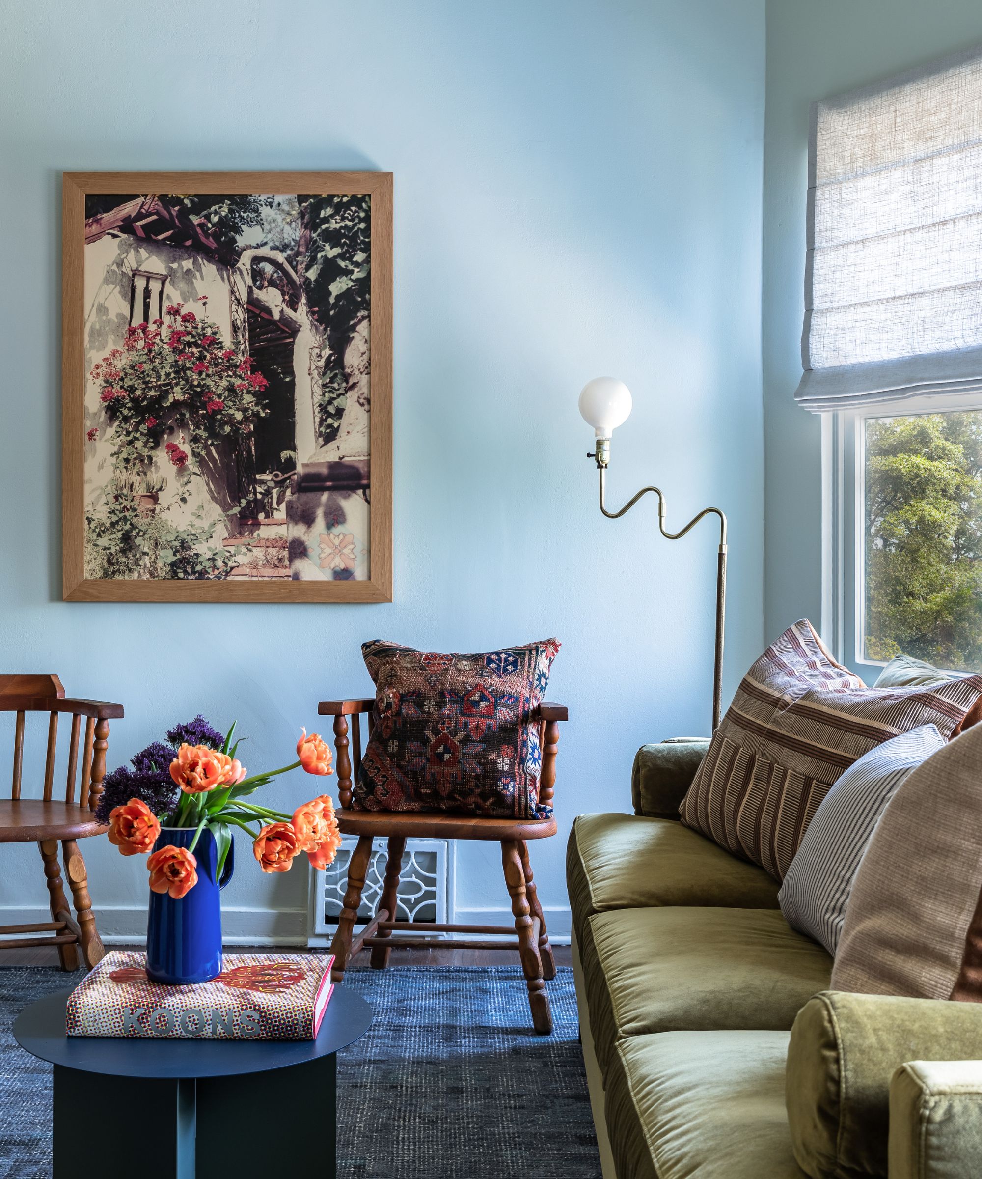
Making another case for decorating with blue in the living room, this space was designed by Jillian Kliewer and features Farrow & Ball's Cromarty across the walls. Although technically a gray-green paint, Cromarty is said to be a chameleon color that responds differently to different lighting. 'This room reads very blue for this color, which I love,' says Jillian.
While it can be tempting to go for true neutrals in rooms that feature more colorful decor, this space proves that the right shade of blue reads neutral and only enhances the other colors present, whether that's green or orange.
If a room in your home is due a color refresh, why not turn to calming blue? Whether you're decorating a kitchen or a bedroom, blue can work in any room of the home, so long as you get the right shade. Lighter blues will feel more restful while darker variations will make more of a statement – but either way, blue works well with so many other colors, making it a welcomed change from classic neutrals.


