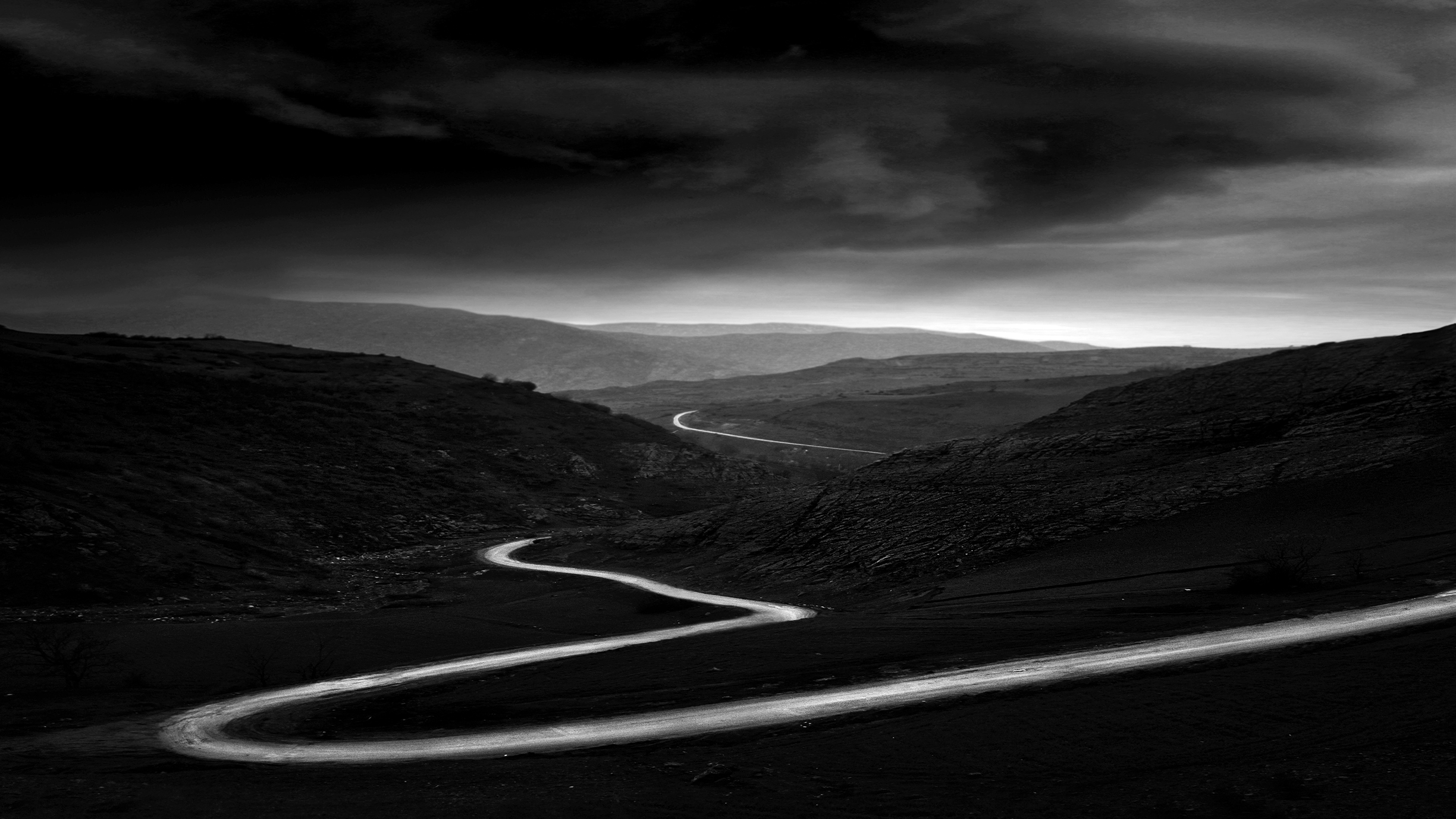
Shooting in monochrome is easier, and a more obvious choice for some photographic subjects than others. Photographic genres like street photography benefit from the absence of color, which eliminates distracting elements in the background. Whereas, minimalistic scenes like landscapes are more challenging to capture. This is because scenes in black-and-white work well when contrasting boundaries within the scene’s elements are present.
In color photography, this means the color contrast, but in monochrome, those elements can only be distinguished based on their luminosity levels. If this is not taken into account, monochrome tones merge, making it difficult to draw clear visual lines. Although it may seem simple to step back from focusing on shaping the scene based on colored elements, our eyes are not accustomed to focusing solely on contrast. To train your vision, study portfolios of renowned black and white photographers. This will help you develop a better understanding of scenes that work well in monochrome schemes.
Combine contrary elements, such as foliage and stones framed in front of clouds or water. To enhance their textual qualities, using a long-exposure technique to capture the scene is best as it highlights soft characteristics to the maximum.
When out shooting, a simple yet effective way to ensure that contrast is present is to close one eye and squint with your viewing eye. This simplifies the scene into what is light and what is dark, revealing the contrast.
Once you have found a suitable subject, keep an eye on the light. This is a key element that affects luminosity and defines the scene’s elements by adding or minimizing contrast. To understand the power of how light can transform your subject, start to photograph the same scene at different times of the day. You will notice that the subject appears significantly different and may even lose its impact under specific lighting and weather conditions.
Balance mono scenes

When composing, think in layers to give your frame a dynamic look
As there are no colors to add impact, composition strategy can make or break a black-and-white image. As we work with a reduction in tones, simple composition techniques are most effective to draw the viewer in. Analyze the scene, identify a strong focal point, and look out for leading lines you can integrate into the composition. Don’t forget that the distribution of elements due to their color isn’t effective in black and white, so seek lines of differentiating luminosity only. If the scene you are capturing is shaped by similar mono tones, you can separate them by changing your perspective and adding some mid-ground. Here, additional foreground elements can help the distribution of the frame while also adding interest.
Add depth

Reveal the shapes and textures of the subject to add monochrome interest
Monochromatic tones underline the subject’s form and shape. On a clear day around midday, the sun creates high-contrast scenes, revealing texture and shapes from the subject. Here, simple and graphic shapes gain importance and get transformed into leading lines, which direct the viewer into and through the frame.
To go a step further, make use of the defined shadows the harsh midday sun creates on your subject. Those can become an interesting and more abstract subject themselves.
When capturing the shadows, it’s best to have the sun directly behind your subject so that you can add the shadows in the foreground and add interest to your composition. A bright, sunny day also reveals the textures of objects, adding dimension and depth to your frame. To create a visual interplay between image elements, look for scenes with contrasting textures. Here, you can introduce a secondary dimension and visual counterpoint, creating a real sense of interest.
Discover more of this series:
- 5-minute photo tips: when to use Noise Reduction
- 5-minute photo tips: Make AF microadjustments to sharpen your shots
- 5-minute photo tips: Create double exposures in-camera
- 5-minute photo tips: activate grid lines to instantly improve your composition
- 5-minute photo tips: Use Auto HDR and save your exposure struggles!
- 5-minute photo tips: customize the white balance to save yourself time
- 5-minute photo tips: Select in-camera B&W to master mono and keep color


