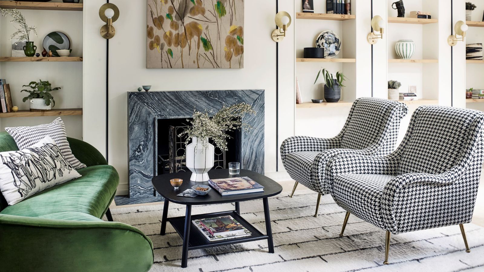
Living room layout mistakes can make or break a room. The layout of any room can have as much impact as the colors you choose, or the furniture you fill it with. There are a few classic tried-and-tested formulas we all seem to stick to, whether they actually work for the space or not, with many of us tending not to venture far from the 'base everything around the TV' set up.
But there are more options out there, and they will help us swerve basic living room layout mistakes that might be having a big effect on how your space looks and flows.
We asked interior designers to let us know what living room layout mistakes they always avoid – and what we should be trying instead.
5 living room layout mistakes to avoid
Living room layouts are personal. So many mistakes made are because we choose a classic set up that works in theory, but could be so much more exciting and so much better suited to how we use the space. Avoid these living room layout mistakes for a room that works hard, but also works for you.
1. Ignoring the function of the room
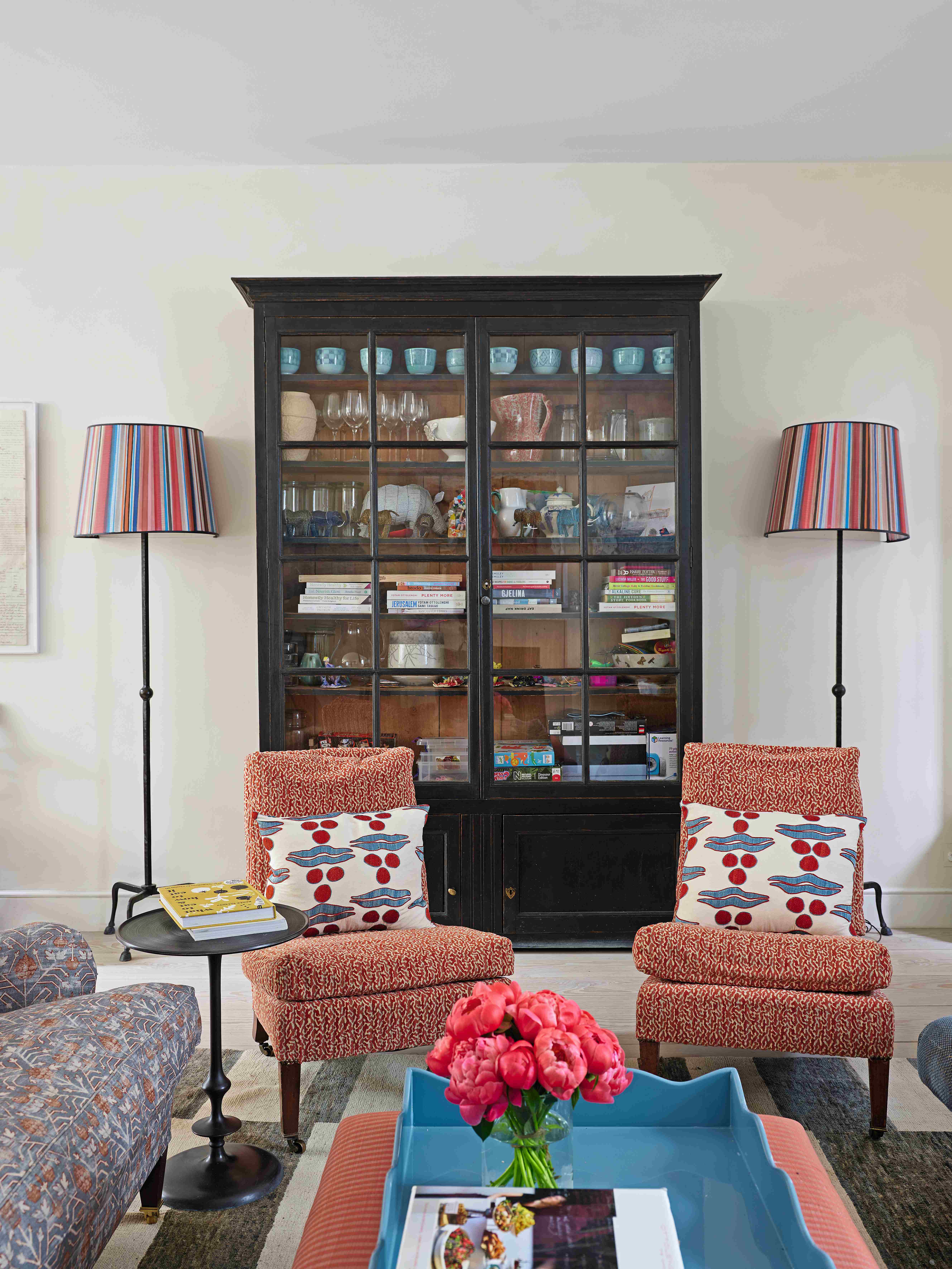
This is the first thing you really need to consider when deciding on your living room layout is who uses the room and how they use it. Because the layout needs to work, every single day, it needs to make sense for the functions of the room. Is it a formal living room, where you entertain (with no tech), is it a family room that needs to work for everyone and is perhaps centered around tech, or is it more of a cozy snug in which the layout should feel, well, snug and be more based around conversation and the TV?
'While everyone wants a beautiful living room, before buying that pretty sofa, consider how you'll use the space,' says designer Kati Curtis. 'Is it primarily for socializing, watching TV, reading, or a combination? Neglecting to align the layout with the room's purpose can lead to a huge waste in time and money on furnishings that might look good but just don’t work.'
2. Making the TV the focal point of the layout
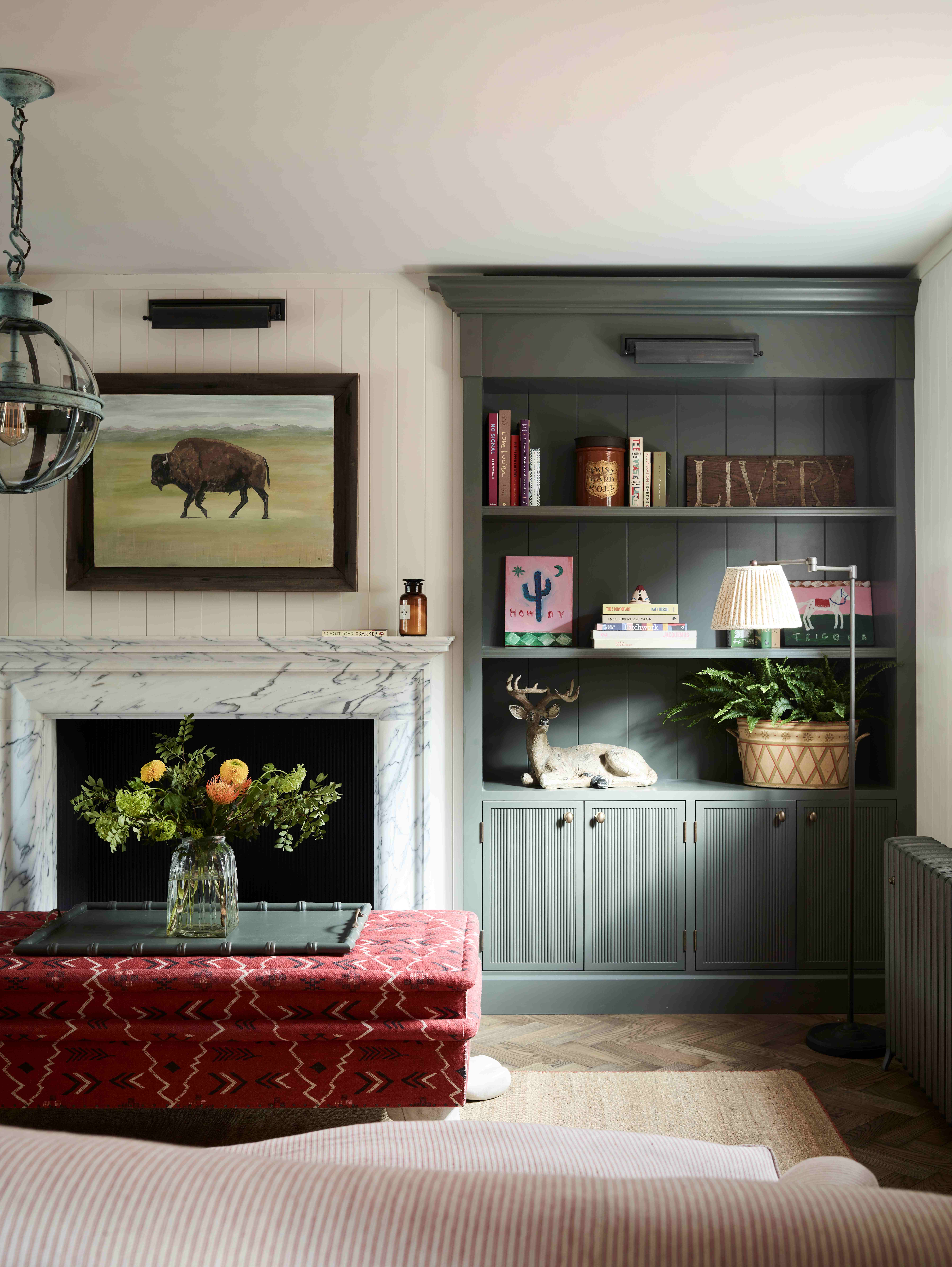
'The number one mistake people make when arranging living room furniture is forgetting the focal point of the room,' says designer Irene Gunter. 'If the room has a stunning view, for example, I arrange the furniture to maximize it. Alternatively, I might use an open fireplace or a beautiful wall of joinery as the focal point.'
'Whatever you do, avoid making the TV the focal point. Instead, look for stylish ways to hide a TV from view to create a more aesthetically pleasing environment. There are several options available, such as concealing it behind an automated wall panel that moves aside when you turn the TV on, or using a sliding painting. Another option is to incorporate the TV into a dark-colored shelving unit, so it won't stand out.' she adds.
Kati Curtis agrees it's a huge living room layout mistake to make the TV the sole focal point. 'As much as we’d all like to pretend we don’t have a TV, it’s a necessary evil in modern life. My pet peeve is the TV above the fireplace set up! If you have a TV in your living room, avoid placing it in a location that requires strained necks or uncomfortable viewing angles. Also, ensure it's not the sole focal point, as this can undermine social interaction.'
3. Pushing all the furniture against the walls
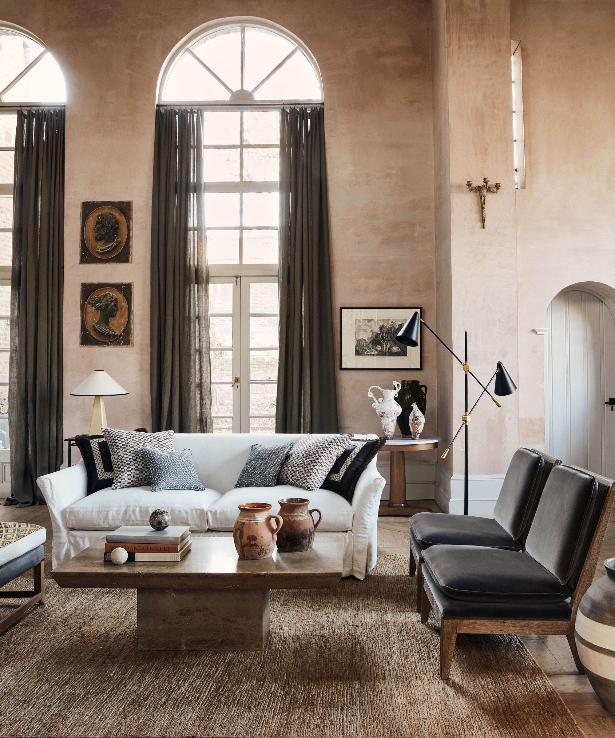
This is a classic living room layout mistake, probably one we are all making. What is the obsession with pushing all the furniture up against the walls? What you are left with are crowded edges and a sea of empty floor in the center. Ditch this old format and pull your furniture into the room. It will create a far more social space, and even in a small living room, it can actually make the room look larger.
'While it might seem intuitive to push furniture against walls to create more floor space, this can actually make conversations feel disconnected,' says Kati. 'Try arranging furniture in a way that encourages interaction and conversation, the furniture doesn’t have to (and shouldn’t) touch the walls.'
'When arranging furniture in a living room, avoid the common mistake of pushing everything against the walls, this can create a disconnected feeling in the room,' adds designer Jennifer Davis. 'Instead, pull furniture away from walls to create a cozy inviting seating area. Balance is key – avoid overcrowding the room with excessive furniture. To ensure a smooth traffic flow thoughtfully place furnishings to avoid obstacles in pathways, such as a door. Lastly, don't obstruct natural light sources. We all need all the sunlight we can get! Placing large furnishings, such as bookshelves, in front of the window can make the room feel gloomy.'
4. Misplacing the rugs
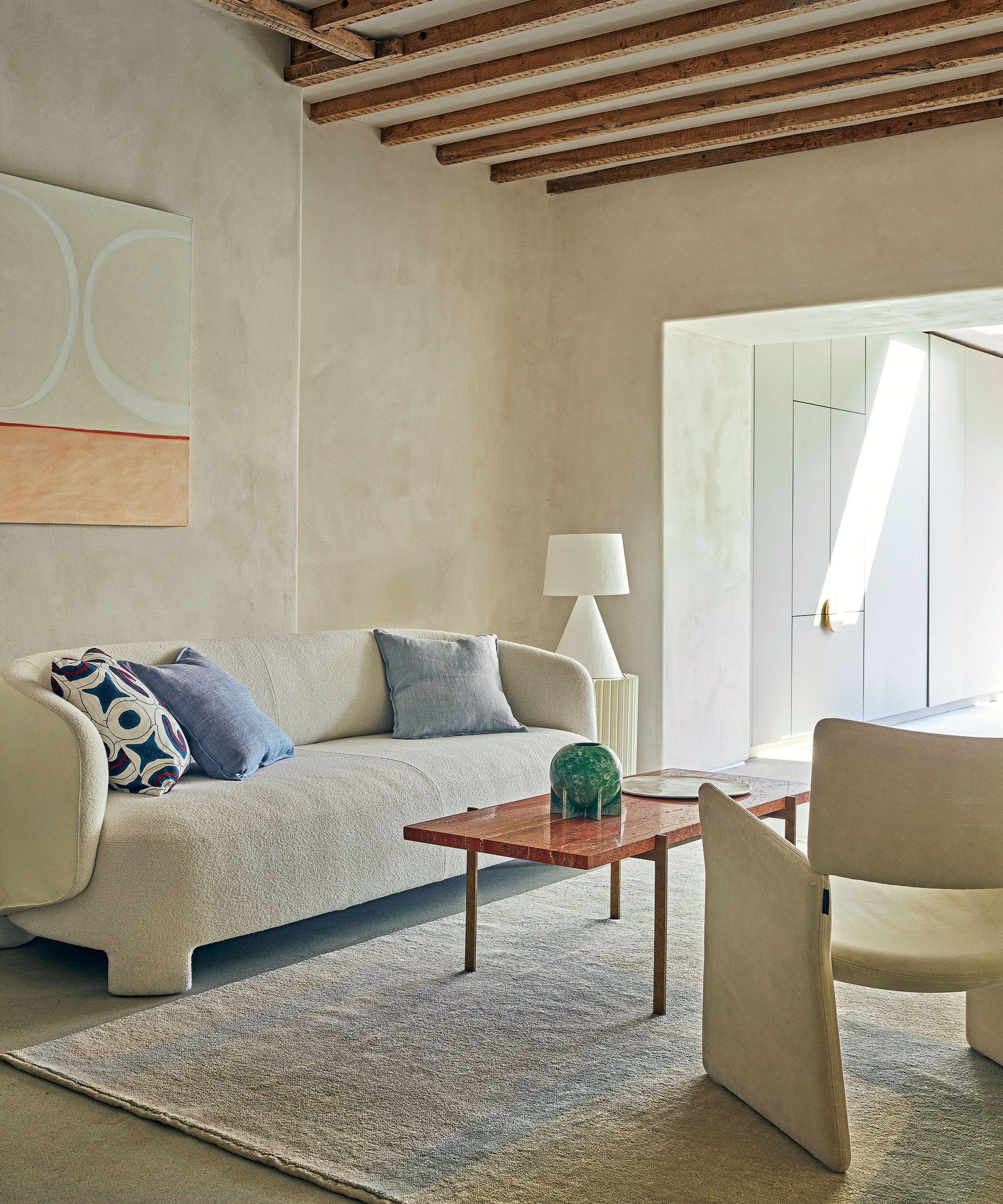
Living room rugs may not sound like they would have a huge impact on the layout of your space, but they do. See them a bit like walls; they zone and ground your furniture so getting their position right is important.
'Rugs help define zones within a room, but placing them incorrectly can make the space feel disjointed. Ensure the rug is appropriately sized and positioned to anchor furniture within a cohesive arrangement,' says Kati.
We would recommend that a rug should go underneath the majority of your living room furniture rather than sit with an awkward border of floor around it.
5. Not including enough seating options
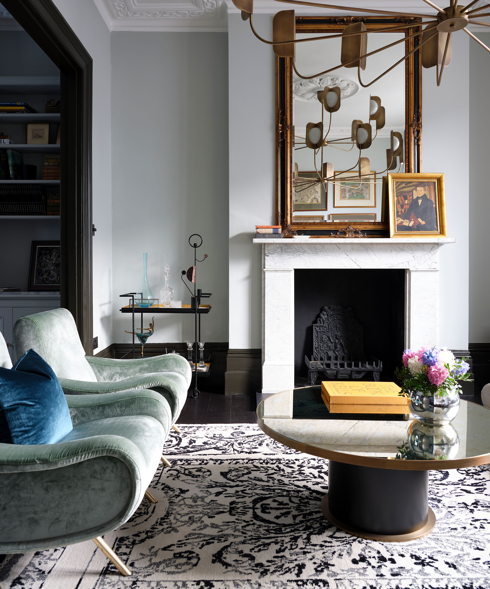
Don't rely solely on the couch. If you have enough square footage it's nice to introduce different types of seating to your living room layout. Create break-out spaces that can be used when the room is more of a social space, or if you want a quiet space to read away from the main zone of the room.
'When planning a living room layout, it's important to have adequate seating and different types of seating. You don't want to just have a sofa or just have a sectional – which doesn't allow for a conversation space.' says designer Victoria Holly.
'I like to have at least three types of seating, such as a sectional or sofa, accent chairs, and then an ottoman. This is great for kids who want to jump around and have fun while watching TV, or use the ottoman to build things or set up a train station, and more. It's also great for when you have friends over for different conversation locations. Having multiple types of seating allows for breakout conversations as well as main conversations within the space.'
6. Filling the room with too much (or too little) furniture
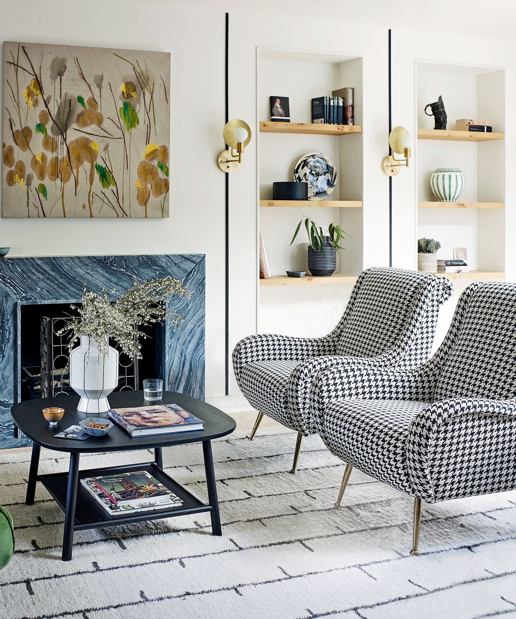
'There's no one-layout-fits-all when it comes to living room design, however, I always advise my customers and clients to be wary of trying to fit too much into a space. You never want a living room to feel claustrophobic or too crowded, so it's important to work with the space you have and place your pieces so that there's ample room to maneuver around them,' says designer Kathy Kuo.
Ginger Curtis, founder of Urbanology Designs agrees, 'A common mistake is underestimating the scale of your furniture and decor. Don't let the desire for negative space leave you with chairs and a sofa that are way too small for a large room. Items too small or large will break the cohesive flow.'
Speaking of flow, 'Circulation is another key consideration when planning the layout of a living room,' says Irene. 'You need to be able to move effortlessly through the room without furniture getting in the way. To work out where to place living room furniture, use FrogTape to mark out the furniture placement. This type of masking tape won't rip the lacquer off your wooden floors, which is a valuable lesson I have learnt!'
'Marking out furniture also helps you decide how big (or small) furniture pieces should be. You don't want a small two-seater sofa in a grand Georgian living room, as it will look out of place. However, you don't want a small living room swamped by a large L-shaped sofa either. The scale of the furniture needs to be appropriate for the size of the room.' she adds.
7. Not creating zones in a larger space

A living room layout mistake you might be making is seeing the room as one open space to fill, rather than the potential for all the smaller zones you could create. This is especially important if your living room is multi-functional or an open plan living room.
'Having a large living room can be both a blessing and a curse. While it offers plenty of space to entertain guests and spread out, it can be difficult to decorate and make it feel cozy. One solution is to divide the room into smaller zones for lounging, dining, and entertaining. When selecting furniture to divide the space, be mindful of the scale. If it's too small, it won't effectively divide the space and will appear as though it's floating. If it's too big, it can compromise the open feel and affect ease of movement throughout the space.' suggests Irene.
'There are various ways to divide a large living room. For example, an L-shaped sofa positioned in the middle of the room can be used to break up an expanse of space. I recommend choosing a chaise longue-style L-shaped sofa so that you only have one sofa back to contend with. To detract attention away from that back, add a console styled with plants, treasured objects, and perhaps a lamp.'
FAQs
What should I avoid when laying out a living room?
One of the worst things you can do when laying out a living room, and one of the worst living room design mistakes you can make is having a rug that's undersized. Everything else can be perfect in the room, yet a too-small rug can create a hugely negative impact. Always ensure it's large enough that your seating's front legs at the very least can sit on it.
Bear in mind that small living room layout mistakes will be still more impactful on the success or failure of your room. For both large and small living rooms, choosing furniture that's out of scale is a mistake to avoid: too small or too large, these pieces will skew the layout negatively, so always endeavor to get their proportions right. Using paper templates, cut from newspapers or old wallpaper rolls, laying them on the floor and checking their footprint is an easy way to ensure you are making the right choice.


