Just like there are trends for interior design, there are trends for exterior design too. These ideas for finishes of your home's external walls improve curb appeal and make a home feel more expensive.
So what's driving these trends for the exterior of homes? 'Most of our current clients are interested in how their homes will stand out from the crowd,' explains architect Andrew Lyon, founder of Studio Lyon Szot.
So what styles will help your home make a statement? These are 5 ideas for materials, finishes, colors and more that architects are using for modern homes.
1. Stucco
When it comes to interior design trends, we're seeing textured wall finishes used throughout the home, from limewash paints in the living room to Tadelakt and Roman plaster in the bathroom. But how does this translate for exterior trends?
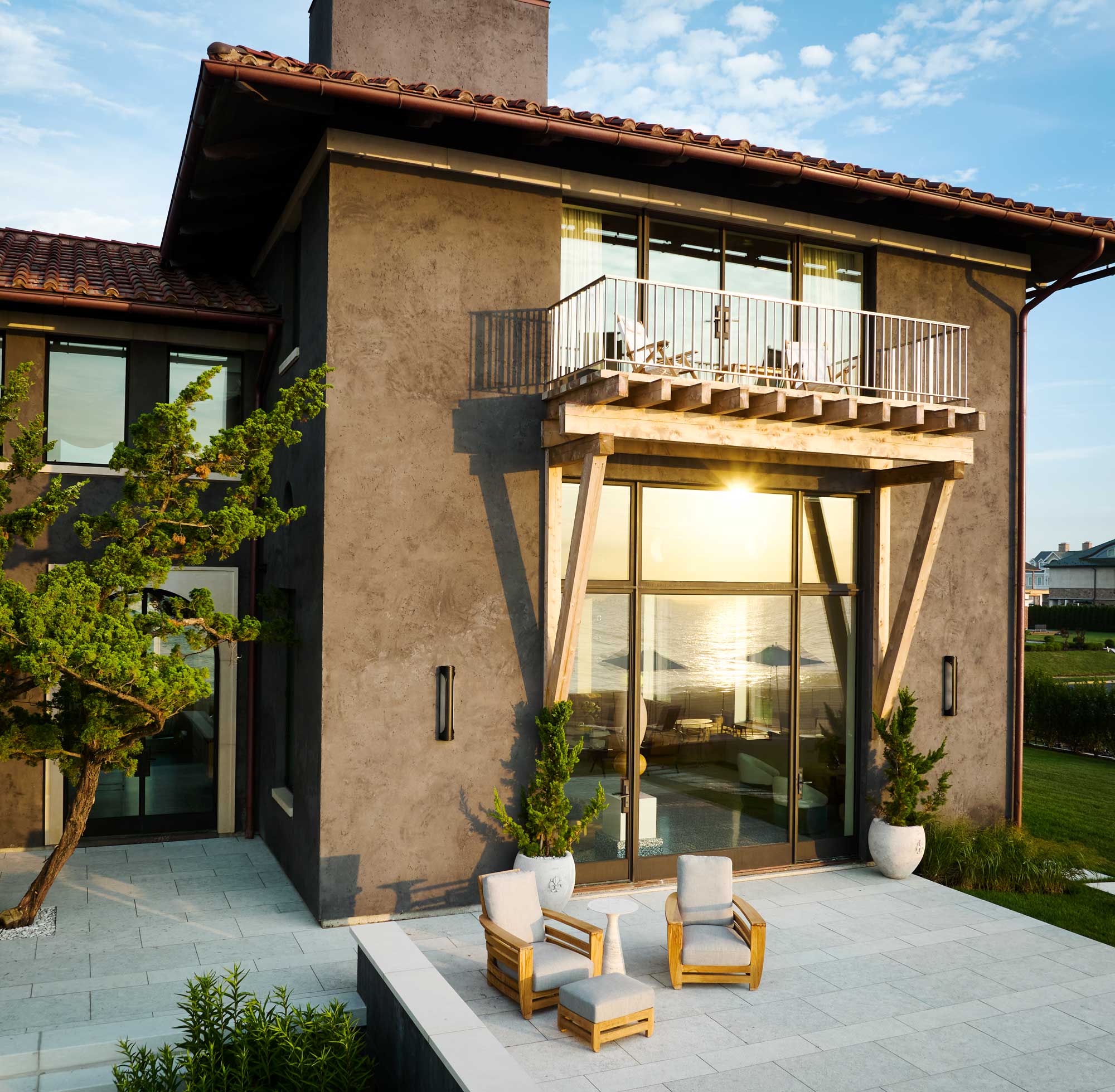
We're seeing architects look to stucco for textured exterior finishes, especially when using color as a way to bring depth and interest to a home's walls.
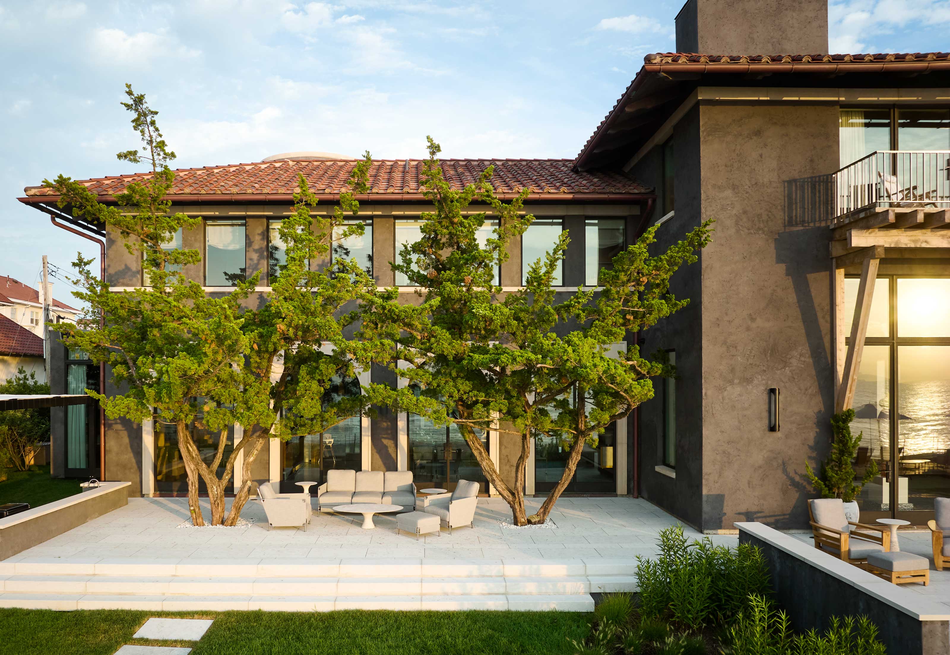
John Ike, principal of Ike Baker Velten, chose a dramatic black stucco for the exterior of this modern coastal villa.
'The external finish is a stucco made from black volcanic sand paired with Indian limestone,' John explains. 'This home was inspired by Mediterranean architecture, specifically Catania, Sicily near Mount Etna, where they utilize volcanic stone and sand to make stucco. The exterior is black with white trim, and the interiors are the opposite with white plaster walls and black terrazzo floors,' he explains.
2. Shingle siding
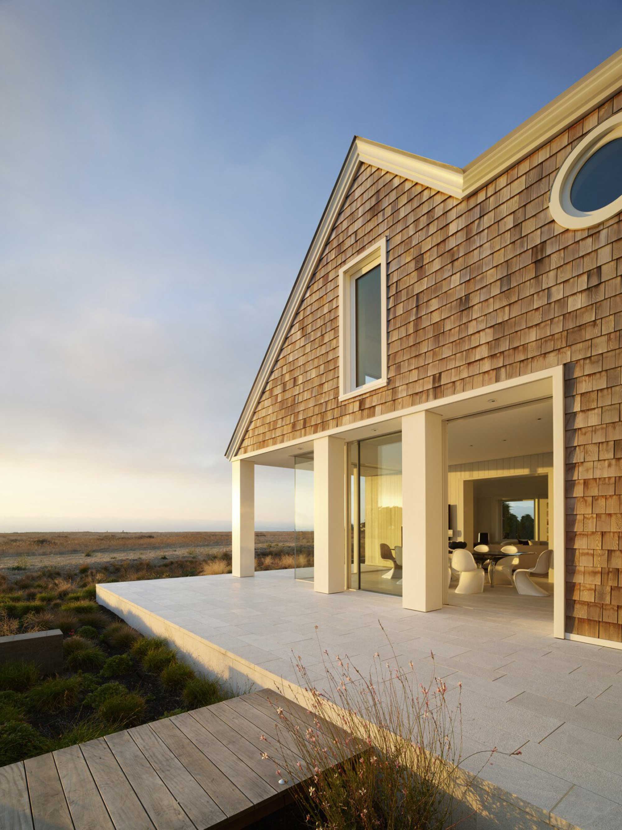
Shingles are a traditional siding choice for a coastal homes, and for homes like this modern home on the California coast, it's for a good reason. 'The house is located on a bluff in Half Moon Bay and gets the brunt of storms and inclement weather, so materials and finishes were chosen to be as durable as possible for the coastal site,' explains Anne Griffes, Senior Project Manager at architecture studio Walker Warner.
This type of cladding is Sinker Cypress - 100% heartwood, 100% clear. 'These shingles are much thicker than a standard shingle, for both aesthetics and durability on the California coast,' explains Anne, 'and they will turn completely silver over time.'
While they're best suited for these ocean-adjacent homes, we're seeing more people embrace shingle as a way to recreate the look, especially for homes inspired by popular trends like the Coastal Grandmother style. We're also seeing more decorative styles like scallops offer a modern take on the idea.
3. Minimalism
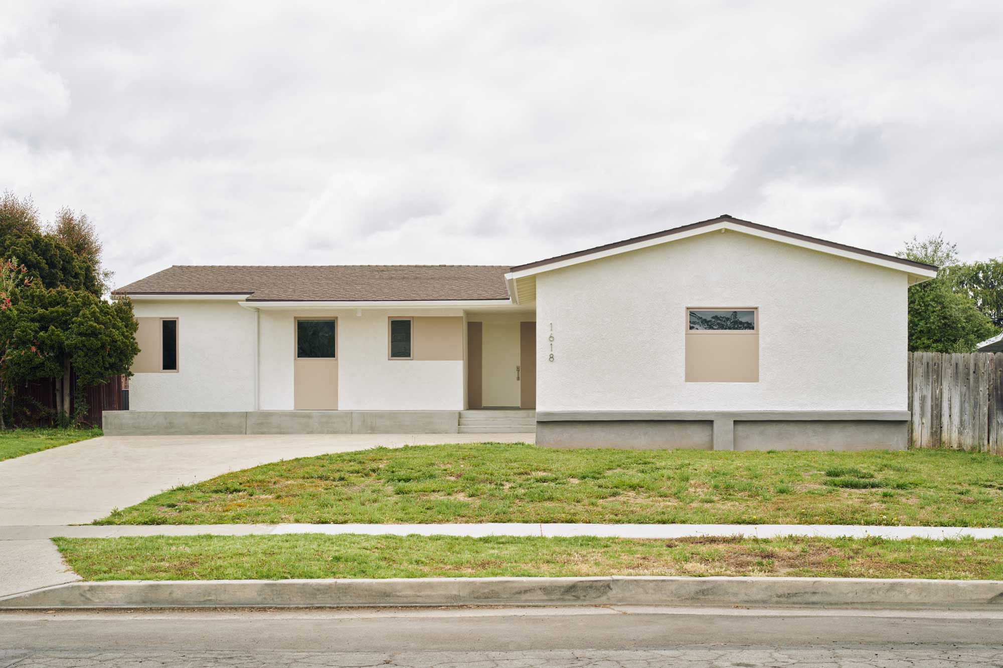
There are certain types of architecture that you might think are impossible to retrofit onto an existing home, but as this project by Yeh Yeh Yeh Architects goes to prove, embracing minimalism as part of a remodel isn't one of them. What was once a dated 1950s home has been re-imagined by the architects with minimalist architecture inspiration.
'This house, dating back to its original 1955 construction, preserves the lifestyle and design ethos of that era, and while we deeply appreciate the vintage charm of its original layout, our mission is to breathe new life into it for a contemporary owner,' says Jooyoung Chung, architect and principle of Yeh Yeh Yeh Architects. 'Our objective is to seamlessly blend the old and new, creating a modern ranch-style house. To achieve this, we introduced a concrete deck on the front facade, providing both a resting area and anchoring the house visually to its surroundings. Between the horizontal linear eave and the concrete deck, we implemented a distinctive window configuration, inspired by the original window placements, which has now become a central focal point in the facade's overall aesthetics.'
4. Black
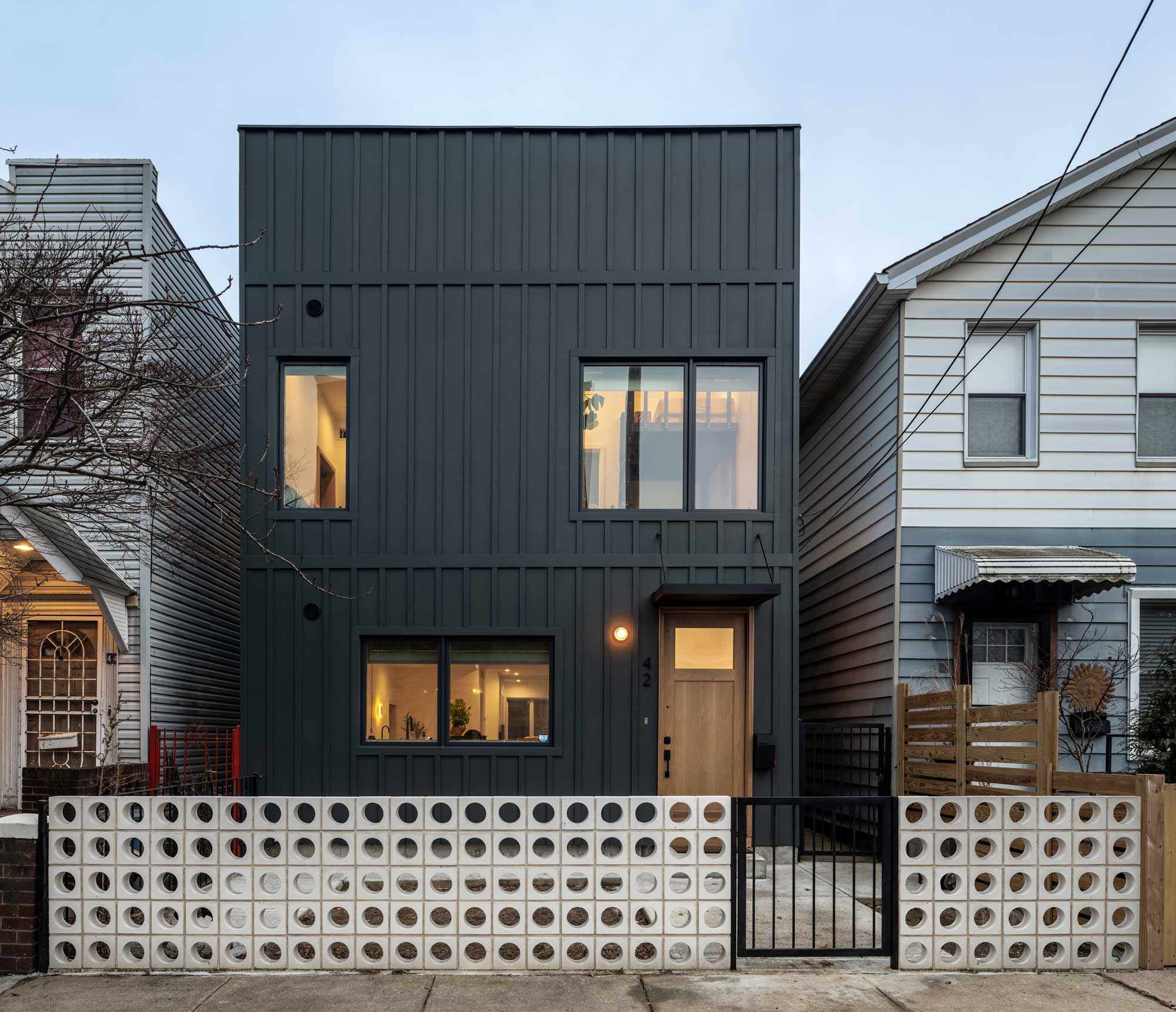
When it comes to making a statement, black remains one of the most effective and stylish architecture trends for the exterior of a home. For this contemporary property in a Brooklyn neighborhood, a combination of a solid black color and an intriguing paneled effect helps the architecture avoid feeling too monolithic.
'We felt that creating a strong street presence and contrasting the existing context would make the house stand out on the street,' says Andrew Lyon, founder of Studio Lyon Szot. 'We developed a strategy of using Hardiplank standard sizes to express the framing and floor levels. We hoped to evoke a modern take on board and batten siding while making it feel contemporary.'
'This is a cementitious Hardiplank that is through-body colored so that if scratched or damaged, the color is consistent,' Andrew explains.
5. Slats
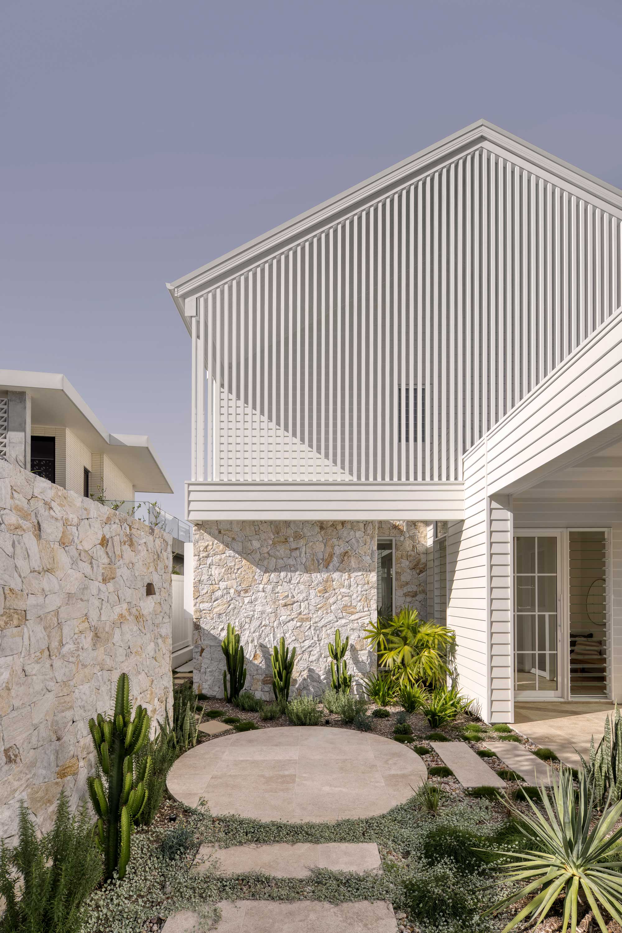
Slats, from fences to screens, are a popular modern design trend for the exterior of the home. But they have more to offer than just good looks. For this home in Queensland, Australia, it also played a part in ensuring the house functions well in the heat, while offering privacy (and a connection to the outside) for the owners.
'This facade faces due West, so the battens have a purpose to act as a secondary facade which keeps that heat off the actual main facade materials and creates a cavity air space between the battens & the building skin to mitigate the harsh West sun,' explains architect Wayne Greenland, principal and architect of Habitat Studio Architecture. 'Battens as a secondary facade work well in this climate as they allow breezes to still penetrate the screen and enter through windows beyond into the house. They also allow the occupants a visual connection through to the street that a solid secondary facade wouldn't,' Wayne adds.
It's a look that is easy to customize to create a different feel, and it can be tricky to get right. 'It's easy to make these elements look really clunky by disproportionate spacings or oversized batten elements,' Wayne explains. 'There is different solutions that work well and you can get interesting rhythms by using varying size battens to create a pattern.'


