The idea of freshness speaks of renewal, which in interiors translates to a space that constantly seems new — as if it's always just had a recent lick of paint. A fresh home also comes across as confident in itself, at once on the design pulse but also not caring what’s going on outside its four walls. It emits a youthful joy, radiating the essence of life, almost like sunshine itself.
Freshness and spring are tied together, yes. Many 'fresh' tones come from just-bloomed plants or flowers, like they should have lambs gamboling around them and like they’d make an ideal HQ for a family of Easter bunnies (if this sounds like your thing, look into full spring color palettes, too). But these 'fresh' colors will carry that budding, effervescent ambiance throughout the year — and trust me, mid-winter, their cheering, soul-arousing effect will be life changing.
So, let’s browse a few color groups that tick the so-fresh and so-clean box; colors that, in general, are the best to choose if you’re looking to fill your home with a feeling of unblemished buoyancy and shine, no matter the season.
1. Yellow
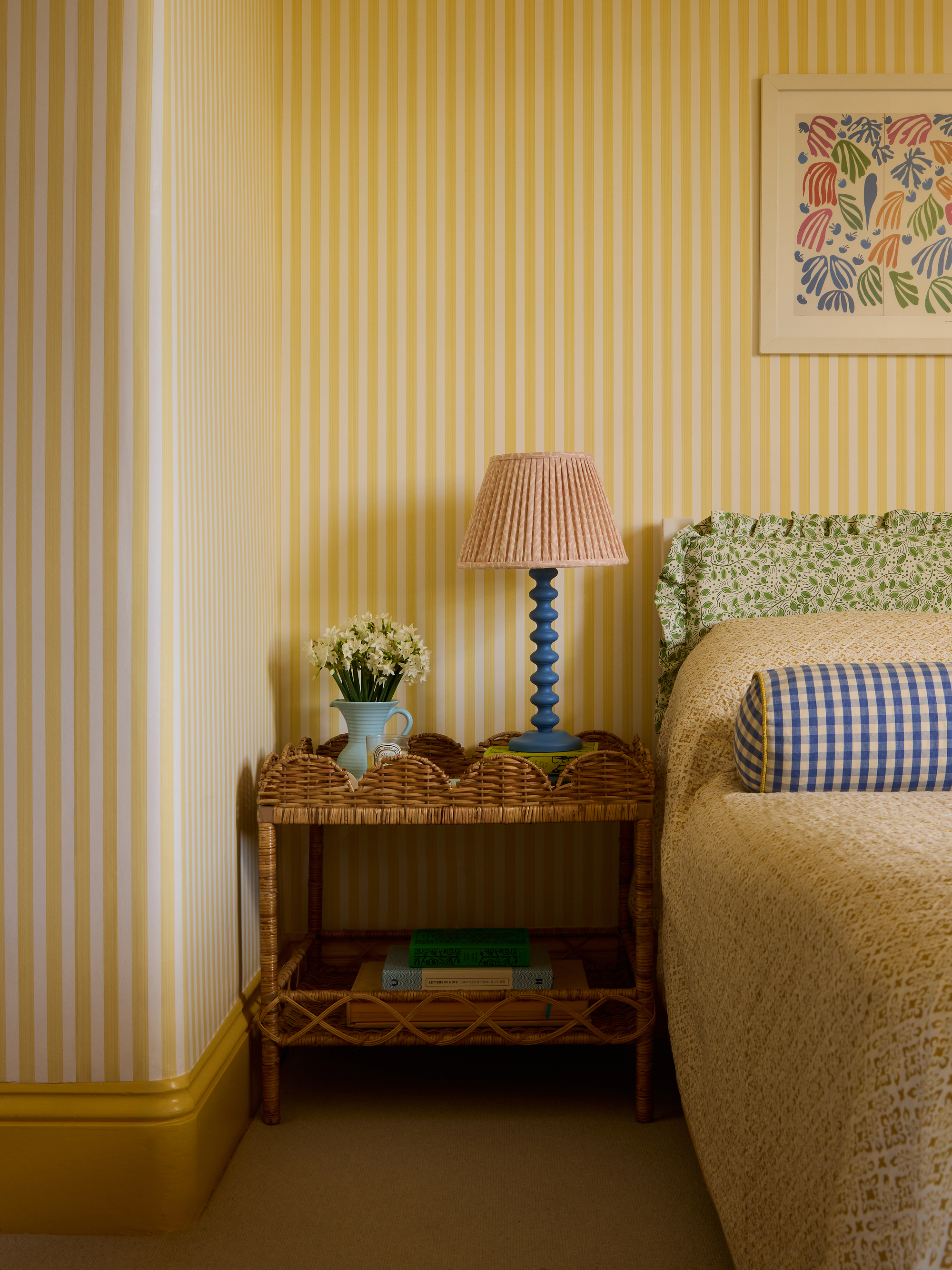
Yellow is the color of light and happiness itself. The hue feels fresh in the home because it practically shines, making the space glow with optimism that’s imbued into the very walls. When decorating with yellow, there’s no dimness, shadowy corners, or areas you’ll look over without seeing. It’s like a constant source of brilliance, lifting the space and bringing liveliness and a sense of hopeful rejuvenation.
“Yellow has a unique ability to bring instant freshness and vitality to an interior,” agrees Laura Stephens, founder of Laura Stephens Interiors. “Even in small doses, it can transform the atmosphere of a room, making it brighter and more welcoming. It’s an instant mood booster, injecting warmth and energy into a space.”
Importantly, yellow doesn't need to dominate a scheme to make it feel fresh, Laura notes, adding that it's often the smaller, thoughtful accents, such as a painted chair, the lining of a bookcase, or a piece of art, that feel most sophisticated.
"These small injections catch the eye and bring a sense of spontaneity and life to the room without dominating the wider palette,” she explains. “If painting all the walls yellow feels too much, try a shade which is neither too saturated nor too washed out — such as Citron by Farrow & Ball — on the ceiling and moldings. Pair it with a fresh neutral on the walls, and it will give a natural warmth to the space without overwhelming,” she suggests.
2. Green
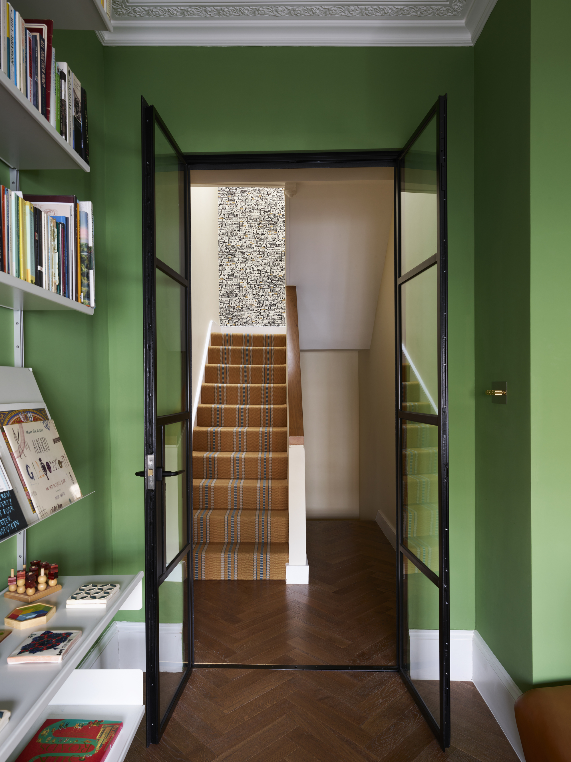
Green — surely, it’s the epitome of freshness? It reminds us of life itself bursting forth into the world, giving us a sense — and full display — of new beginnings and regeneration.
“The strength of decorating with green catches the eye in the way that the vista down a lawn does,” says Edward Bulmer, founder of Edward Bulmer Natural Paint. “It is packed with obvious allusions to the abundance of nature, which makes it uplifting, and despite its weight, it has a lightness that does not overpower. Green manages to be generally attractive while bold at the same time — nature does this as plants bounce their foliage into the light, too!”
“To create a fresh, mood-boosting effect, I would use green in areas where it has good light to offset it, and where it can provide a joyful link between the indoors and the outdoors,” Edward says. “Try something like our Invisible Green with a clear and light palette for the other furnishings — and don’t be afraid to bring in some strong accents in the complementary opposite reds.”
3. Pale Blue
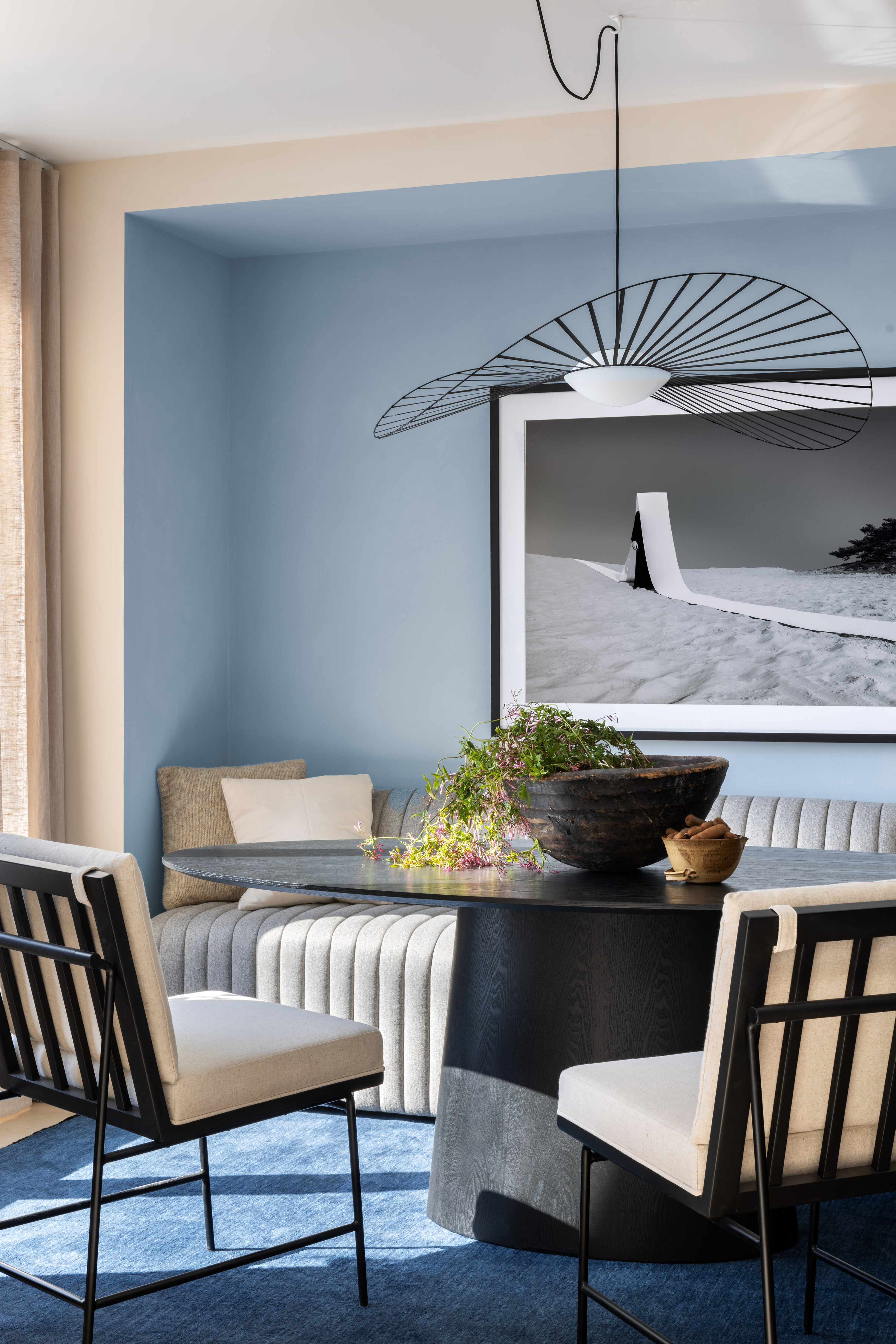
Need to get fresh in a hurry? Dousing your space in pale blue might be just the ticket. The hue represents water, being washed clean and emerging as something new and invigorated, and in interiors it lifts the atmosphere, pacifying the eye, and boosting openness and clarity.
“Pale blue exudes a sense of tranquility due to its connection to nature, adding a beautiful sense of peace to homes and complementing the outside world rather than distracting from it,” says Helen Shaw, color expert at Benjamin Moore. “Pastel shades reminiscent of summer skies create a feeling of optimism and lightness in the home.”
It's the perfect foundation for a room’s color scheme to maximize a fresh, airy, and mood-boosting effect season to season. "Its calming undertones make the home feel both relaxed and uplifted,” Helen continues. “A shade like Benjamin Moore’s Raindance 1572 — a pale take on a sky blue — works beautifully in rooms where you want to create a fresh atmosphere, such as bedrooms and living rooms, as it takes on a more luminous quality without fading into the background. Pair with a crisp white and natural textures to enhance the sense of sanctuary.”
4. Mint
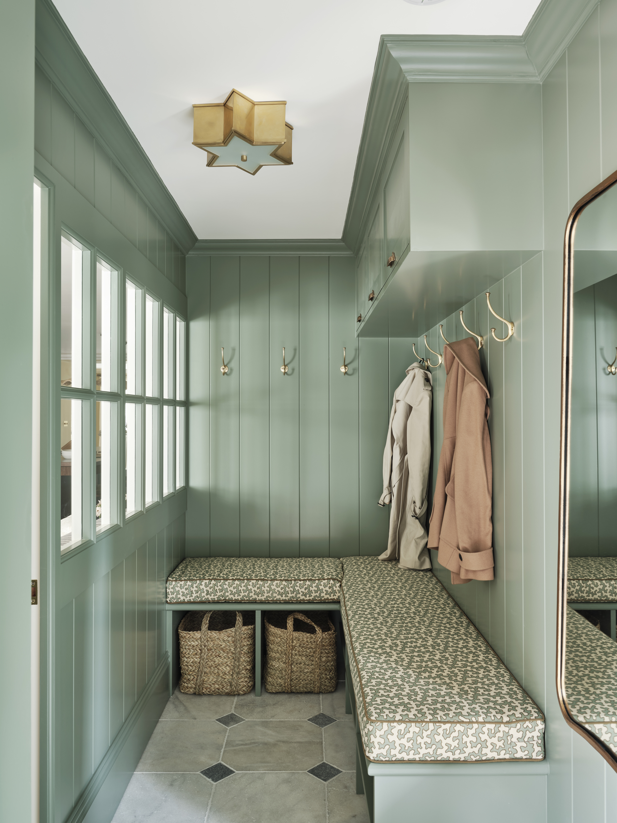
Mint is the flavor of freshness, and its pale green color is, by association, rather zesty. In the home, it’s refreshing and quietly playful, evoking thoughts of bright cleanliness, delicate crispness, and soothing herbaceousness.
“A soft, mint green, such as Farrow & Ball’s Card Room Green, brings a beautiful freshness to the space, making it feel light and airy,” explains Rebecca Hughes, founder and creative director of Rebecca Hughes Interiors. “I see mint as a neutral that brings softness and calm to a space."
“Decorating with mint also serves as a connecting element from interior to exterior, creating feelings of being in nature and connecting us to our surroundings, so it grounds a room, immediately making us serene," she adds. "It works especially well in spaces where there is no direct sunlight, connoting the sensation of being outside, even when you are not.”
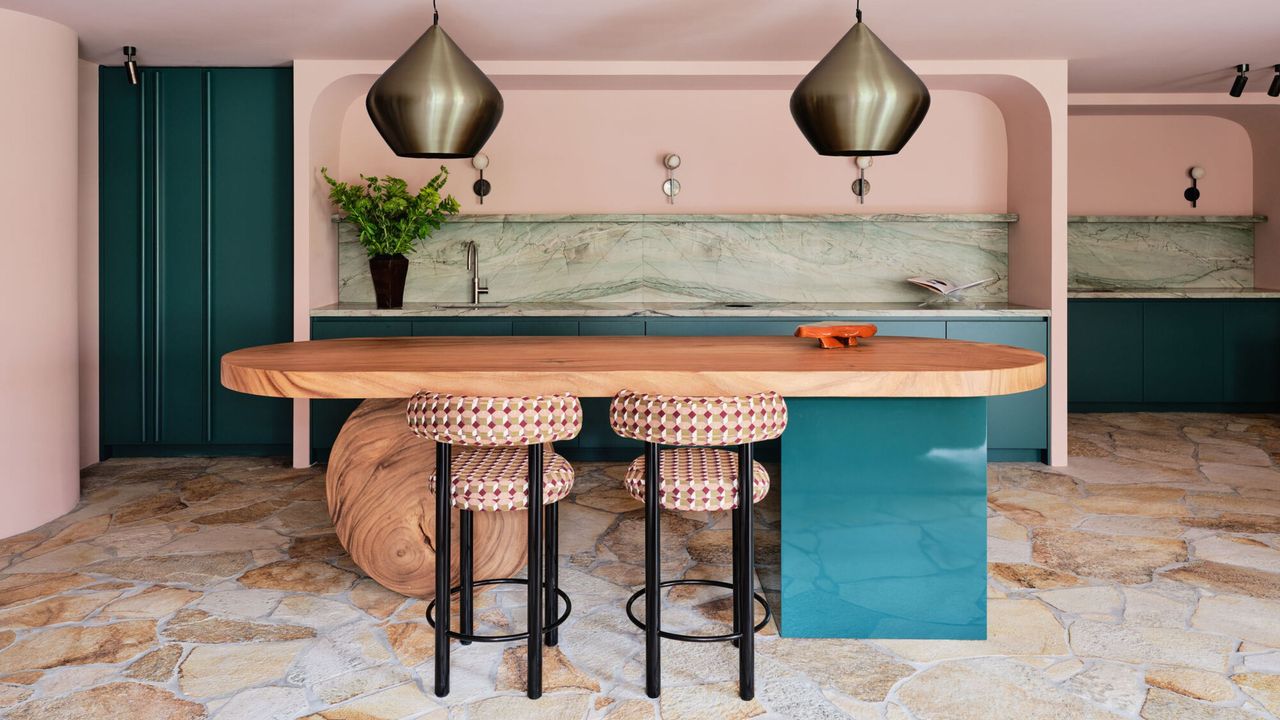
5. Blush Pink
So we’re agreed — there’s nothing fresher than spring. You think spring, and you think blossom, and you think whimsical blush pink, pretty, romantic bursts of life that declare ‘newness is here’. Spring decorating ideas are like a reset button for the home that captures the hopeful, the bright, and the rather charming.
“Blush pink is the color of spring; it uplifts your mood on the grayest of days,” says Nicole Dohmen, principal designer of Atelier ND Interior. “It has a kind of freshness which reflects the outside light, and feels very natural. It is a fresh, refreshing hue, which is also easy to combine with almost every color.”
Nicole loves to use soft — "not too baby pink" — pink rather than white, as it gives a gentle touch to a space. "Combine shades such as File Under Pop’s Pink Soon — a lilac blush with a bit of gray in it — with tones like sweet pea green and primary red to uplift it even more, or try cooler tones like petrol blue, dark oranges, and fresh whites for more contrast," she adds. In the UK, Farrow & Ball's Peignoir is a good alternative.
But don't be fooled — spring-like, new-beginning-inspiring, fresh colors are relevant and beguiling all year round, delivering hope and happiness as well as that pristine, just-out-of-the-box feeling to every corner. It's a color trend that'll never fade.