
Martha Stewart never fails to surprise us when it comes to decor ideas, but somehow her rule-defying choices just work – perhaps it's the Martha effect, or maybe it's simply that she is fearless when it comes to experimenting with color.
Either way, I am always intrigued by the way she's willing to break the mold when it comes to unexpected color combinations (see our recent piece on Martha Stewart's black and yellow kitchen), and her Turkey Hill Dining room, dating back to 1996, is no exception.
The walls are painted in what Martha describes in an Instagram post as an 'odd green' – I'd describe it as somewhere between a turquoise and a fresh spring green. But as dining room ideas go, I think her choice of decorating with green is not only a bold but an inspired design decision.
There's more to this color than its aesthetic, however. 'I really think humans just feel comfortable with green – it's in our DNA,' comments Elizabeth Ryan, the principal designer at Elizabeth Ryan Interiors. 'Just like nature soothes, green can really relax us and complement other aspects of our surroundings.'
Jennifer Ebert, the Digital Editor at Homes & Gardens, is similarly impressed with Martha's use of color. 'The way Martha balances color with cherished antiques is masterful,' she says.
'That soft green transforms the room into a gallery-like setting, beautifully highlighting the patina of the gilded mirror, the sparkle of the crystal chandelier, and the elegance of her antique dining chairs. Even the blue ceiling – traditionally something designers say should never be seen with green – works effortlessly here, adding depth and contrast while reinforcing the room’s confident, rule-defying character.'
The patina of the American gilded mirror is beautifully emphasized by the green wall on which it hangs, while the crystal chandelier and antique wooden dining chairs are also brought to the fore, as if in a gallery, by the backdrop of the unexpected dining room shade. So, it seems that Martha is onto something when it comes to the best color to use when decorating with antiques.
And it's no wonder that this soft green hue feels somewhat familiar. It reminds us unequivocally of Martha's treasured collection of jadeite kitchenware. This soft and surprisingly versatile color can be seen in Martha's vintage collections, such as her jadeite glassware, as well as in new pieces of jadeite tableware that she has designed.
These elements have contributed to this unassuming shade becoming a design icon of the Martha Stewart brand. So, once again, her capacity to think outside the box when it comes to decor proves the theory that 'Martha did it first', even when it comes to design choices that feel new and fresh.
Shop the Martha-Inspired Edit
If you're not ready to splash this 'odd' green over your walls yet, why not try the shade in a more subtle way with some Martha Stewart-inspired tableware and dining room accessories?
I've also found some furniture, inspired by her iconic space (including these almost-identical vintage chairs from Charish), to help you get the look beyond going green.
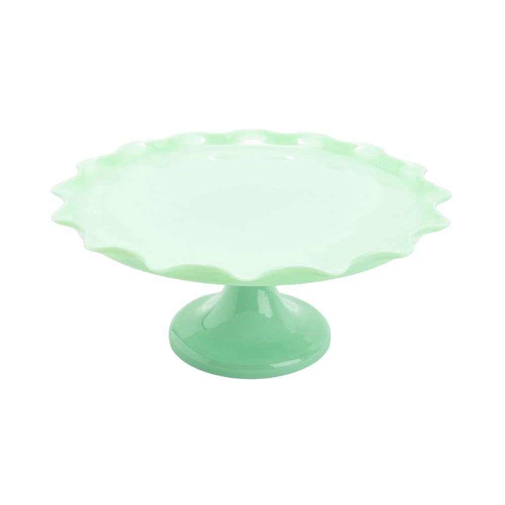
Add one of Martha's beautiful bakes to this jadeite glass cakestand, which pays homage to her own vintage collection and you've got yourself a stand-out table centerpiece.
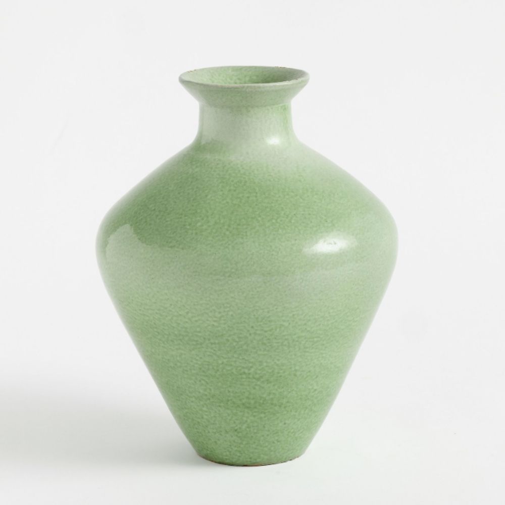
Whether for the mantel or dining table, this stunning vase can be filled with seasonal blooms or tonal soft green foliage for a bold dining room accent that really leans into this fresh colorway.
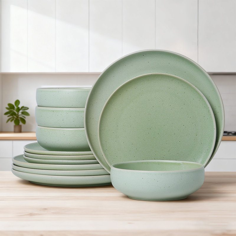
With an equally 'odd' name to match Martha's description of her dining room wall shade, this Misty Sprout dinnerware set is an easy way to bring the hue to the table – we love the textured finish.

Just like Martha's, these pieces are true works of art. Expertly crafted with solid construction, their deep brown finish, which can appear almost black in certain lighting, adds a refined and sophisticated touch to any dining room.
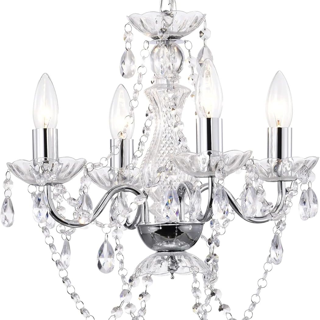
There’s something so chic about light spilling just right over a table, and this 4-light chandelier does exactly that. Its mix of sleek metal and twinkling crystals adds a subtle sparkle without feeling fussy, creating a cozy, inviting atmosphere for any dinner party.
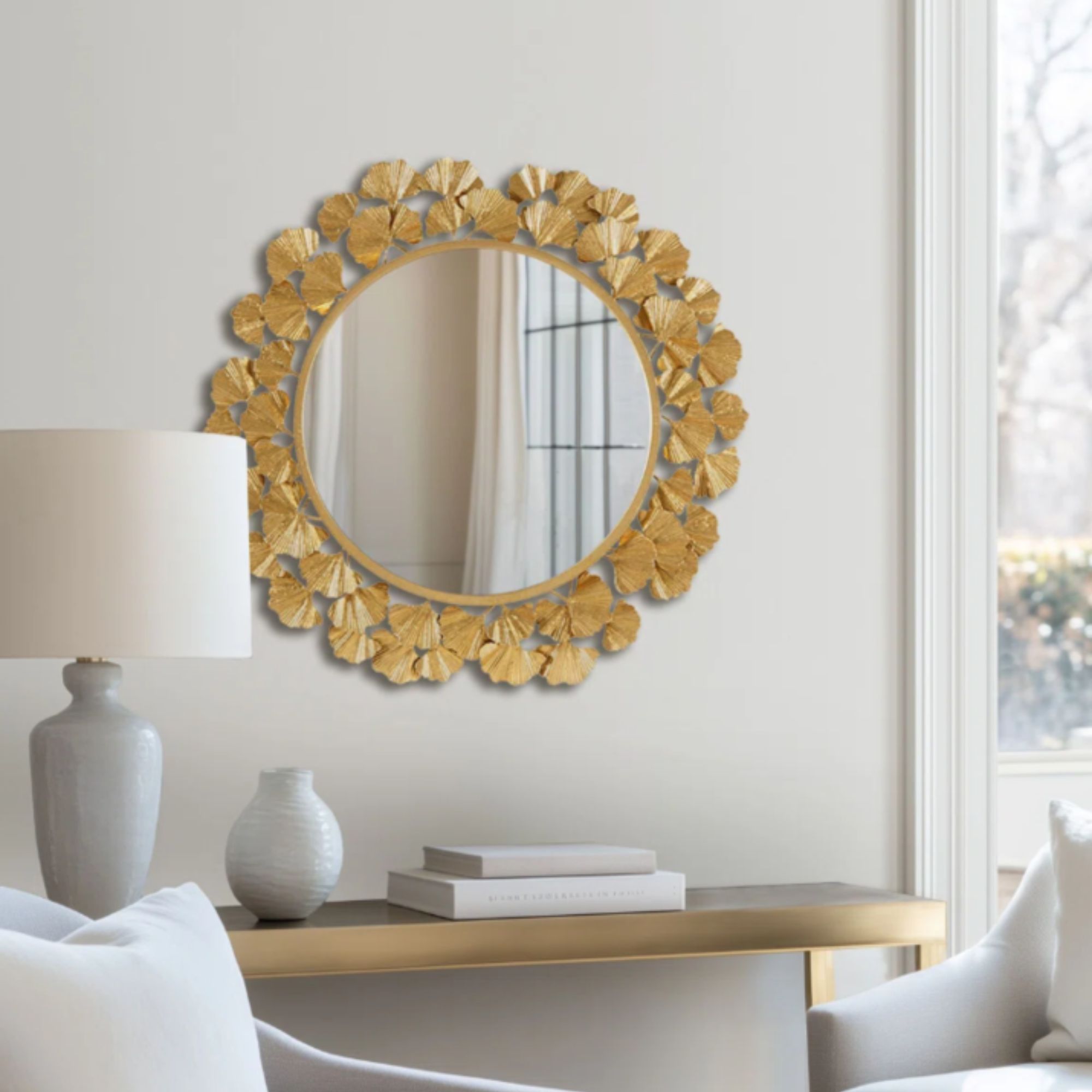
Designed by Martha herself, this round wall mirror features a sculptural frame adorned with intricate gingko leaves. Its nature-inspired design brings subtle sophistication to your home, just as hers does.
Painting a dining room wall in a light green shade like Martha Stewart is a way to inject instant freshness for spring, but you can equally try the look first with some carefully chosen accessories or even window treatment ideas that incorporate the shade. The choices of how to follow her 'odd' example are endless.