Let’s face it, The Block teams were set up for disaster when they were tasked with creating an office space in their Phillip Island holiday homes, alongside a rumpus room. At odds with the fundamental concept of a beach house, a space designed to be all business made no sense.
For that reason, most of the teams saw it as merely a suggestion and created alternatives to a WFH space. The only team to follow the office brief was couple Courtney and Grant, who failed to impress with their ‘therapy session’ aesthetic.
Best mates Ricky and Haydn had the right idea, eschewing an office and going with a games room instead. They tied first place with sisters Maddy and Charlotte, who revealed plans for a self-contained studio in their coastal home, with external access.
Last place went to married pair Mimi and Kristian who only completed one of the two rooms, but it was parents Kylie and Brad who perplexed The Block judges Darren Palmer, Shaynna Blaze and Marty Fox the most with their design choices. Here’s where they went wrong in their office.
1. Lack of purpose
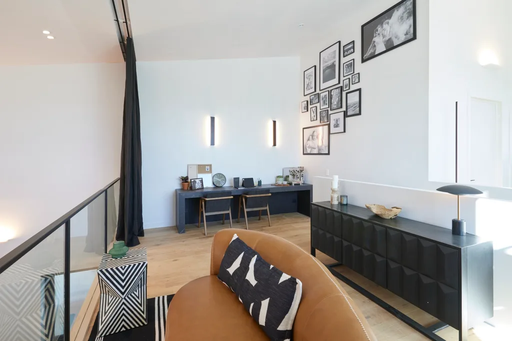
“This is functionally useless,” said Darren. Although Kylie and Brad were on the right track in rethinking the office brief, they failed to make the room’s new purpose obvious. Placing a couch in the centre of the space overlooking the room below was an unusual design choice. “This does not make sense,” said Shaynna.
2. Confusing curtain
The black curtain across the glass balustrade made the judges feel like they were at a ‘peep show’. “Can you imagine how confused a buyer is going to be?” said Shaynna. “They’re going to go, ‘Why do I have theatre curtains?’”
3. Uncomfortable desk
A desk against the wall was a futile inclusion, given the feng shui was completely off. Shaynna showed how unappealing it would be to sit at, with a blank wall in front and your back to the room.
“This is ridiculous.”
Shaynna Blaze
All of The Block 2024 office and rumpus rooms
Here’s how the teams went in the week nine reveals.
Tied 1st place: Ricky and Haydn
“We thought it was a better use of space creating a bigger games area,” Ricky explained of their decision to avoid an office. They went with a timber balustrade, arcade games and a pool table. “This is so smart,” said Marty. “You’ve got Street Fighter, you’ve got Pac-Man, you’ve got Phillip Island on the walls,” added Shaynna, who gave them a 10.
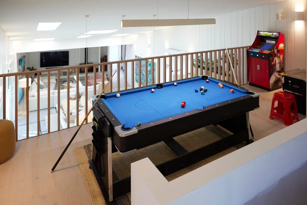
Marty predicted buyers would have an emotional connection to this room. “I believe people will come and visit, and their kids will say, ‘Mum, Dad, you need to get this.’”
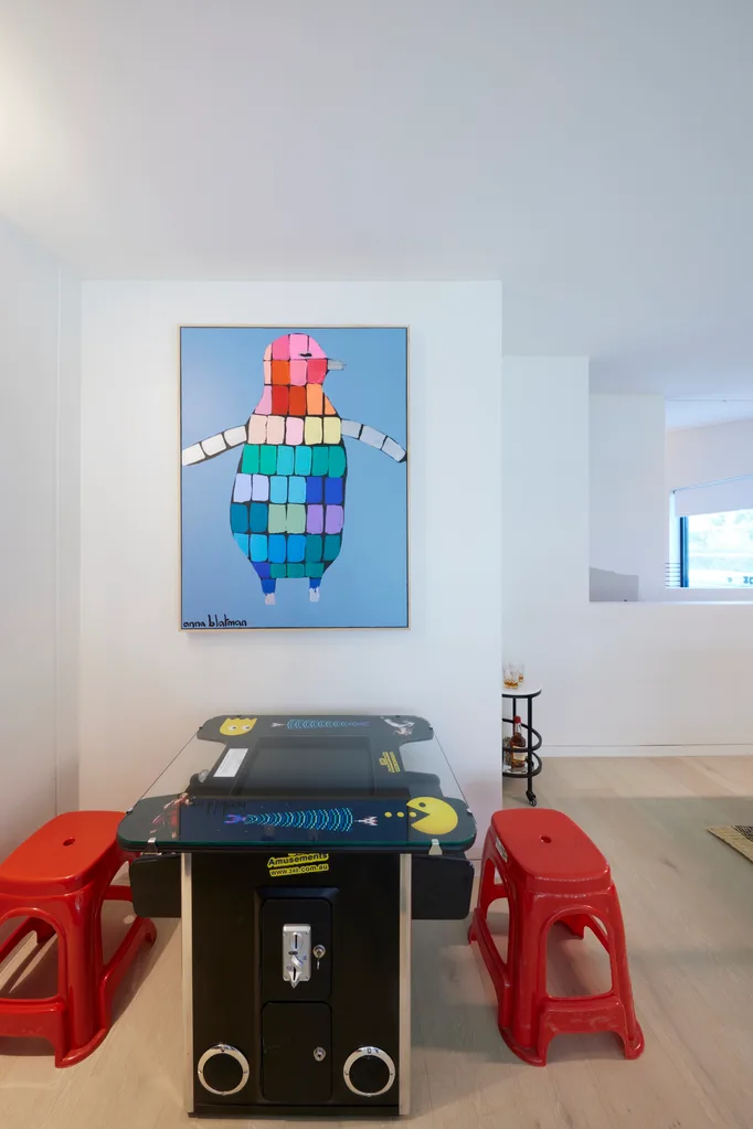
The rumpus room also got a great reaction, with a curtain to create privacy. “Having the sofa bed in this room means they can sleep 10 guests as opposed to the others who can sleep eight,” said Marty. “It’s leaning towards that investment piece for the end user of the property.”
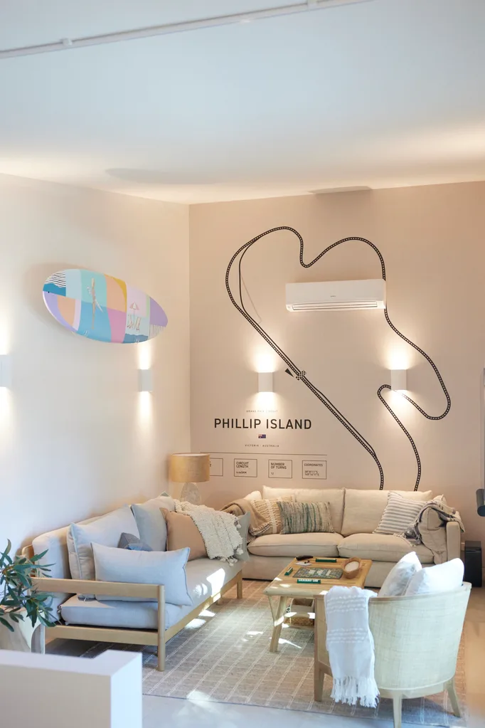
“I’m personally not aesthetically excited by this room,” said Darren. “But in a real estate sales competition there is definitely going to be a buyer who wants this relaxed, less uptight style of holiday home.”
Score: 28/30
Tied 1st place: Maddy and Charlotte
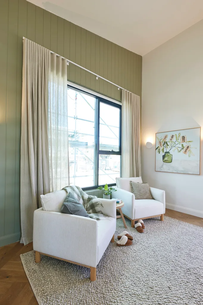
With business degrees under their belts, Maddy and Charlotte flipped the floorplan to make a more marketable house. The grand plan is to create a self-contained guest retreat with its own external access. To do this, they changed the office into a rumpus room and made the other space into a sitting area. These will connect to a bedroom and ensuite.
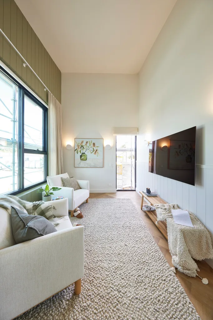
“This is a massive selling feature,” said Marty. “It’s so multi-generational, multifaceted, multi-income generating, they have opened up a massive amount of possibilities by changing that window to a door. It’s genius,” said Darren. “It’s a game changer.”
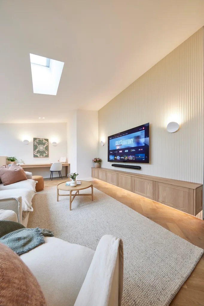
In the other space, a large skylight filled their rumpus room with plenty of light and the judges liked the lived-in feeling.
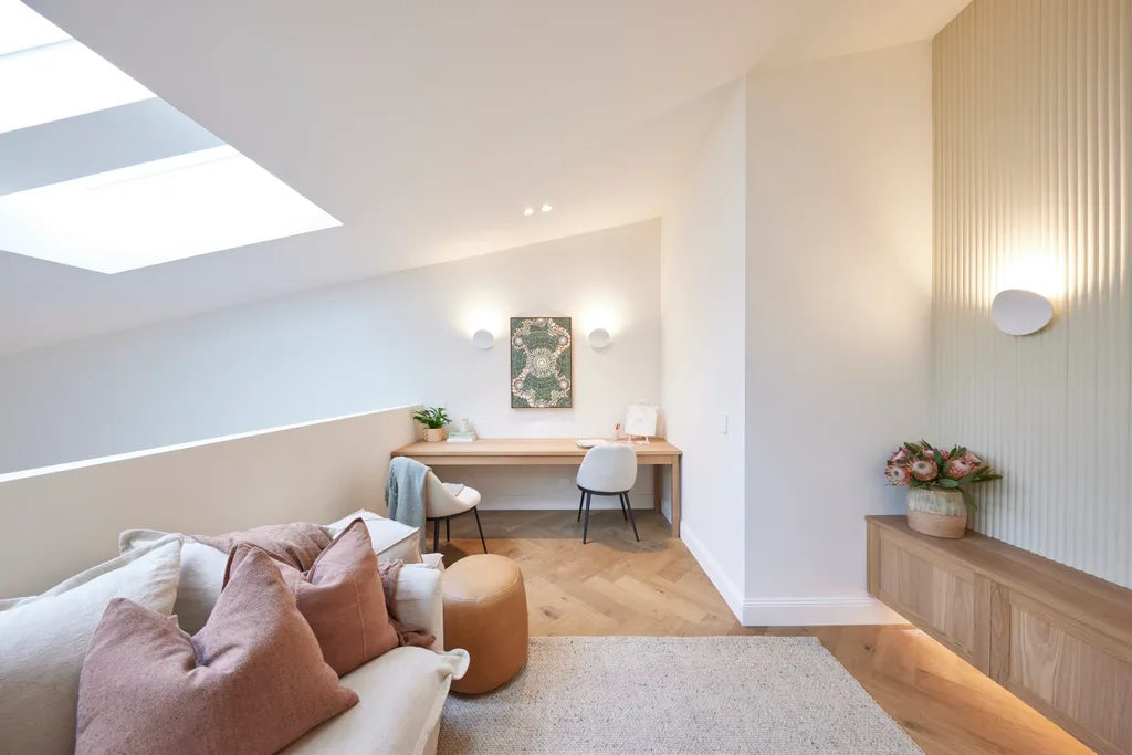
“The girls have listened to some of the styling tips and kept it a lot simpler,” said Shaynna. “How do you make it look so cosy when it’s never been lived in? I think the girls nailed it,” added Marty, who scored them a perfect 10.
Score: 28/30
3rd place: Courtney and Grant
The couple took space from their office weeks ago to create a larger ensuite, making their space the smallest of all the houses. Regardless, they pushed ahead with a full office fit-out. The desk with two chairs felt a bit “business centre” for Darren. “I feel like I’ve walked into a possible therapy session,” he said.
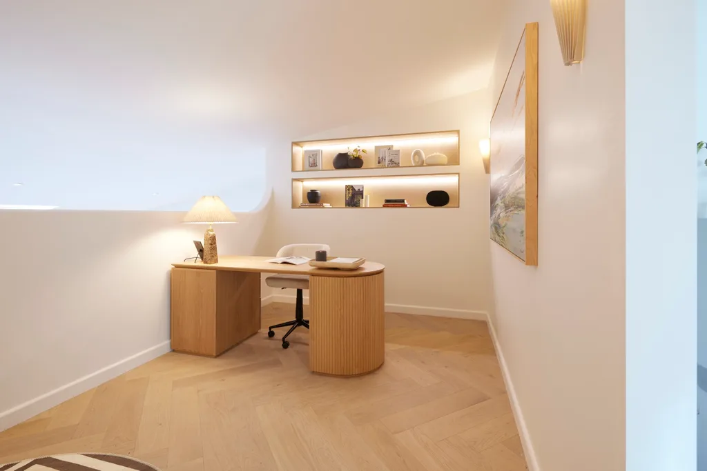
“If you’re going to run an office in here, your conversation will be heard [in] the lounge room,” said Shaynna. The rumpus room had more appeal. “Lovely furniture, beautiful colour scheme,” said Darren. “Decision after decision, we have style in spades.”
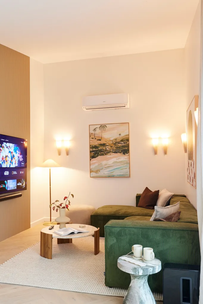
Regardless, Shaynna pointed out that the floorplan change to create such a large ensuite weeks ago hadn’t panned out. “If we have a bathroom of that size, I want a king bed,” she said. “This comes down to ensuite week up here. We knew the planning was either going to work for them or bite them in the behind. And it’s definitely bitten them in the behind.”
Score: 23.5/30
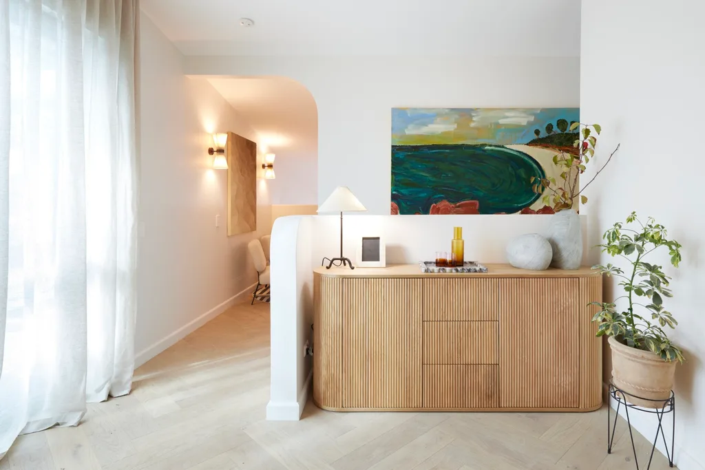
4th place: Kylie and Brad
After scoring first place for their living and dining room the week before, it was a surprise that Kylie and Brad “dropped the ball” with their office and rumpus room design. “I don’t understand why there is a couch up against a glass balustrade,” said Marty. “Why am I sitting 30cm off a glass balustrade looking over the living area?”
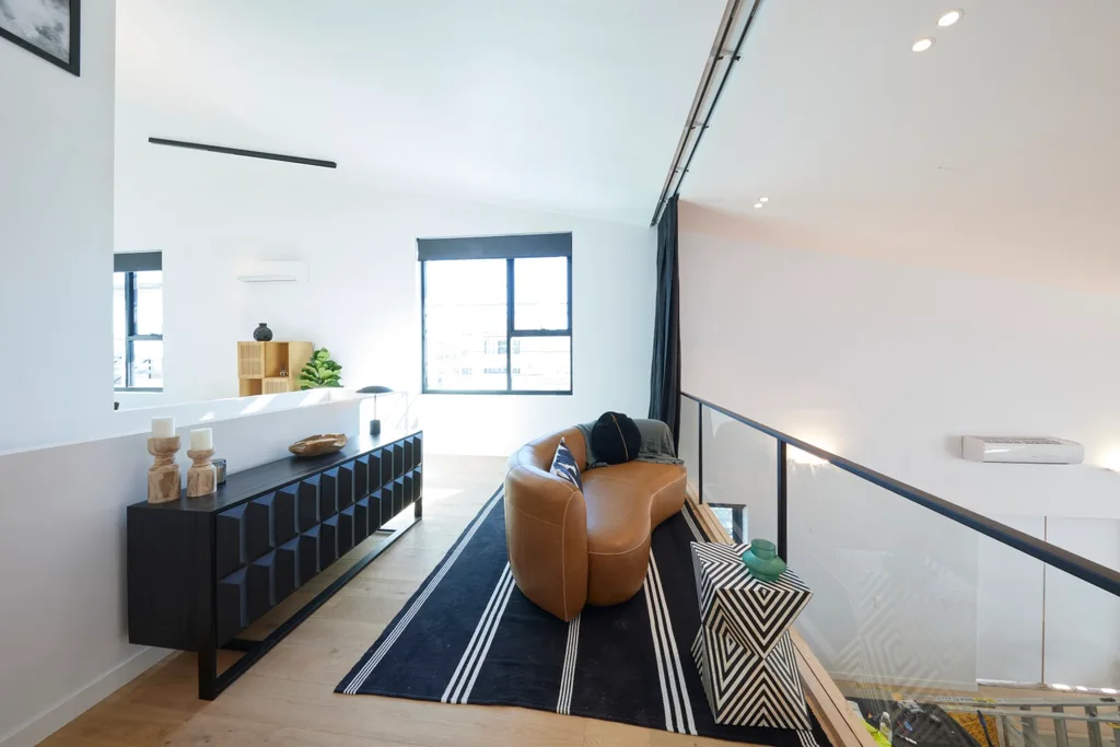
The rumpus room wasn’t much better, with a lot of wasted space behind an awkwardly placed couch. Even the palette didn’t have the personality the pair have become known for. “When did they become so white?” said Marty. “I gave them a 10 last week. This is just not them.”
Score: 16/30
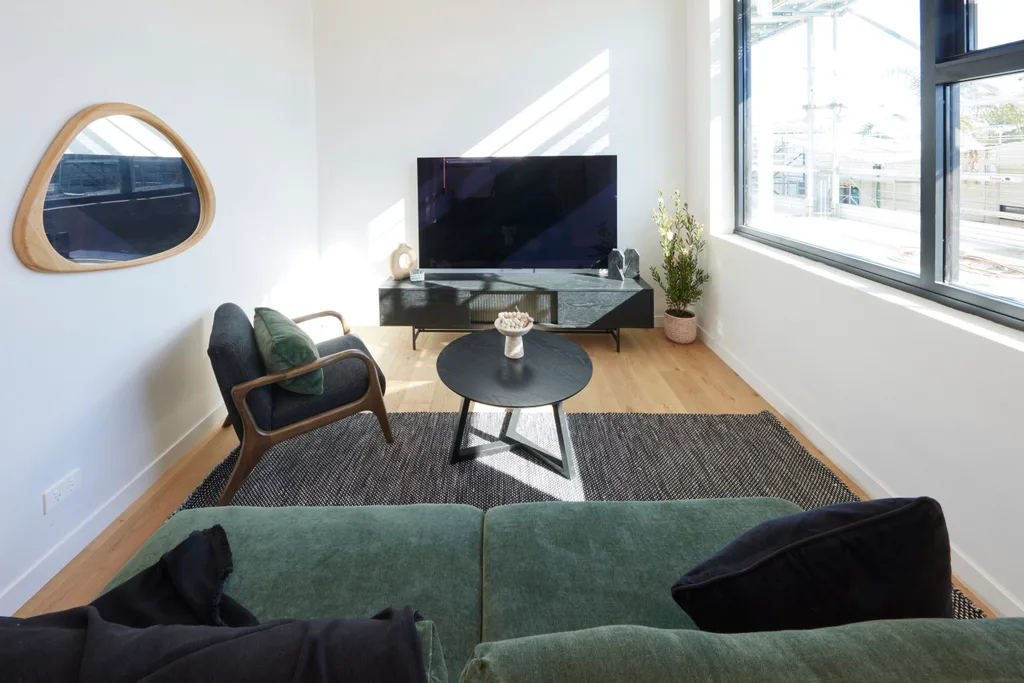
“10 out of 10 for creating the most uncomfortable room we’ve seen this season.”
Marty
5th place: Mimi and Kristian
A floorplan change saw Mimi and Kristian change a downstairs bedroom into a rumpus room with access to the pool and a bathroom beside it. The judges weren’t convinced. “If you’re going to change the floorplan to your advantage, you have to blow us away,” said Shaynna. “This has zero connection to the lifestyle outside.”
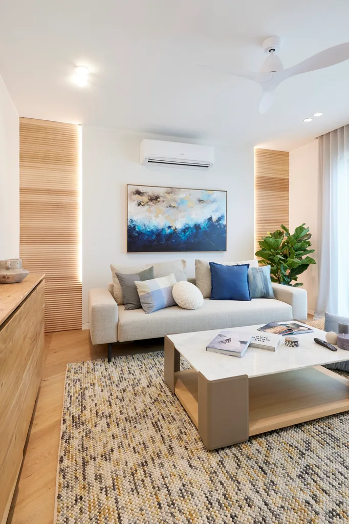
They also thought it should have been more suitable for post-swim hang outs. “Shouldn’t this be a place that’s pool friendly? If you have a plunge pool there and you want to come in and watch TV and play games, don’t you want surfaces that kids can be in their bathers?” said Shaynna.
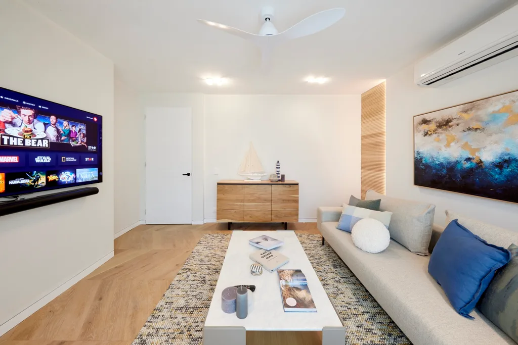
Even the styling wasn’t going down well. “It’s so basic,” said Darren. “I haven’t seen a room with this many things that I like separately that look so boring together. This is a nice couch, it’s a great coffee table but it’s ‘meh’.” Failing to finish their second room left the pair in last place.
Score: 12.5/30
Tune into The Block 2024 on Sundays at 7pm and Mondays, Tuesdays and Wednesdays at 7.30pm on Channel 9 and 9Now.
Take a tour of all The Block holiday houses so far
Week 5: Main bedrooms and walk-in robe reveals
Week 8: Living and dining reveals
In case you missed it:
This article originally appeared on Home Beautiful and is republished here with permission.


