Living and dining room week is a big one for The Block contestants. The pressure is on as it’s the most pivotal interior space they do during the season. It affects the overall impression of their houses and how they perform at auction.
This area needs to impress design-wise but it’s also difficult to pull off such a large transformation in just one week. “Some of the living and dining areas are bigger than the average two bedroom apartment,” Scott Cam shared of the open-plan spaces in the Phillip Island holiday houses.
After the previous week’s controversial guest ensuites, most of the teams played it safe. Even Kylie and Brad were restrained with their moody aesthetic, but it worked in their favour.
Leaving the bold neons and ill-fitting Art Deco details behind resulted in a winning room for the pair, scoring a perfect 10 from judges Shaynna Blaze and Marty Fox. “Quite frankly, this has been my favourite room of The Block this season,” he said.
As for the rest of the teams, we’ve highlighted the key mistakes they made in living and dining room week and the tweaks that would elevate their spaces.
FAIL: Lack of contrast
It was a whole lot of white, cream and beige in Maddy and Charlotte’s house this week. “That’s vanilla,” said Shaynna, likening their living and dining area to the most plain ice-cream flavour. “We all have a double scoop, don’t we? Vanilla with pistachio? I need pistachio,” she continued. The room required more contrast to make it really shine and prevent it from feeling like a project home. If everything’s hitting the same note, it feels flat. Unfortunately, this was the case for Maddy and Charlotte’s living and dining room.
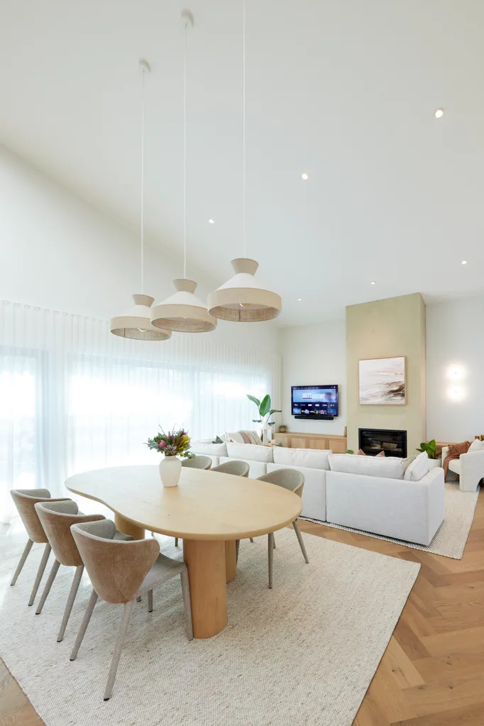
“There’s nothing wrong with vanilla, you just need some sprinkles.”
Darren Palmer
FAIL: Decor too small or too large
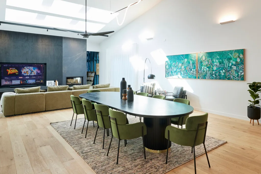
Kylie and Brad’s room may have won, but there was one thing that let it down – a rug that was too small for the table. “It’s the one thing I can fault,” said Darren. Finding pieces that fit a space perfectly creates a more a designer look. Get it wrong and it throws a room off completely. It’s not so easy to do, though – even furniture designer Courtney missed the mark, with pendants in the corner that were too small and too high. Meanwhile, Maddy and Charlotte’s dining table was too tiny for such an expansive space. If your budget allows, custom furniture is the best way to get it right.
FAIL: Fumbling the floorplan
Mimi and Kristian’s layout was unfortunately a “fumble” in Marty’s opinion. “They’ve just gone, let’s take the house that’s got the best outlook and turn everyone’s back to look at that TV,” he said of their decision to place the sofa facing away from the view. While TVs are considered essential to modern living, good design makes them a focus, not the entire focus – especially in a holiday home. Orientating furniture to optimise the view and conversations is more of a priority when you’re away on vacation.
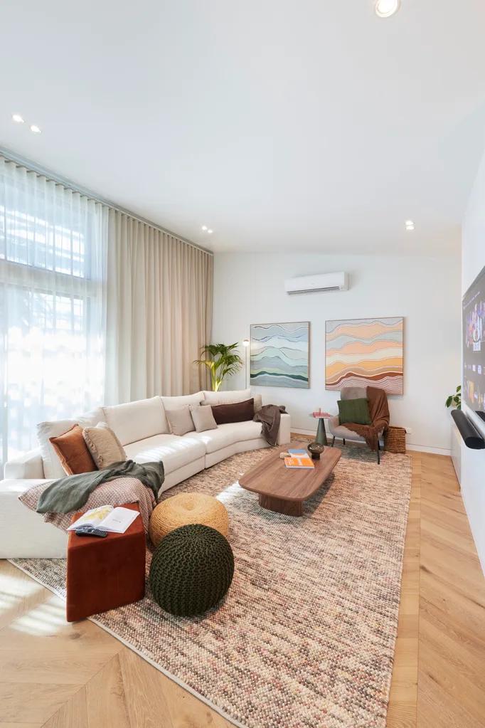
“I’m not coming to the beach for my whole lounge room to be built around a TV.”
Shaynna Blaze
All of The Block 2024 living and dining rooms
Here’s how the teams went in the week eight reveals.
1st place: Kylie and Brad
Kylie and Brad accented their oak floors with a licorice black timber wall and olive green furniture and decor. “It’s unbelievable,” said Shaynna. The ambient lighting particularly impressed the judges. “Not a single downlight in sight,” said Marty. “This is the lighting layout I’ve been hoping to see all day. These wall sconces are perfect. The strip light through here, fantastic.”
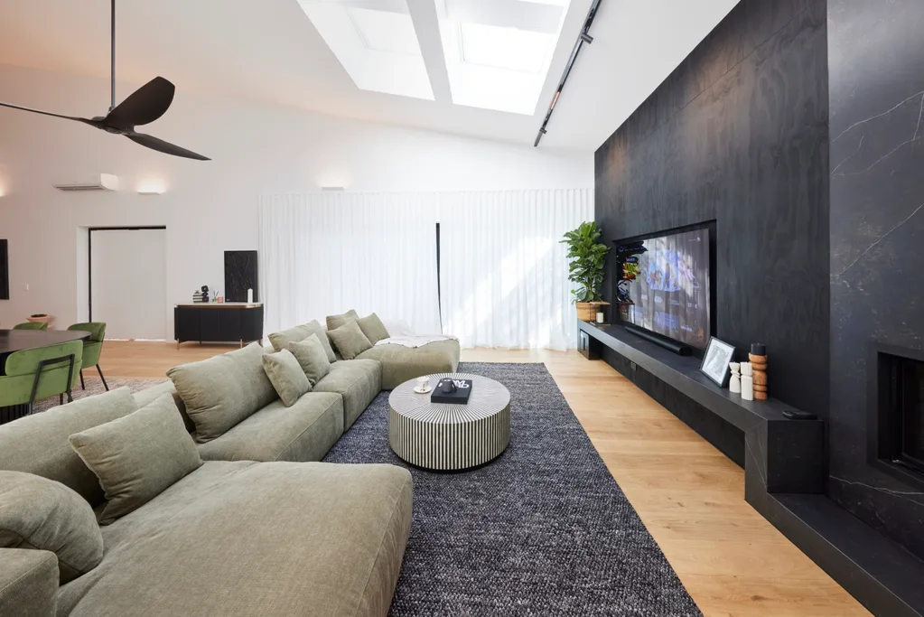
“This dining table anchors the kitchen and the lounge,” said Shaynna. “This is magnificent. This is what happens when you take the time to order a custom table.”
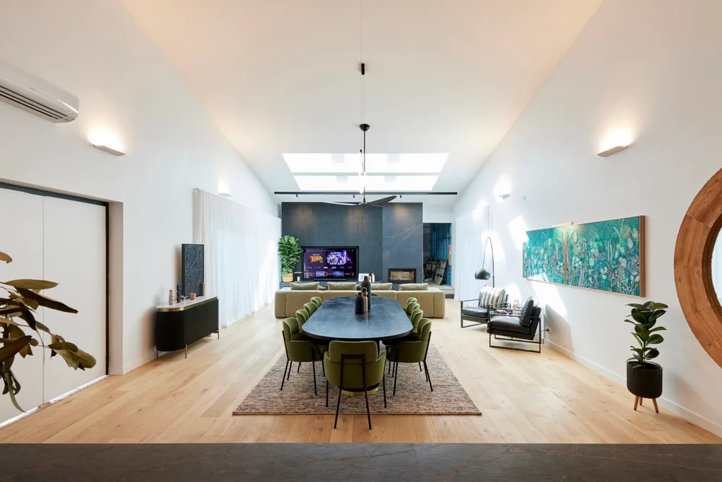
Dekton tiles were installed around the fireplace at great cost, but it was worth the investment. “The palette is really simple – black, green, oak – the end,” said Shaynna, who loved the addition of crushed linen curtains. “They add softness to this really strong, simple palette.”
Score: 29.5/30
“Who knew that licorice ice cream could be this delicious?”
Darren Palmer
2nd place: Courtney and Grant
Courtney and Grant’s room was delivering rum ’n’ raisin flavours, with deep browns and caramel. If only they had planned the fireplace better. “That is possibly the worst position within a room of this size,” said Marty. “No one benefits from it,” agreed Darren. Luckily it was all up from there, with elegant curves and open shelving, lit beautifully. “I love that we have the naturals and the neutrals with a little bit of punch,” said Shaynna.
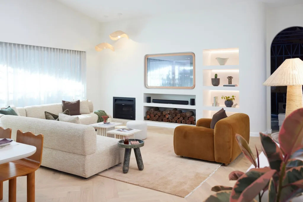
After the striped ensuite debacle, a more pared-back approach was well received. “All the lovely archways, the way they’ve done the niching around the curtains. It gives it a softness and tactility that I really love,” said Darren. “They’ve softened things that need to be softened and sharpened things that need to be sharp. It’s a lovely contrast.”
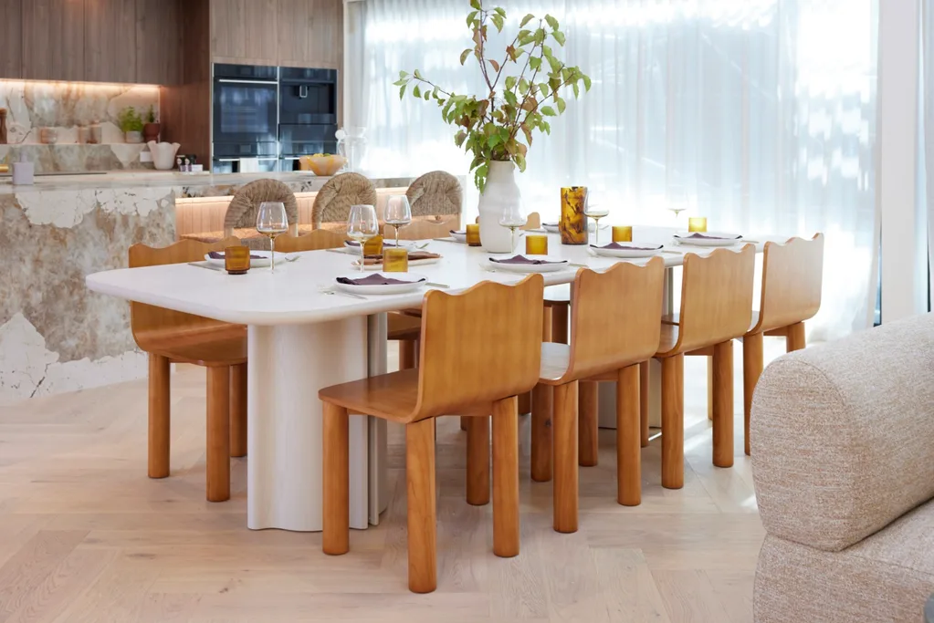
The dining chairs, designed by Courtney’s furniture business, The Lazy Stylist, were a hit. “They’re cute as hell,” said Darren. “The colour is beautiful, the form is beautiful.”
Score: 26.5/30
“They like my dining room chairs. That’s just made my day.”
Courtney
3rd place: Maddy and Charlotte
Being vanilla isn’t all bad – Maddy and Charlotte’s living and dining space was cohesive and had plenty of marketing pull. “Vanilla is a universally-loved flavour,” said Marty. The natural log fire was also a “phenomenal” choice in his opinion. The palette appealed to Darren, but he would have liked a bit more drama. For Shaynna, it was the styling that let them down, needing to be more elevated.
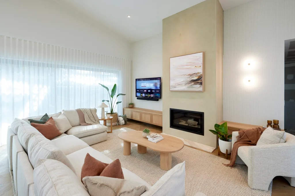
“It feels friendly and natural, encompassing and inviting,” said Darren. “Texturally, they’ve got it right,” added Shaynna. “I love the big texture in the rug, the smaller texture in the couch and texture in the timber.”
Score: 25.5/30
4th place: Ricky Haydn
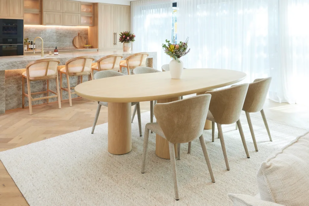
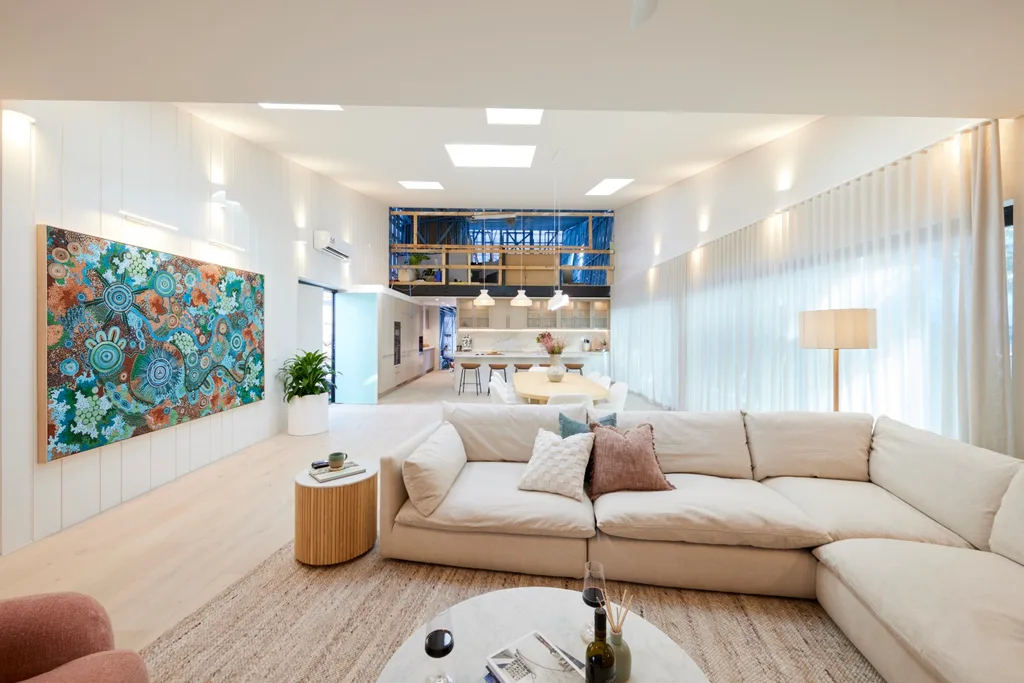
“This is about five metres bigger than the previous houses,” said Darren of the boys’ living and dining area. There were some tweaks that needed to be made to the layout. “It feels quite heavy,” said Darren, as pieces were loaded towards the living area. Marty felt the dining table needed to run in the other direction to give more space to move around it.
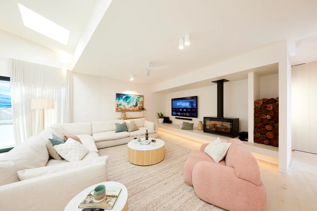
Shaynna would have liked the dining table to be a darker colour so everything wasn’t all the same tone. “You look at those beautiful stools, the leather stools [in the kitchen]. The table needs to be that colour,” she said.
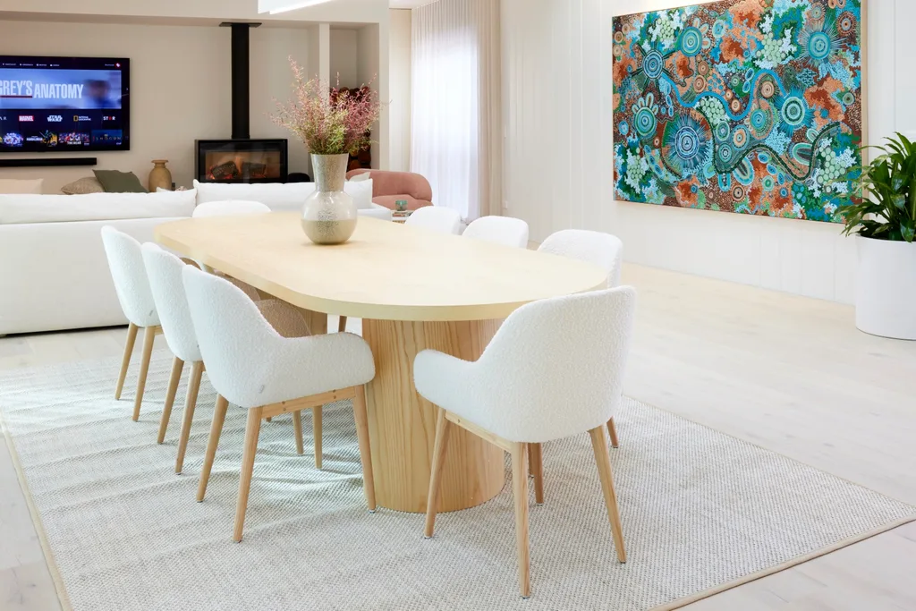
The biggest statement in the space was the artwork from the Cungelella Art collective’s Artist Lane. Worth $20k, the boys won it in a challenge. “That is absolutely stunning and perfect for this space,” said Shaynna. The James Hardie oblique panels on the wall amped up the holiday beach vibe while the Cosentino stone under the fireplace was a little luxe – but not quite enough. “They’ve done a beautiful job. It’s just a bit basic for me,” said Shaynna.
Score: 25/30
5th place: Mimi and Kristian
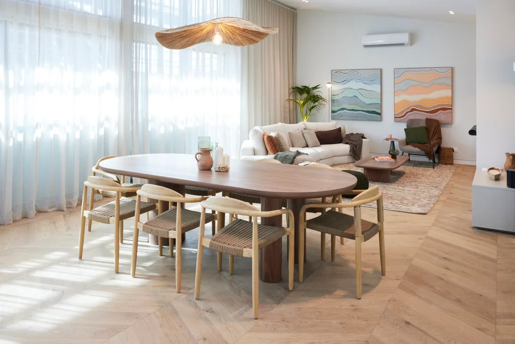
Newlyweds Mimi and Kristian received the worst score of the season. The only team with a two-storey home, their floorplan left them with the smallest living and dining area. What they lacked in space, they didn’t make up for in the design. “When you have a smaller space, you need to balance that by upping the luxury in the materiality,” explained Marty. “There’s no sophistication. For me it’s the biggest let down of the day.”
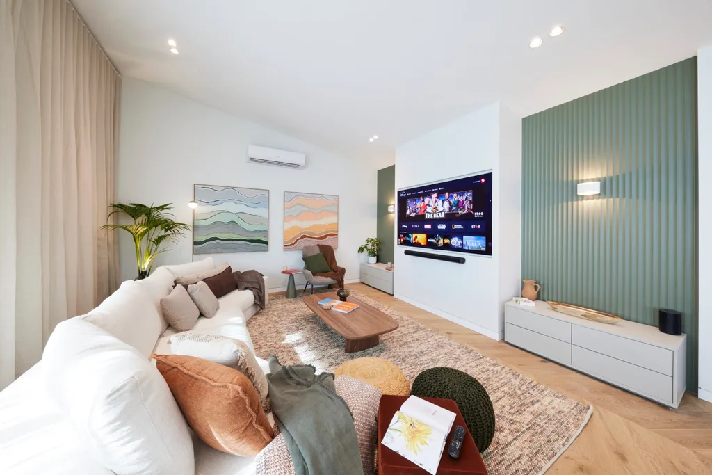
The couple went with a soft green laminate feature wall and walnut table that was in the wrong spot for Shaynna. “I find this table a barrier,” she said. “You’re walking in here and you’re going straight into the dining table. I would have preferred a round table.” Let’s hope the early frontrunners can get back their winning streak.
Score: 23.5/30
Tune into The Block 2024 on Sundays at 7pm and Mondays, Tuesdays and Wednesdays at 7.30pm on Channel 9 and 9Now.
Take a tour of all The Block holiday houses so far
Week 5: Main bedrooms and walk-in robe reveals
In case you missed it:
This article originally appeared on Home Beautiful and is republished here with permission.


