Choosing the perfect paint color for your kitchen is never an easy decision, and it's all the more important when your space is north-facing. "Beyond picking a color you love, understanding how light interacts with your chosen shade is paramount," explains Helen Shaw from Benjamin Moore. "One of the most significant factors influencing how a paint color will appear in your kitchen is the orientation of the room. Selecting a paint color that harmonizes with the orientation of the light in your space will make the difference between a room that feels inviting and one that falls flat."
Now, despite what people may have you believe, a north-facing room is not a kiss of death. Of course, we all love the idea of a gorgeous kitchen flooded with light, but unfortunately, this can't always be the reality. And while you can't control how much light your kitchen receives, you can control how you design it.
All colors behave differently depending on the level of light surrounding them, so when choosing colors for north-facing rooms, it's important to understand that colors tend to present as slightly cooler than they would in other spaces due to the lack of direct, bright sunlight. Whether you choose to counteract this or lean into it, though, is down to you. But before you make your decision, take a look at what the experts have to say on the matter — these are the three kitchen colors that will work particularly well for your north-facing space.
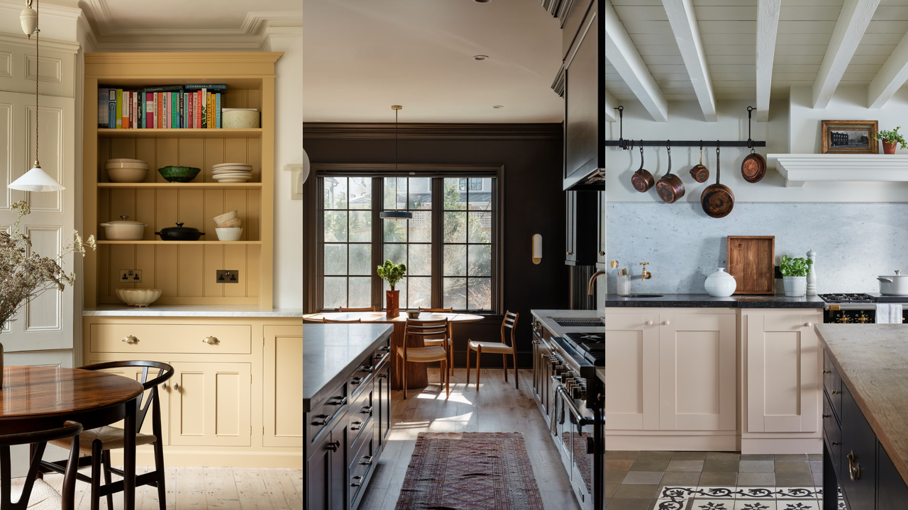
1. Deep Greens and Blues
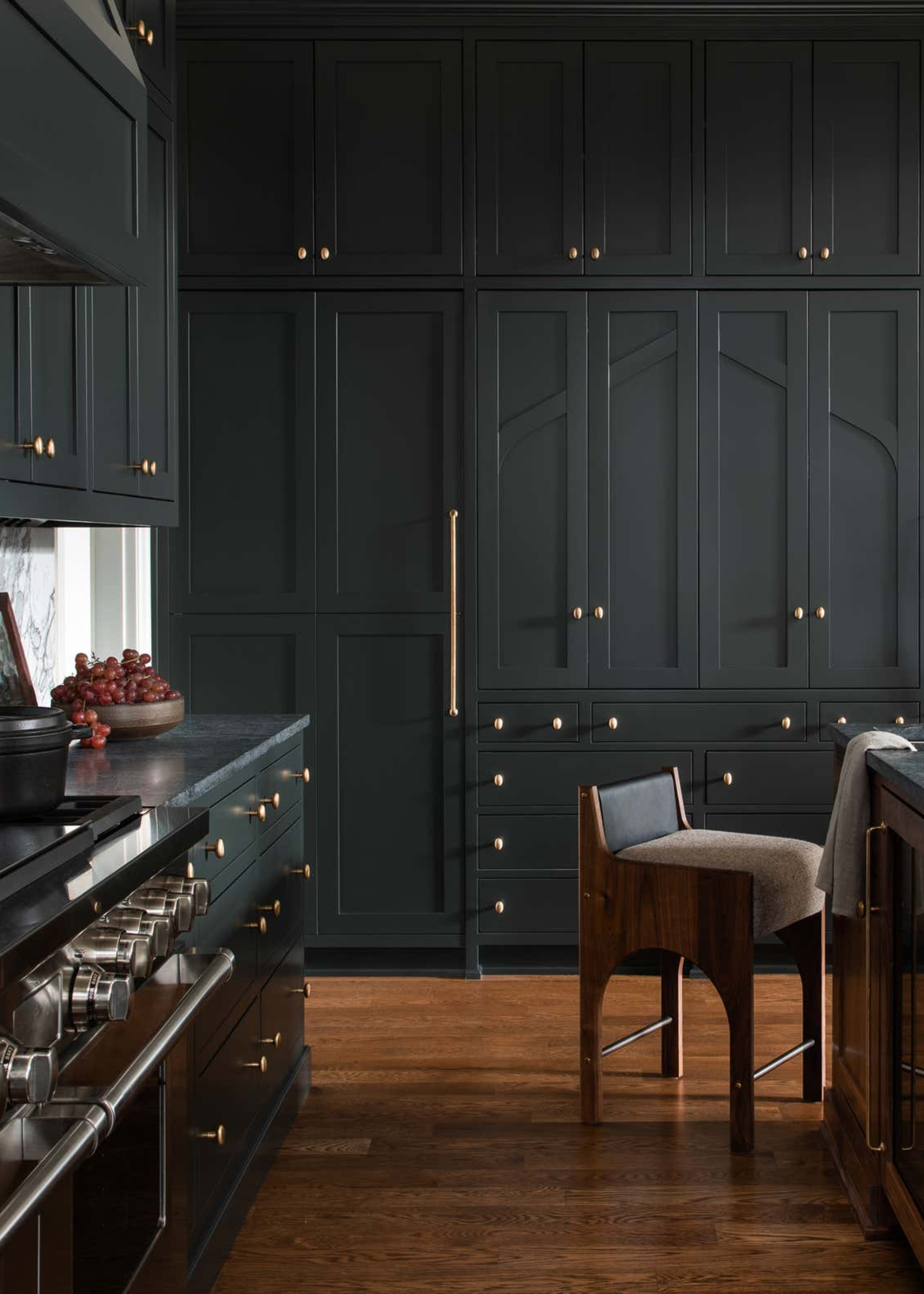
As northern-facing rooms naturally tend to feel a little darker than your typical kitchen, you'll often see people shy away from using any deeper, richer tones, for fear of making the space seem even darker than it already is. However, instead of desperately trying to work against the nature of your room, you may find accepting this and leaning into it to be a more effective and even liberating approach. As Patrick O'Donnell, brand ambassador at Farrow and Ball, says, "If you are prepared for more drama, then lean towards darker colors."
While traditional, outdated design rules will steer you towards lighter, warm tones, discouraging anything too dark or cool, "Colors like dark greens and blues, and graphite or charcoal are still safe to use," explains Allison Lynch from Roundhouse. The power is in how you style them, introducing warmth through your kitchen flooring and accessories; she suggests pairing these moody-toned cabinets with timber floors for "an inviting, warm ambience."
If you are nervous about your kitchen feeling too heavy, Allison recommends contrasting your dark cabinets with a lighter kitchen worktop: "The worktops will bounce the light around, and the number of floor-to-ceiling cabinets should be fewer with the danger of closing in the space," she says.
As beautiful as a light, airy white kitchen can be, there is a special allure to a darker, moodier kitchen, too; and when your kitchen is already north-facing, this is all the easier to achieve.
Railings is a true tried-and-tested favorite when it comes to building intense, moody color schemes. A soft, blue-toned black is intense without being heavy.
Named after its chameleonic nature, this shade shifts between blue, black, and green, depending on its surroundings.
This sophisticated forest green offers a soothing, relaxing look that is perfect for a north-facing kitchen.
2. Light, Warm Neutrals
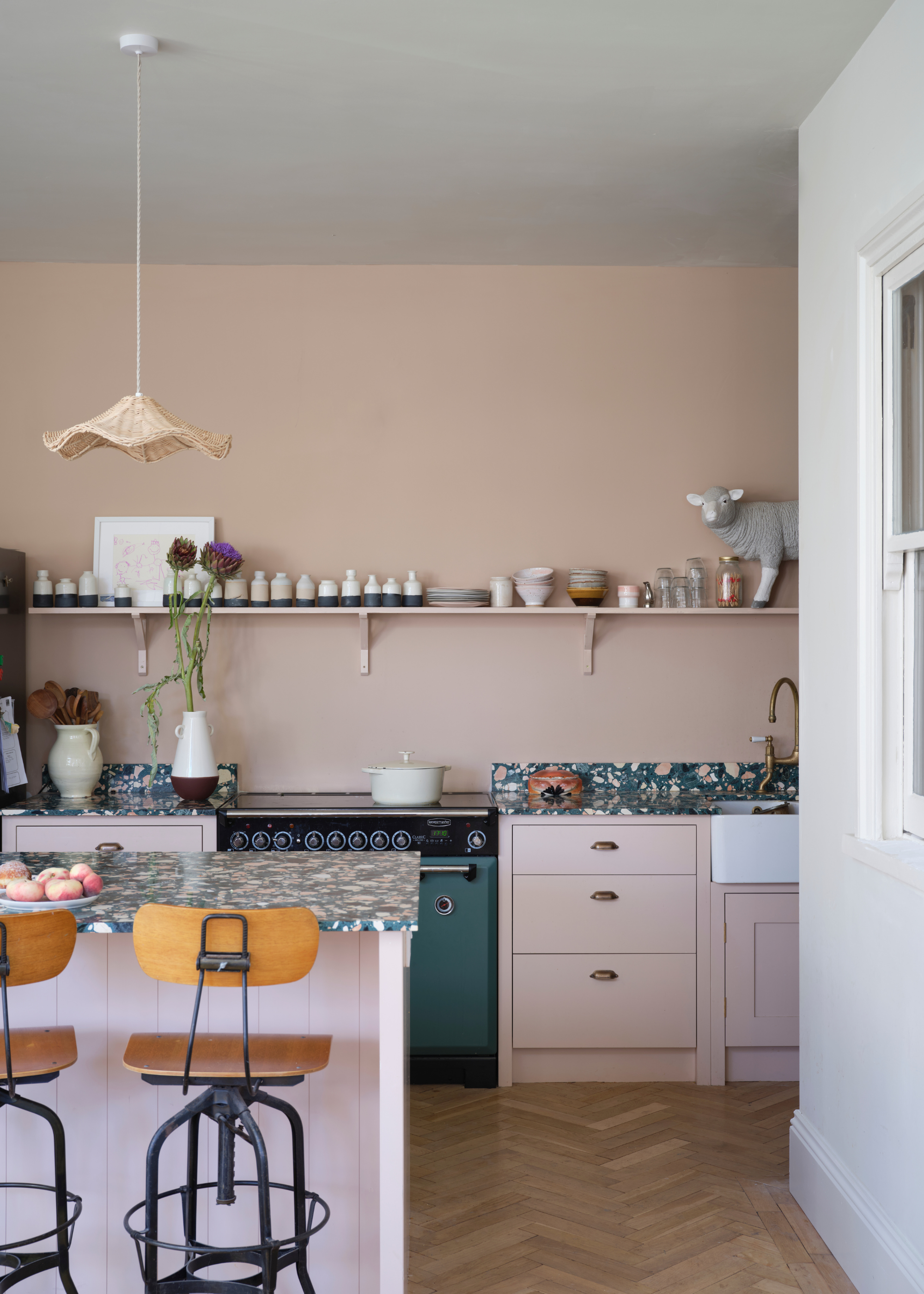
"If you prefer paler, more neutral palettes, always opt for shades with a warmer undertone," urges Patrick. Although cooler undertones can work when using a darker palette, with lighter, softer tones, these cool hues become far more noticeable, making your kitchen feel unwelcoming.
Instead, search for warm-toned neutrals, like soft clays and earthy greiges. Not only are these shades super easy to style, but they bring a subtle yet impactful sense of warmth into your space, which is especially important in a north-facing kitchen.
"Walls smothered in a gentle, earthy pink like Templeton Pink will give you a delicious and delicate warmth," says Patrick.
Plus, while it's certainly true that these colors work beautifully in sunlight-deprived rooms, their appeal stretches far beyond this. Dubbed the 'new neutrals,' these warm, earthy tones couldn't be more on trend.
Pink doesn't have to feel flouncy or prim, this warm, beige-toned pink can look surprisingly deep in low-light spaces.
Inspired by the countryside charm of Soho Farmhouse, this soft beige is lifted by yellow undertones, giving it a comforting warmth.
The OG warm neutral, Elephant's Breath, is arguably one of the most iconic paint shades, and for good reason. This warm, soft gray is a reliable go-to.
3. Tones of Yellow
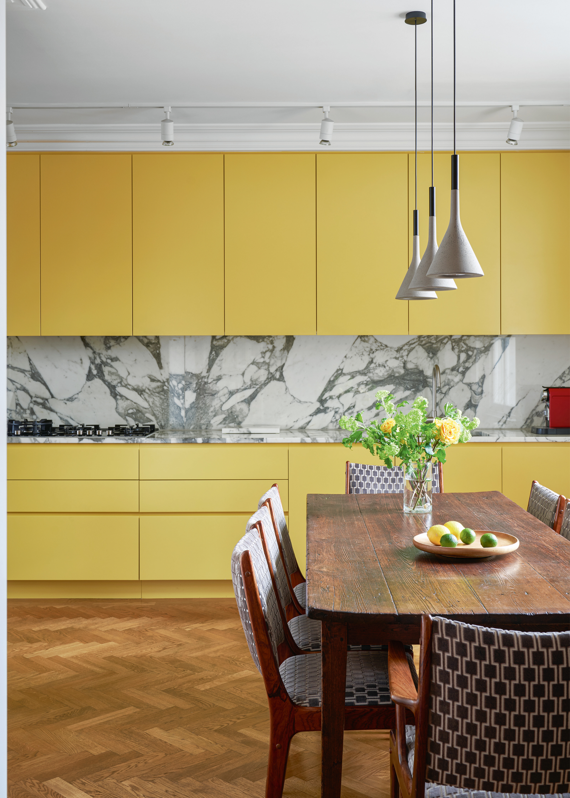
Since your north-facing kitchen won't benefit from the sunny warmth of natural light, why not create that sunshine-feeling with some yellow-toned paint? Although it may sound intimidating at first, a yellow kitchen can look surprisingly chic, and it's an easy way to bring a little bit of joy into your day-to-day.
"You can drench your space in this color to bring brightness, warmth, and sunshine into rooms that lack natural light," explains Ruth Mottershead, creative director at Little Greene.
Or, if you want to take it up a notch, "You could also consider double drenching, by introducing related honey and caramel hues with varying undertones on the ceiling, woodwork, and cabinetry," she adds.
Even if you don't want to go for a full true-yellow paint, even just a yellow undertone can do wonders for your north-facing kitchen.
This cheerful yellow is bold without being overwhelming; it's a sweet, sunshine shade that's guaranteed to bring a smile to your face.
An intense, rich mustard shade, yellow-pink is an earthier take on a yellow paint, and looks wonderful in north-facing kitchens.
Butter yellow may have been the color of the summer, but we're not over it yet. This energizing, uplifting paint has a soft, creamy finish that would look beautiful on your kitchen cabinets.
Before you commit to a paint, it's always worth sampling it first. As Ruth says, "Sampling is essential when it comes to choosing color; the effect of natural light, which is influenced by the orientation of your space, along with artificial lighting, is a key consideration when thinking about whether to choose warm or cool tones."
As much as natural light will have an impact, so will your kitchen lighting. "It’s amazing how much tones change from natural to artificial light, and from direct sunlight to cloudy conditions," says Ruth.
To make sure you're up to speed on the next and best in design, sign up for the Livingetc newsletter, and the news will be delivered straight to your inbox.