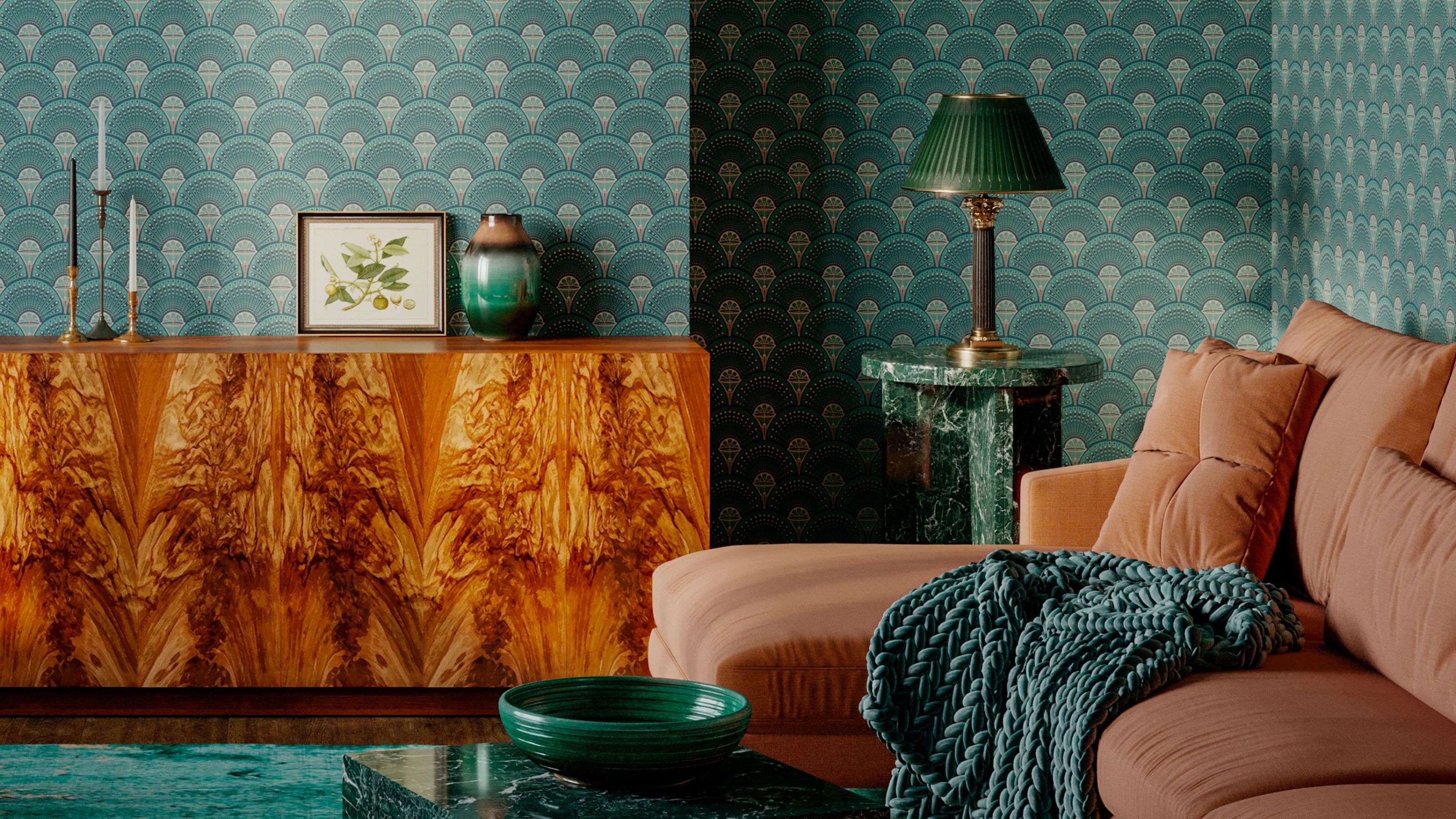
Art Deco color palettes are not subtle — and that’s what makes them all the more exciting (even a century after the style first emerged) as a contrast to minimal and restrained palettes often seen in modern homes. And while not everyone is keen on Gatsby-level glamour, one way to dip into the drama is to set a cinematic tone by way of color.
The palettes most associated with the Art Deco interior design movement were bold, rich, and luxurious. “In the 20s and 30s, this often meant dramatic contrasts — think deep emerald greens paired with inky blacks, or vibrant teals set against rich golds and silvers,” says Tom Kennedy, co-founder at Divine Savages, who produce wallpapers with plenty of Deco attitude. “Jewel tones were particularly iconic of the era, with green standing out as a color that symbolized both opulence and a growing appreciation for the natural world.”