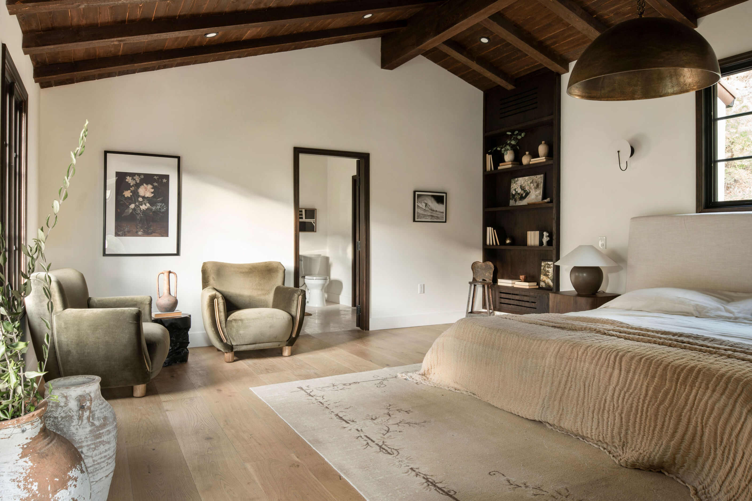
If you're in need of a bedroom makeover, it can be overwhelming to know where to start. It's hard to feel inspired by outdated furniture and paint choices you made years go, but these beautiful bedrooms prove that it's possible to see past the old-fashioned interior and breathe new life into your out of style bedroom.
We've been putting together lots of before and after stories on Livingetc recently, but these 11 bedrooms have seriously impressed the team, transforming spaces from old and tired into functional and super stylish. If you're lacking inspiration for your own bedroom, you've come to the right place. Here are our favorite modern bedrooms that have had a serious glow-up.
1. This plain bedroom made gloriously dark
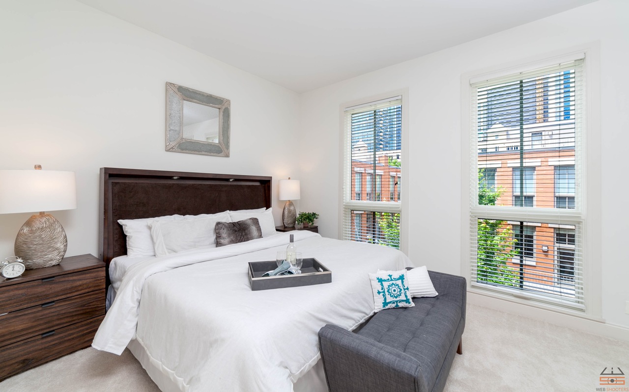
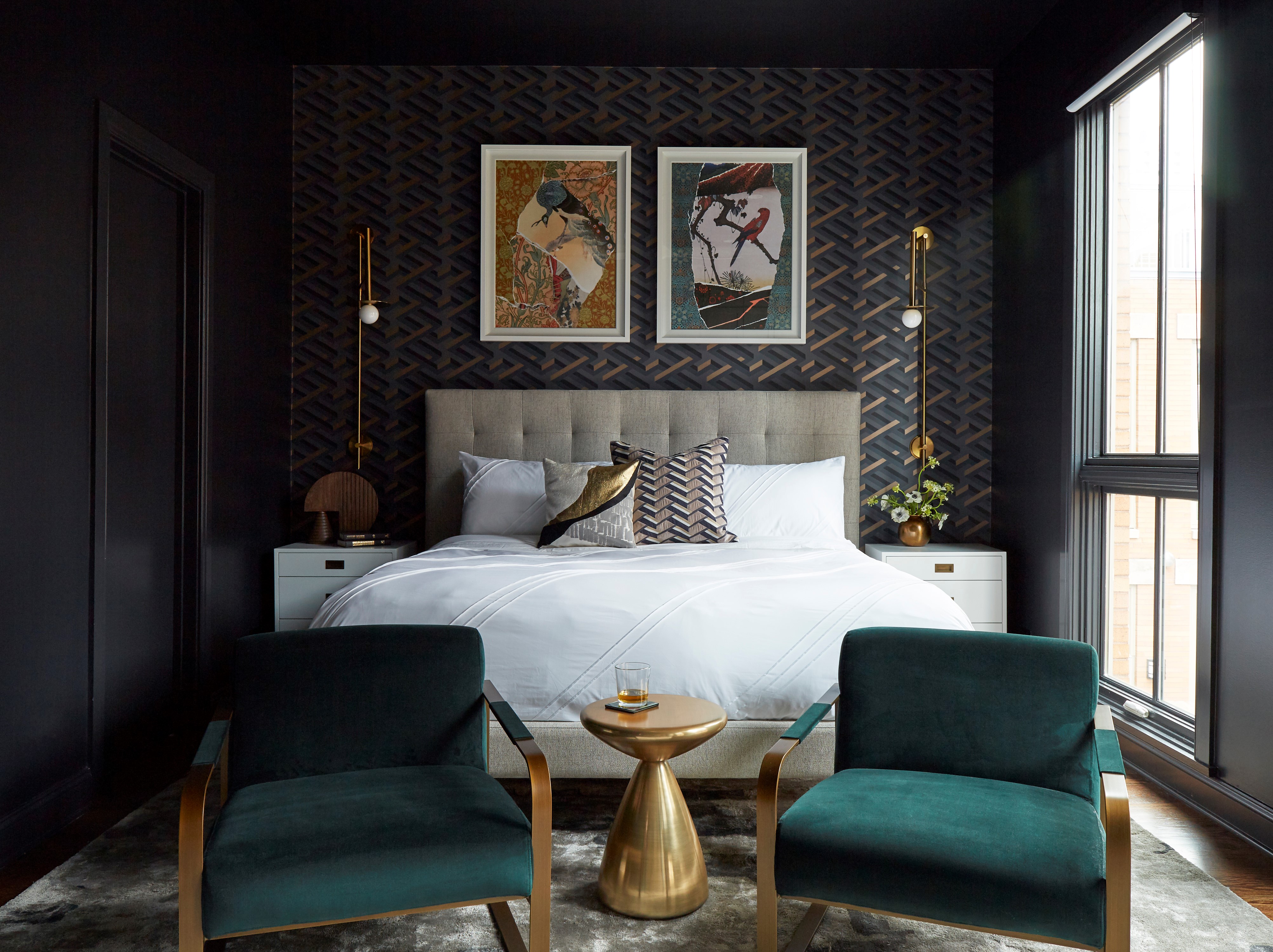
While there was nothing really wrong with this light, bright bedroom, the owners of this home had a different idea for it. 'When the client came to me to discuss their project, they asked me to create a primary suite that had drama and would help them sleep better,' says Mark Schubert of Chicago-based Phillip Harrison Interiors. 'I decided to go dark with the design to embrace the drama that the client wanted but also to create an environment that would let them rest better. This was achieved through dark paint, blackout shades, and luxurious materials.'
'The bedroom wallpaper is by Cole & Son and was the starting point for the design,' Mark adds. 'We came across this pattern and loved that it had various shades of dark blue with hand-blocked metallic gold within the design and it added that artisan appeal to the space.'
2. This old fashioned room that evolved into a serene space
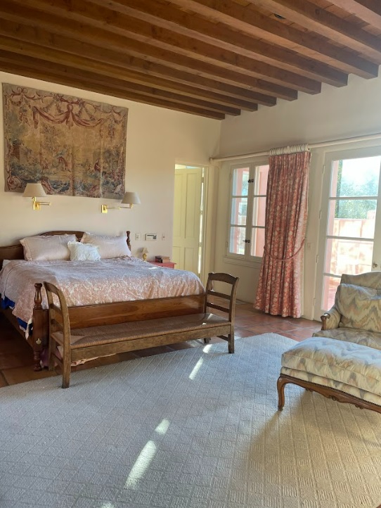
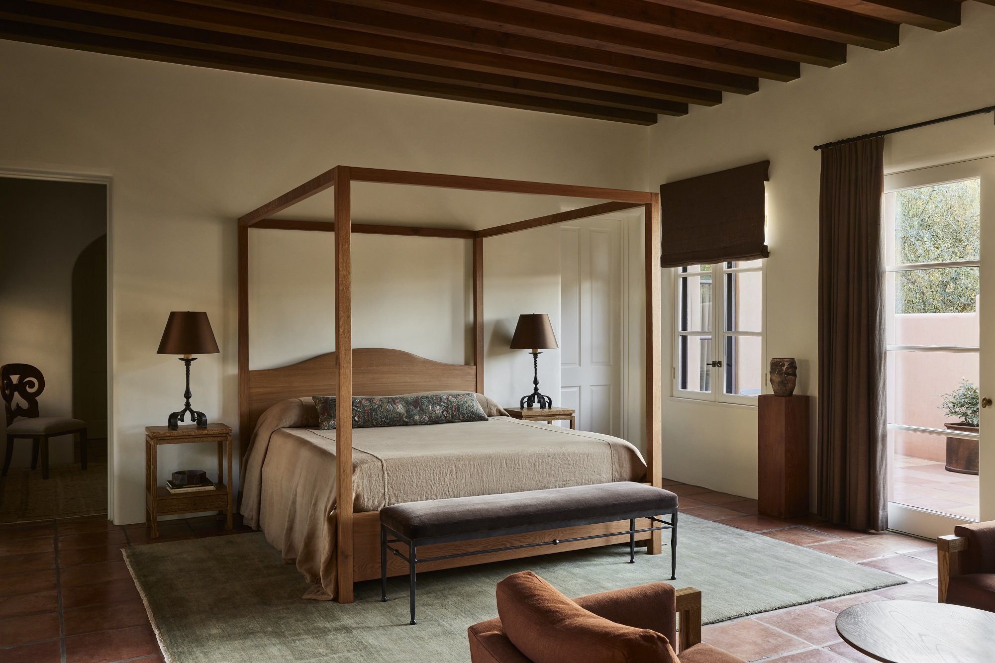
Designer Corinne Mathern put her stamp on this ranch-style vineyard with her signature calming aesthetic. The space was tired and outdated, but with timber beams and surrounded by inspiring views of nature, there was plenty of potential that the team were able to successfully unlock.
'The clients wanted the property to have a calming feel the moment a guest enters,' explains Corinne. 'The aesthetic brief was a designer’s dream - design an elegant and modern home that is welcoming and warm.'
Corinne was able to take that brief and run with it. 'In particularly, this bedroom felt frantic,' says Corinne - with fussy upholstery that didn't blend together and fusty decor. 'Now it feels soothing,' she says.
3. A garish bedroom that was given a peaceful transformation
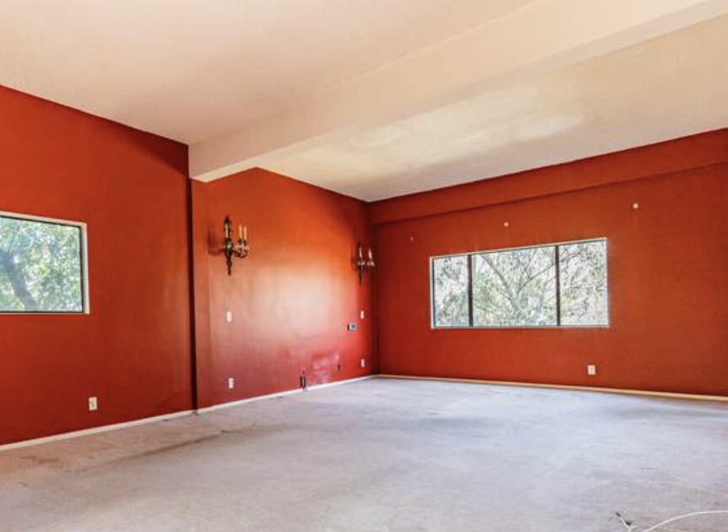
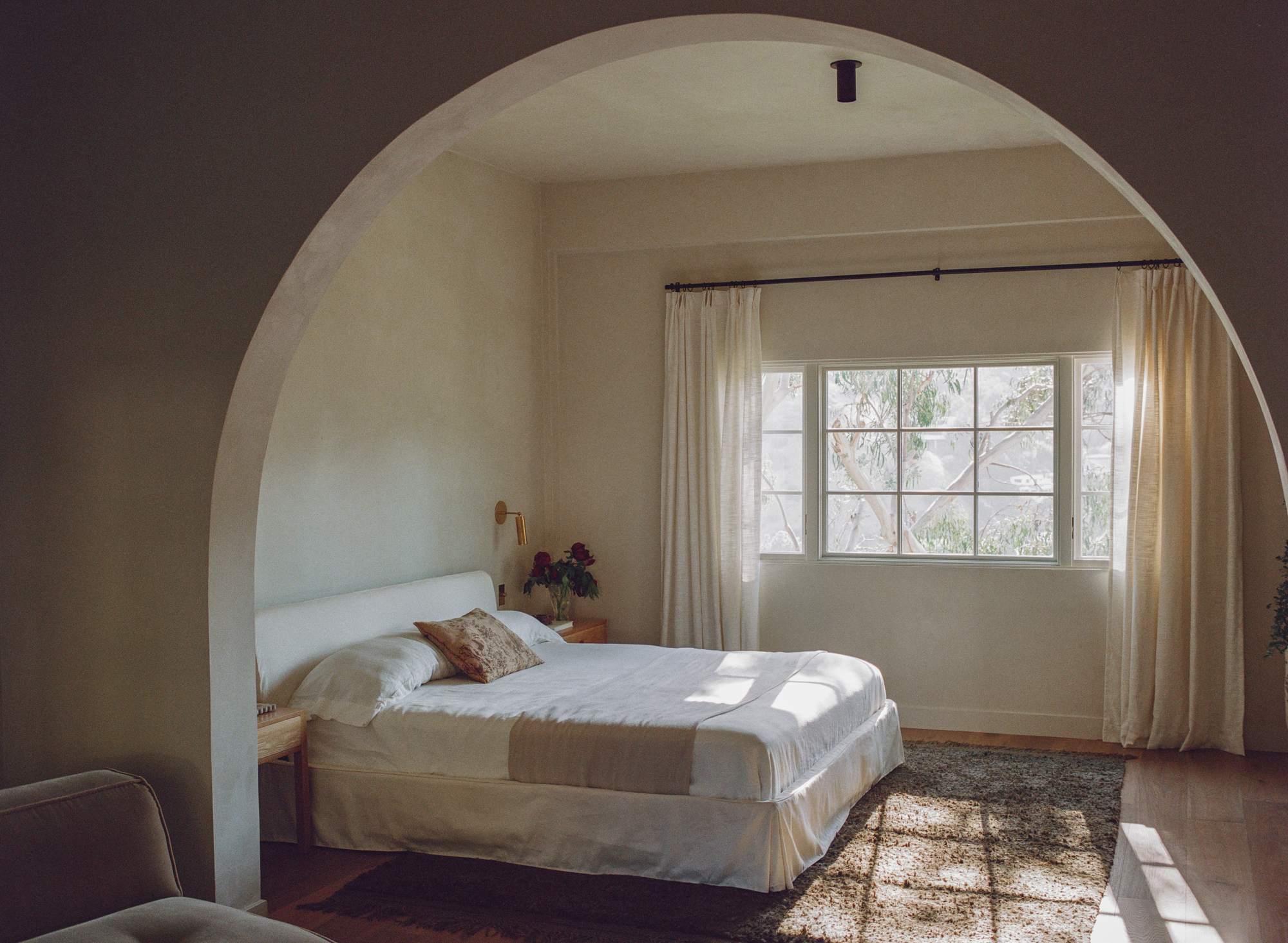
Red is a bold paint color for any room, but it's particularly difficult to get right in the bedroom. The shade holds so much energy and vibrancy that it's not necessarily conducive to a good night's sleep. Design duo Ome Dezin were able to strip back the garish paint to create a calming aesthetic, infusing the space with relaxing bedroom paint and decor.
'The main colors of the home are terracotta, navy blue, natural wood tones, creams, white and a bit of green and lighter blue,' explain Joelle and Jesse. 'A base of earth tones will always provide a calming space.'
The bedroom nightstand is one of the only spaces for decor. 'For bedroom nightstands we tend to declutter by having wall sconces as your bed side lights which allows for more space. The simpler the better, a book and simple vase with flowers, a beautiful glass for water is really all you need.'
4. A primary bedroom suite transformed into a contemplative urban cabin
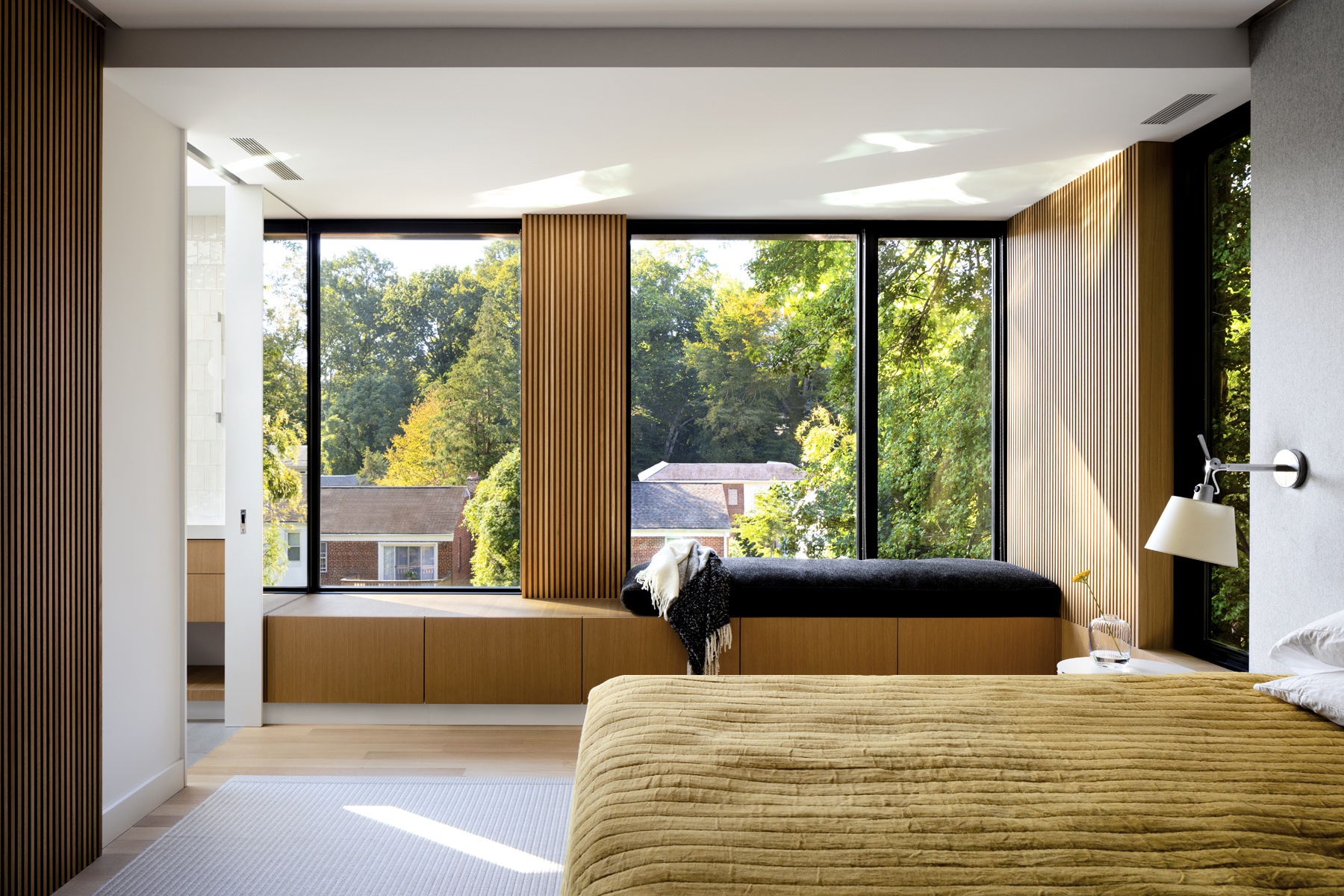
This bedroom renovation from Washington-based Colleen Healey Architecture was all about embracing the views. Before renovation, the space consisted of a narrow bedroom and a dark unused transition space.
Healey's goals were to create a bedroom better connected to the outdoors, using an organic material palette and to provide privacy while still taking advantage of a southern exposure for plenty of natural daylighting.
The whole suite is clad in a warm white oak wrapper, punctured by windows and a wool wrapped headboard wall. The textured wood walls help frame views to the trees and houses below.
'Simple concepts like material continuity, skylit daylighting, and selective reflective and mirrored surfaces bring in light in unexpected ways,' says Colleen.
5. This bedroom where wooden beams were embraced for a Spanish aesthetic
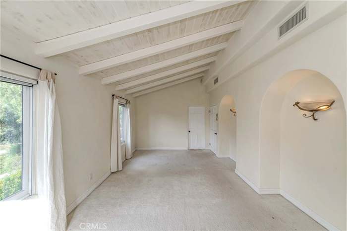
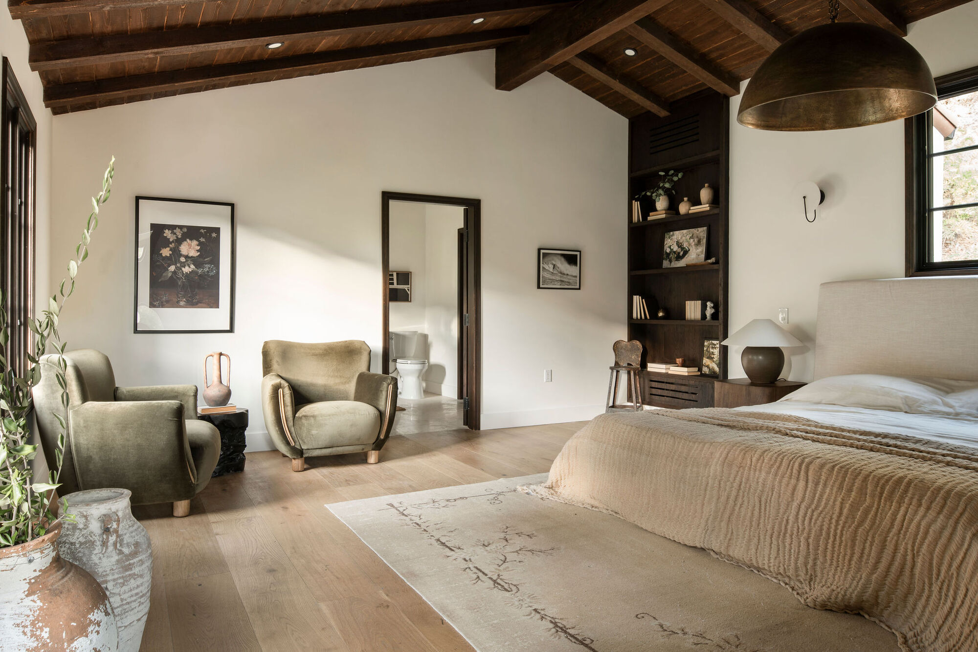
Los Angeles-based House of Rolison transformed a newly remodeled four bedroom home in Beverly Hills, and the bedroom is one of our favorite moments.
The brief involved embracing the Spanish feel and the design team set about honoring the period in which the home was built by encouraging visitors to look up and take in the beautiful wood bedroom ceiling.
The wood was once painted over but the team stripped them back to make them an architectural feature. Amanda Leigh and Taylor Hahn infused a lot of natural light into the room too, opening up the space and giving it an elevated and warm feel through textured decor.
6. This dated bedroom that was given a coastal-style revamp
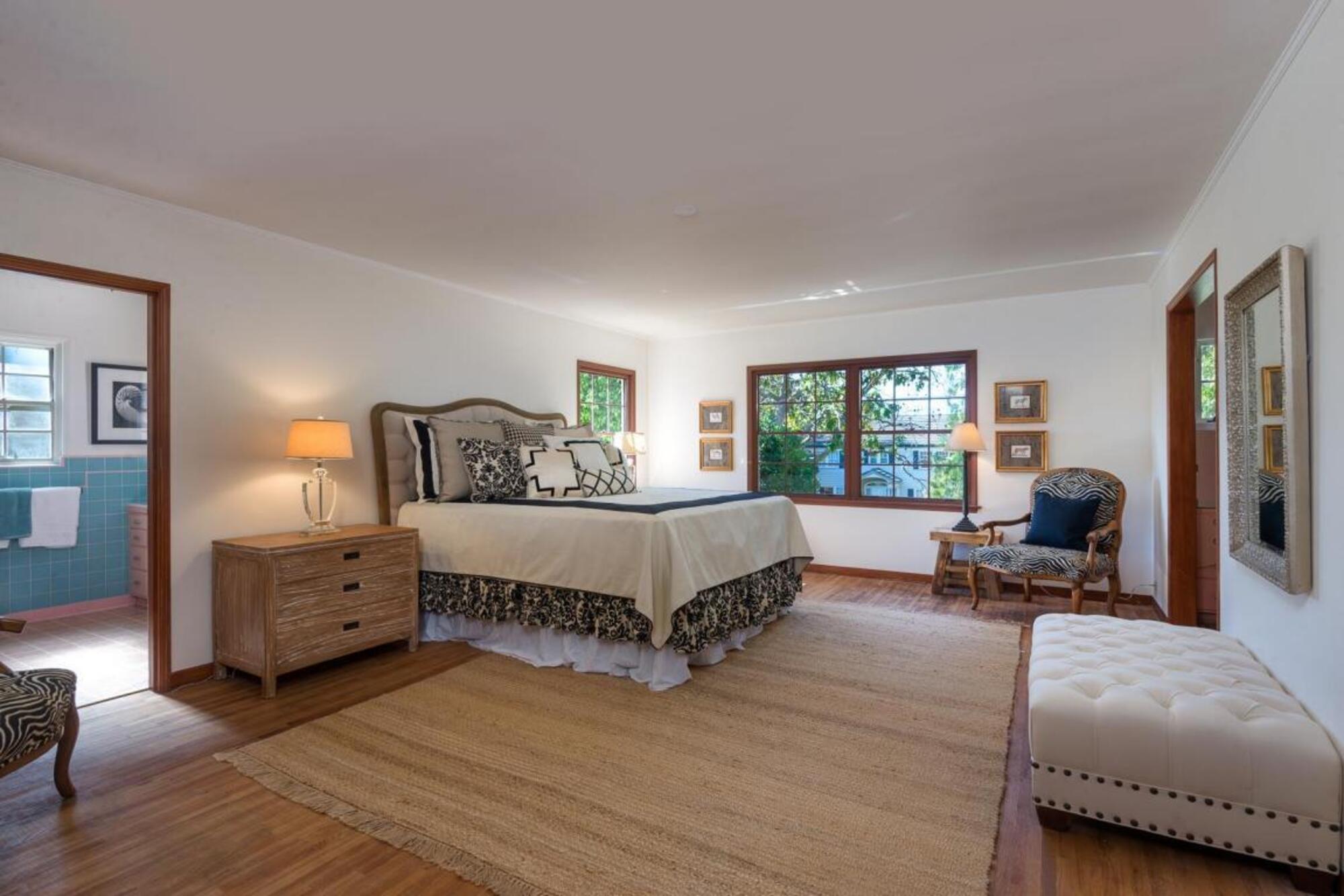
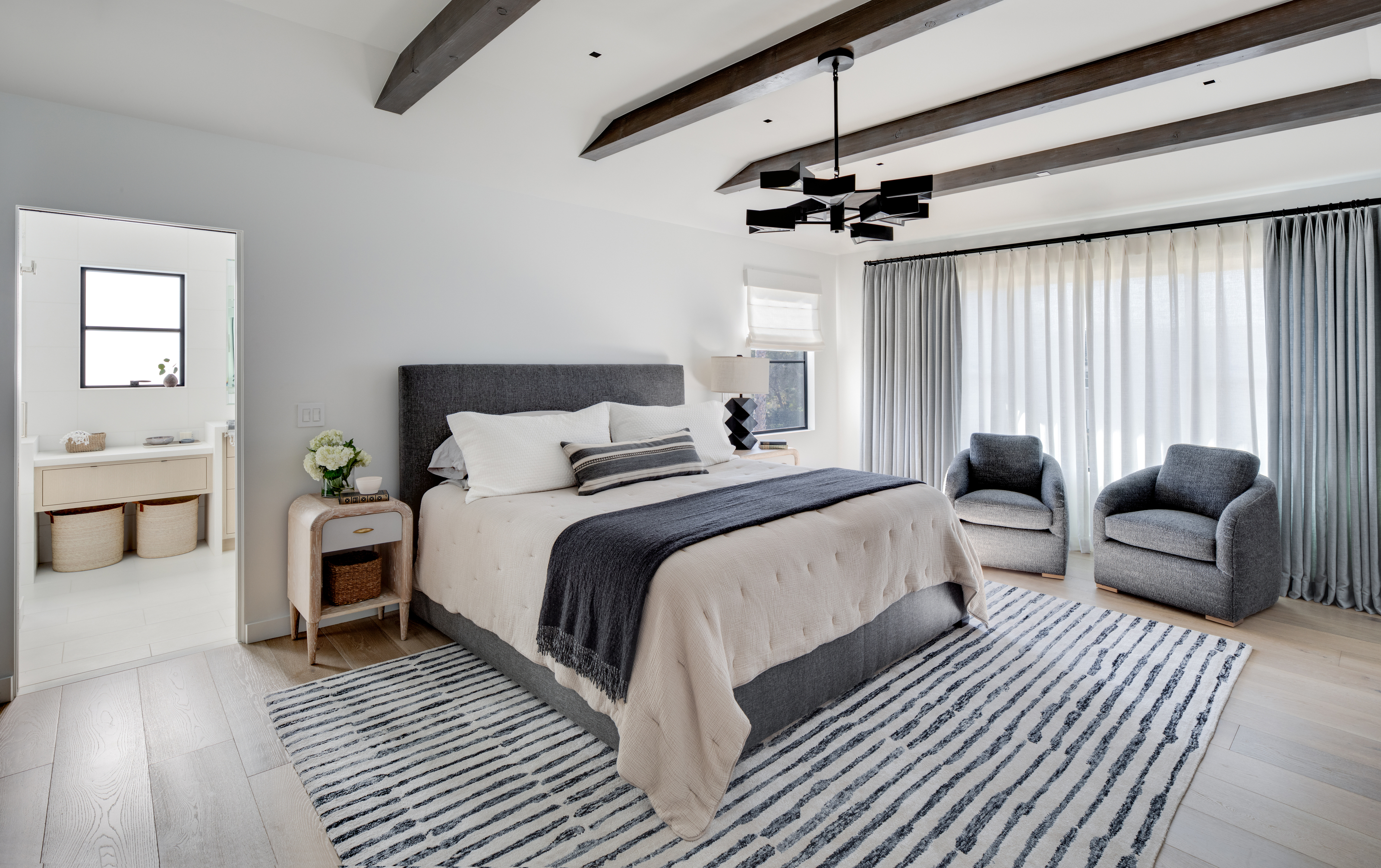
This before and after had a distinctive 1950s feel that was reworked and brought into the modern day with a coastal grandmother twist.
The master bedroom in particular went from drab to dreamy, with added timber beams in the ceiling that honored the previous cottage-core aesthetic, and enhanced the views.
The window trim was a dark wood but has been lifted with a cool color scheme that makes the space feel breezy and airy. 'We used subtle hues in the fabrics and pillows and accessories,' says Santa Barbara interior designer Jessica Risko Smith. 'This home is in a California beach town so we wanted to reflect that, but with a very sophisticated approach.'
7. A child's bedroom turned monochromatic guest suite
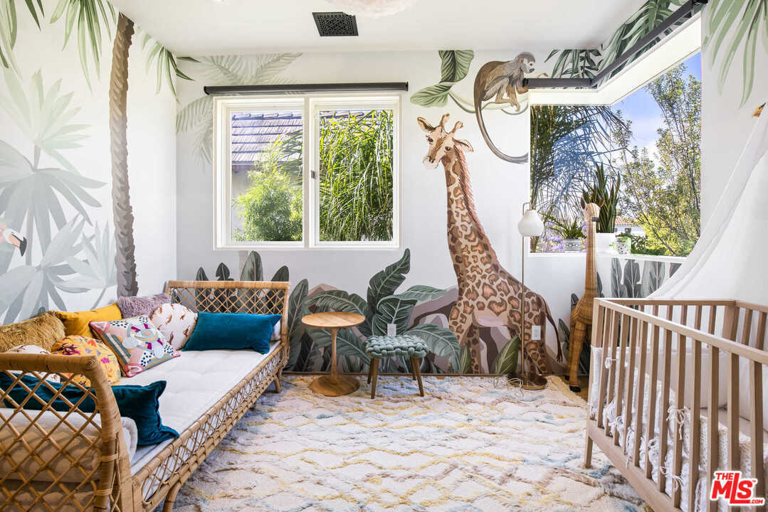
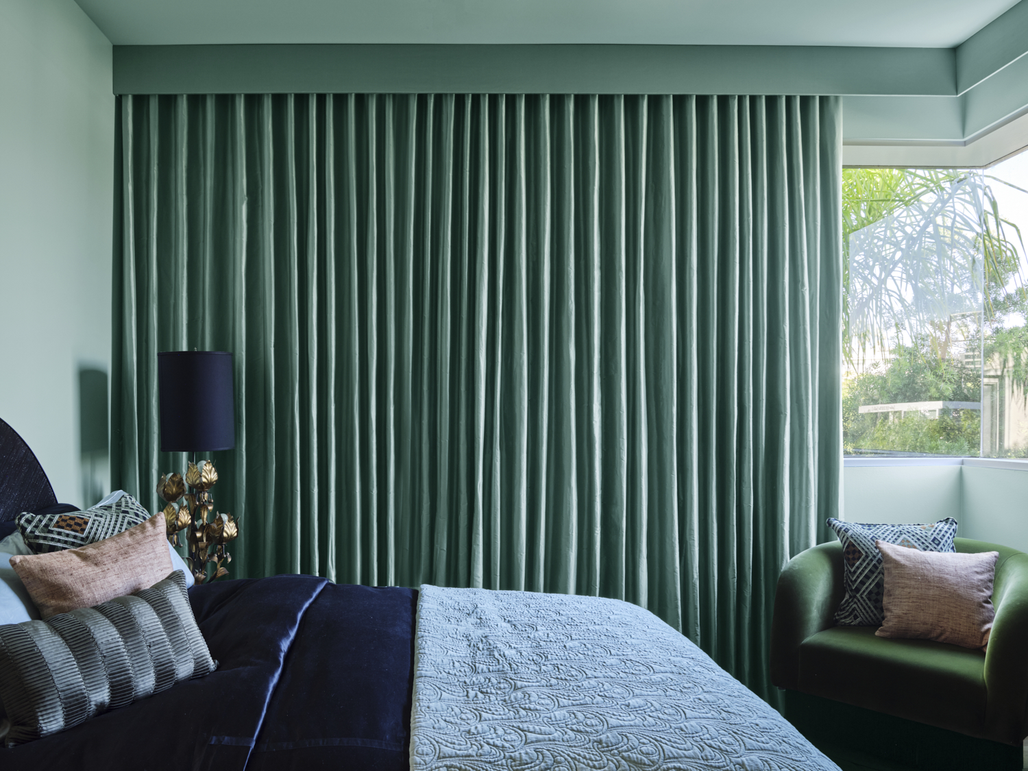
LA designer Tamarra Younis of Union of Art Interiors turned this kid's room into a monochromatic guest bedroom in an elegant shade of mint, bringing the wall paint and window treatment together for a harmonious and seamless look.
Tamarra worked with the drapery company to create curtains that hung from valance boxes in the exact same tone, and in the corner, they meet and ensconce a cozy accent chair for a comfortable reading corner.
'We absolutely love it when we get to play with bold colors on our projects. For this room we let Bali from Benjamin Moore take the lead,' says Tamarra.
'By mixing in fun tonal textures in the decorative accents, a custom built wallpapered nook, and stunning custom floor to ceiling silk curtains this room went from being a bland regular old room to becoming a real showstopper!'
8. A natural, organic space with wooden details
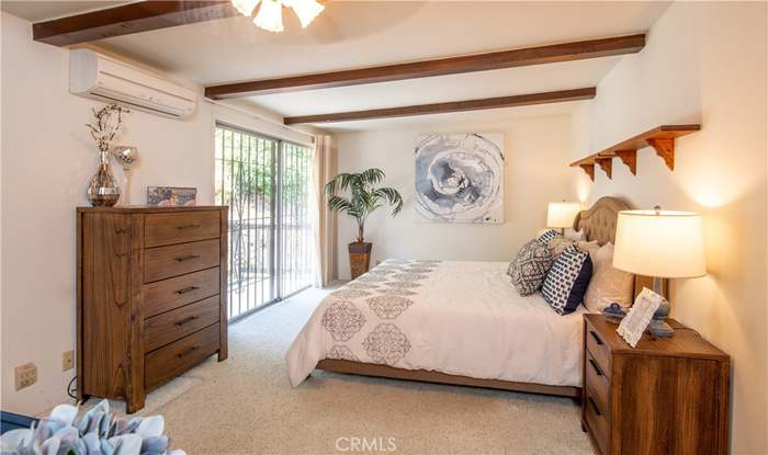
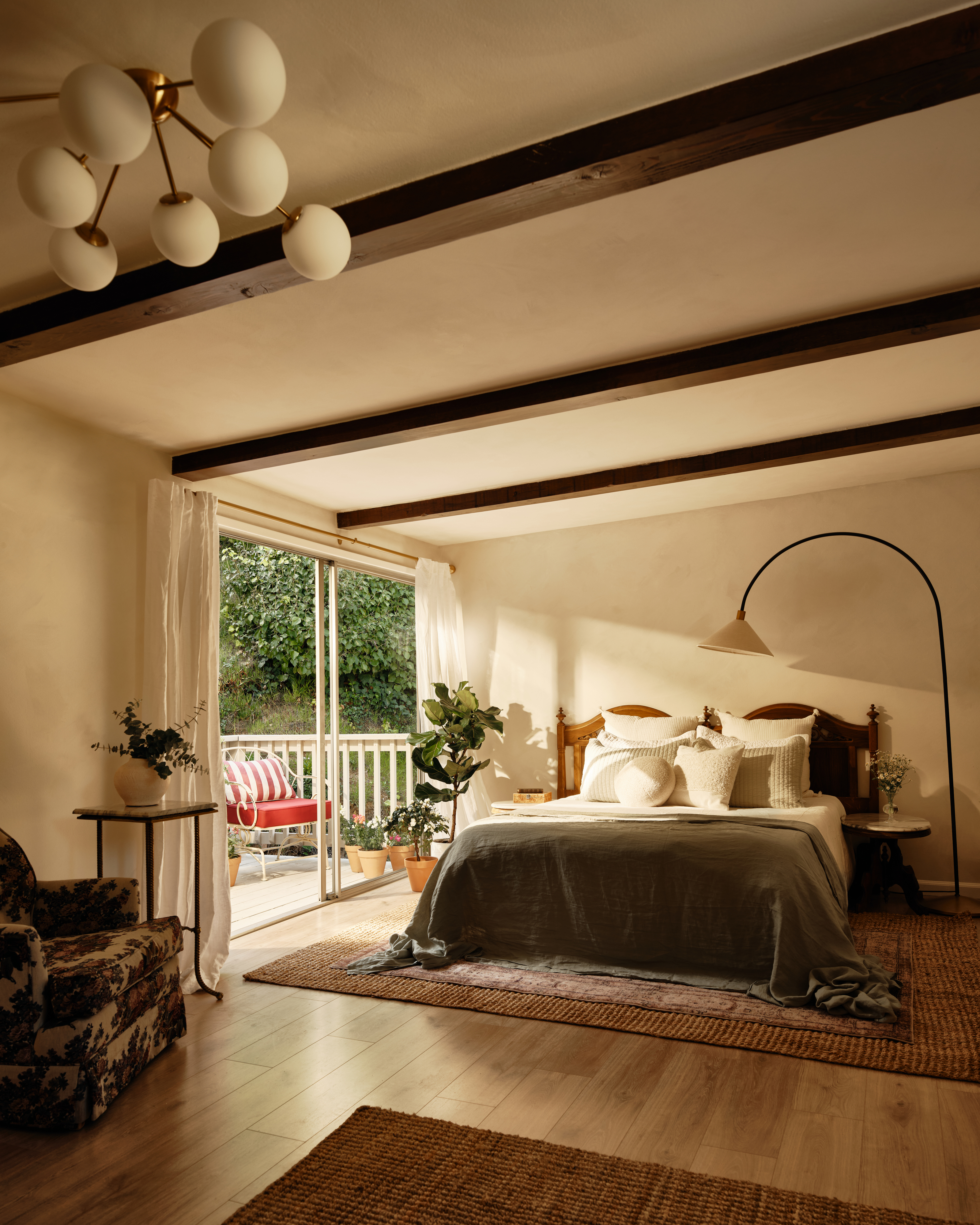
The primary bedroom felt lackluster and surprisingly dark considering the double doors opening onto the balcony. But LA-based designer Naomi Gibson of Gibson House transformed the room into a space that feels natural, organic and oozing personality by removing the carpet and repainting the walls with a lick of limewash paint.
'The clean wood floors instead of carpet really lighten up the space,' adds Naomi. 'I also stripped and stained the painted wood beams in the bedrooms, and added custom dramatic wall sconces to bring in lots of soft light.'
The bedroom layout was totally reconfigured too, and the bed moved to make the most of the natural light and opening the space up.
9. This Washington bedroom that went to the dark side
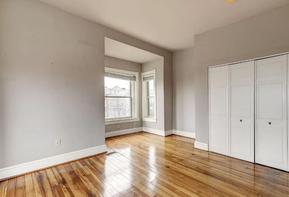
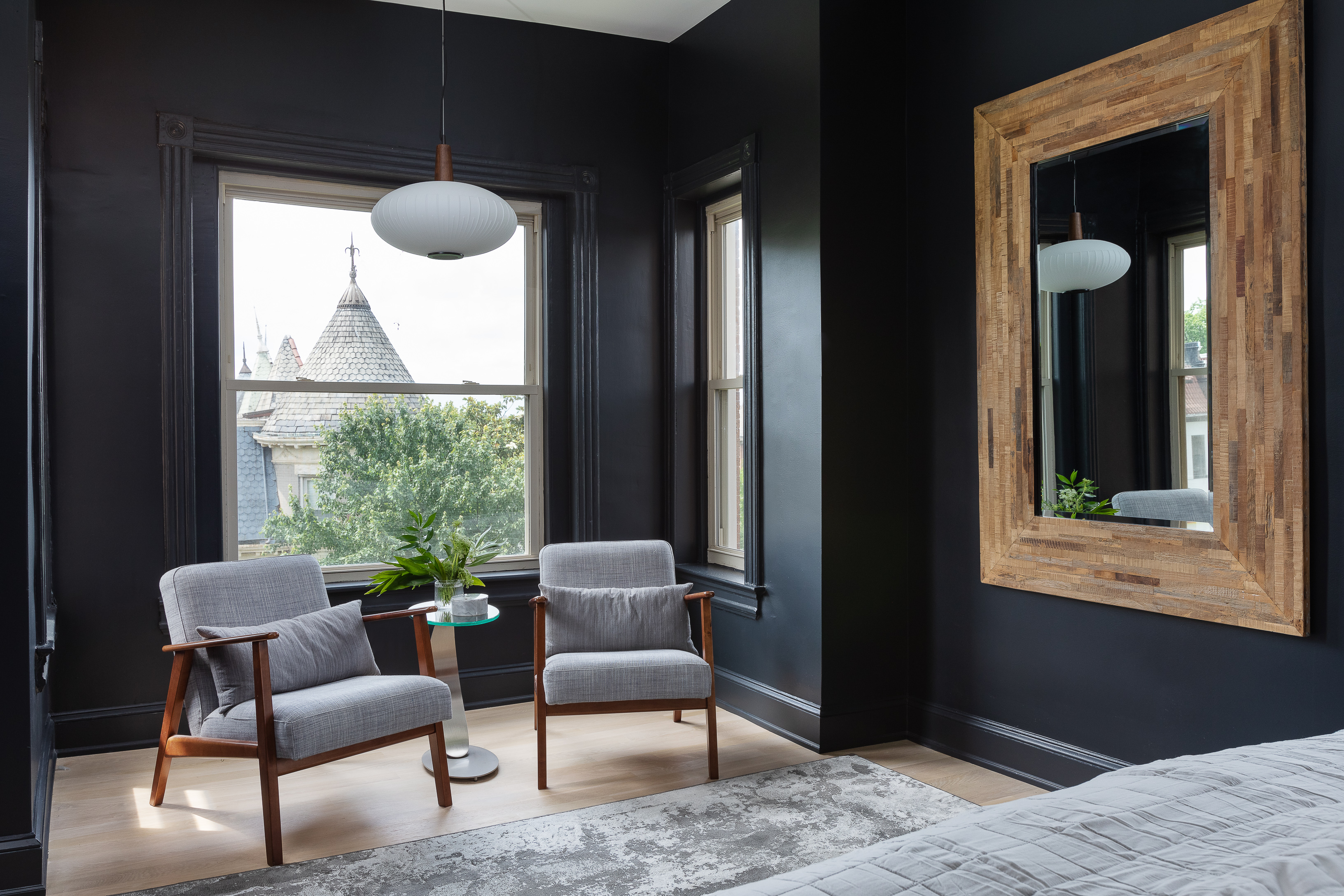
In this Washington home designed by Third Street Architects, the architecture of the home lent itself to enhanced nooks and crannies that have been given a lick of paint and made cozy with the addition of window seats and book nooks. This bay window is one such example, made snug with the addition of two mid-century-modern chairs accompanied with a side table.
The designers chose an inky blue shade for the bedroom paint, and as you move around the home and up through the levels, the third floor rooms, such as this bedroom, and the more intimate, private zones are painted darker. The large wooden framed mirror throws light around the room and keeps the space feeling open and spacious.
10. This uninspiring bedroom turned moody and elegant
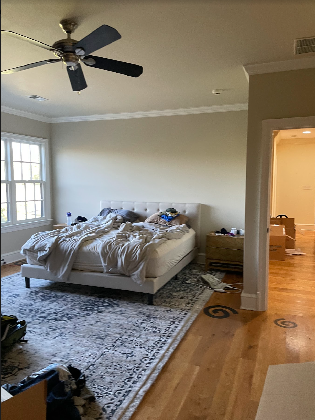
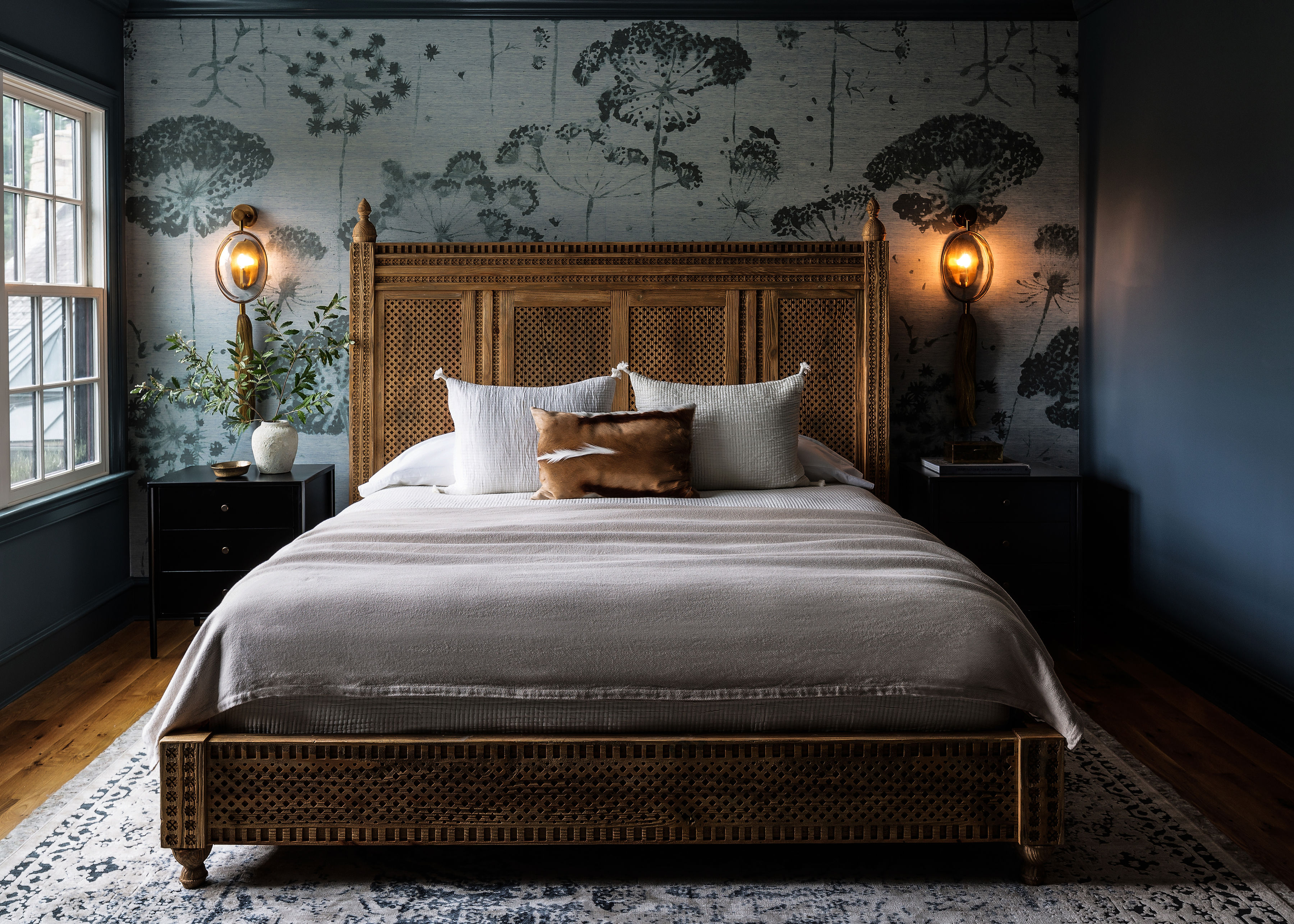
Prior to the renovation, this bedroom lacked any real character. With off-white walls, wooden floors and plenty of natural light, there was a lot of potential for a calming minimalist scheme.
Ann Gottlieb of Ann Gottlieb Design tipped this on its head and decided to go to the dark side with a smokey blue bedroom. 'The client needed this space to be an escape and her calm space, and blue seemed to be the right color,' explains Ann Gottleib.
Ann offered the homeowners a selection of mural wallpapers, and they settled on feature wallpaper from Phillip Jeffries that fosters an ethereal and calming mood. 'I showed them several mural wallpapers, and they fell in love with this one,' says Ann.
The wallpaper was used as a lynchpin for the rest of the design to follow. A dark and moody blue was used to match the trim. The effect is a room that takes its cues from nature, with wooden accents (including that dramatic detailed wooden headboard).
11. A guest room and bedroom hybrid given a new lease of life
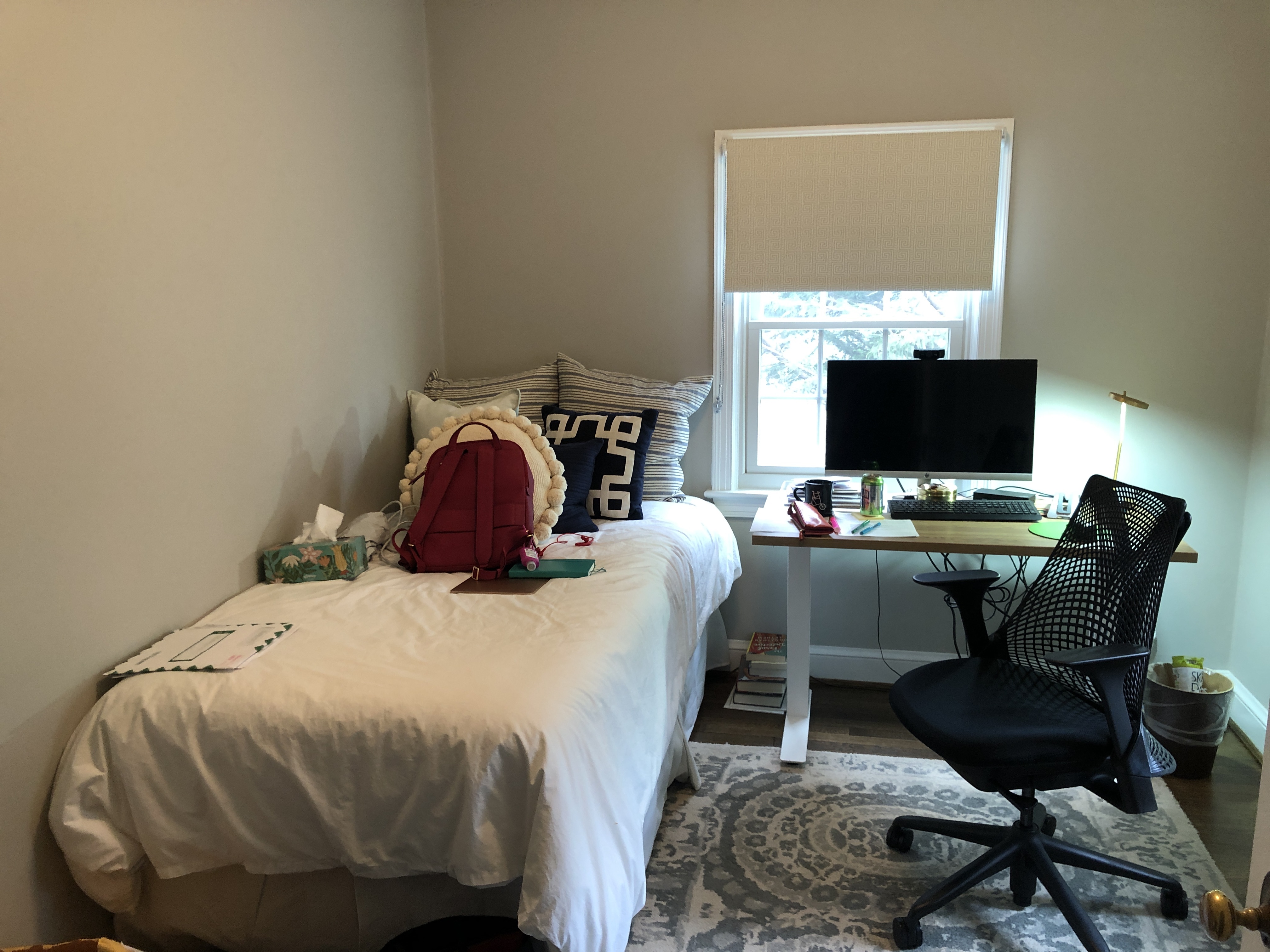
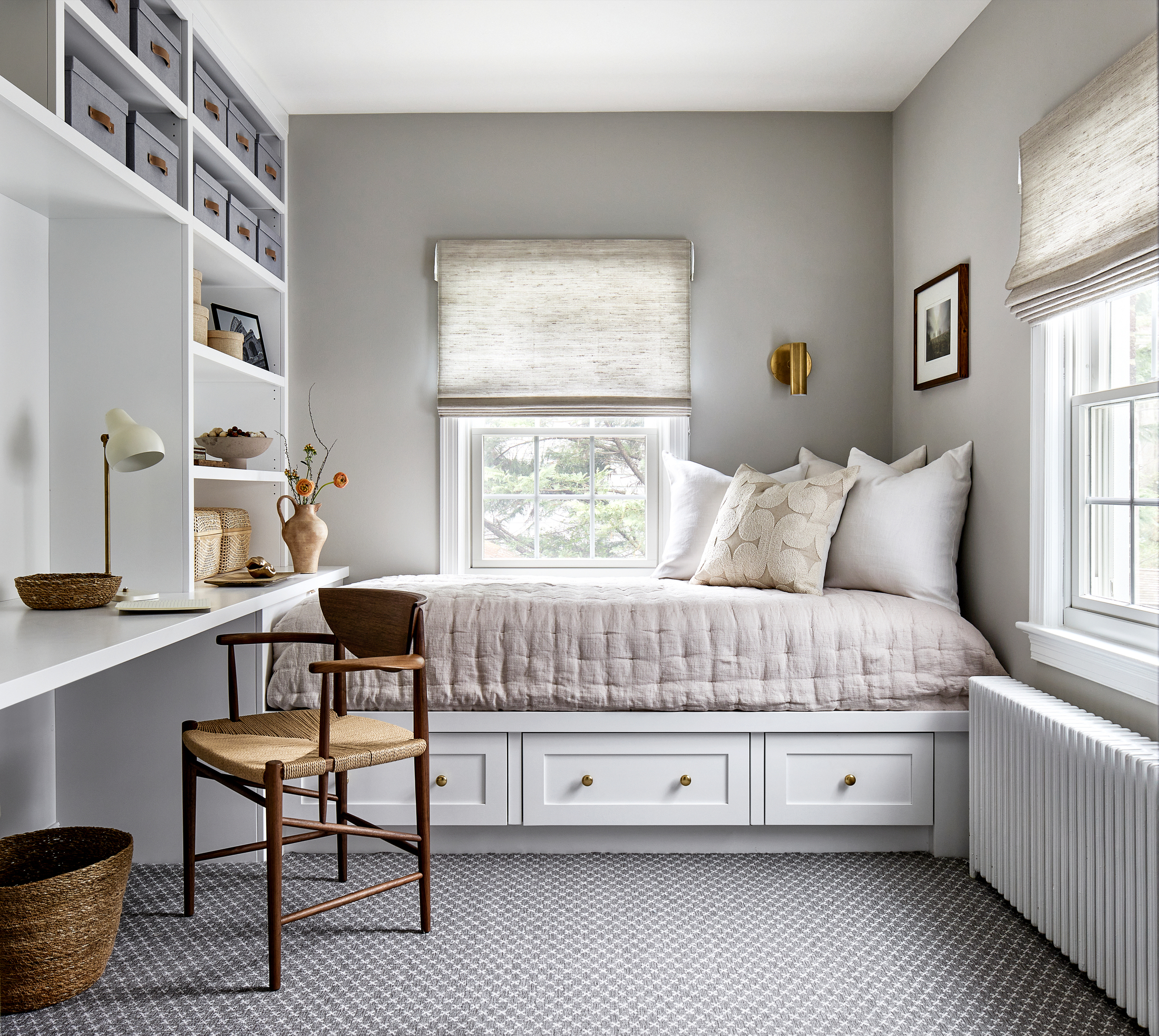
When it comes to pokey guest rooms that need to double up as working from home spaces, it's difficult to create a space that easily flexes between the two, but it's something Kate Ballou of Hendrick Interiors has managed to do with ease.
It's a small bedroom, but Kate has reconfigured the room, creating a small desk area out of a floor-to-ceiling storage unit and a built-in storage unit under the single bed.
‘My client had a separate desk facing the window at the end of the room, and the bed was in the corner along the long wall. By switching their locations, I was able to provide them with a huge amount of storage and the bed feels more like a daybed,' says Kate.
With wall-to-wall carpeting and a neutral color scheme, including curtains that allow light to diffuse into the space, it helps the space feel bigger than it is.


