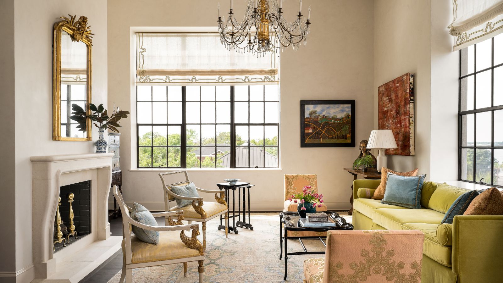
An apartment in an iconic and historic building calls for beautiful and considered interiors. This particular apartment, on the third floor of an award-winning converted vocational school in Charleston, SC, has an interior design scheme that elevates it to another level of luxury. In fact, we're so wowed by the careful placement of antiques and paintings, and the bespoke wallcoverings and finishes, that we've added the penthouse to our list of the world's best homes.
Its owners turned to Moe Draz, owner and principal of Architrave Interior Design, to redesign the interiors for their top-floor corner penthouse. 'I always think that the architecture of the space should inform the design,' says the designer, 'so I try and start with the building envelope, paying attention to the scale of the rooms, the windows and the natural light in the space.'
There were quite a few other considerations, however, in the form of the owner's extensive collection of modern art and European antiques, all of which needed to find their perfect placement. The finished results are remarkable. This is a layered and luxurious space, that's at once traditional and unexpected.
We think there's a lot to be learned from this Charleston apartment about how to place familiar antiques alongside bold and challenging artworks, and the important role pattern and texture play in tying these elements together.
Designer Moe Draz give us the tour and shares his insights, below, on creating this beautiful transitional style.
1. Make a strong start with the entry walls
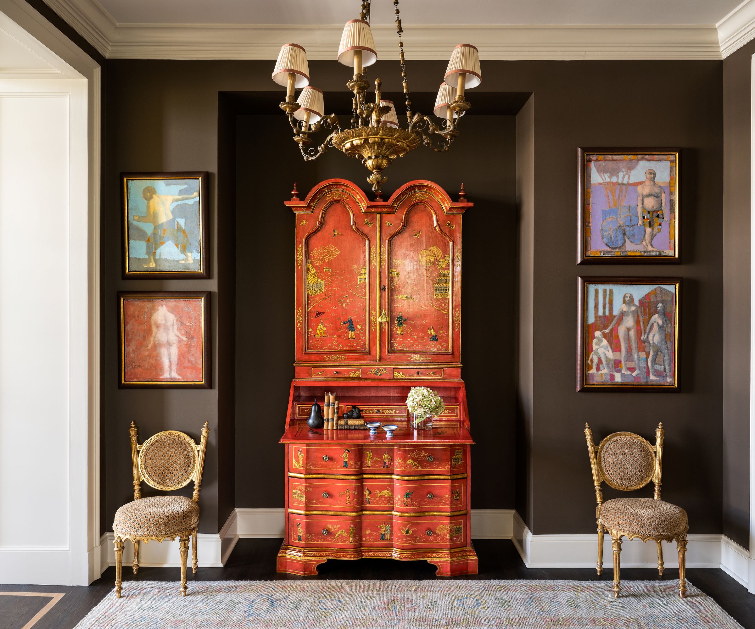
'We wanted to strike a balance between the clients' colorful modern art, the European antiques, and the historic structure that still felt fresh and light,' says designer Moe Draz.
That intention is strong right from the get-go. His entryway ideas in this transitional space feature a confident and dramatic brown paint for the walls. 'The vestibule was a great place to use the client’s lacquered chinoiserie secretary and gilt wood chandelier, and the dark chocolate paint creates a bold contrast for these fine pieces,' the designer adds. A pair of antique gilt chairs and an Oushak Rug from Mottar Rugs complete the scene.
2. Soften bold colors with texture
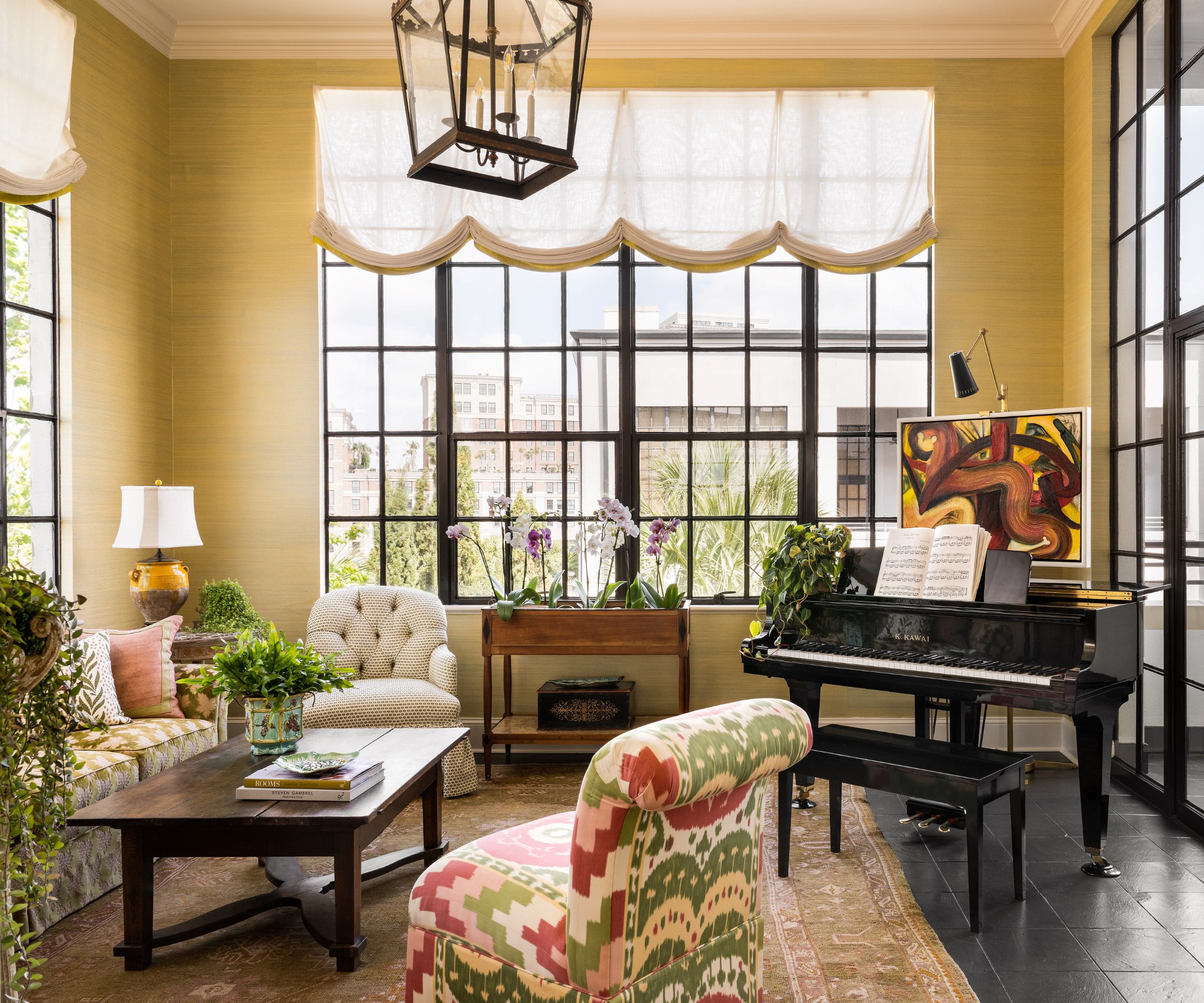
It's the sunroom that benefits from the penthouse's position on the corner of the building. With windows on two sides, it enjoys good daylight and so seemed the natural space to create a relaxing area to enjoy the city and river views, and to play the grand piano.
The abundance of natural light makes this the ideal space to appreciate the subtle textures of a grass cloth wallcovering, which also brings an element of softness and balances the stronger architectural features of the space, namely the high ceilings, steel framed windows, and glass screen.
Explaining his sunroom ideas, designer Moe Draz says, 'We used this room as a space for lounging and cultivating house plants. I really love how all the dark elements of the room interact with the chartreuse green grasscloth (by Innovations in Wallcoverings) on the walls.
3. Use built-in bookshelves for color and character
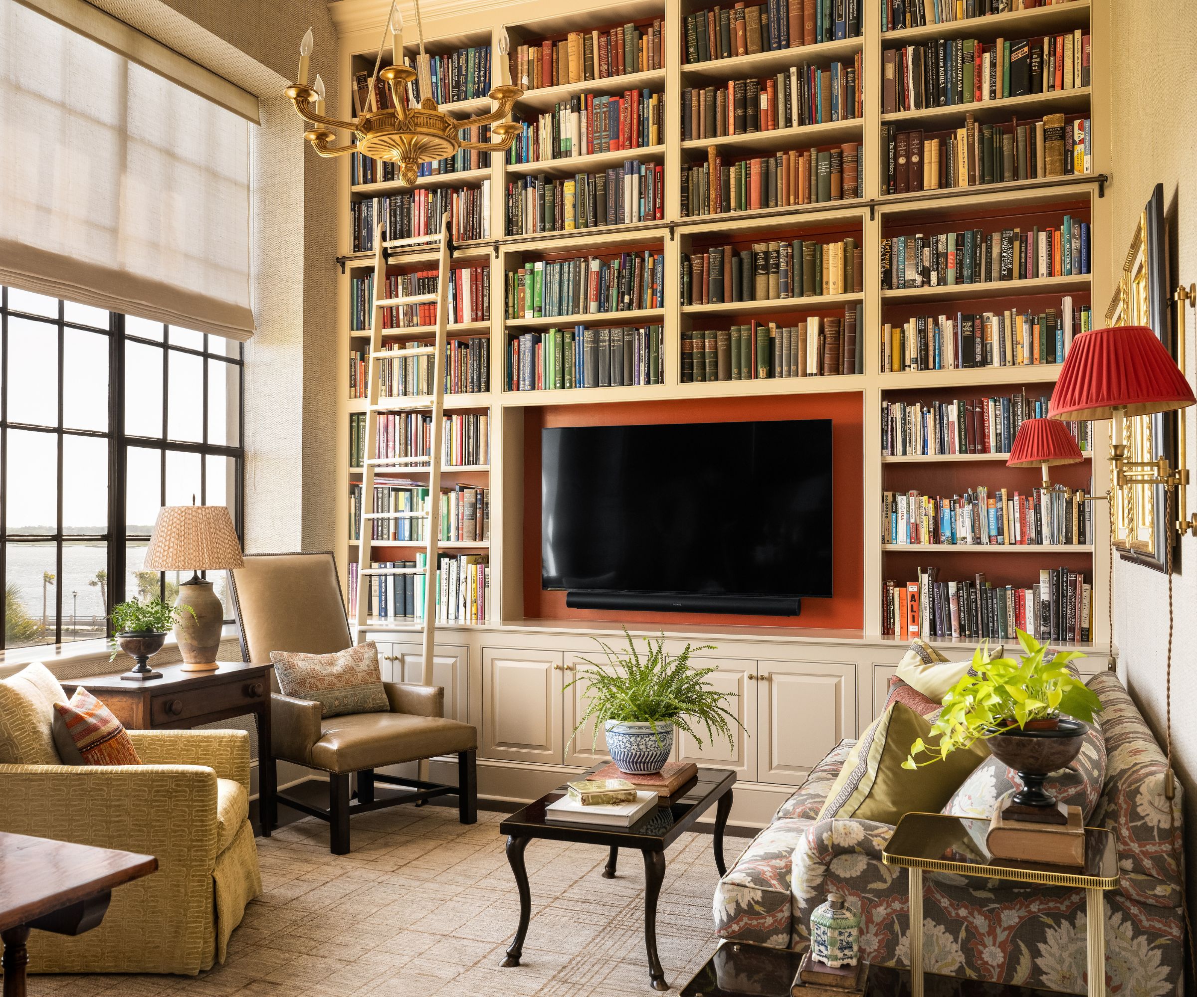
The library is designer Moe Draz's favorite room, and no wonder since this home library epitomizes his approach to the whole apartment. Taking traditional furnishings and placing them in an unexpected way gives the space a fresh look but with a respectful nod to the past. So while the floor-to-ceiling shelves, library steps, molded cabinets and brass wall lights might bring to mind an English country house library, the sleek built-in design (and let's not ignore the wall-mounted TV), custom rug, and another textured wallcovering all give the room a modern twist.
'After searching for months for a fabric to re-cover the sofa, the client loved a Lewis & Wood printed linen. From there, I selected the tweed-like chevron patterned woven paper from Cowtan & Tout to cover the walls and provide a nice masculine feel to the space,' says the designer. 'We commissioned Sullivan Fine Rugs to make the rug for the room which has a more muted and modern look. We echoed the green in the sofa fabric on a swivel club chair in the room and used leather from Holland & Sherry for the Lee Industries high-back chair.
4. Let the room's features be a guide
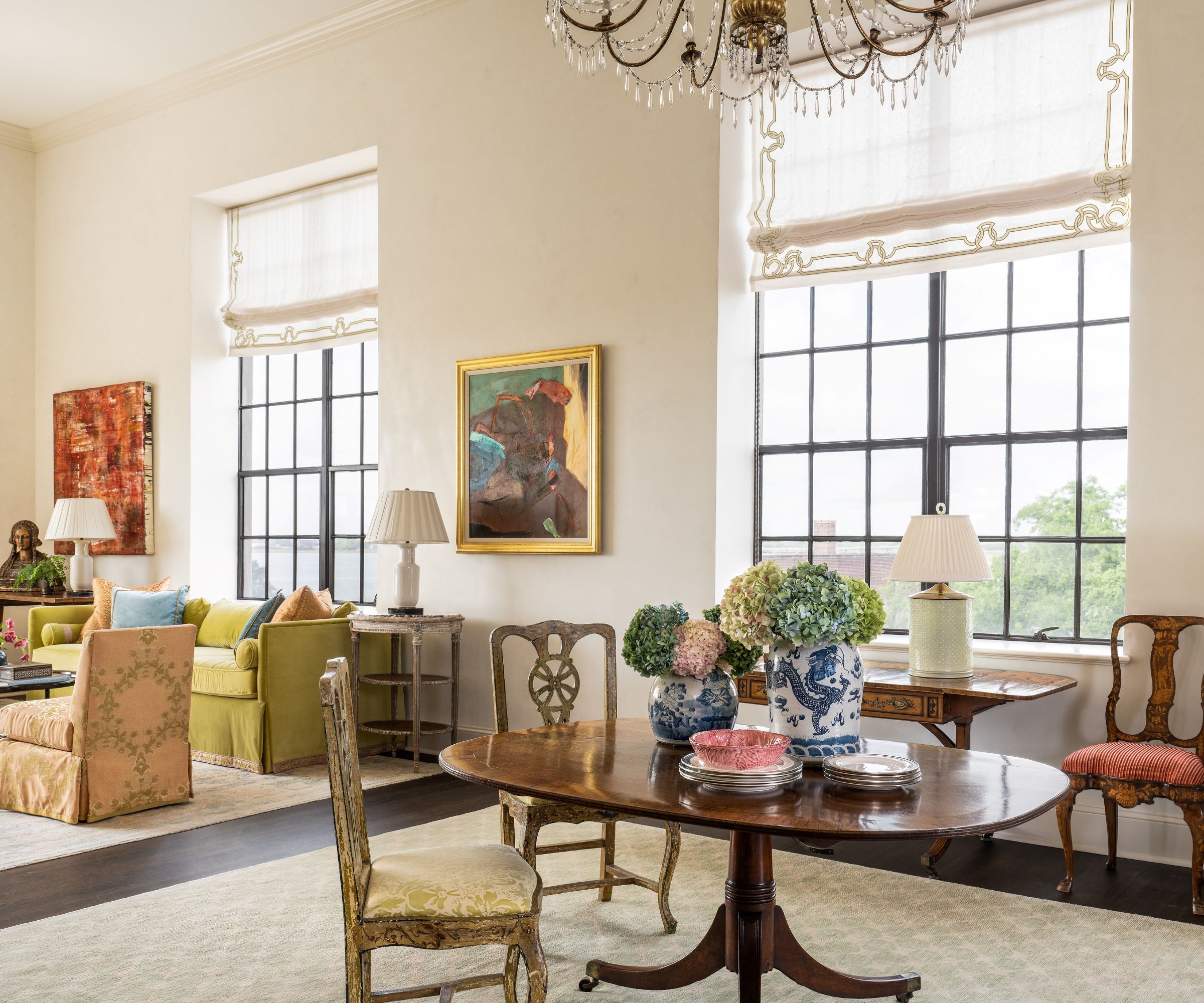
Just as in the sunroom, the high ceilings and huge steel-framed windows in the dining room give the space a strong architectural identity, which designer Moe Draz leaned into as he placed the owner's art and antiques. Strong lines call for an equally strong response from the furnishings: note the symmetrical placing of the artwork and area rugs in the open plan dining-living room.
Thoughtful design is about so much more than simply matching a room's architecture, however, and Architrave Interior Design add some exquisite softening touches to layer the space. Decorative paint effects specialist Kristen Bunting gave the walls a Venetian plaster finish, the old-Italian styling beautifully complemented by an 18th-century Genoese chandelier and custom-embroidered window treatments by Holland & Sherry.
5. Keep a thread of color for a harmonious effect
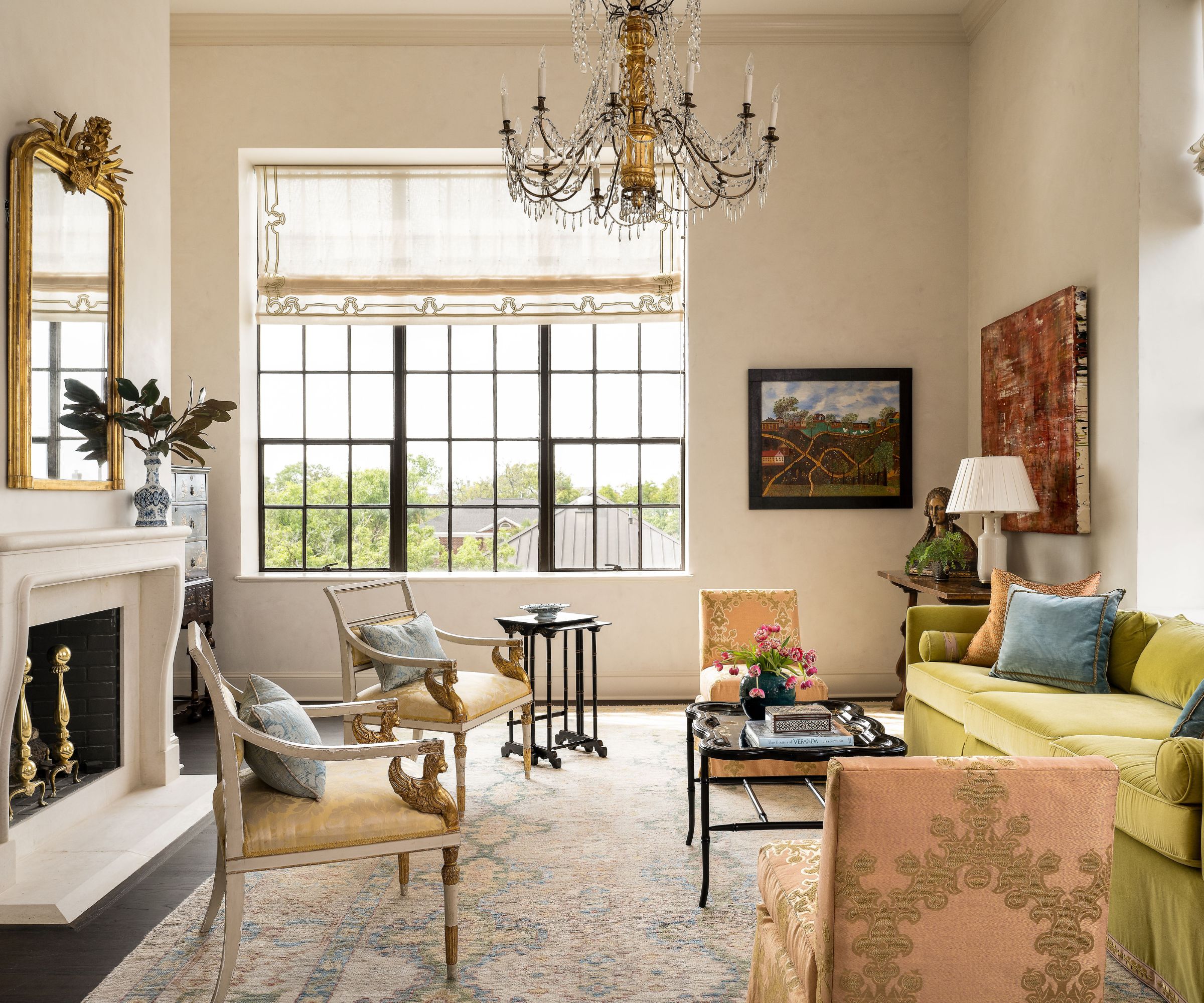
'The client loves greens and yellows so we implemented a citrusy color palette that looked fresh yet not overpowering,' says the designer of his color choices for the apartment as a whole. Picking shades from the same color palette and similar accent colors (in this case, recurring pink and raspberry tones), for each room ties the interiors together in a calm and harmonious way.
'Here in the living room I wanted to create an elegant soft space for entertaining,' adds Moe Draz. There's ample inspiration here for anyone looking for a new perspective on traditional living room ideas.
6. Soften the edges of a modern kitchen with artwork
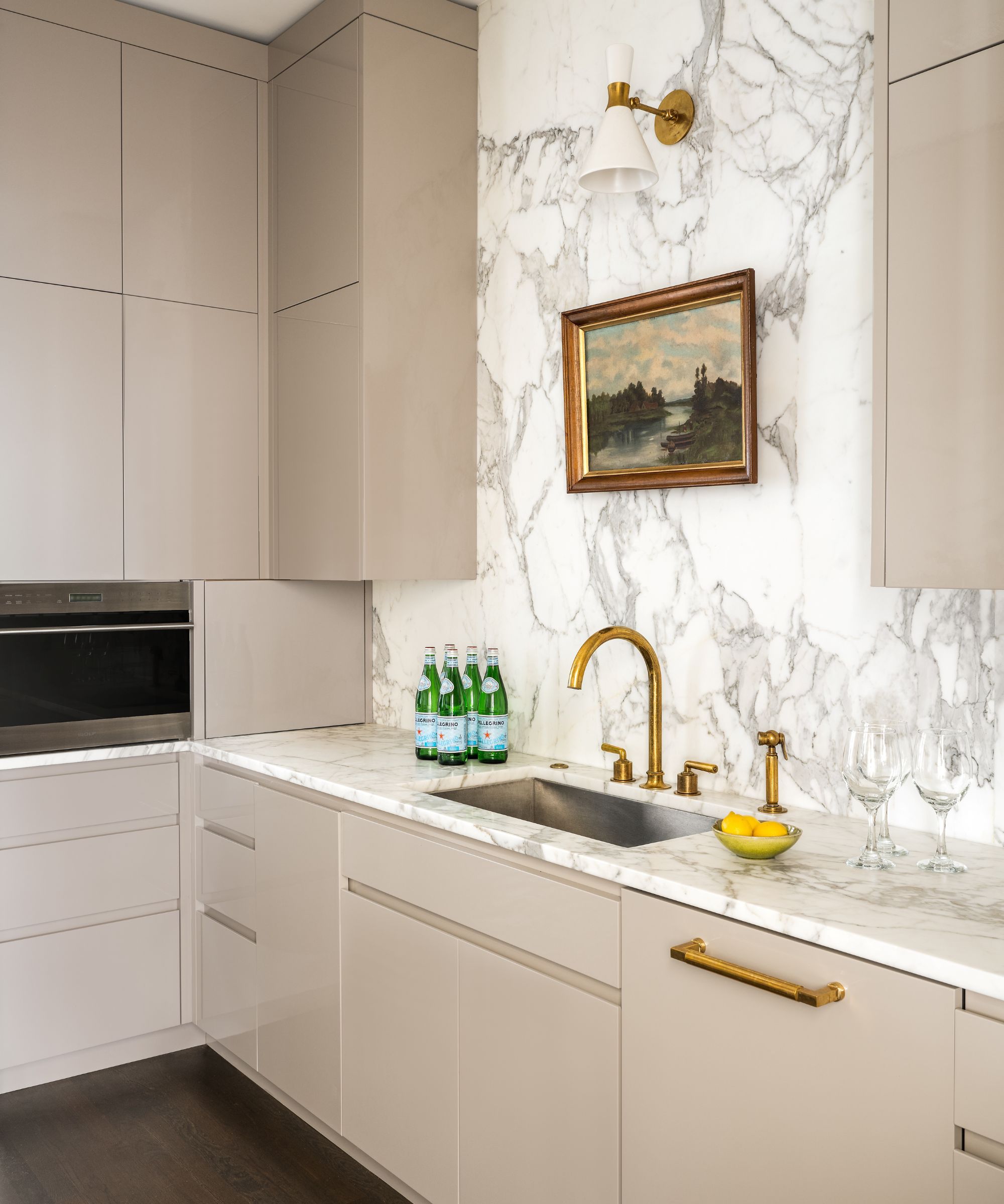
'We decided to go minimalist and modern for our kitchen ideas, with custom cabinets in high gloss finish to maximize the space and light in this interior galley kitchen,' says designer Moe Draz. Yet even in such a sleek workspace, there's scope to bring in another layer of interest and personality to soften the edges. Brass hardware and light fitting, and a small painting over the sink, an antique piece by a Charleston artist, add welcome depth to the space.
7. Embrace the unexpected

This elegant Charleston apartment is full of surprises, and that's a design lesson we've loved learning from the unusual eat-in kitchen ideas, here in the breakfast room.
'In this space, rather than placing a table in the center of the room with chairs all around, we decided to use their 19th-century fruitwood farm table more like a console table, with a custom bench and flanked by two chairs,' explains Moe Draz. 'The room had very tall walls that created a great opportunity to use a custom mural by Gracie Studio, showcasing a low country marsh scene with citrus trees, palm trees, and azalea bushes.'
8. Go bolder in transitional areas
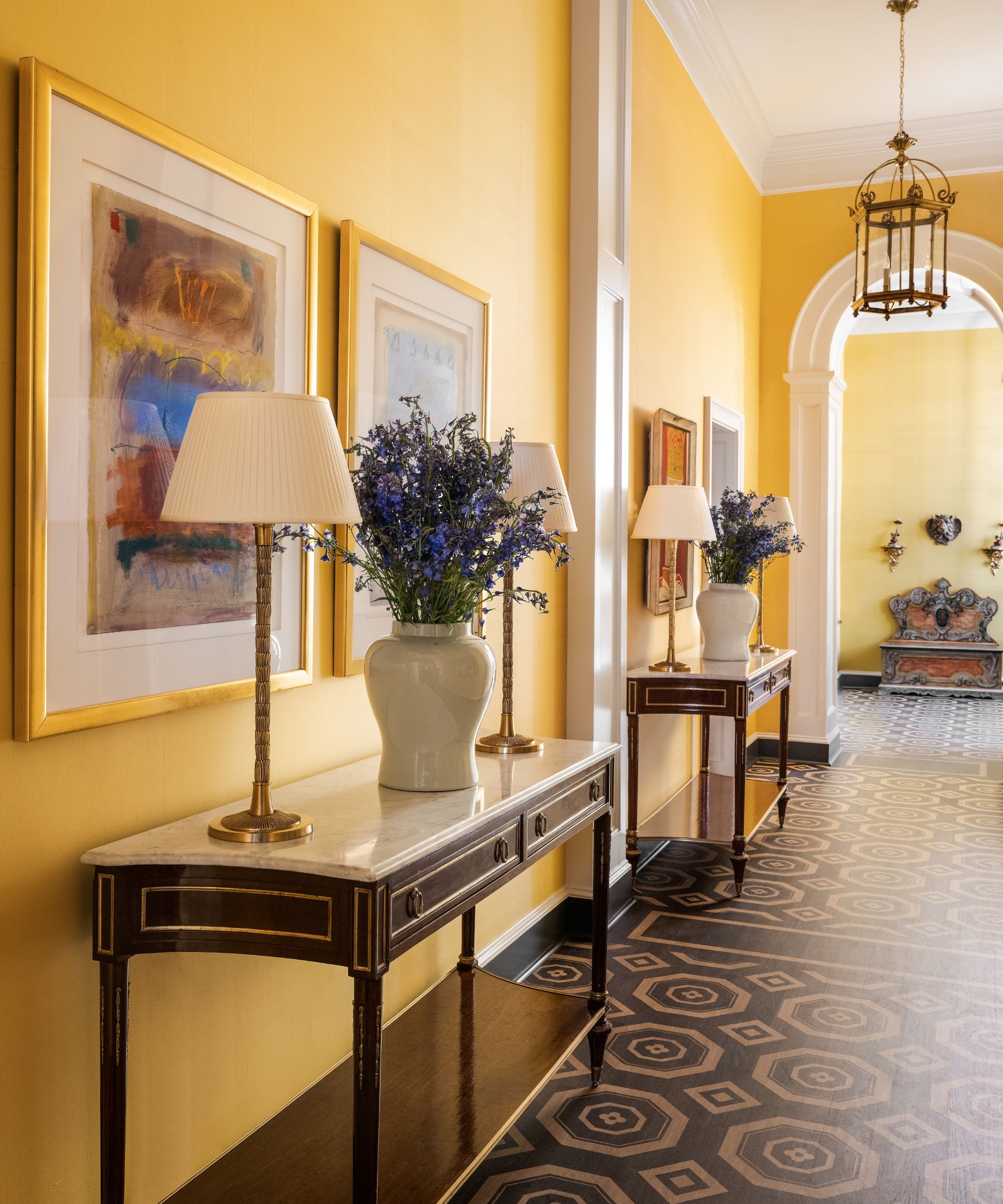
You might be just passing through, but that's no reason to give the hallway any less thought than the rest of the home. Designer Moe Draz thought long and hard about his options for this space and turned a previously dark, narrow passageway into a gallery space for some of the owners' treasured paintings.
'I had the walls covered in paper-backed silk by Gracie Studio in a sunny yellow tone to brighten the space and provide a nice background for art display,' says the designer. 'I also decided to have the floor hand stenciled by specialist Kristen Bunting to create a classic geometric pattern to break up the narrow linear space.'
9. Display meaningful pieces to give rooms personality
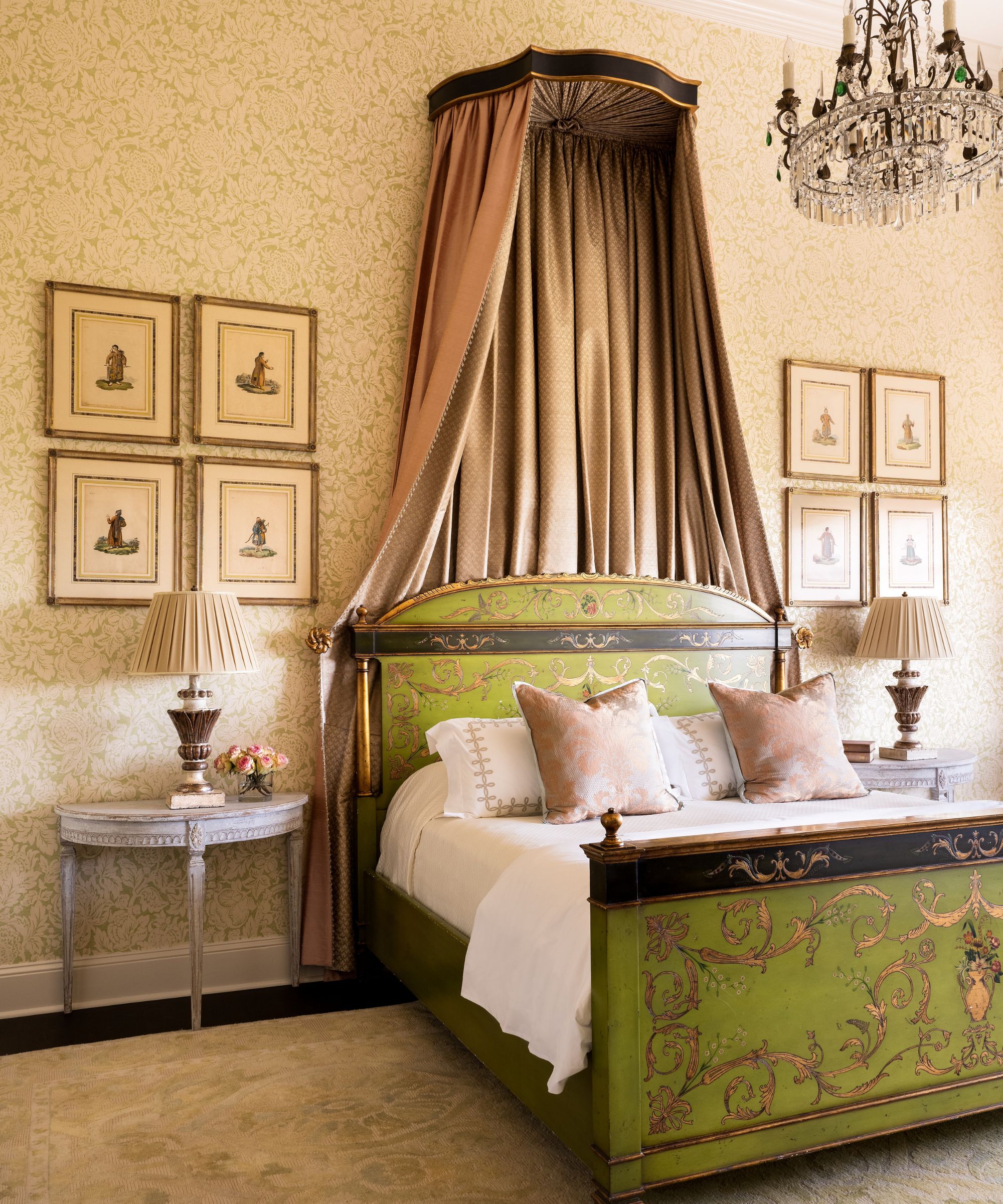
The homeowners had a lifetime collection of art and antiques, explains designer Moe Draz. 'They really wanted us to try to use as many of their pieces as possible and I was excited to do it,' he adds. 'I love incorporating antiques in our work but it's rare that someone comes to us with a huge collection of beautiful antique pieces and all we have to do is fill in the gaps to complete the rooms.'
The focus for this showstopper of a primary bedroom began with the client’s own painted bed, from Alfonso Marina, and a vintage rug from the dining room of their previous home. The designer then carefully sourced additional antique and period-style pieces to complete the curated scheme.
'Playing off the colors of the bed, I found the vintage 1930s chandelier in Italy, with its emerald green crystals,' says the designer. 'I selected a damask-printed wallcovering by Zoffany that is based on historic archived documents. Next, I wanted to bring the scale of the room down a bit and make it feel more comfortable so I designed the bed canopy inspired by one I saw in a French chateau. I used Sarkis Studio to create a custom painted and gilt wood cornice form, which we draped a pink silk by James Hare lined by a small print pattern by Silk Works.'
10. Experiment with patterned walls in a bathroom
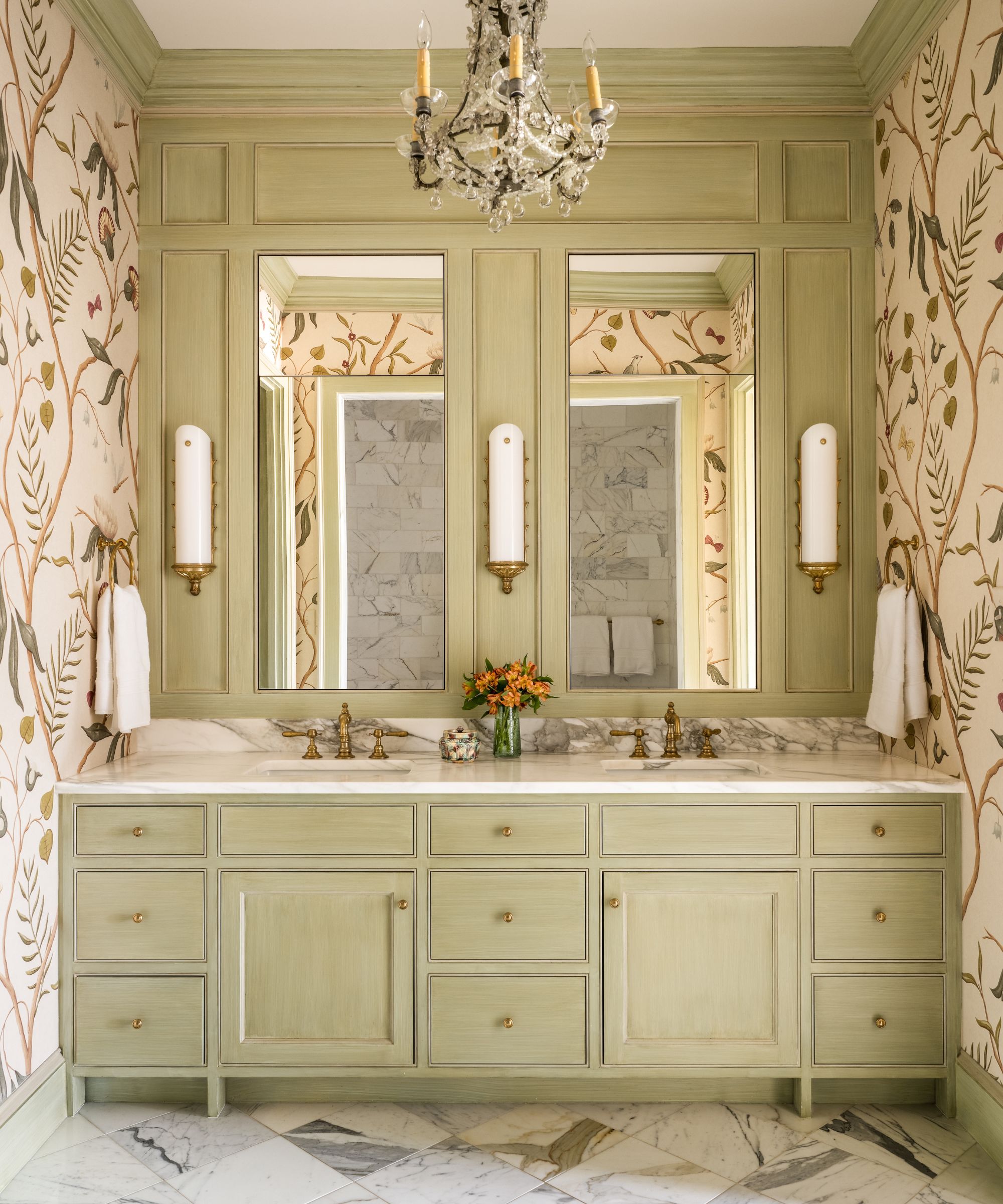
There is another stunning wallcovering in the primary bathroom, a Lewis & Wood large-scale design by UK decorative artist Adam Calkin.
'It provided this interior bathroom with a garden atmosphere,' says designer Moe Draz, who had to negotiate several obstacles before coming up with an alternative plan to achieve his dream bathroom. The space needed to be fully refurbished; however, the team at Architrave Interior Design were not able to move any of the plumbing lines without having to disturb the ceiling of the unit below.
'Rather than relocating the tub and water closet to create a larger shower, we designed a fully tiled wet room with ample space for an open shower and tub,' explains Moe Draz. 'The mirrored paneling above the vanity has hidden storage behind the mirrors and I had the woodwork and vanity painted and glazed like old French furniture.'
Interior Design: Architrave Interior Design
Photographs: Katie Charlotte Photography


