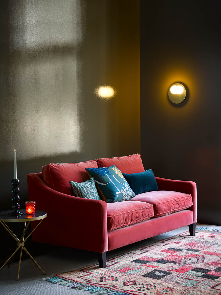
Red, arguably the most debated color of all, has recently had its time in the spotlight. Thanks to TikTok's Unexpected Red Theory (suggesting that red accents can elevate a room, even if they appear out of place), the much-debated hue has enjoyed a revival, especially in the form of accent pieces – an example of which is Zoey Deutch's sofa, which she coincidently perfected before social media penned the trend.
The idea that red accents have a place in any style of home, even those that might have otherwise felt misplaced, is epitomized in the actress's rustic living room. In this space, the exposed stone architectural features take center stage – most notably through the statement fireplace but also through the mantelpiece and raw stone wall. The abundance of organic materials room a neutral room feel raw but timeless – and is, most likely, one of the last spaces we would initially imagine a red sofa. Despite this, Deutch's red fabric sofa works perfectly.
As Taylor Simon, the designer behind the Unexpected Red Theory, explains, adding one red piece (whether it's a sofa like Deutch's or something as simple as a scarlet-painted window trim) will instantly make a room look better. We're letting the actress's space reassure us it's true.
Naturally, decorating with red, especially via a sofa color, is not for the faint of heart. However, there are subtle ways to introduce the theory into our homes, one of which is through artwork, as Deutch also demonstrates. Alongside her sofa, she has framed a red painting that sits on the mantelpiece and complements her furniture choices perfectly. In rooms with a smoother wall, Helen Shaw, the UK Director at Benjamin Moore, recommends opting for red paint, a choice that's surprisingly beneficial for smaller living spaces.
'Incorporating a rich, bold paint color such as red is a fool-proof way to create an instant character, taking a small space from sterile to stylish,' Shaw begins.
'Some fear that adding a deep or bright color to a small space will make it appear claustrophobic, opting instead for light neutrals to keep the space open. However, dark colors cleverly absorb the light of a space, making the division between walls appear blurred. This 'blurred edges' effect adds depth and dimension to a room, making the space appear larger, rather than more cramped as some may fear.'

Plus, Shaw is not exclusive in her support for this hue. As an alternative to Deutch's neutral backdrop and red sofa, Jeffry Weisman, the founder of Fisher Weisman, recommends starting with a red paint base, allowing other furnishings to stand out against the daring base.
'Venetian Red is our current obsession because of the drama and warmth it gives a space. The glow of the color draws you in, and it is happy. As a background, so many colors and materials stand out against it,' he says. Previously, he used Umbria Red by Benjamin Moore in a dining room, and the results were beautiful. 'It’s classic and modern,' he says.
Alternatively, we can tap into the theory with these Deutch-inspired buys (including an almost-perfect sofa match) below.
This sofa features thick cushions, stuffed with a down-feather blend and sinuous springs that resist sagging over time.


