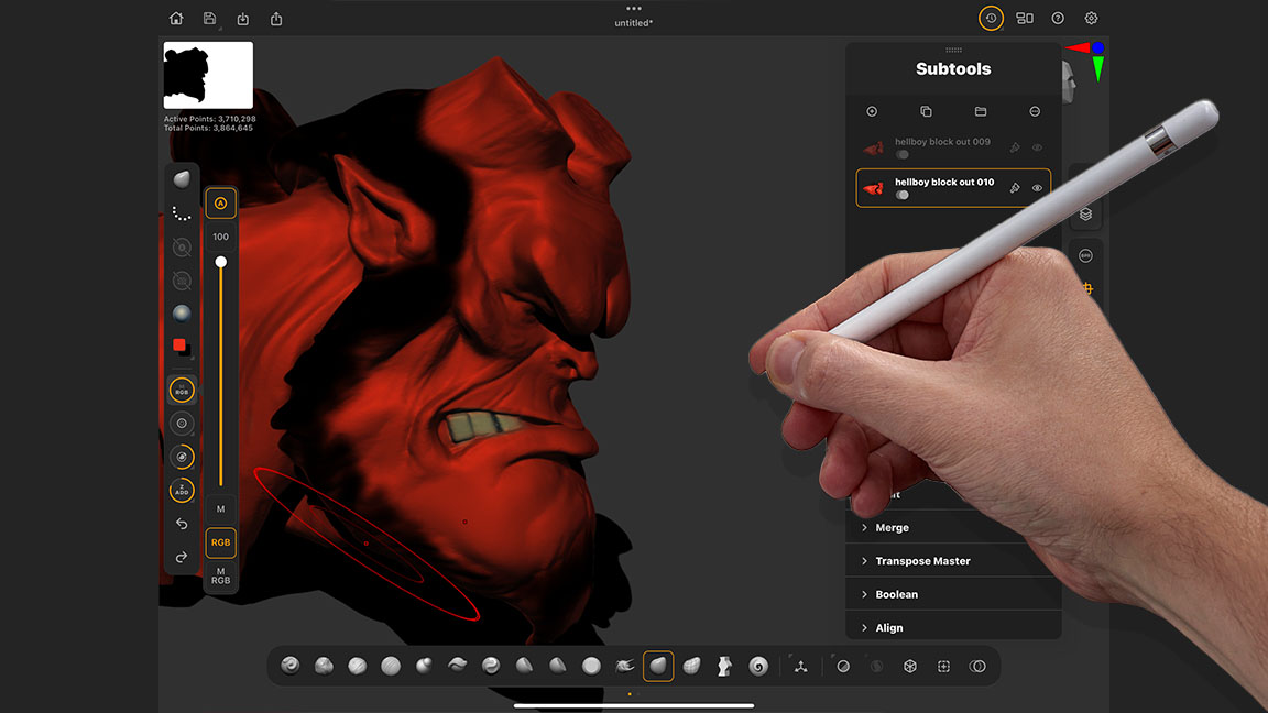
If you're looking to get started in ZBrush for iPad, then these tips are for you. Maxon's new app is excellent, and you can read my ZBrush for iPad review for more on why, but here I'm going to share my advice for how to get up and running in this new sculpting app.
The very first thing that I teach my students about ZBrush is that it won't respond or react in the way you think it will, so get used to it! But good news, ZBrush for iPad is a lot easier to learn (and teach) thankfully and in the few weeks since it was released artists are generally agreeing with that statement.
I actually like the fact that it’s a little different and once you understand some of those quirks and oddities it’s an amazing experience. In recent weeks I’ve been doing a range of articles here on Creative Bloq helping people understand ZBrush for iPad, get an idea of how it could fit into their creative life and also some watch-outs for new users. You can read my ZBrush for iPad speed sculpt tutorial for a good core workflow to create a model.
In this article I will cover 10 tips that will help you get up and running right after you install ZBrush for iPad on your tablet, and maybe save you a little time searching Youtube.
1. Basic sculpting and making a Polymesh
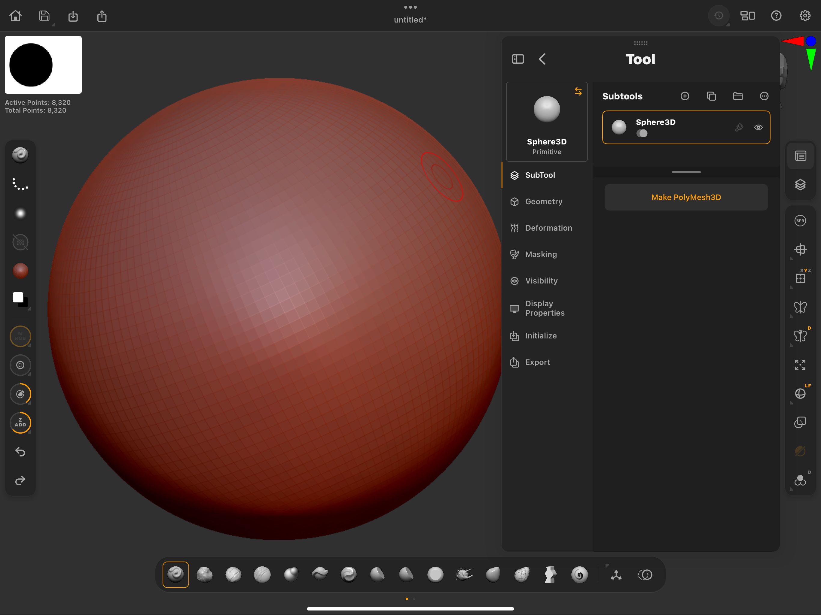
Anytime you start a scene by using a primitive model you need to make that model ‘live’ or ‘editable’ by using a button called ‘Make Polymesh 3D’ It always stumps new users and once you know about it, it isn't an issue but trust me, you are going to see this message a lot on day one.
Primitives are parametric (editable) and you can’t sculpt them until you use this feature. It’s worth having a go at changing some of the parameters for a primitive before doing this so at least you know how for later. (Tool>Subtool>Initialize) and I’ll cover that in the next tip.
2. Use the Initialize menu
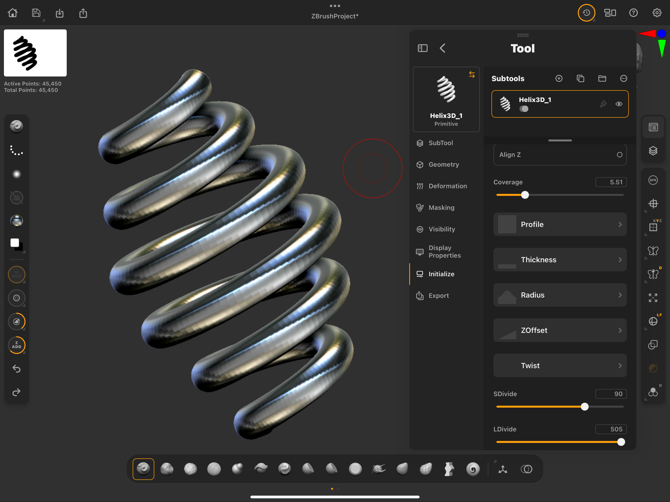
From the main menu you can find a tab called primitive. Look in there and open up the Helix as an example. You can try any of them after you learn this tip but try the Helix for now. From the Menu on the right locate the Tool dropdown and in there you can find Initialize.
At this stage these models are parametric and can be edited at the base level. That means you can edit poly count, profile, thickness, radius, offset and things like twist. It's a very powerful way of making models without sculpting. For example, If you need a spring this is the place to make it not by starting with sculpting.
3. Subtools stacking
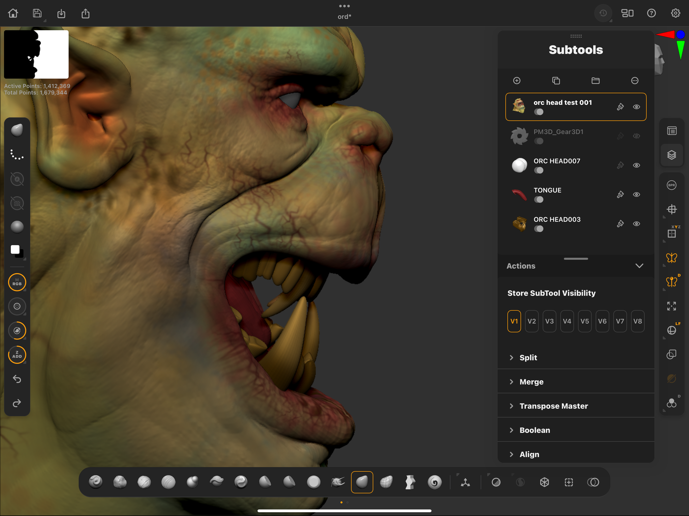
Subtools are the ZBrush way of staying a hierarchical menu of the models (ZTools) in a given set (SubTool). It is very straightforward and uses a common method of having a folder to put model sets into. You can create folders from the subtool menu and drag them around as needed. You can arrange your models in different folders, rename them, show and hide them like you do in photoshop and you can even use the Subtool menus to do more complicated things like Boolean operations.
4. The wheel and what it does
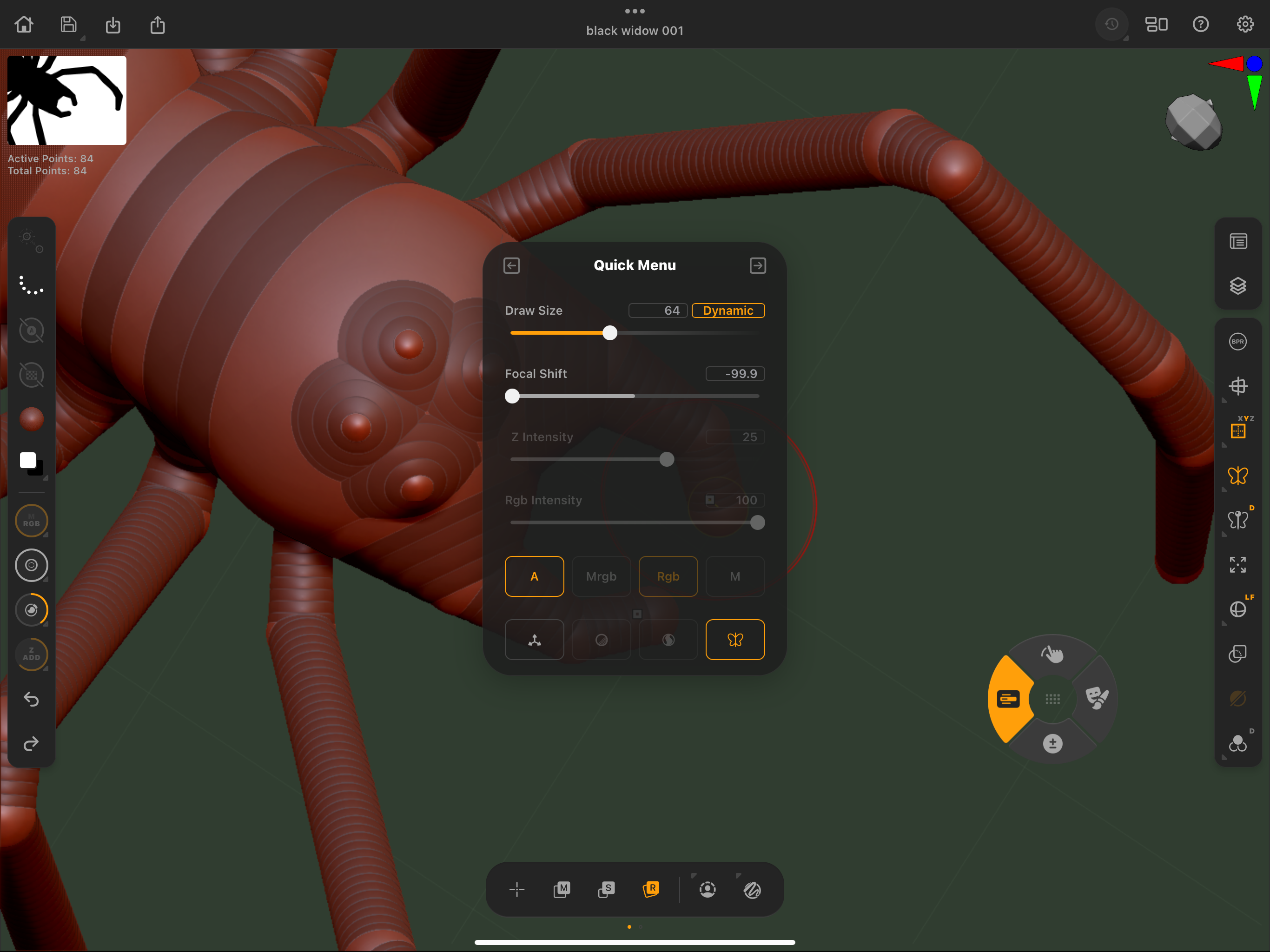
ZBrush on the desktop relies heavily on keystrokes. To get most things done you will need to have your non-dominant hand on the keyboard most of the time. As the iPad if often used without a keyboard this needed to be adapted so they added a little onscreen wheel. Using that will give you all the functionality of the Shift, ctrl, option and command functions and of course the space bar for accessing menus and basic settings. It works really well and you soon come to rely on it. You can also move it around.
5. Learning the right sidebar
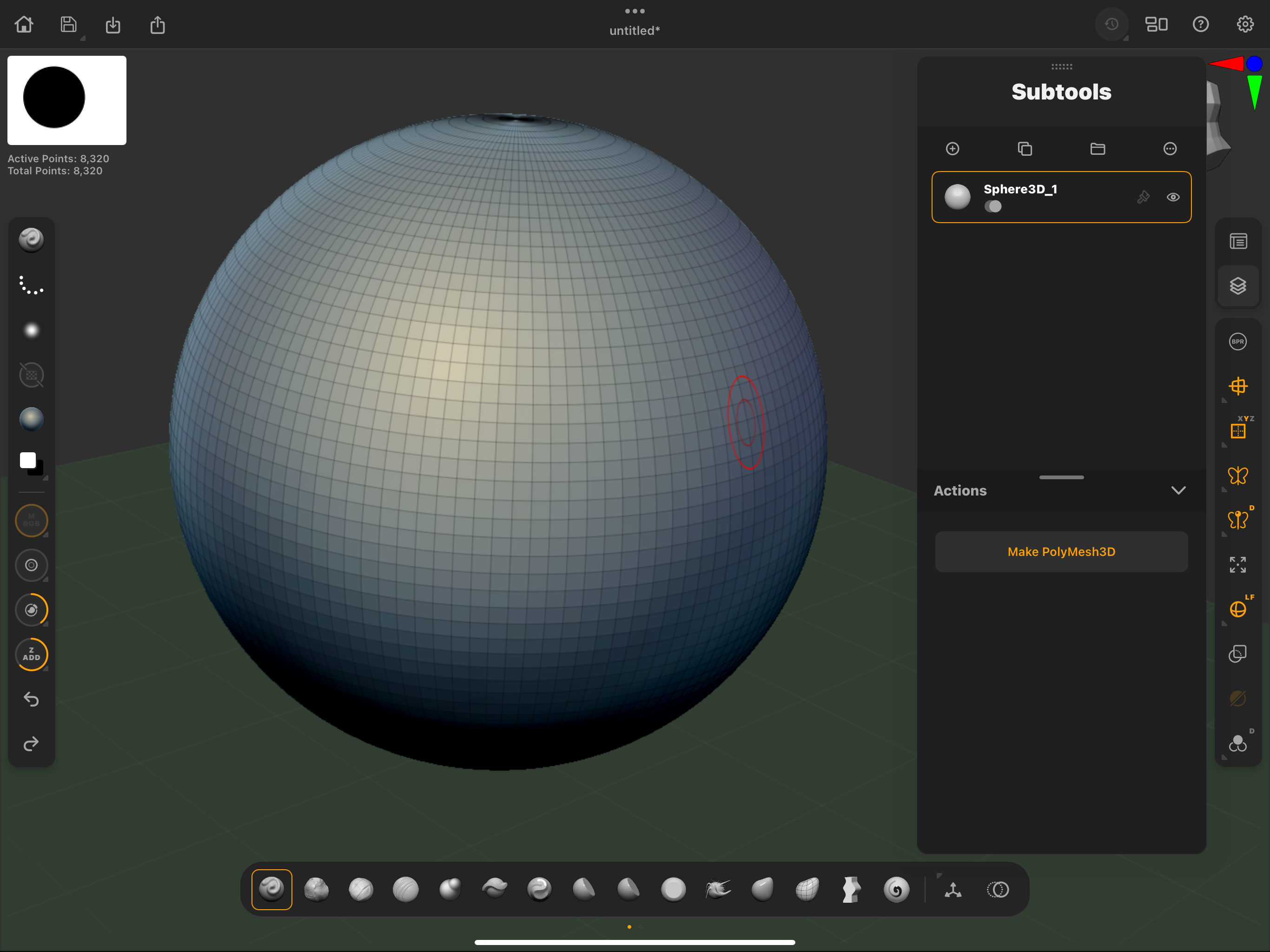
The right side bar contains all of the menus that you get in the desktop version but available form the side of the screen. Add to that a list of other on-screen settings like Polyframe (Wireframe, on and off, Perspective, floor on and off, frame-all if you get lost. It has things like the ability to solo a model so you can concentrate on just that one thing with no distractions. Take your time and learn each button on that menu.
6. Start with the essential brushes
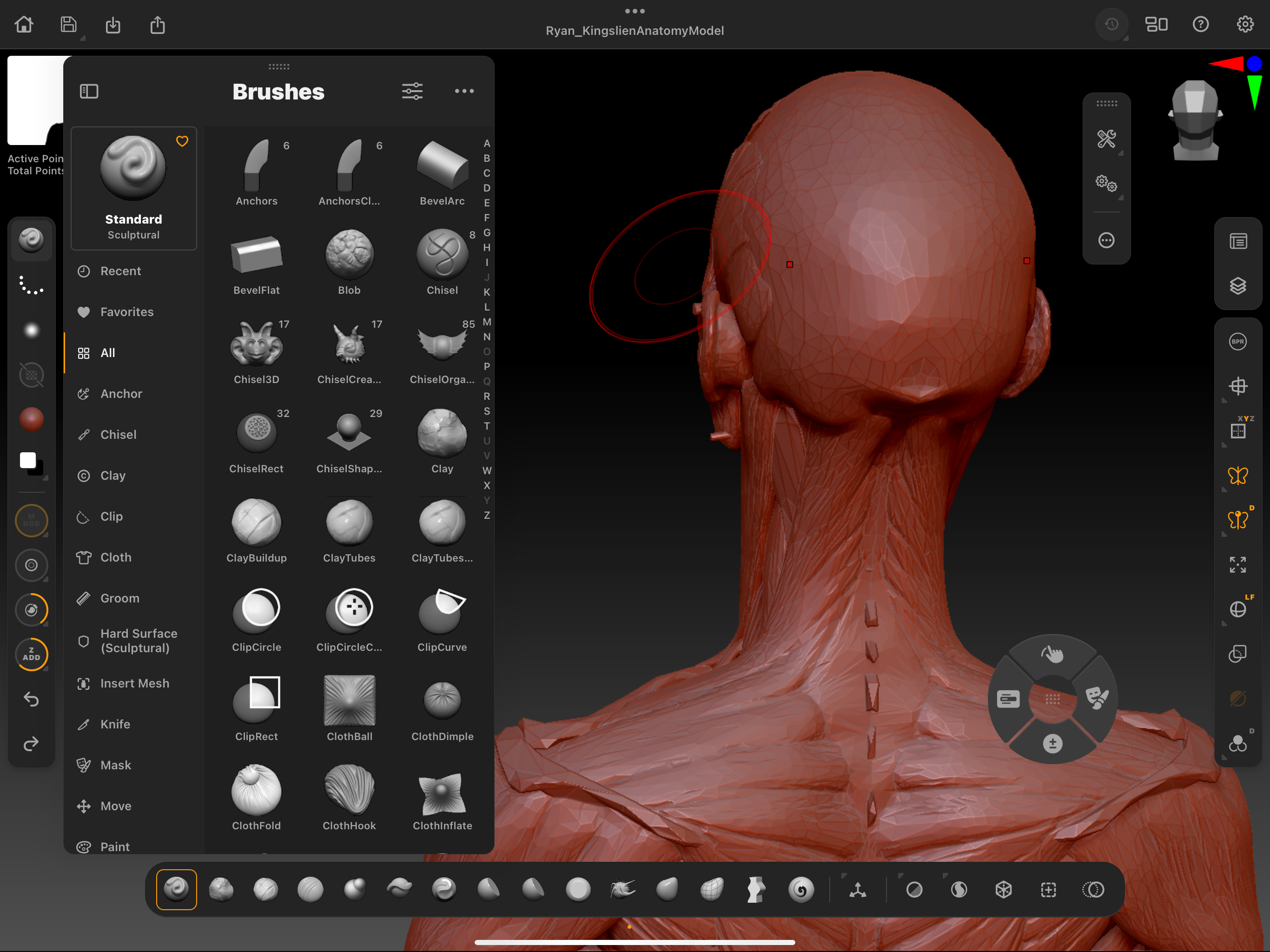
ZBrush has 100’s of Brushes now so where do you start? The iPad version puts all the basic ones right there at your fingertips on the bottom menu. In the paid version you get Standard, Clay, Claybuildup, DamStandard, Inflate, Layer, Pinch, Flatten and hPolish and a few more to the right-hand side.
That really is more than enough to get by in ZBrush in most cases other than high-end technical processes. Don’t forget that Shift is on the little wheel and gives you a Smooth Brush which is part of the essential workflows for ZBrush. If you fancy a look at what else is available, go to the top button on the left side and look at ‘ALL’. You’ll see what I mean.
7. ZSpheres are your friend
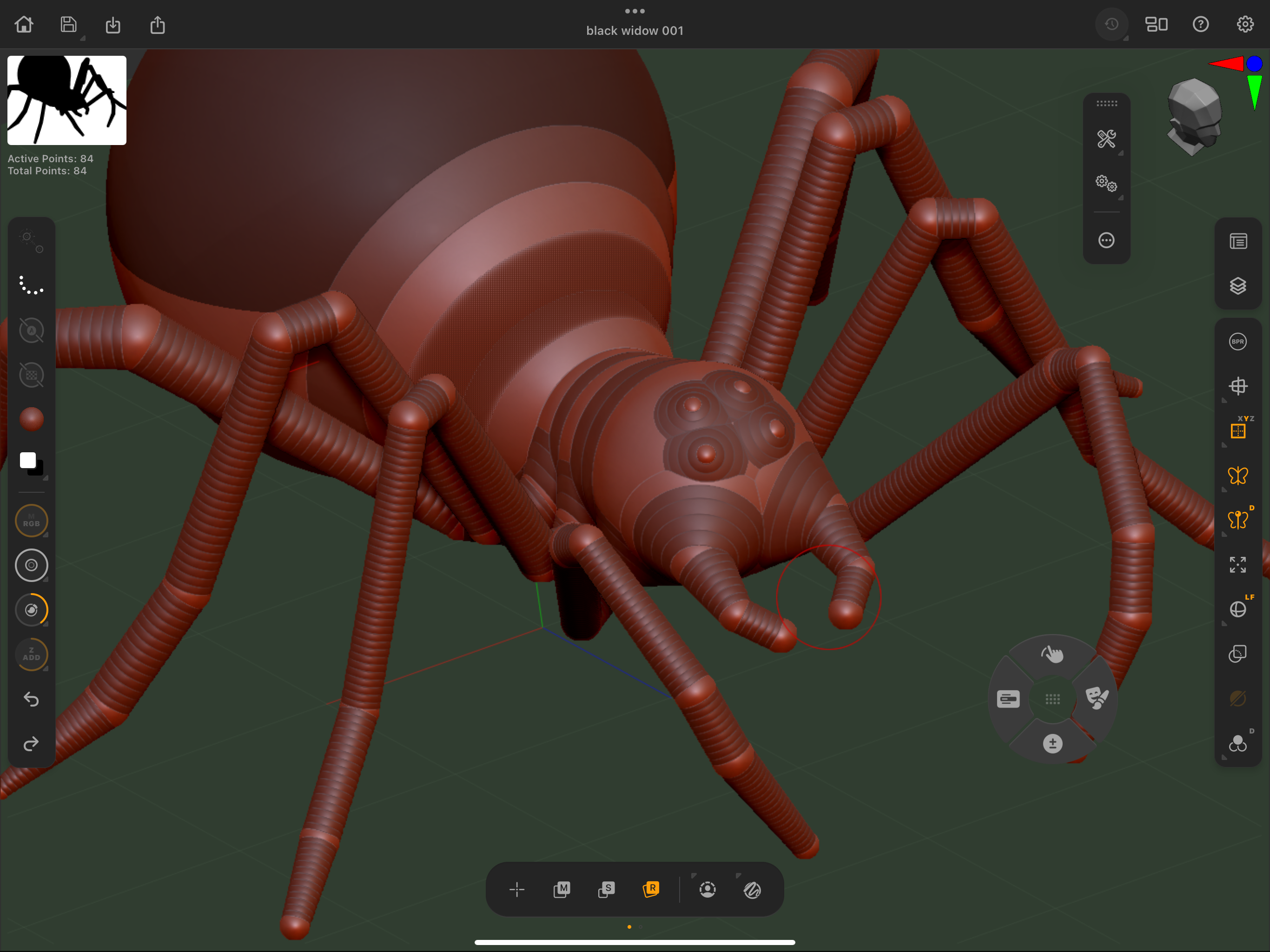
If you have never tried ZSphere then you are in for a real treat. They basically allow you to create an armature which you can manipulate and pose and then turn that into real geometry which you can then sculpt on. The fact that you can pose those models is really liberating and it means you can make a model and try out poses before you ever actually sculpt it.
I use this all the time for creature creation and it allows me to work out length of limbs, size of a neck, how big a head should be, how a head would turn, etc. It's a great way to block out any organic shape. You can find your ZSpheres from the Tool palette.
8. Learning the left sidebar
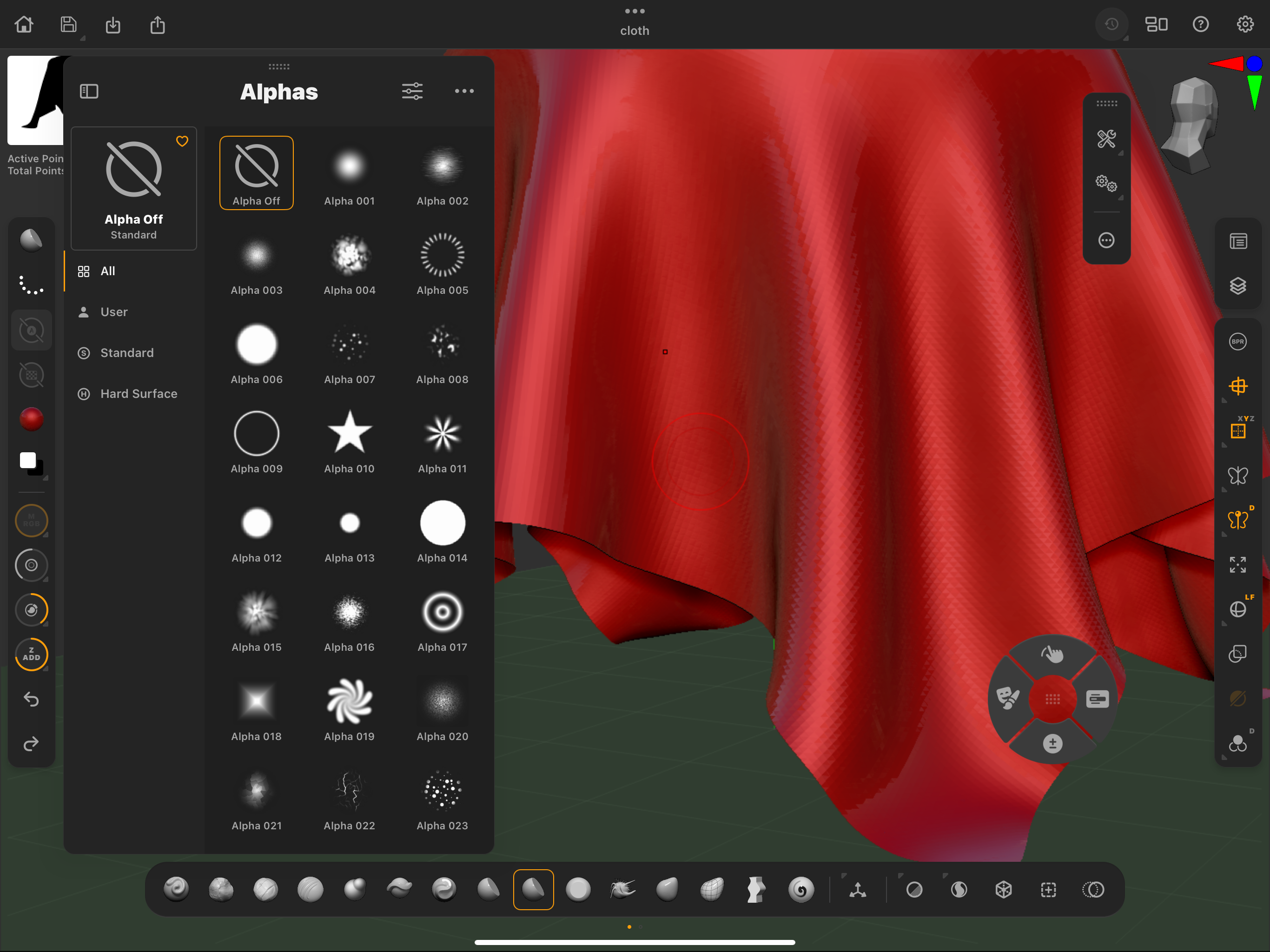
We’’ve covered most of the interface and now it's worth having a look at the left-hand side. It's where you find things like the Brush menu, the Stroke menu and then things like the materials Colour and even how to turn on depth and painting.
You really need to be aware of this menu as you will be using it a lot as you learn. It’s good to go through it and find out what's there so you're not hunting for it later on. The brush menu alone is huge and contains all the modifiers for those brushes. The stroke menu helps you to adjust brushes even more by adding different ways of interacting with the canvas.
9. MatCap or standard material?
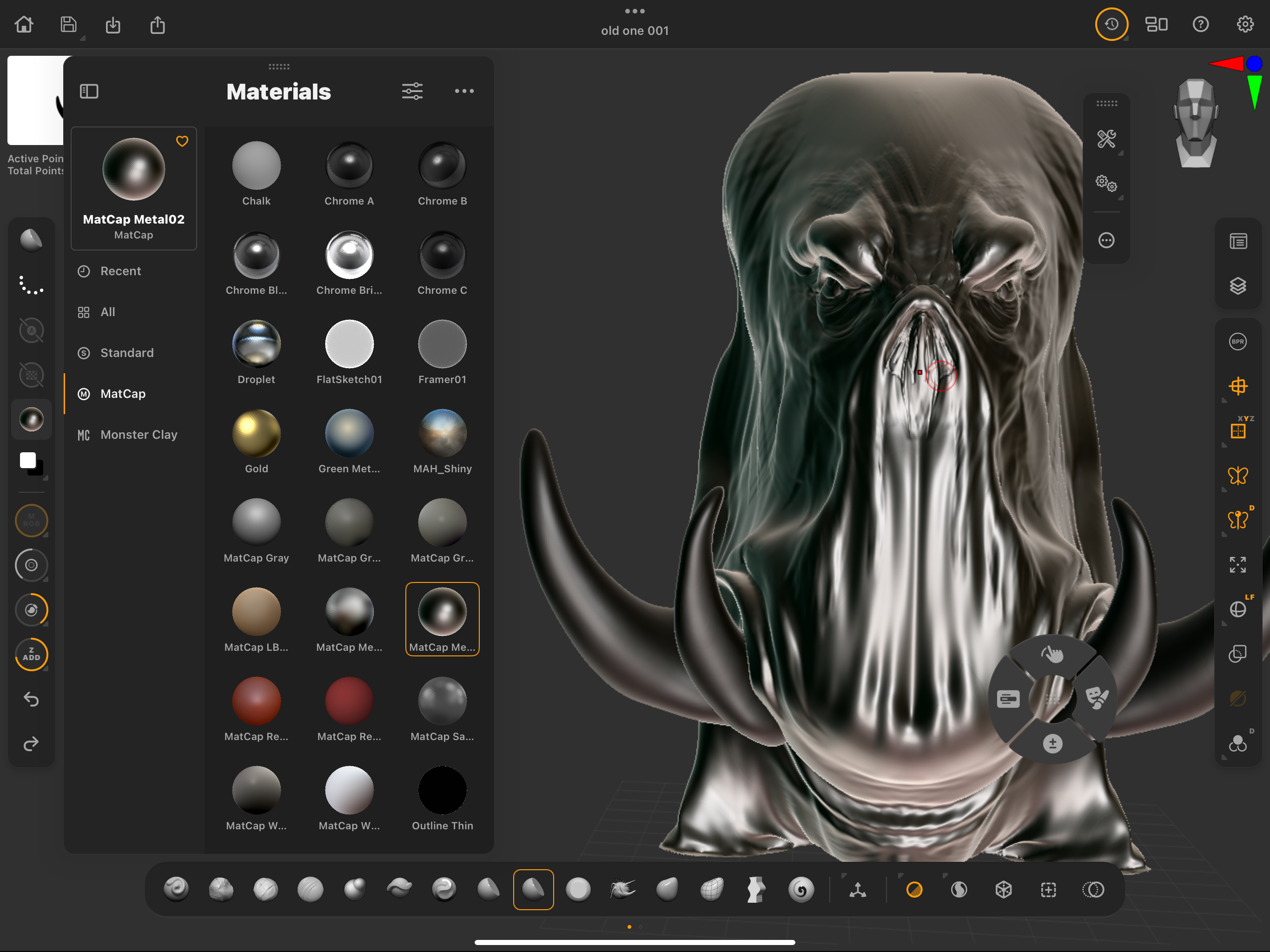
ZBrush has two main types of materials. Both MatCaps and Standard Materials are essential tools, each serving specific roles depending on the project needs.
MatCaps capture both the material properties (like texture, reflection, etc.) and the lighting of the material. The lighting information is baked into the material itself using an image, so the surface will look the same regardless of the environment or the position of the light in the ZBrush scene.
Unlike MatCaps, standard materials don’t have baked-in lighting. They respond to scene lighting, which allows for more flexible and realistic interaction with light sources. As you move or change the lights in the scene, the materials will react accordingly. Both are needed and ZBrush IPad has them both available from the left-hand menu.
10. Master basic Polypainting
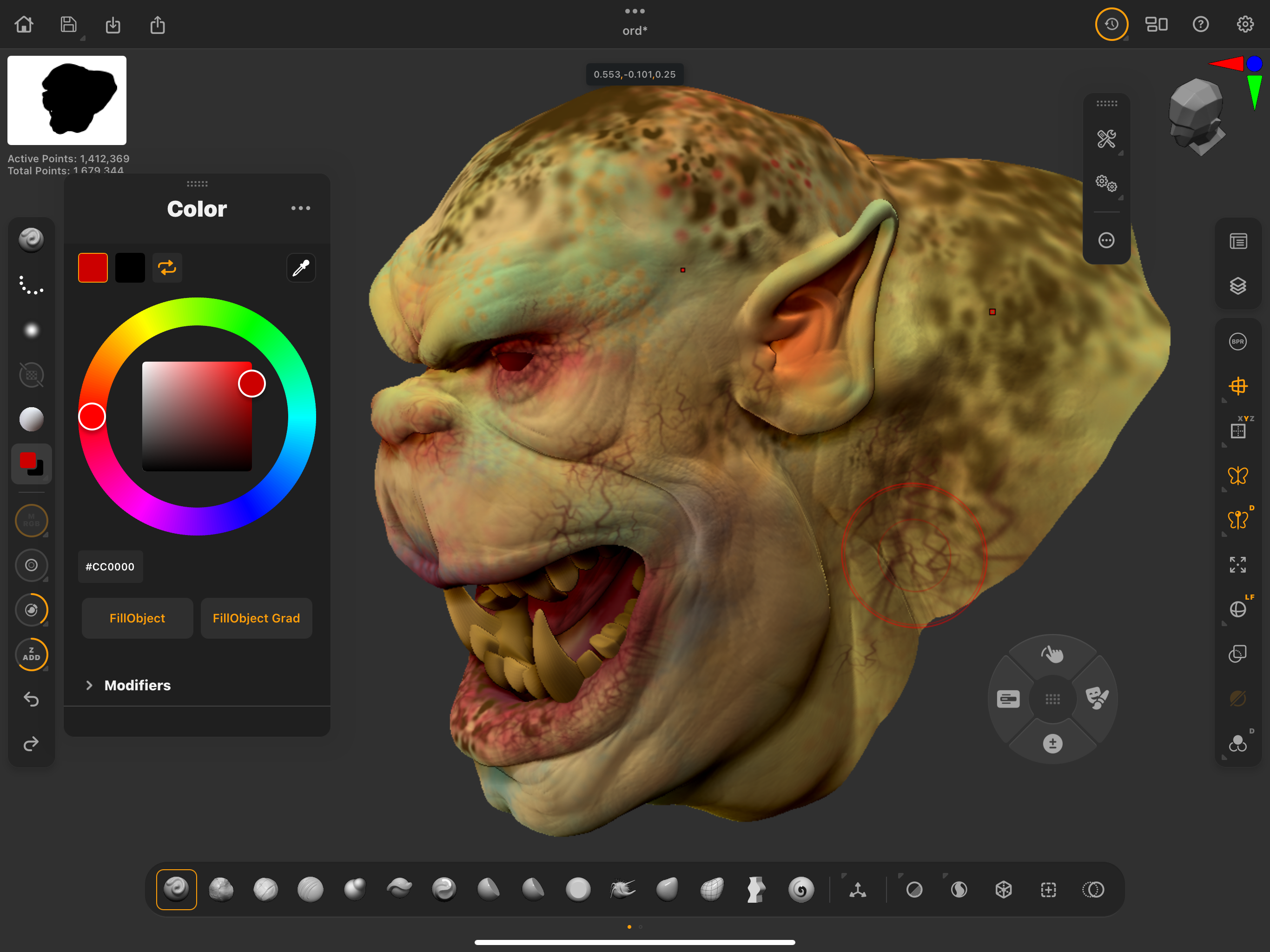
Polypainting should really be called Vertex painting but it's cool anyway! Polypainting in ZBrush is a method of painting directly onto your 3D model without needing any UV maps or textures.
This is a unique way to colour your model, as the paint is applied to each polygon's surface (or each vertex more accurately), giving you the ability to work seamlessly as you sculpt and colour at the same time. It allows you to paint directly onto your 3D model Instead of using a traditional texture maps (which wraps around your model) and as I said, the colour is stored on the vertices (points) of the polygons.
The more polygons your model has, the more detailed your painting can be and ZBrush for iPad works exactly like the desktop version. You can even capture that painting onto a texture map.
If you need more advice, read our ZBrush tutorials (including more from Glen). If you've yet to get an iPad, read our guide to the iPad generations, this explains all you need to know about iPads.


