What you need to know
- YouTube Music has rolled out a visual makeover in the Library tab.
- The most recent update allows you to switch between list and grid views for playlists.
- It comes just a few months after YouTube Music tweaked the tab's layout with the list view.
YouTube Music has quietly rolled out a revamped Library tab interface that gives you the option to view playlists in a grid layout.
The latest change comes a few months after the platform redesigned the Library tab, removing the side-scrolling "Recent Activity" menu in favor of a list view for playlists. As spotted by a Reddit user, a new option in that tab brings about a much-needed tweak to the interface (via 9to5Google).
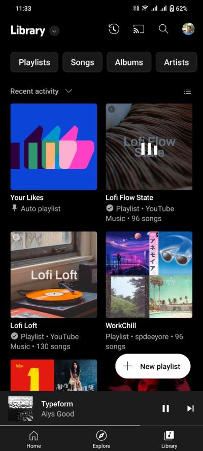
The redesign is live on some of our devices, indicating that the update is not limited to a few beta testers. As shown in the screenshot below, there's now a new toggle for grid or list view across the sorting option.

The new UI option for YouTube Music primarily improves how cover art is displayed, with images appearing larger than before to make it easier to tap the right playlists you want to play. The grid layout, like the list view, mentions the title and artist name, but these details are now beneath the cover art rather than beside it.
Playlists are also distinct from artists in that their cover art has a square shape, whereas the latter is shown in a circle. As a result, only four playlists are displayed at a time, with two items per row. The list view, on the other hand, displays eight playlists at once. Of course, you can quickly return to that layout whenever you want to by using the toggle.
While the latest update adds a handy option that makes it difficult to miss the playlist you want to listen to, it appears to be better suited to large-screen devices such as tablets and the growing number of foldable devices.
It's not clear how widespread the update is at the moment, but we're assuming it's hitting devices via a server-side update.


