What you need to know
- YouTube Music for the Web could soon see visual changes after the new update.
- A new nav bar will include the current Home, Explore, and Library tabs.
- Overall, the new UI change resembles the original YouTube design.
YouTube Music has been put through various redesigns in the past, primarily on the mobile app. A new finding shows a big redesign coming to YouTube Music for the web.
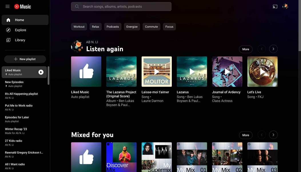
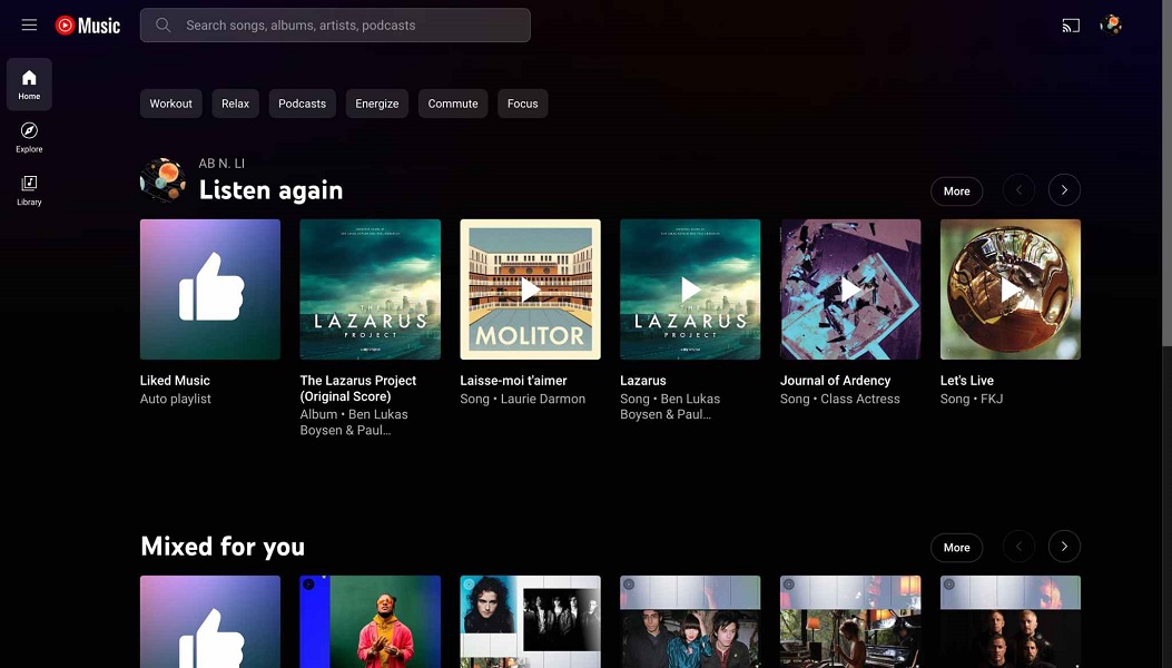
One of the best music streaming services could have a visual makeover soon, adopting a new navigation panel to easily access playlists, notes 9to5Google. This navigation bar on YouTube Music appears to be rolling out, and it includes Home, Explore, and Library sections, which have been moved from their current position at the top of the web version.

The cast button, which resides in the top right corner next to your Google account, will likely remain intact even on the new version of the music service.
The new nav bar can be expanded and collapsed when not needed. Visually, it's very similar to the design seen on the traditional YouTube website. Opening the navigation drawer pulls up a scrollable menu featuring up to 50 of your recent playlists, including Liked Music and New Podcast Episodes.
Users can easily create a new playlist from the new nav drawer, and it appears YouTube Music will remember whether you last had the drawer expanded or collapsed, leaving it in the same state upon your next visit to the website.

Now that the Home, Explore, and Library have been moved to the new nav drawer, the top portion of the music service is filled with a more pronounced search bar interface where users will be able to find songs, albums, artists, and podcasts.
Despite the changes rolling out to the home screen experience on the YouTube Music website, there are no visual changes to the other sections. You would be greeted with the same interface as seen currently when clicking Explore, for instance.


