What you need to know
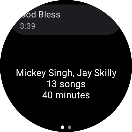
- YouTube Music's latest version on Wear OS finally displays the entire catalog of songs in an album or playlist rather than just a few control buttons.
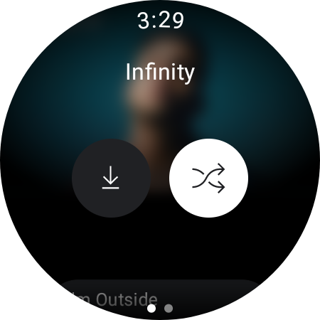
- Meanwhile, the play button has been replaced with a shuffle button.
- Furthermore, selecting a track from an album oddly launches a radio station, so the remaining songs in that album do not play.
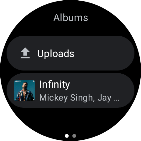
YouTube Music for Wear OS is finally giving us what we've been asking for: the ability to browse songs inside albums and playlists.
The latest change, as spotted by 9to5Google, is part of a new update (version 6.15) to the music streaming service on Wear OS watches. It finally allows you to select and listen to your favorite tunes in a certain catalog without having to endlessly tap the "Next" button.
The old YouTube Music app was a nightmare for anyone who wanted to listen to specific songs on their smartwatch. You had to jump through hoops just to find the one you wanted, and it was never any fun. The new update is a huge improvement, and it makes listening to music on your smartwatch a breeze.
Now, it's easier to find and play the songs you want. Just tap on an album or playlist, and you'll see a list of all the songs in it. You can then select the song you want to play, and it will start playing right away.


In addition to the tweaked functionality, the tracklist will appear over a blurred background of the album artwork. This gives you a more immersive listening experience, and it makes it easy to see the song titles and album artwork at the same time.
However, some UI elements have been removed, and a few oddities may be annoying. The play button in the old interface is gone when entering a playlist or album, and this has been replaced with a shuffle button. This makes sense given that tapping a track in a certain selection automatically plays that song.
Surprisingly, when you select a song from an album, you are greeted with a radio station rather than a tracklist from the same album. This means that the remaining songs in that selection will not be added to the queue. Having said that, you can still play an entire album by tapping the shuffle button rather than selecting a specific song.
Thankfully, this behavior does not apply to playlists, so choosing a song from a playlist starts a queue from the same group.


