What you need to know
- YouTube is preparing to roll out a redesign for its TV app in the "next few weeks" that brings a "dual column" view.
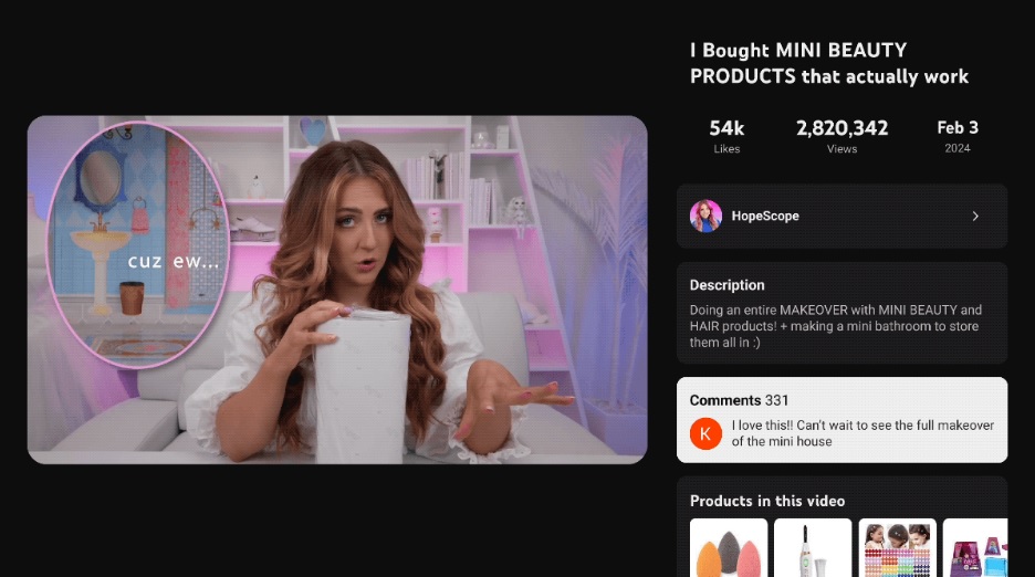
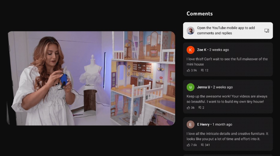
- Interacting with a video's title will shift your content to the left, creating space for its description box, comment section, and more on the right.
- The redesign will arrive for YouTube TV subscribers, as well, as the users can check a game's key plays and stats without blocking what they're watching.
YouTube attributes its upcoming TV redesign to user feedback highlighting the need for a "richer, distraction-free" video experience on the large screen.
According to YouTube, its TV redesign was crafted on the back of wanting to keep its video content "front and center" at all times. The primary change is that opening a video's comments, description, or live chat no longer blocks off the right side of what you're watching.
YouTube states users found that its previous approach obscured the video too much. So, clicking a video's title with your remote control will produce the new "dual column" redesign, shifting the video to the left. The right side will host the title, video statistics, description box, and comments section.
The video users are currently watching on TV will shrink slightly, considering it needs to make room for additional content. YouTube's addition should help enhance the experience when scrolling through a video's chapters, key plays, shopping moments, and keeping track of scores.
Additionally, watching a full-screen video will display the like, dislike, CC (closed captioning), and gear (settings) icons. Sliding back to the video while in this new dual-column view should let users return to full screen.


YouTube prototyped a few different redesign versions before settling on its "dual column" approach. One of its goals was to ensure it struck the right balance between what users want (their video) and YouTube's interactive controls. Using a remote control should continue to feel comfortable as the platform prioritizes "simplicity over the introduction of lightweight controls."
YouTube adds that a "one size fits all" approach will likely not work for everything it offers its viewers. An example would be the platform's live chat, as the post states that it would "benefit from different levels of immersion" moving forward.
This dual-column TV redesign is set to arrive in the "next few weeks" for the YouTube app. The platform is also preparing to bring this to YouTube TV subscribers so they can explore key plays or game stats without removing them from the action.
Back in February, YouTube TV celebrated its achievement of 8 million subscribers. The company also made it clear that it wanted to place more focus on living room viewers as folks have tallied an average of 1 billion hours watched from a TV. Those watching YouTube on a TV are in line for reworks in 2024, and it looks like this is the start of those enhancements.


