If you’re truly exploring portrait photography, then at some point you’ll start to consider versatility. Natural light is amazing, be it backlight sun or the soft light of an overcast day. Even in place artificial light, like street lights or neon signs can supply the colour and tone needed to make your portrait.
But what if you want to shoot at night when the lighting isn’t so good? What if you can’t visualize what’s happening with flash, be it a flashgun or a studio strobe? Well I’ve good news for you. There is a whole range of continuous lights from many manufacturers that use the same modifiers as studio lights. You can get that look, but what you see is what you get in camera. For LED lighting, the Godox SL60W is tried and tested and long in the tooth, but still keeps on going. It takes Bowens fit modifiers and even looks like a studio light. There are plenty of others like Apurture or Hobolight.
Now, simply pointing the light isn’t good enough. Victoria Secrets photographer Russell James once said the secret to his work was the use of classic lighting. So let’s look at the classic lighting patterns that you can use to revolutionise your use of light.
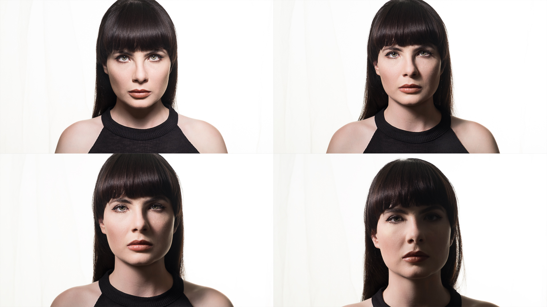
These photos are unedited to let you see the light and are shot using a beauty dish so the edges of the shadows are obvious.
1: Butterfly lighting
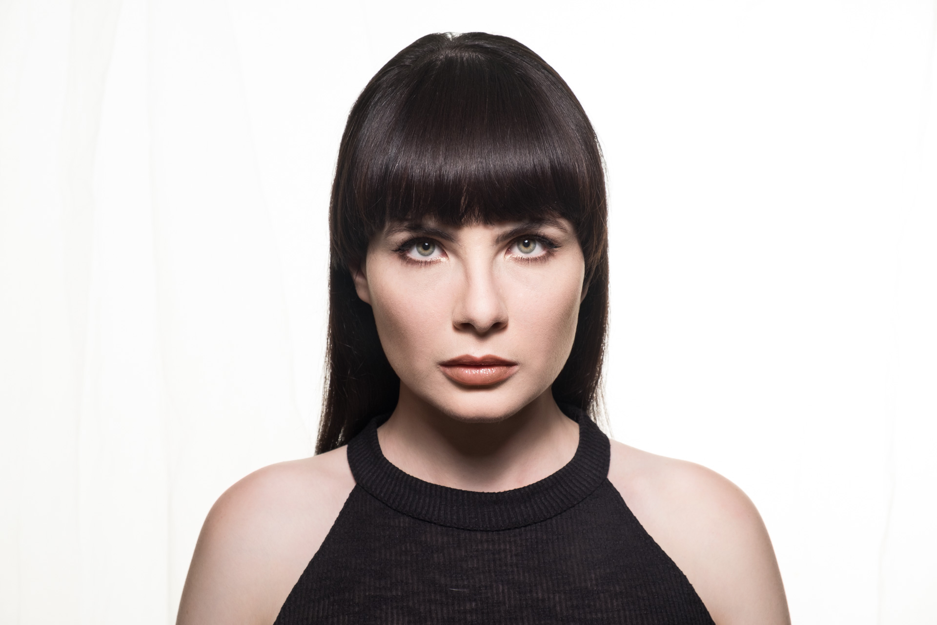
For best effect, this lighting set-up needs a boom arm, but Neweer has a stand that lets the spigot point out perpendicular to the start, so you can be directly under the light. The light is situated directly between the subject and the camera. The nose shadow needs to be roughly halfway between the nose and the lips. The name comes from the shadow looking like a butterfly in flight head on. It’s also referred to as Paramount Lighting.
2: Loop Lighting
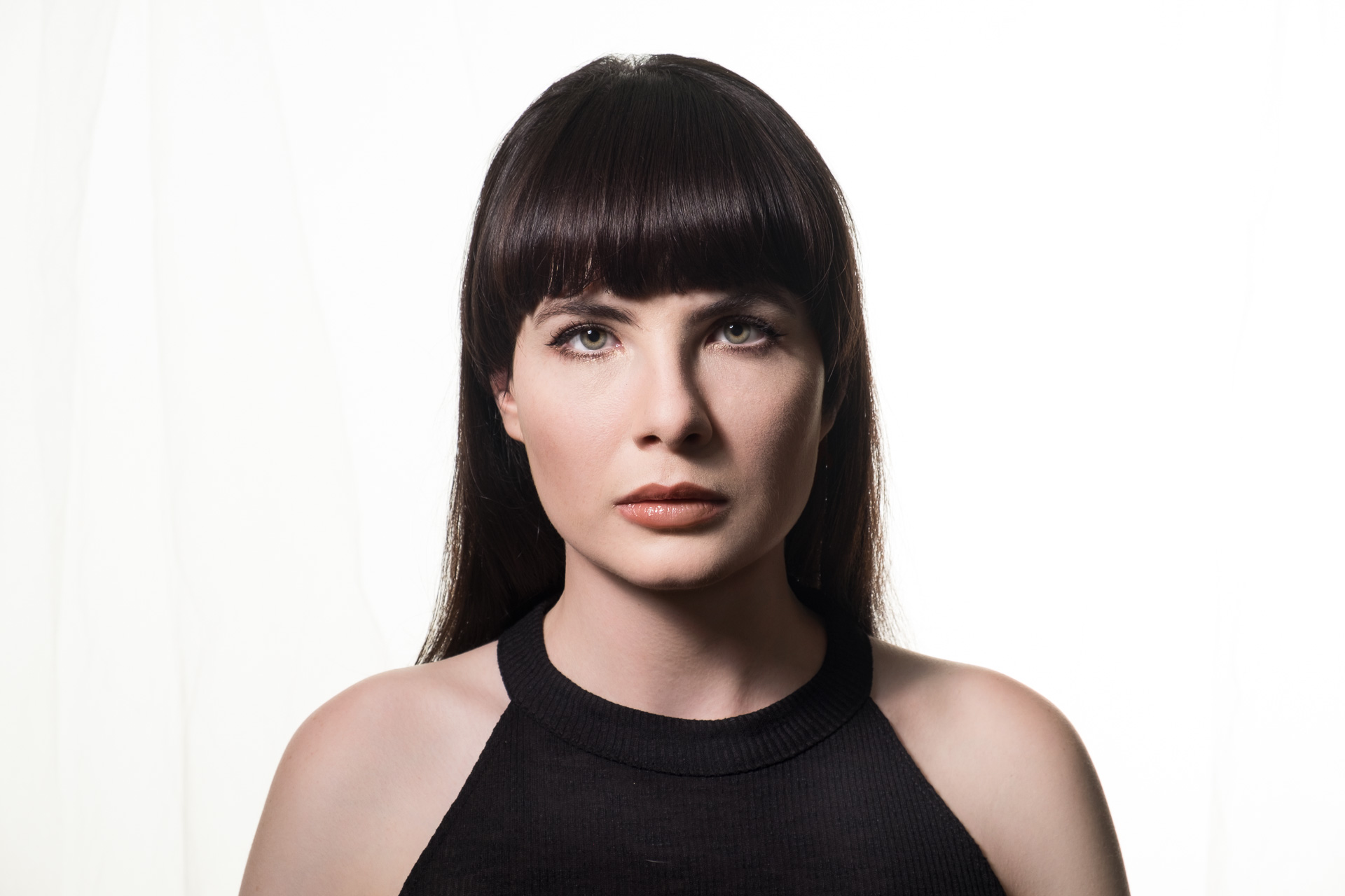
If you move the light to either side at around the same height, you get a more pronounced nose shadow on the cheek. The cheek opposite the light starts to fall into shadow. The hallmark of this pattern is that the two shadows don’t meet.
3: Rembrandt Lighting
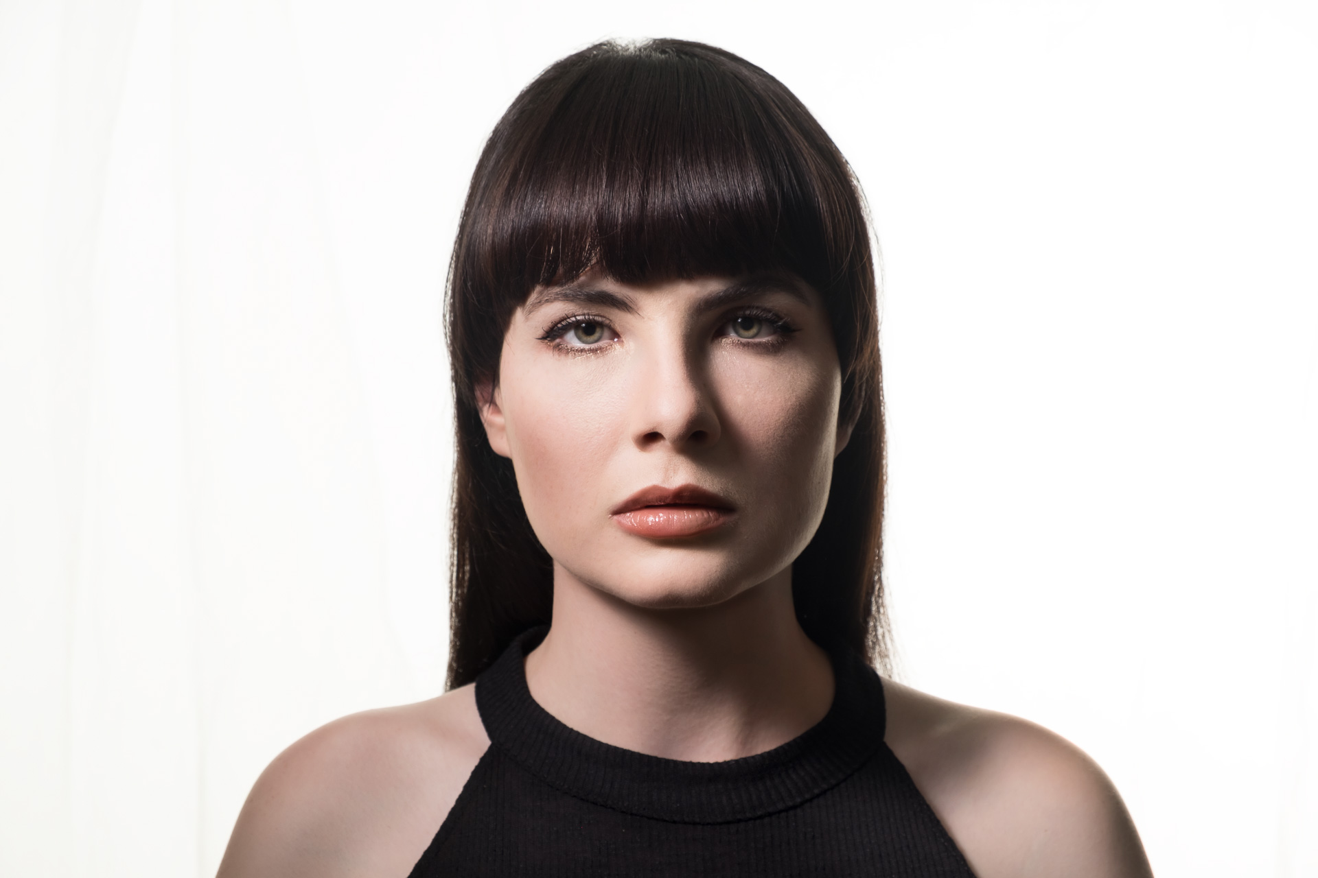
This is my personal favorite. The light is over more and the nose and cheek shadows meet, creating a triangle of light below the eye. The light can be moved higher for a deeper triangle, but be careful to retain a catchlight in the eye.
4: Split Lighting
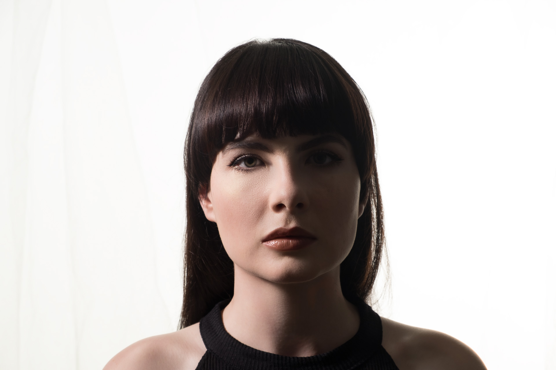
When you move the light in to come from the side, it leaves one side completely in shadow ‘spliting’ the face in half. It’s not as flattering on women, but was famously used on the album cover of Meet The Beatles. This is often combined with a light from the back (called a kicker or rim light) in movie posters.
5: Broad Lighting
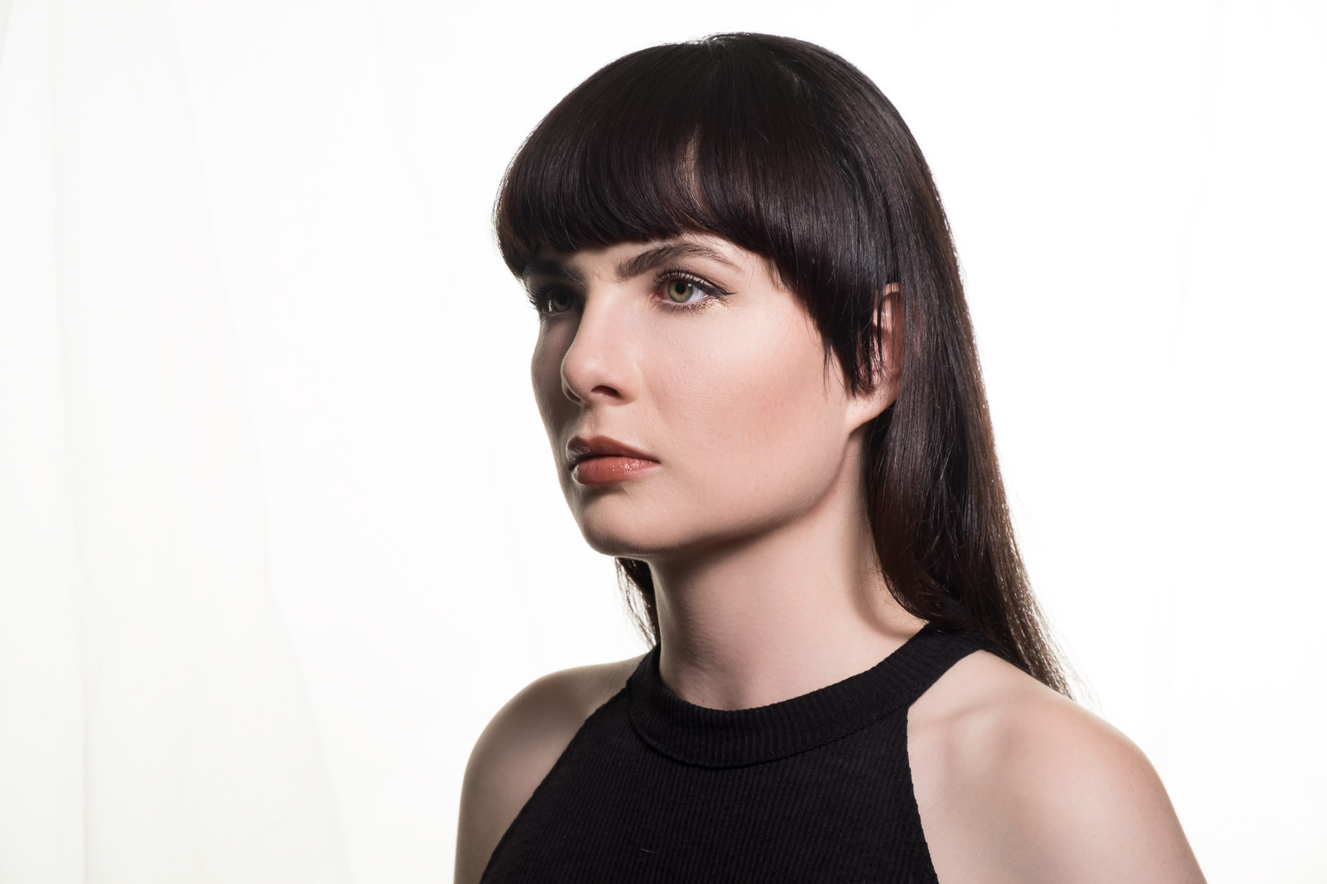
The patterns so far have had the face straight on, but often the face is at an angle, so the placement of the light relative to the camera can dramatically alter the look of the photo. These angles break down into two types, Broad and Short lighting.
Broad Lighting has the light on the nearest side of the face. Short Lighting has it on the side that’s further away. With Broad Lighting, there’s very little shadow on the face, and all details are visible. True to its name, it can indeed ‘broaden’ the face and shouldn’t be used on heavier-set people.
6: Short Lighting
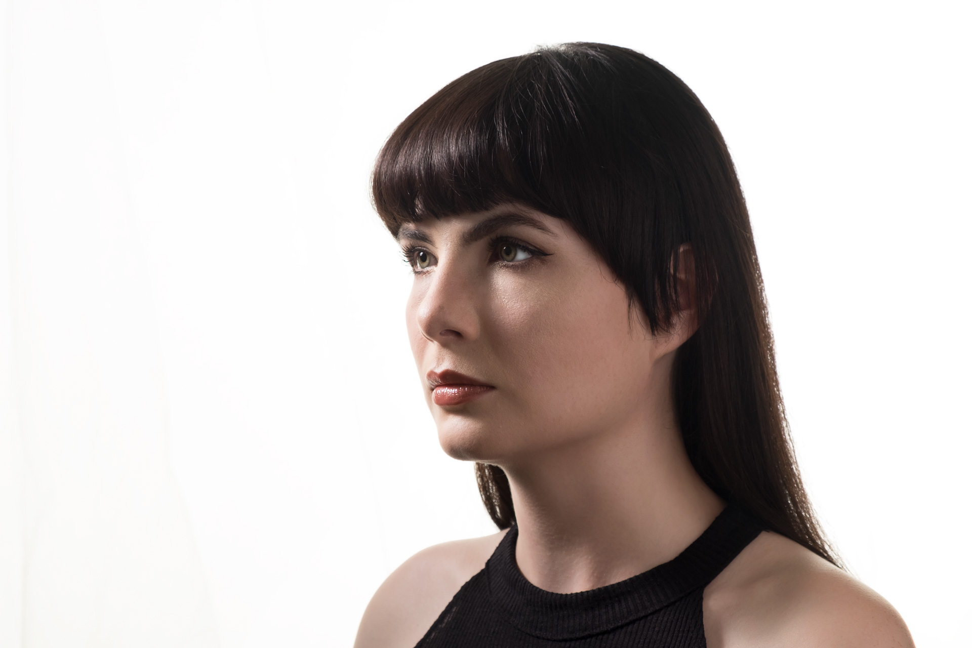
Short Lighting is both flattering and dramatic. People have built careers on short lighting. Combined with the lighting patterns above, you get a much larger range of options. A short-lit Rembrandt pattern is one of the most dramatic looks you can get and should be a staple in your portrait arsenal.
Go practice these looks and become familiar with them. Start looking at fashion ads and celebrity portraits. You’ll see these everywhere. Use them in your work and you too will be a lighting expert.
