The tricky thing about art is that you want it to stand out, of course. You’ve made a purchase and you want to showcase it. However, in an interior that is designed in a more minimalist style, you’ll face the challenge of making sure the art does not stand out in a way that is overpowering and ruins the balance of the design.
Should you stick to neutral color schemes, or go for something bolder?
There is an art (pun not intended) to choosing and placing your artwork within your space so that it’s both holding its own amongst the other elements of the room and complementing the overall scheme. Here’s how Justin Charette did it in this modern home - an East Village apartment project.
Showcasing art was a vital part of the designer’s brief for this space

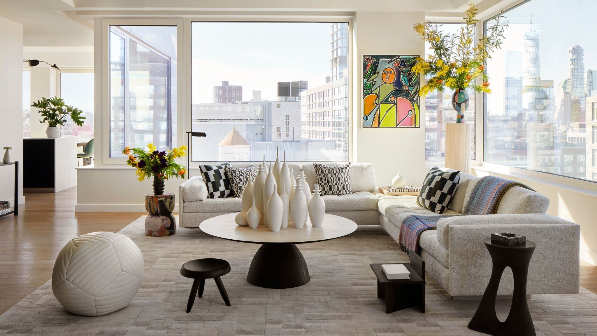
This apartment designed by Justin Charette features impressive views of the New York skyline. Located in the East Village, a young and vibrant neighborhood, it’s no surprise the designer chose artworks to reflect that playful spirit.
The client’s brief featured a clear request for both the extensive NYC views and curated artworks to be the focus of the design thanks to a neutral color scheme. ‘With careful editing, I was able to achieve a layout that lets the eye focus on views from every window, and place large-scale art throughout each room,’ tells me Justin.
How bold artworks were selected for this minimalist interior

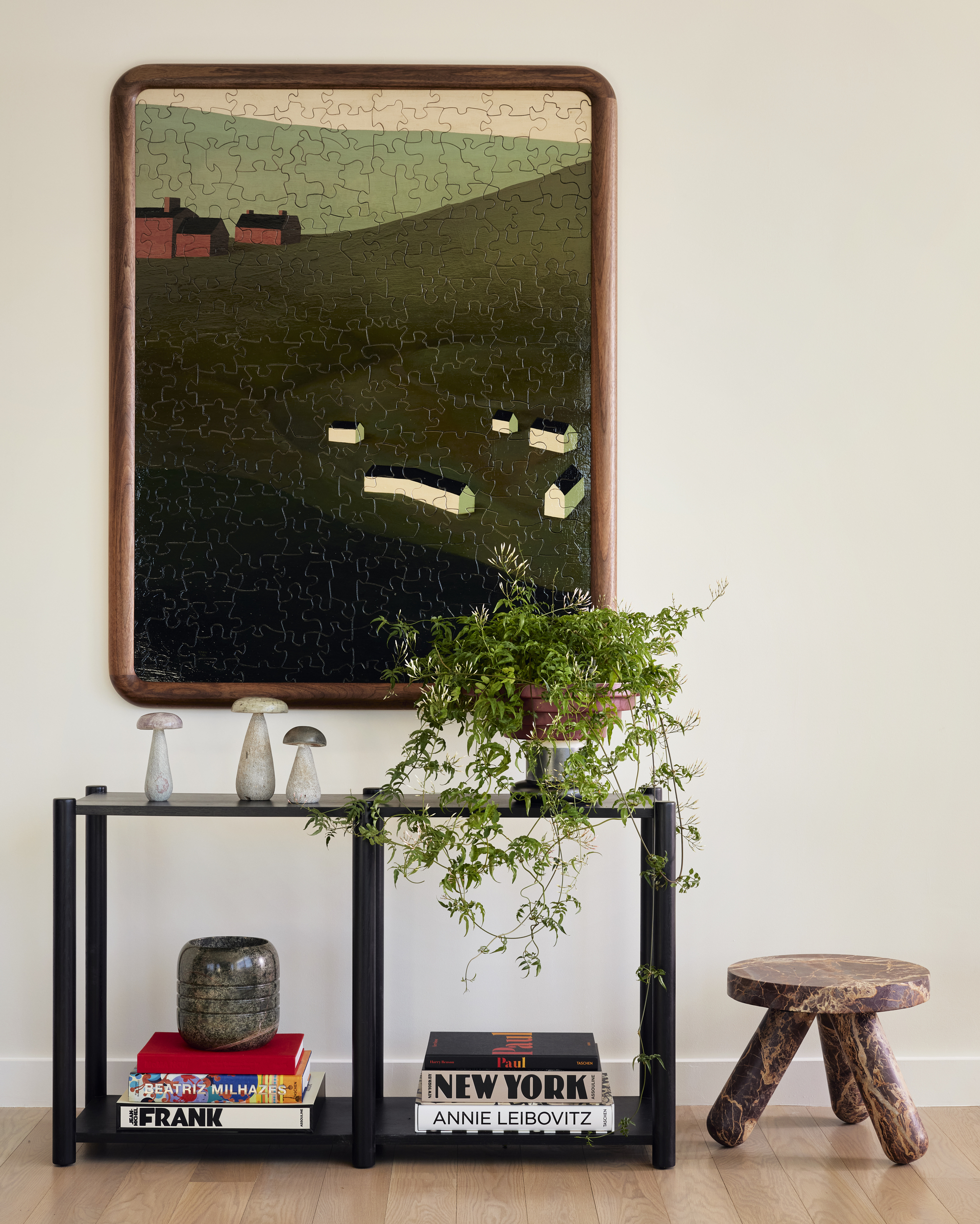
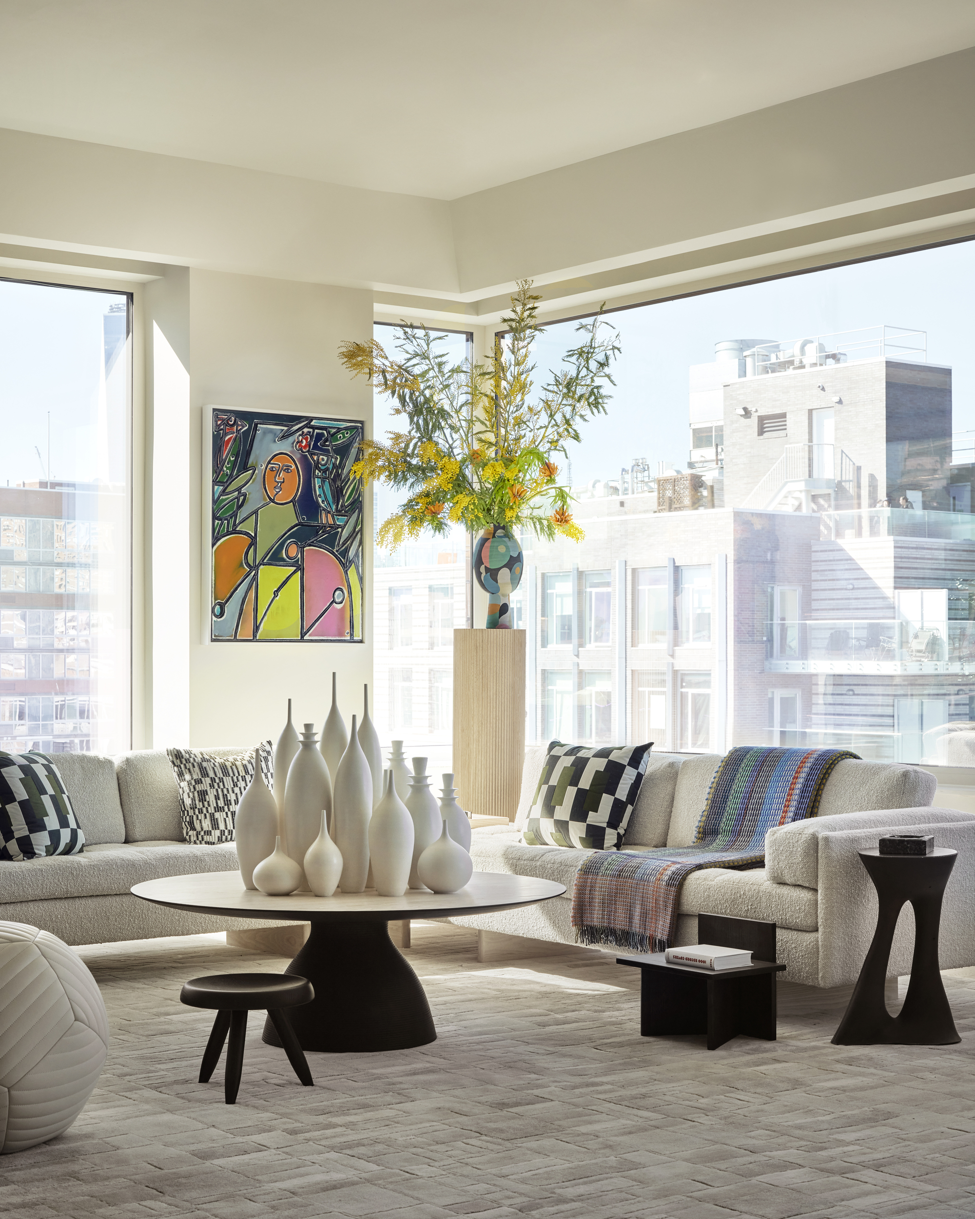
I noticed a perfect balance has been achieved, where the geometry of the NYC building views reflects the colorful geometry of the painting between the living room windows. In the hallway, colors from the art are picked up in the furniture and accessories. Black, brown, and green are found in both the puzzle art and the console table, stool, and plant. The dog artwork on the terrace also serves as a bench. It’s these thoughtful details that make it all blend in so seamlessly.
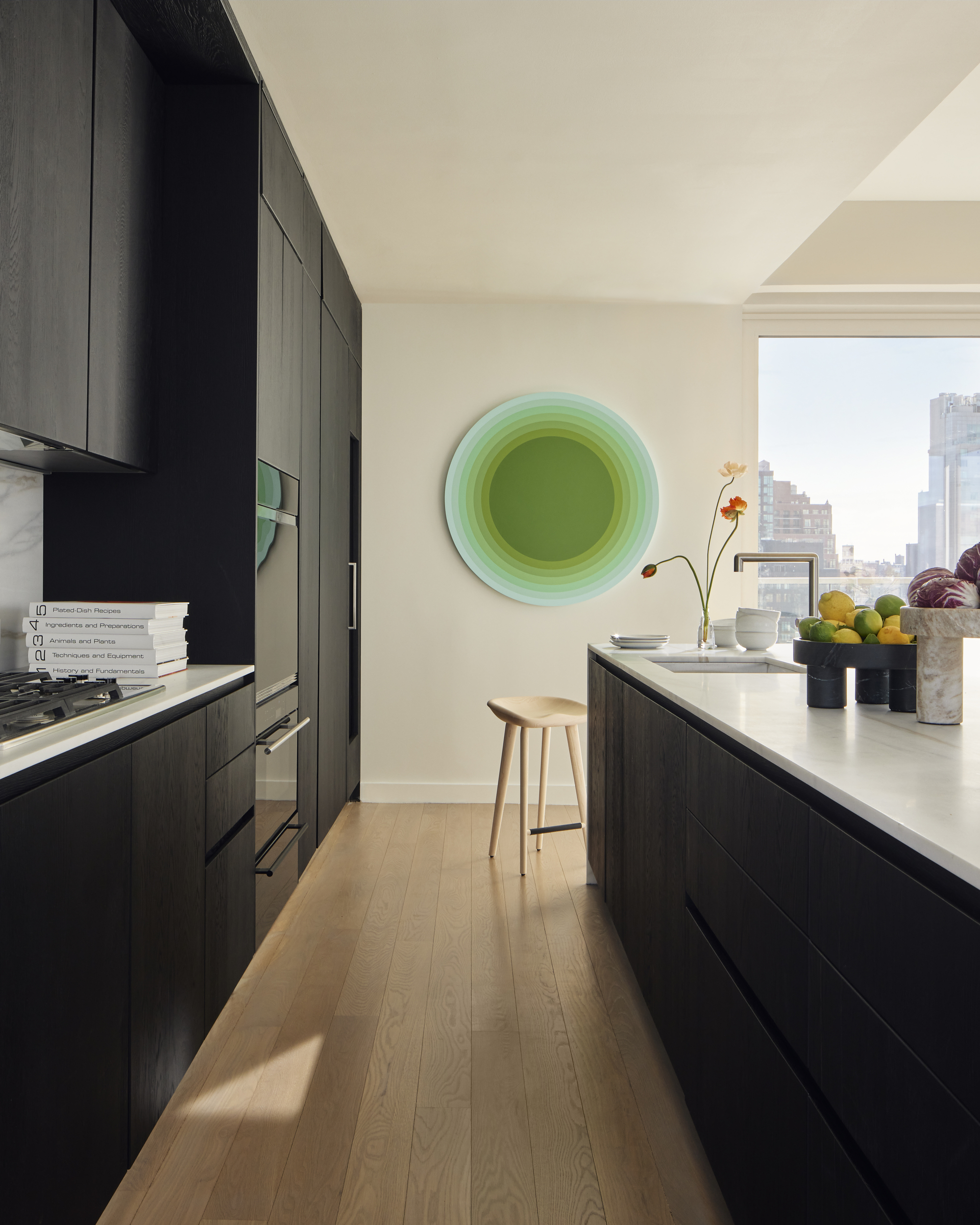
‘For the indoor art, I wanted to select pieces that felt unexpected and unique,' Justin tells me. 'The round kitchen art adds a great shape to the otherwise very rectangular space. The BBDW puzzle art feels elevated but adds a sense of whimsy to the entrance area. The Bradley Duncan peg work art above the fireplace doubles as an art installation and an architectural element in my opinion. With new construction, spaces can often lack depth, and I feel this piece gives a sense of depth and interest.’
This is what you should try at home

Following Justin’s example, you can absolutely have a minimalist house that's full of color. In order to harmoniously marry colorful art into a minimalist design, you need to pay attention to the details. Research your area for local artists that will bring authentic flavor to the space and reflect its surroundings. Search for common colors within both artwork and styling accessories and place them in proximity so they create a harmonious look.
If placing a painting or print next to a window, notice the view. Are there any shapes or colors that are reflected in the piece? And last but not least, soften any sharp, rectangular edges in a room with rounded shapes in your chosen artworks.


