Have the 2024 web design trend predictions come true? We're over halfway through the year, so it's a good moment to assess. Wix, which tops our pick of the best web builders for small business, has done just that, analysing what approaches have been used for new web designs in the last six months.
The results? Maximalist design has solidified its presence in web design as predicted at the start of the year. There's also been an abundance of Y2K design and nostalgia for the early days of web design as well as an increase in the use of more handmade elements, perhaps as a push back against the artificiality we're seeing in the explosion of AI generated content online. Here are the highlights of the report.
01. Hyperreality in web design

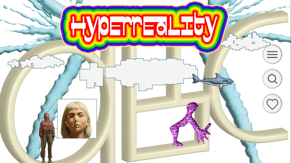
Jean Baudrillard's concept of hyperreality involved the idea that simulation that can feel more real or impactful than reality itself. The AI boom is no doubt part of the resurgence in interest in the concept, but Wix also noted the surge in designers and creators pushing limits of what’s possible both online and IRL, from NPC characters on TikTok to MSCHF’s viral big red boots.
To tap into the trend, Wix suggests that web designers can use interactive 3D elements that users can manipulate, like clickable objects that change state or appearance with each interaction, to create a more immersive experience. Surreal animations that alter the perception of the digital environment, like overlays or dynamically changing backgrounds, can also given a sense otherworldliness.
02. The human touch
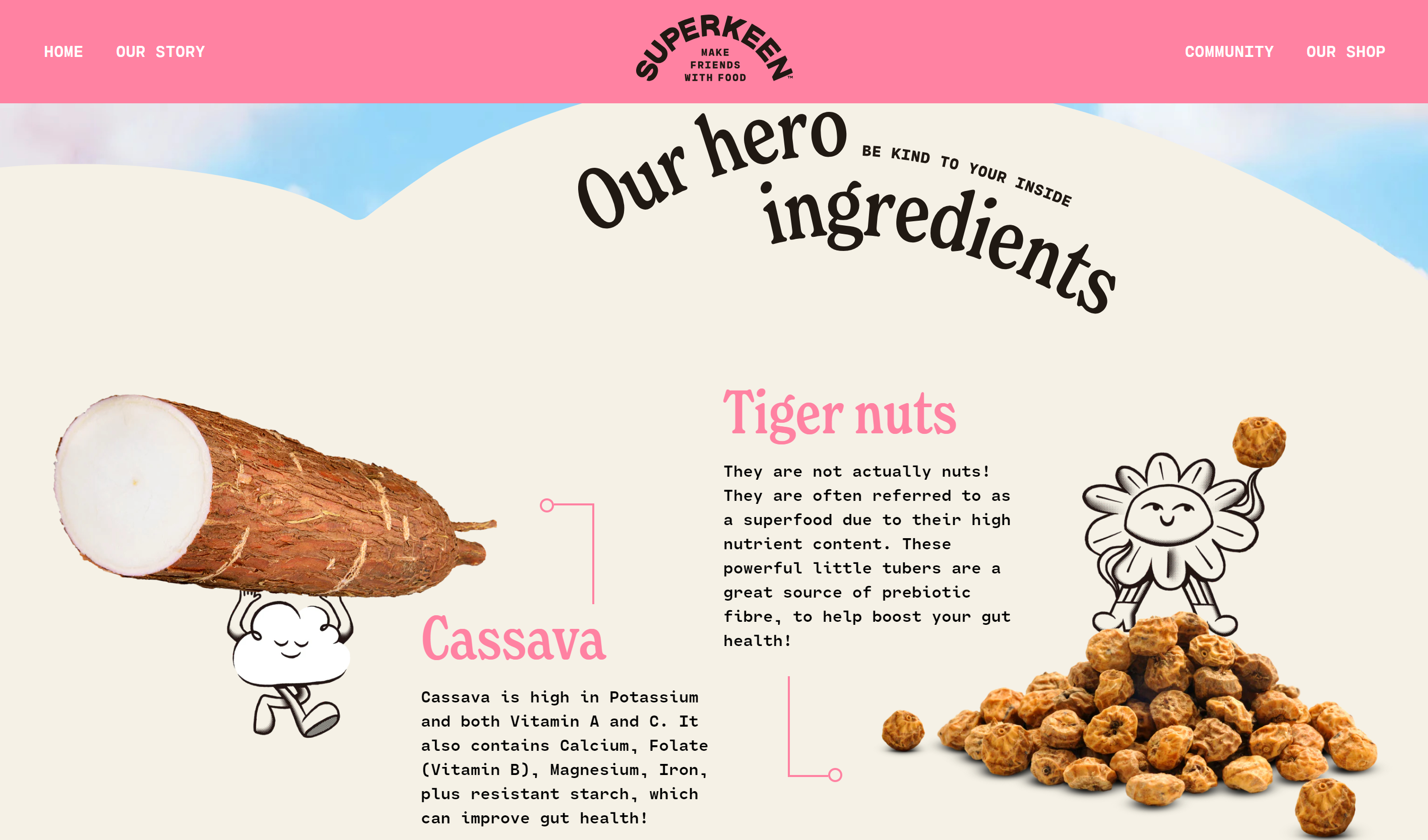
An alternative reaction to AI has been to put an emphasis on an organic human touch in web design through the use of handmade illustrations and handwriting fonts. Wix cites examples such as Dinner Ladies’ fancy script wordmark and the hand-drawn illustrations of Delicious Nuggets by the Earth Alliance and Superkeen (pictured above). Bespoke visuals featuring imperfect lines and organic textures contrast with the artificiality of AI-generated art, giving a sense of authenticity.
03. Maximalism
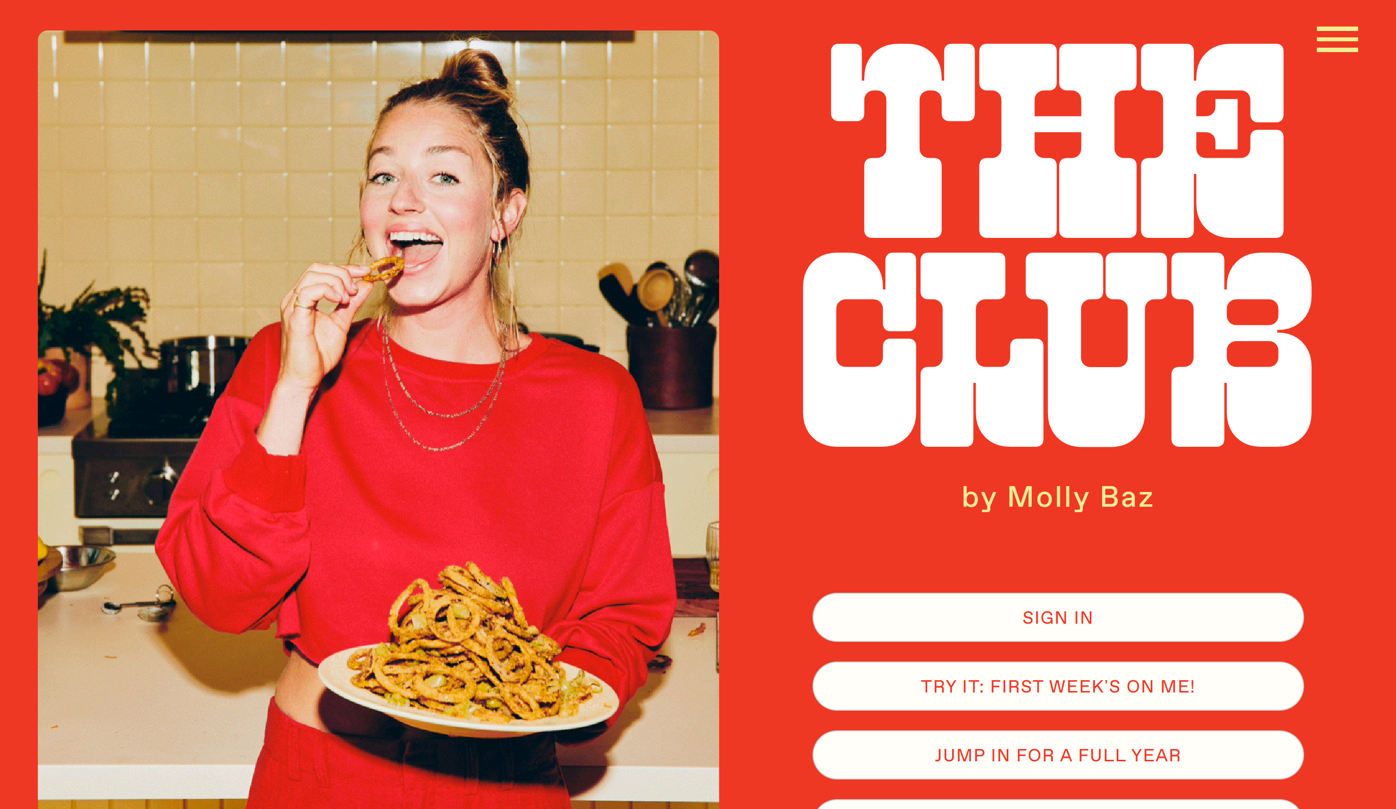
The trend of maximalism in web design needs little introduction, but Wix thinks it's far from reaching peak saturation in 2024, with consumer package goods and food and beverages aimed at younger audiences particularly keen on the trend. Wix highlights JKR’s rebrand of Fanta, the chubby, all-caps branding of celeb chef Molly Baz's website and Collins’ revamp of the streaming service Freeform.
How can web designers apply the trend? Oversized 3D lettering or bold and dramatic typography like ITC Avant Garde Gothic, Montserrat or Oswald for headings, vibrant, contrasting colours like Neon Pink (#FF6EC7) and Electric Blue (#7DF9FF). Big buttons and icons are also part of the maximalist look, for example scaling up the logo in a website footer to fill the width of the screen.
04. Heritage revivalism
Maximalism borrows from the heavy ornamentation of 17th and 18th century Baroque and Rococo. So it makes some sense that Wix has also noticed a heritage revival afoot, with brands taking advantage of higher resolution screens to bring back some of the detail that had been reduced in recent years. It cites last year's Burberry rebrand as an example.
Designers can make use of this web design trend by using old-style fonts like Garamond or Caslon or a decorative font with special glyphs and vector elements. Wix also suggests using rich jewel tones and subdued neutrals, pairing pops of colors like burgundy, navy blue and emerald green with cream, taupe and antique white backgrounds. Vintage floral patterns, ornamental frames or Toile De Jouy complete the look.
05. Dial-up design
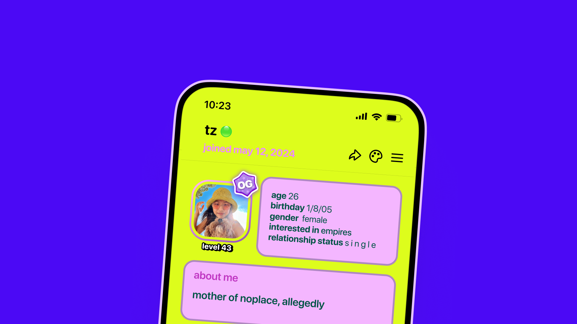
Finally, there’s also a nostalgia for the more free-form experimentation of the early web and the days of fewer brand guidelines. We wouldn't recommend going full Geocities, but low-fi social assets and word art are everywhere amid the success of Charli XCX’s Brat.
Check out the Myspace-inspired social app Noplace and Celestial Seasonings Sleepytime Bear mascot. The trend includes the use of ephemeral memes, bitmap fonts like Press Start 2P or Neue Pixel Grotesk to emulate the low-resolution text style of early web design, brash and even clashing colours and retro UI elements like big, blocky buttons with bevels and tiled backgrounds.
For full details, see Wix's web design trends.

