Windows 11 continues to gain new capabilities, and in many ways, that is a positive sign. The operating system is evolving, modernizing, and expanding its reach. However, not every addition improves the experience. Some features feel redundant, intrusive, or simply unnecessary in day-to-day workflows.
To be clear, this is not about AI integration or privacy controls. I have already made my position clear on those topics. AI should always be optional, and no dormant component should exist in the System without explicit user consent. Privacy should include a clear, centralized control mechanism. That discussion is separate.
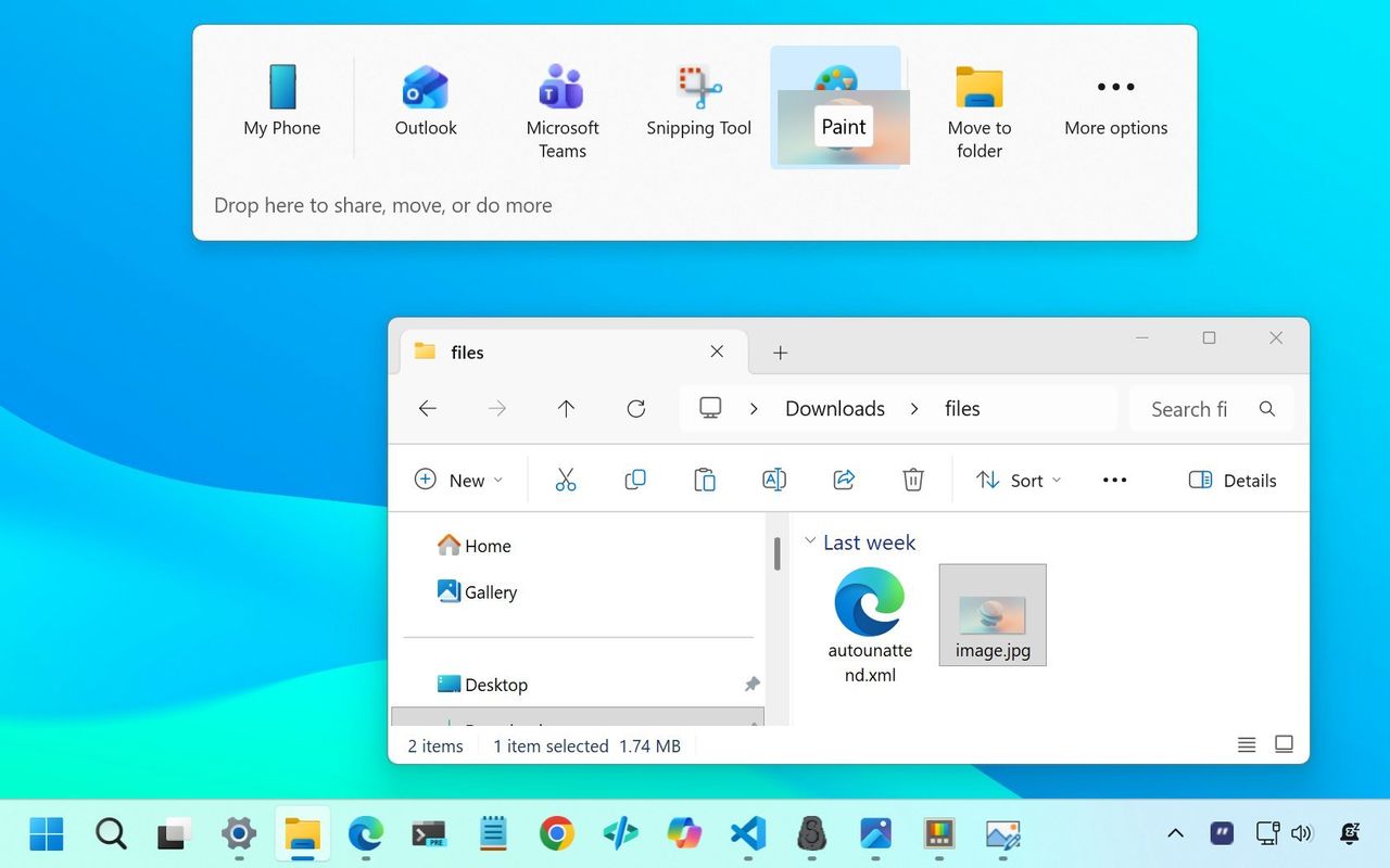
Specifically, in this case, I'm referring to the Snap Assist flyout that appears when dragging a window to the top of the screen, and the Drag Tray flyout that automatically surfaces suggestions to share files with other apps. These features aim to enhance multitasking, but in practice, they often disrupt the natural flow that long-time users have developed over decades.
Snap Assist and Drag Tray
Snap Assist itself is not the problem. The layout menu that appears when hovering over the maximize button is useful. It's deliberate. You intentionally hover, review layout options, and choose one. Keyboard shortcuts such as "Windows key + Z" are also efficient and precise. These methods feel controlled and predictable.
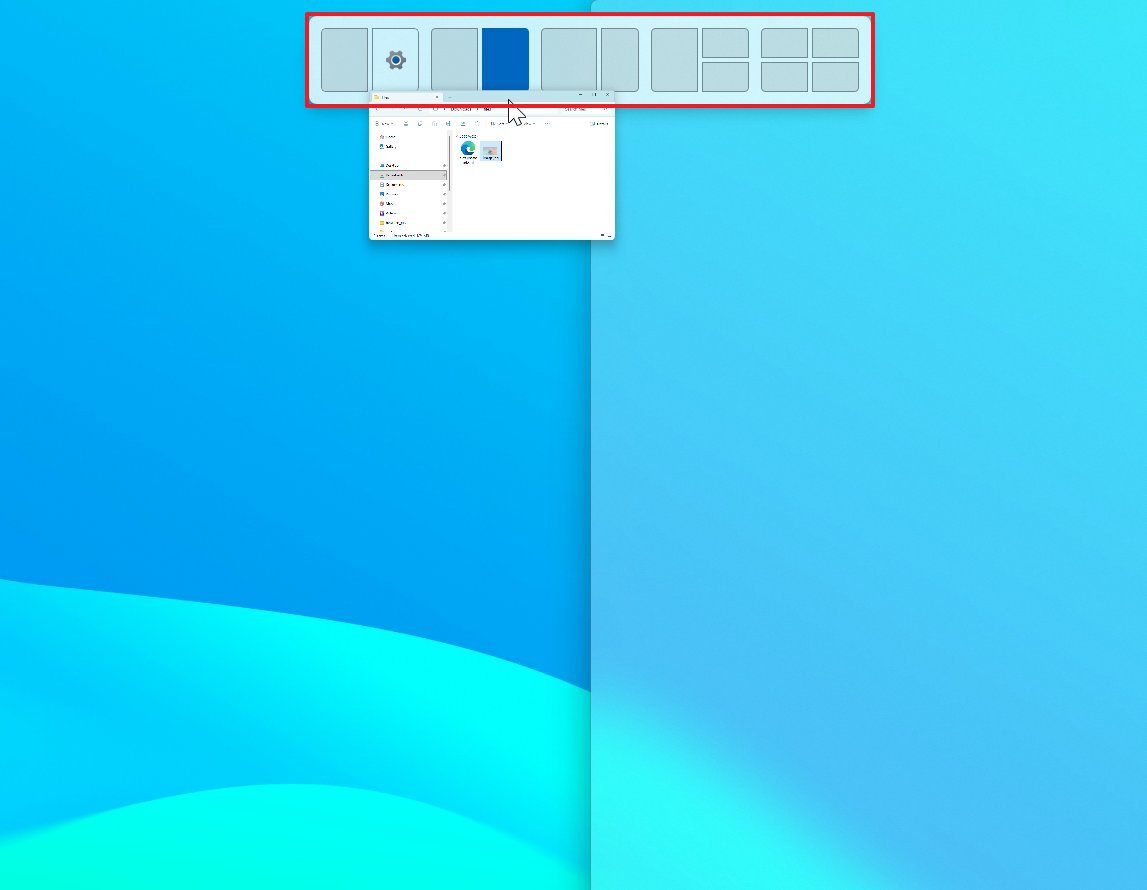
The top-of-screen Snap Assist tray is different. When you drag a window toward the top edge, Windows 11 displays a flyout overlay with multiple snapping zones. While it may be helpful for new users, it introduces friction for experienced users who want to quickly maximize or reposition a window. Instead of fluid motion, you encounter an interface element that demands attention.
Actually, I'm not the only one. For example, Zermist in Reddit said: "I'm wondering if there's any way I can remove this gray window that pops up whenever I drag a window near the top of the screen. this feature has annoyed me for months and I finally want to get rid of it for good."
The Drag Tray makes it worse. As you drag files around, Windows 11 attempts to anticipate your intent and present layout suggestions. Rather than enhancing productivity, it can feel like the operating System is second-guessing you. The experience of working with files should be fast and invisible. When visual overlays repeatedly appear during simple drag actions, the experience becomes heavier than it needs to be.
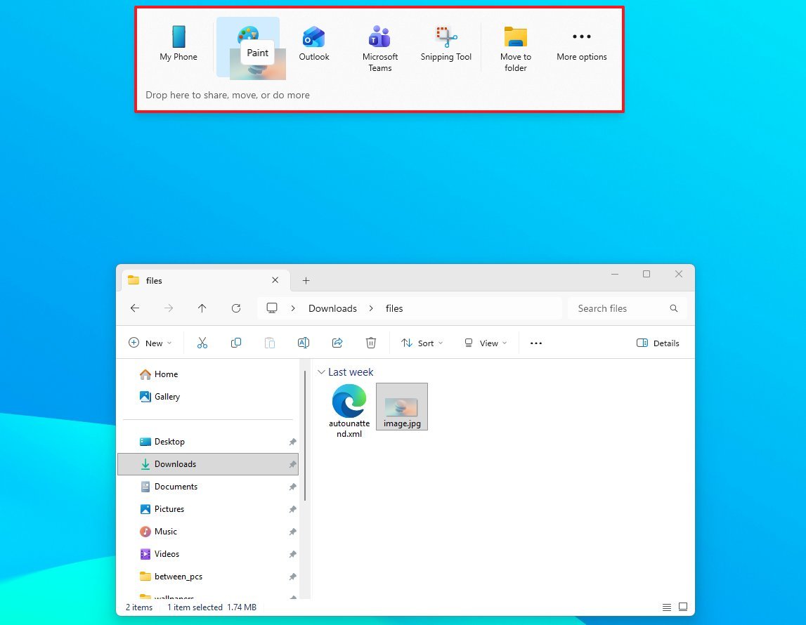
On Reddit, about the Drag Tray, dindustries10 notes: "Is there any way to remove this annoying pop-up bar in file explorer? I used to be able to conveniently drag and drop files between tabs in File Explorer, but now everytime i drag files to the top of the screen to put in another tab, this pop-up bar appears blocking access to the tab."
The operating system has historically been good at giving users control without unnecessary visual interruption. The maximize button menu and keyboard shortcuts respect that philosophy. The Snap flyout at the top of the screen, in contrast, introduces assistive elements that many power users neither need nor want.
Disable Snap and Drag Tray flyouts
If you agree and prefer a cleaner experience, you can turn off these behaviors through Settings. To disable the Snap Assist flyout, use these steps:
- Open Settings.
- Click on System.
- Click the Multitasking page on the right side.
- Click the Snap windows setting.
- Clear the "Show snap layouts when I drag a window to the top of my screen" option.
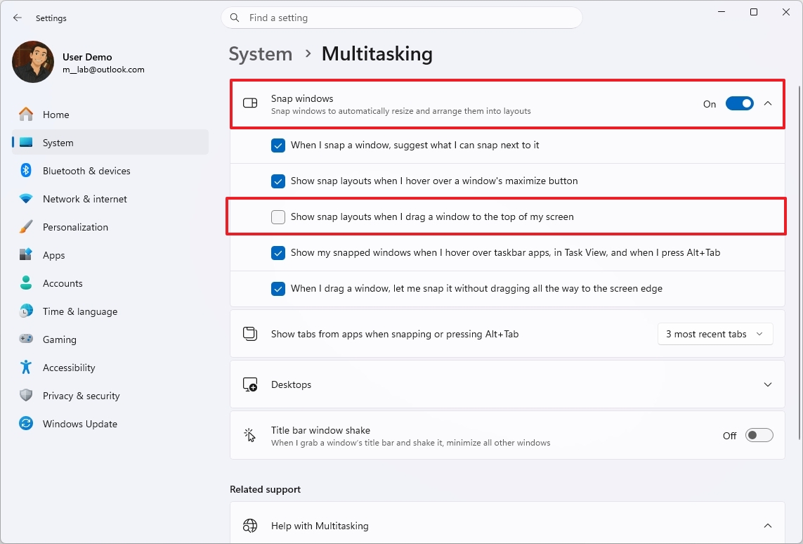
Once you complete the steps, the top Snap tray will no longer appear, while traditional snapping via keyboard shortcuts and the maximize button will continue to work.
You can also turn off suggestions that appear when you drag a file to the top of the screen.
- Open Settings.
- Click on System.
- Click the Nearby sharing page on the right side.
- Turn off the "Dray Tray" toggle switch.
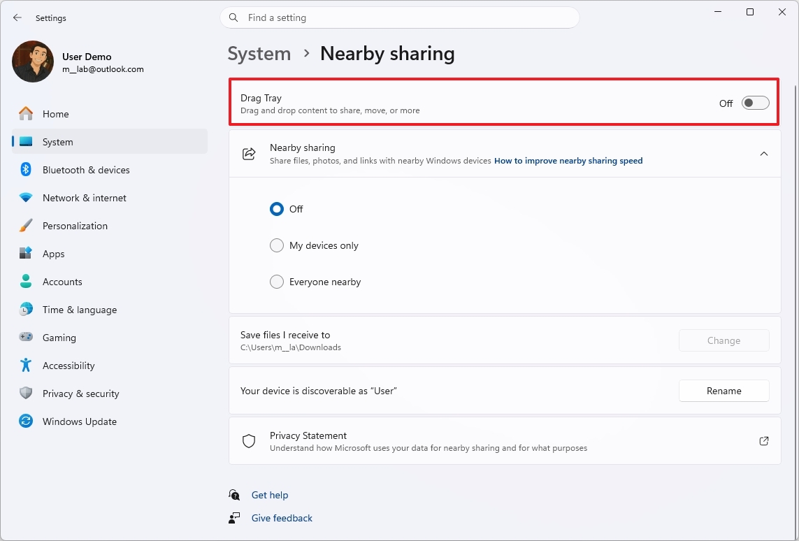
After completing these steps, the flyout to share files will remain disabled unless you manually re-enable it.
Windows Central's take
Windows 11 is in a strange place right now. On one hand, Microsoft keeps rolling out genuinely useful improvements — better accessibility tools, smarter window management, cleaner settings pages, and a steady march toward a more modern OS. On the other hand, the company can’t seem to resist bolting on features that feel like they belong in a different product entirely.
The two additions highlighted here aren’t “bad” in the catastrophic sense — they’re bad in the classic Microsoft way: well‑intentioned ideas that end up cluttering the experience instead of improving it. Windows 11 doesn’t need more layers of suggestions, recommendations, and AI‑powered nudges. It needs clarity, consistency, and a Start menu that doesn’t feel like a billboard for whatever Windows thinks you should click next.
These features aren’t deal‑breakers, but they’re symptoms of a bigger trend: Windows 11 is slowly drifting toward “busy” instead of “better.” And if Microsoft wants users to embrace the OS long‑term, it needs to focus less on novelty and more on making the core experience feel polished, predictable, and actually helpful.
We want to hear from you!
👉Are these new Windows 11 features actually helpful, or do they just get in the way? Drop your thoughts below — especially if you’ve already run into them in the latest Insider builds.
More resources
For more helpful articles, coverage, and answers to common questions about Windows 10 and Windows 11, visit the following resources:
- Windows 11 on Windows Central — All you need to know
- Windows 10 on Windows Central — All you need to know

Join us on Reddit at r/WindowsCentral to share your insights and discuss our latest news, reviews, and more.