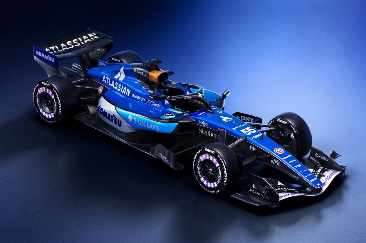
Williams unveiled its highly anticipated livery for the upcoming 2026 Formula 1 season today to much fanfare.
After missing the Barcelona shakedown, which ran from 26 to 30 January, the Grove outfit revealed its new design featuring two tones of blue, white and a red-and-white pinstripe. Drivers Alex Albon and Carlos Sainz joined team principal James Vowles to reveal the new design to the factory before it was released on social media for fans.
"2026 is the next step on the path back towards the top for Atlassian Williams F1 Team as we enter a new era for the sport, and we are excited about the season ahead," Vowles said in a press release.
"We have a great driver line-up, some fantastic new partners, an ever-growing fanbase and want to build on the success we tasted last year, but we are not naïve about the challenge ahead of us. Nobody quite knows what will happen at the first race but we are looking forward to finding out, and hope our fans will love cheering us on with this great new livery."
While some fans argued that more could have been done with the livery, the one aspect that continues to catch the attention of fans is the Duracell battery airbox.
The wait is over. Meet the FW48 livery 🤩 pic.twitter.com/Q88qWS0jI5
— Atlassian Williams F1 Team (@WilliamsF1) February 3, 2026
"As long as the Duracell battery stays then I’m satisfied," wrote one fan on Reddit, while another added: "Not my favourite seems a bit messy with the colours, Duracell air intake are still elite as ever."
One slightly disappointed fan commented: "I guess I’m in the minority, but I do think they could’ve done better. The three shades of blue is much less appealing than the gradient of last year imo," and another responded: "Yea the BARCLAYS shade of blue, doesn't work for me along the rest."
Photos from Williams launch

Williams launch, in photos

Williams launch, in photos

Williams launch, in photos

Williams launch, in photos

Williams launch, in photos

Williams launch, in photos

Williams launch, in photos

Williams launch, in photos

Williams launch, in photos

Williams launch, in photos

Williams launch, in photos

Williams launch, in photos

Williams launch, in photos
Other comments include, "Man, I like blue but I wished they splashed some yellow to reference their 1990s livery", "Oh thank god the other one was fake. That looks awesome" and "I don’t get the hate from the same fans that always love heritage stuff, the keyline is iconic and obviously the lighter blue is for Barclays, I think it’s pretty good tbh."