- WWDC 2023 - live updates
- Apple VR and the Reality Pro headset
- iOS 17
- macOS 14 Sonoma
- iPadOS 17
- watchOS 10
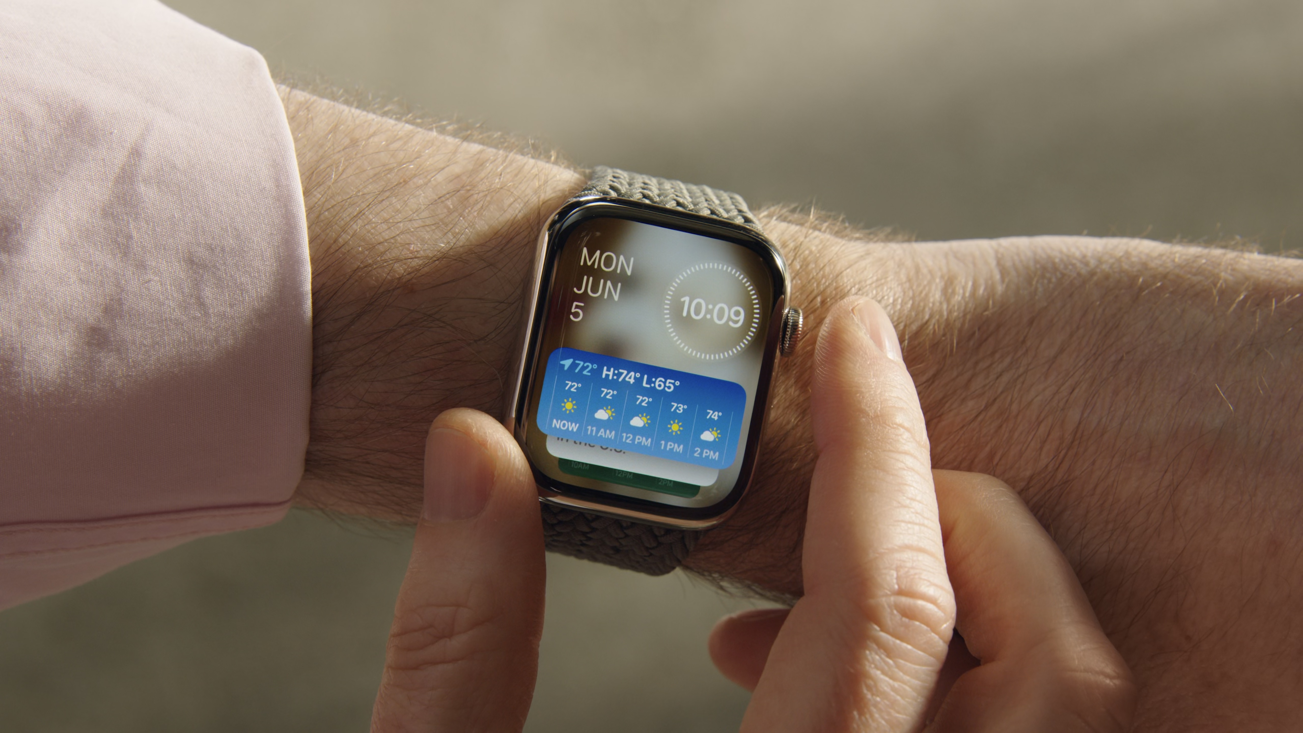
Watching the WWDC 2023 keynote on June 5, I said 'finally' twice when all these announcements were coming thick and fast - one when widgets appeared on the desktop for macOS 14 Sonoma, and the second when glances were showcased watchOS 10.
I've been wanting to use widgets on the desktop in macOS, ever since Apple moved them to a column. It felt restricting, especially since iOS 14 brought them to the home screen, followed by iPad gaining this feature in iPadOS 15 a year later.
But from the demos at WWDC, it looks like you can finally place a bunch of them on your Mac's desktop - and they'll stay there for the foreseeable!
It's when I take a step back from the Vision Pro, 15-inch MacBook Air, and the redesigned watchOS 10, that I can confidently say that widgets won WWDC this year, and in a big way.
Widgets, widgets everywhere
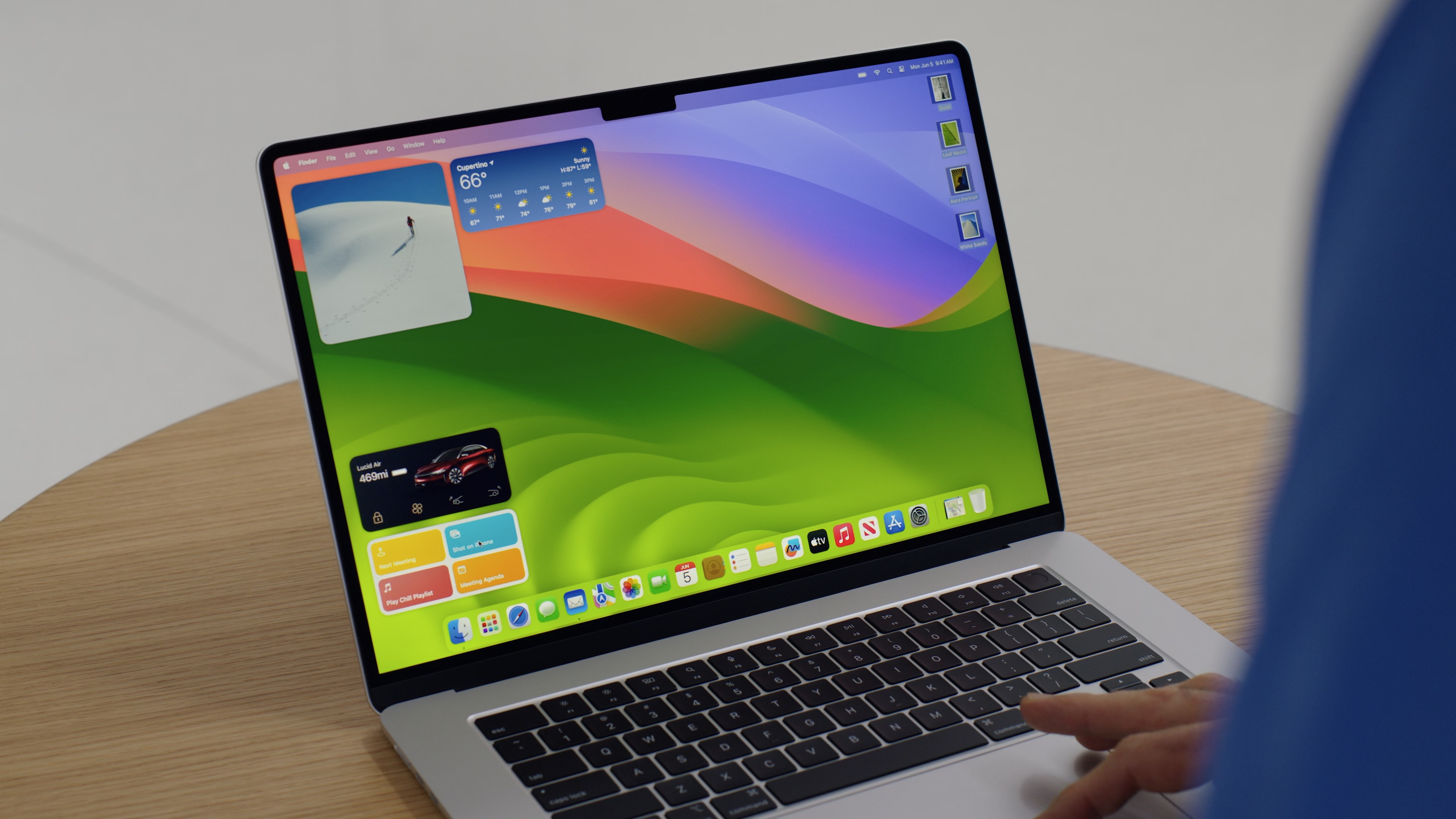
Widgets first appeared as an app called Dashboard with the release of Mac OS X Tiger 10.4 back in 2004. You could open this up and be greeted with a bunch of widgets to choose from. You could even make your own, whereby you could copy a web address, and the RSS feed for it would appear.
But eventually, widgets fell away for Apple, and it's only in 2023 that they've returned in a big way.
I use them all the time on my iPhone and iPad - from controlling my HomeKit lights for my home, to quickly checking the weather with CARROT Weather, or when checking the battery for my Apple Watch and AirPods.
But I was always hoping to see these on macOS someday - and not only has that happened, but they can now be interactive. This means that you can switch on a HomeKit light with a widget, without being taken to the app. This is something that applies to widgets on iOS 17 and iPadOS 17, so it's going to benefit a lot of users just from this one change.
This also applies to how watchOS 10 handles widgets. Widget Stacks from iOS 14 have arrived on the Watch, so you can swipe between these widgets on a watch face with ease.
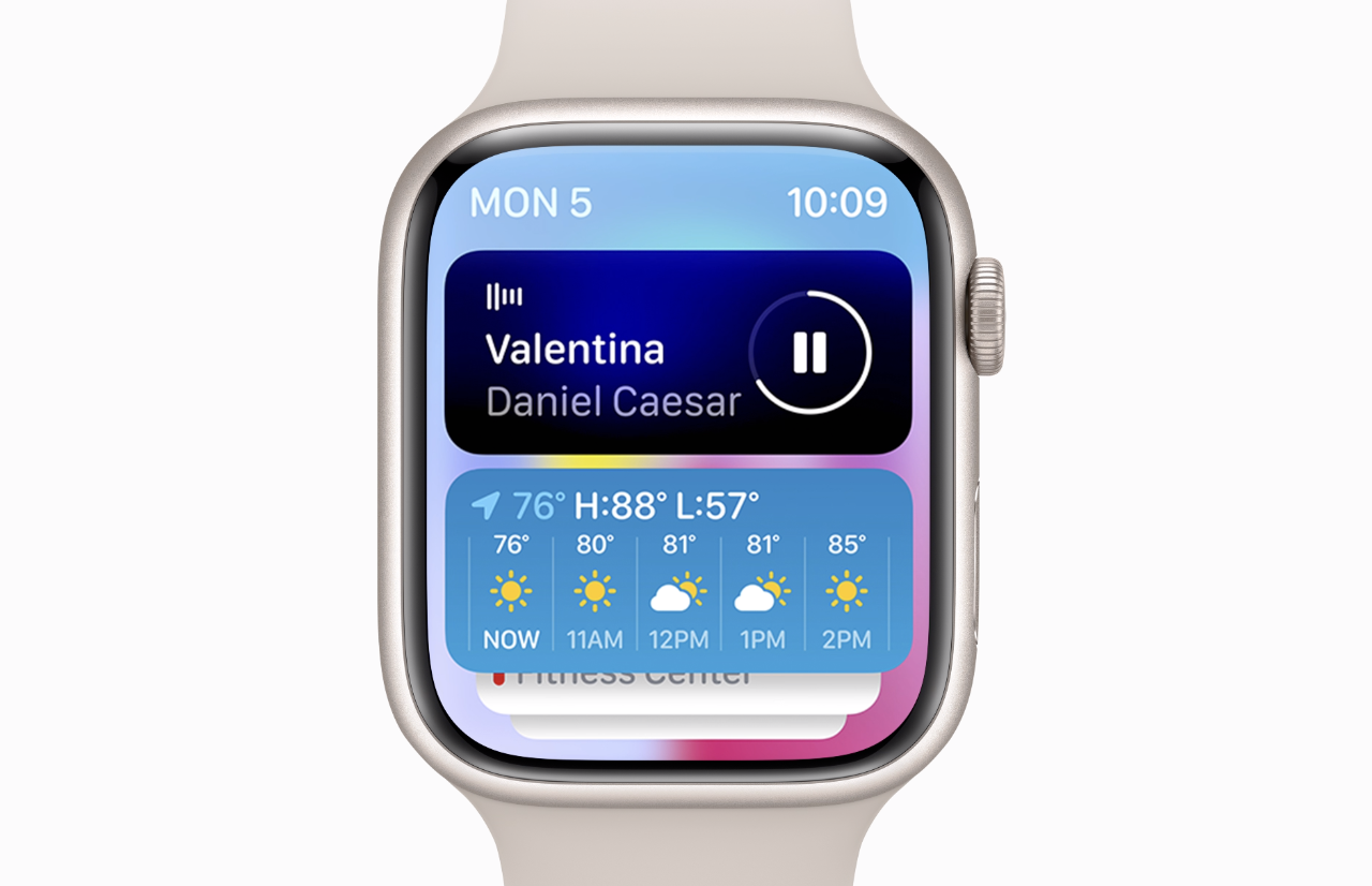
These look fantastic, and they're a natural evolution of Apple's widgets on the watch. You can swipe and tap on them as needed, and using these on the Apple Watch Ultra will surely be the best experience for widgets, thanks to that bigger screen.
The developer betas are already available for developers, and word is already reaching out that you can fill up your macOS 14 desktop with all the widgets - big and small.
Imagine doing the same to a desktop on a 24-inch M1 iMac, or a 27-inch Studio Display. But time will tell if these different displays mean that you can add even more widgets to these desktops.
We're only at day 1 of WWDC, but I'm already convinced that widgets were the star this year. They've been improved by being made more interactive, they're available on iPhone, iPadOS, and now watchOS and macOS, alongside being able to use a Continuity feature to sync across widgets from your other devices.
It took a while to get here, but Apple is embracing widgets like never before on its platforms, and I'm excited to finally use them on my MacBook Pro and Apple Watch, when these software updates come out later this year.
We finally have interactive widgets in iOS 17! #WWDC23 pic.twitter.com/oIrlh3JWC7June 5, 2023
We're covering all the WWDC 2023 announcements live and as they happen. Don't miss all our Apple VR, iOS 17, macOS 14, iPadOS 17, and watchOS 10 news so far.

