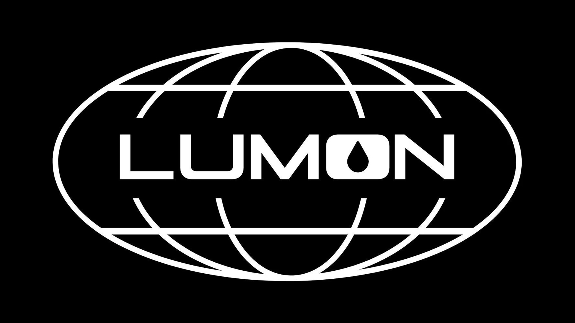
There are plenty of crafty details in Apple TV's hit series, Severance, but if you're a design fan that mysterious Lumon logo may have caught your eye. On the surface, it's the perfect unassuming corporate design, but as fans of the show know, not everything is always as it seems.
The refined design of the Lumon logo could easily blend into our list of the best logos of the 1970s thanks to its retro aesthetic, creating an eerie authenticity that makes the Severance world feel all the more real. It's a simple design packed with symbolism if you look a little deeper (but don't worry, I'll keep this a spoiler-free analysis).