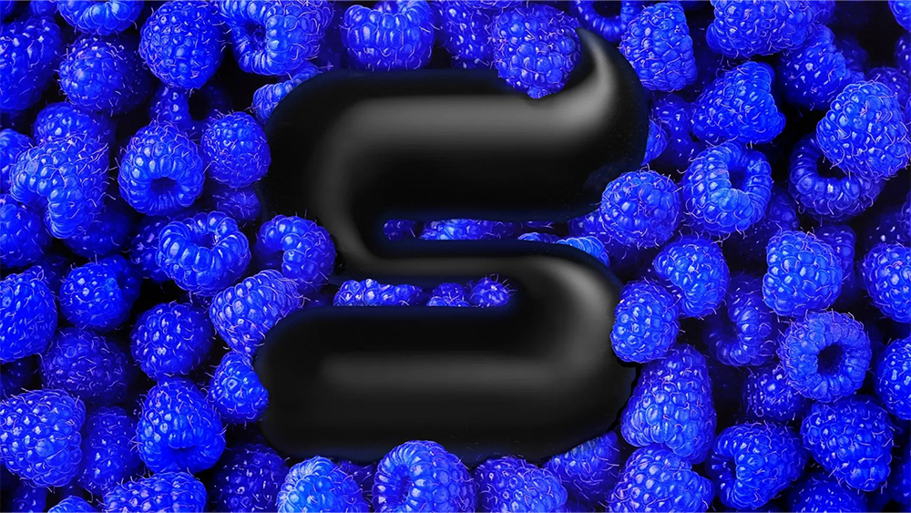
7-Eleven's Slurpee is perhaps the world's most famous slushie. Sold in over a dozen countries, from the US to Australia, it's been giving people brain freezes for over half a century and has been referenced in numerous films and series.
Now, after an incredible 57 years, the convenience store chain has decided it's time for a rebrand, joining the many soft drink rebrands we've seen in 2023. But some think the new look isn't as appetising as the brand. Slurpee has bold new colours and a sleek new logo. But alas, it does look a little bit like a certain emoji (see our guide to how to design a logo for tips for your own work).
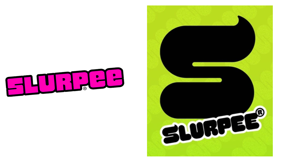
Tasked with updating the Slurpee brand was New York-based studio Safari Sundays with input from Brainfreeze Collective, 7-Eleven Inc’s customer research panel. It's served up a vibrant modern look that re-energises the brand for the 21st century with a bespoke Slurpee SWERVE typeface, on-trend electric colours and a logo that reflects the 'flowing' nature of slushed ice.
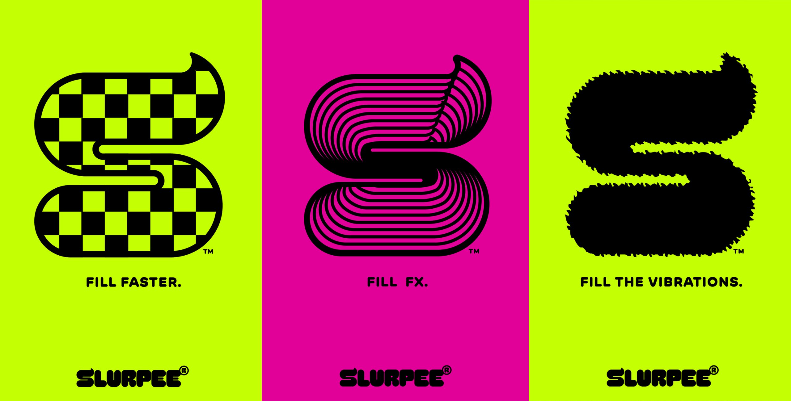
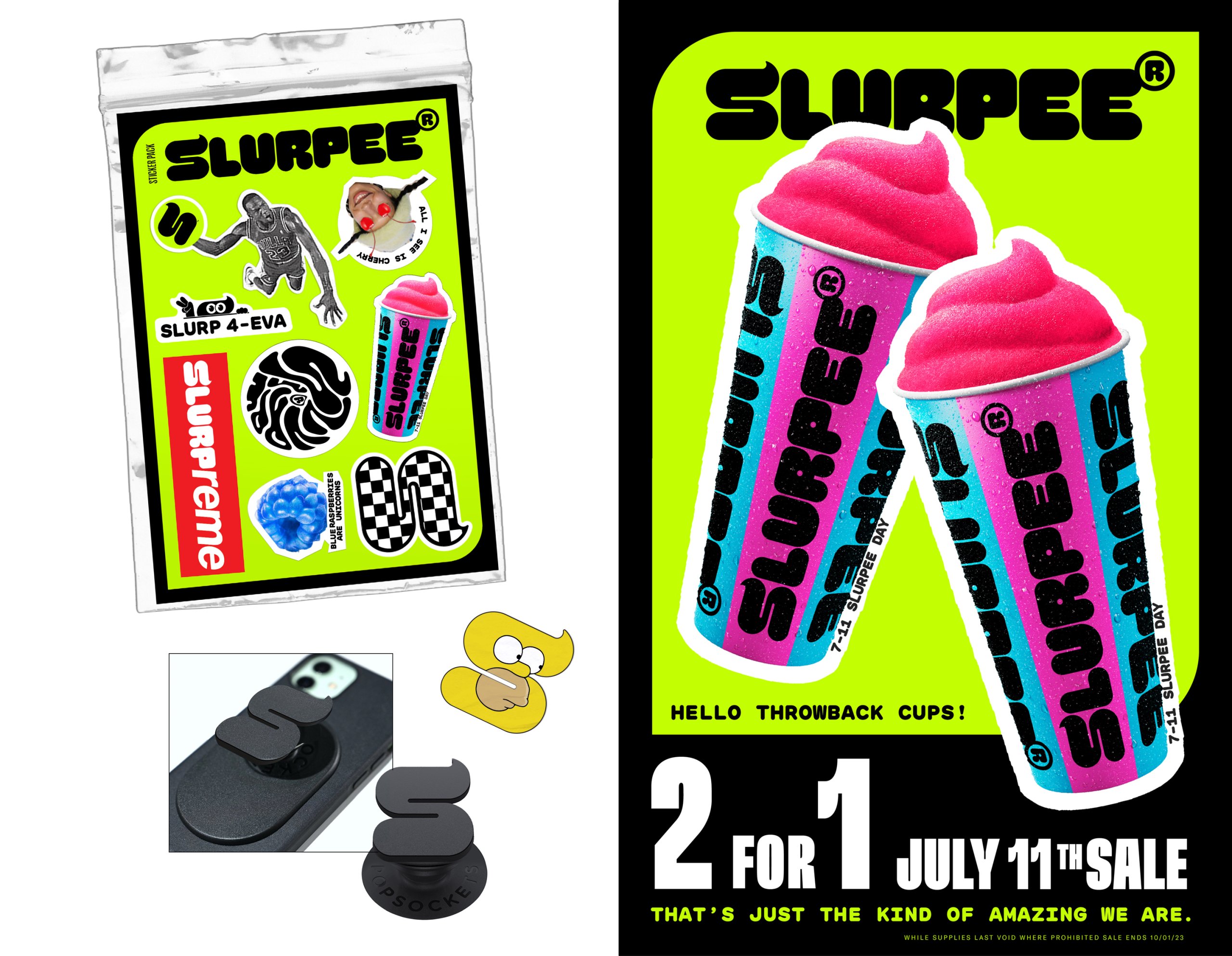
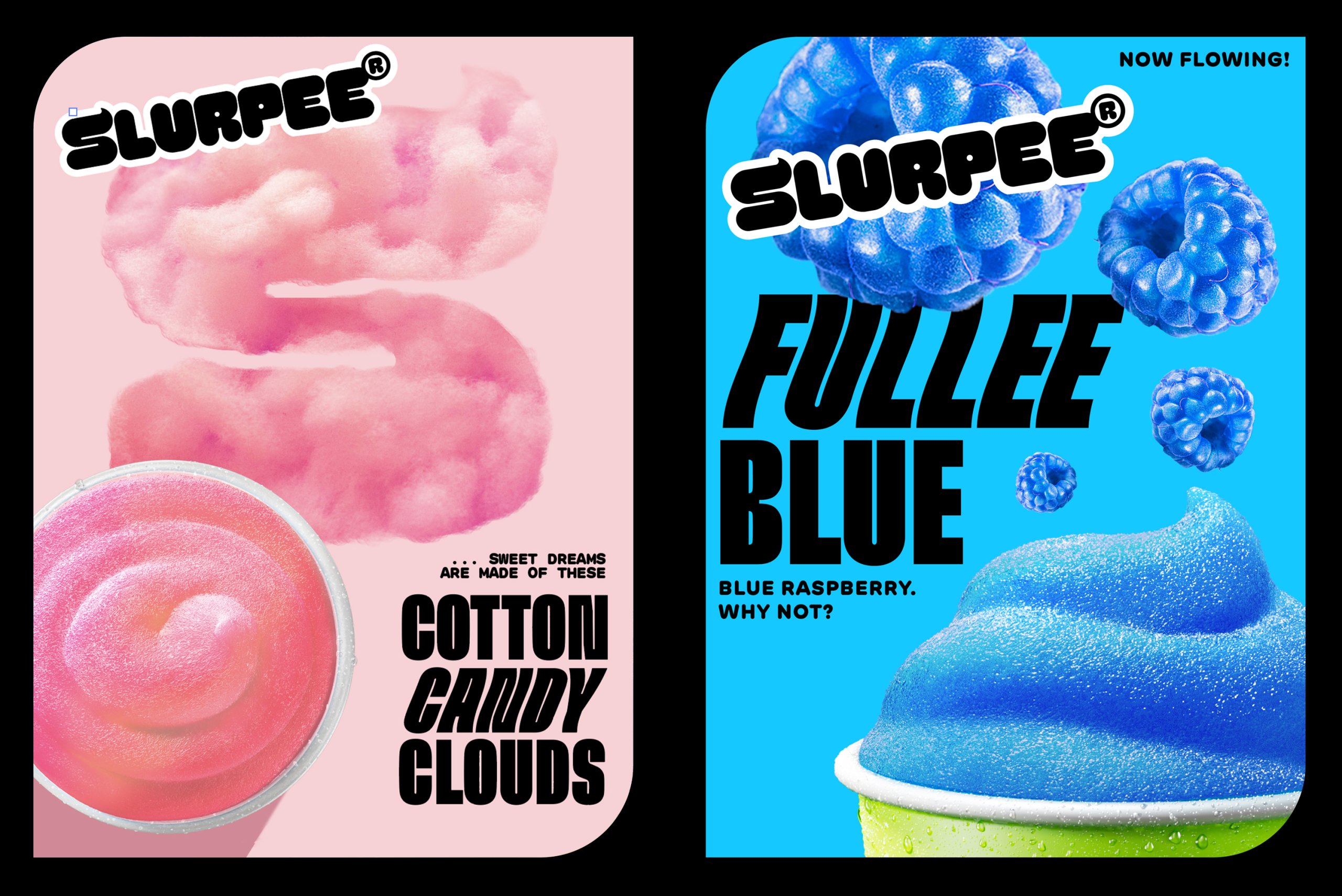
More than just a logo, the new Slurpee 'S' is described as a mascot with a sense of mischief who will inhabit a whole bunch of merchandise. He/she (pronouns haven't been announced) was designed to reflect the shape of a dollop of freshly churned Slurpee. Some people think it looks like the Sketchers logo or "a drink you'd find in the Metaverse, but the most damning response on Twitter is that it looks like the pile of poo emoji.
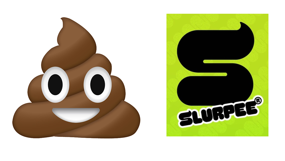
why did they rebrand the slurpee to the slurpoo https://t.co/ApuuzDEHbDJune 13, 2023
It's unfortunate that one small emoji has inadvertently come to own a particular curved form, from ice cream to chocolate – only six months ago people were poking fun at the Hershey rebrand for the same reason. Some will say that Slurpee should have got a second opinion on its new logo/mascot, but I'm here for it. It's time to reclaim the dollop shape from the poo emoji.


