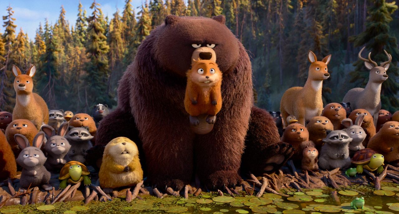
Pixar is back with its first movie since Elio. Released this weekend, Hoppers sees the mind of animal-loving student Mabel Tanaka transferred into a robotic beaver so she can communicate with creatures in a bid to save their habitat from destruction.The theme is a bit of a departure for Pixar with its quirky sci-fi premise, and people have noticed that Hoppers looks different from other Pixar movies too. The animation style strays from the hyperreal polish we're used to for a more stylised look, and Pixar's been revealing the why and how behind that decision (also see the Pixar rules of storytelling).
Traditionally, Pixar has leaned into 3D realism as technology advanced to permit that. Hoppers represents a conscious departure, experimenting with a new, more stylised look while still maintaining that Pixar aesthetic of expressive, cartoony characters.Characters are chunkier and rounders, surfaces are softer, colours more controlled, and fabrics, fur and other textures are exaggerated. The result is a cosy atmosphere and a world that feels more handcrafted, with environments and characters that feel touchable, almost like they're plush toys brought to life.
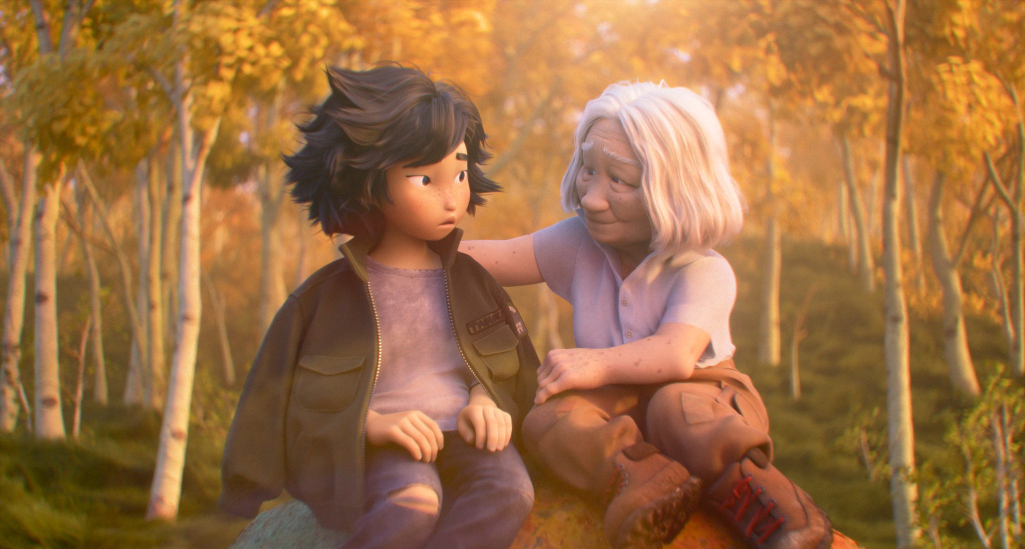
The decision to go with this new look may represent the touch of director Daniel Chong, who created We Bare Bears for Cartoon Network. On the Disney website, screenwriter Jesse Andrews reveals that it as decided from the beginning to make the movie look distinct and also to "be honest" about the intensity of nature rather avoid its more grisly side like many animated movies have."Instead of conceiving animals that are simply furry people, we tried to keep them as animalistic as possible, while still making them funny, relatable, and identifiable,” she says.Producer Nicole Paradis Grindle adds: “We didn’t want [them] to feel like humans in animal suits, and that’s often what storytelling with animals involves. That’s where Pond Rule No. 2 comes from: ‘When you gotta eat, eat.’ We had to address that issue; animals do eat other animals, which makes sense when you explain it as a way of coexisting."
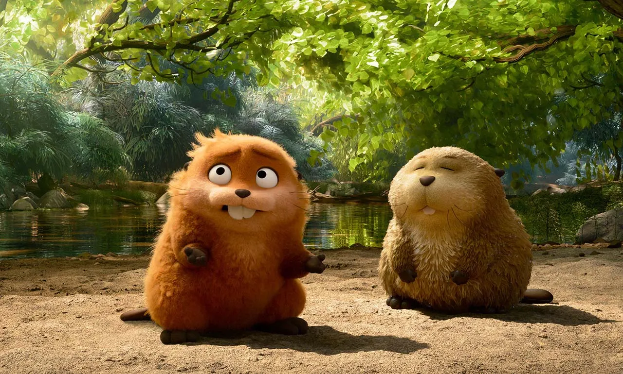
Character Art Director Anna Scott focused on using simple, readable shapes. She told Laughing Place that the character designs are built from “beans and circles,” hence the softer, more rounded shapes. Scott said early explorations tried out with more exaggerated extremes, but later iterations achieved a tonal balance between endearing and comedic. In the video below, Piper Curda and Bobby Moynihan share details on their Hoppers characters, Mabel and King George.
Shading & Lighting Art Director Hye Sung Park described how the story team and look department used colour scripting to define the tones used throughout Hoppers. They used hundreds of painted thumbnails created by the art and lighting teams to map out the mood for each sequence (also see how Disney used colour in Aladdin)Due to Hoppers' use of quick comedic timing and expressive acting, saturation was carefully controlled to ensure backgrounds never overpower. When the tones change, there's always a reason for it, linked to story beats, such as the use of higher-contrast colours to add impact for character introductions and story turns.
Landscapes play an important role in creating Hoppers' art style too, contributing to create the handcrafted look.“We had these very stylized characters, and they needed to fit into a natural world that can’t be busy," Paradis notes on the Disney website. "We wanted to give people the feeling of being in nature without the harsh reality of what a 3D environment can look like. "Ultimately, it was about the emotion. We wanted people to feel relaxed, to feel connected, and we wanted the characters to pop in that. We wanted your eye always to follow the characters.”Achieving that required the creation of an entire new technological workflow.Visual effects (VFX) supervisor Beth Albright notes: “We needed everything to speak the same visual language. We also needed to maintain the scale of nature, because if you simplify things too much — or if you make things too cartoony — you can lose the stakes.”The new workflow allowed the team to take each individual leaf, turn it into a point, and then replace it with a painted brushstroke. “We’re preserving all that really saturated, really vibrant color detail, and all the shading and lighting work that went into it, and then putting an artistic texture on it,” Beth said. “Ultimately, that helps to ‘quiet’ the setting.”You can watch Beth talk about why Hoppers looks different from other Pixar movies in the interview with MovieWeb below.
Hoppers animation test
THANK YOU for loving #Hoppers this weekend! 💞 To celebrate, here's a 2D animation test we did back in 2020 for inspiration (by Lorenzo Fresta) 🦫🦫 pic.twitter.com/DKXWujZ10sMarch 8, 2026
UPDATE: Interestingly, Daniel Chong has shared a clip of a 2D animation test for Hoppers made by Lorenzo Fresta back in 2020. The short clip features a scene of almost Ghibli-like serenity, showing two beavers floating down a river.
It's going to be a busy year for Pixar with Toy Story 5 coming in June. After The massive success of Zootopia 2, it seems Disney and Pixar may truly be back.Speaking of Zootopia, see how many questions you can get right in my tricky Zootopia 2 quiz. And for more animation inspiration see how KPop Demon Hunters used Unreal Engine 5.