For many people it's the dream when searching for a new home — finding a listing that has clearly been interior designed by a professional. It offers the opportunity to not only inherit the fixed finishes of the space — think great flooring, architectural trim and more — but also a borrowed understanding of what works for the space.
For the buyer's of Kristin Fine's Connecticut home, they got one better — not just a property that an interior designer used to live in, but the perfectly-placed person to help them re-define the house with their own needs and style in mind.
'This was a unique project in that it was previously my home,' the interior designer and co-founder of The 1818 Collective says. 'When the house went on the market, the first people to view it came inside and fell in love with everything. After quickly going to contract, they reached out to me to discuss hiring me to help make it their own. It was an unusual process, but they were great clients.'
The design process took six months, while Kristin and her family were still living in the modern home, offering a unique perspective on designing a space for someone else, while knowing how it feels to live in it. 'I knew that the redesign needed to represent them, their family, their narrative,' she says. 'It needed to be true to their story.'
Understanding the light
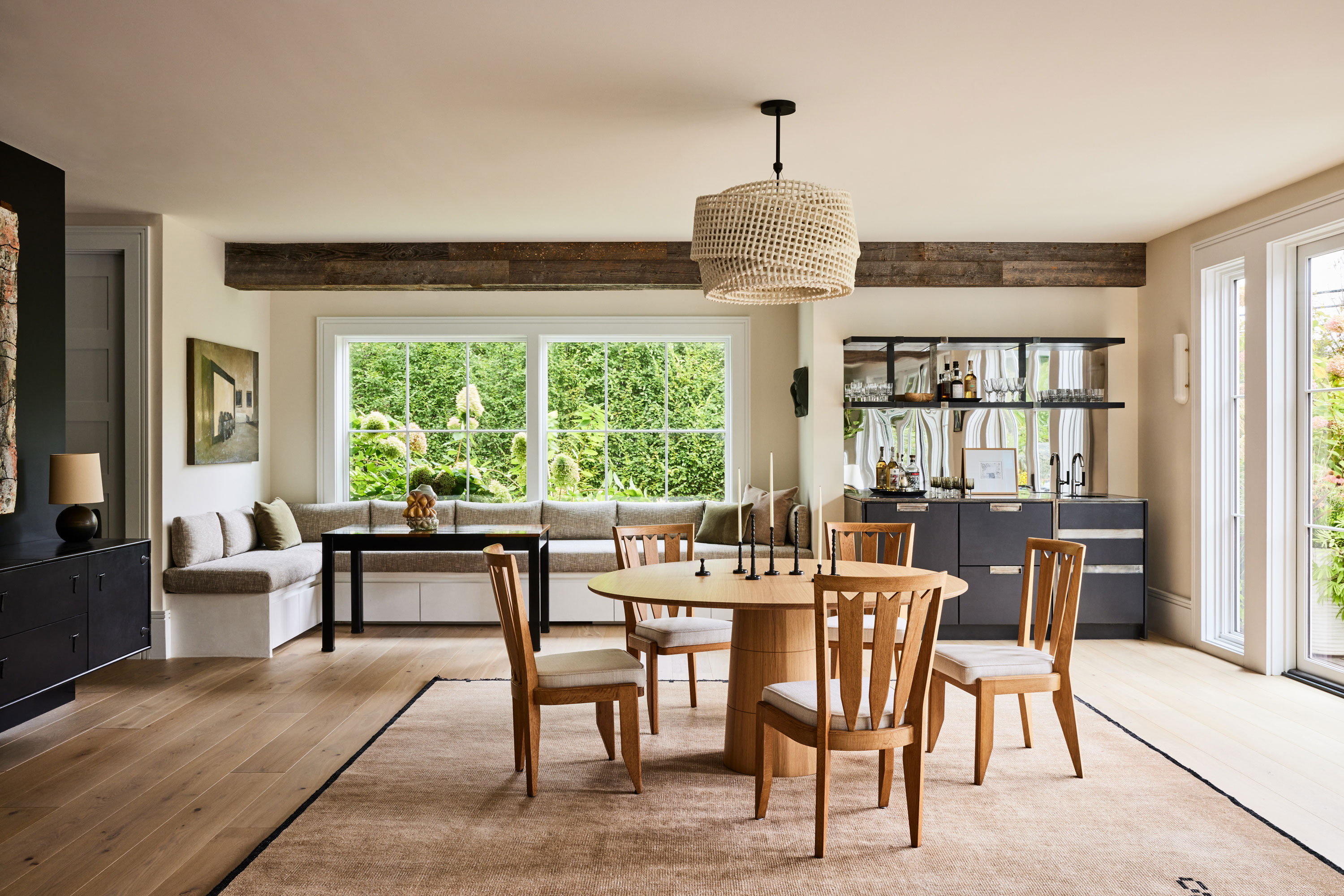
Today, the house is spread across three levels. Upon purchase, two of the house’s six bedrooms were combined into one, with one other bedroom being converted into a home office, resulting in the four-bedroom, 6,800-square-foot floor plan that exists today. While it was built back in the 1800s, it's had several serious transformations in that time — and now only one room is original to that structure.
But it wasn't just a knowledge of the history of the house that Kristin Fine brought to the table, but also an understanding of how it "lives".
'I approached it as an opportunity to be able to stand in spaces when considering and planning all the design features,' the designer says. 'Really it was a deep understanding of the light. This house has beautiful light so I loved knowing exactly where it would move and to take advantage of that with placement of pieces that played with the shadows and reflectivity and so on.'
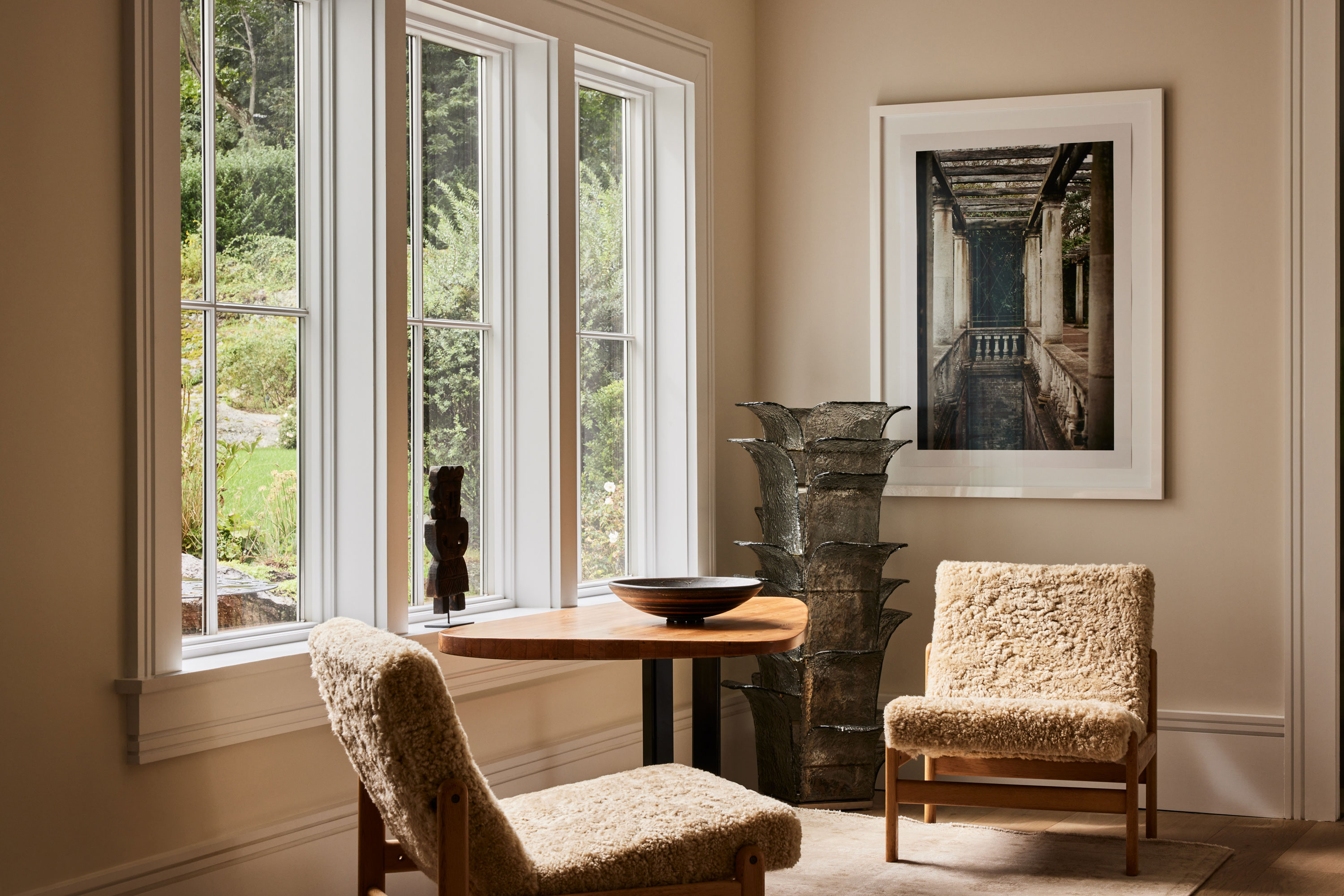
It informed everything, from the layout to the color palette of the home. 'The brightness allowed us to include a few strong deep colors like the black wall and console and the blue sofas without impacting the airy brightness of the space,' Kristin says. 'I could place furniture and objects easily knowing they would fall into a sun spotlight at certain points of the day and exactly where a photograph would be safe versus where a painting or sculpture might be a better bet. I also knew where to add more lighting in the few areas where the sun did not pour in.'
Get the look — shearling
Kristin has used shearling and sheepskin textures on accent chairs throughout the house to bring texture. Here are a few of our favorite pieces to get the look.
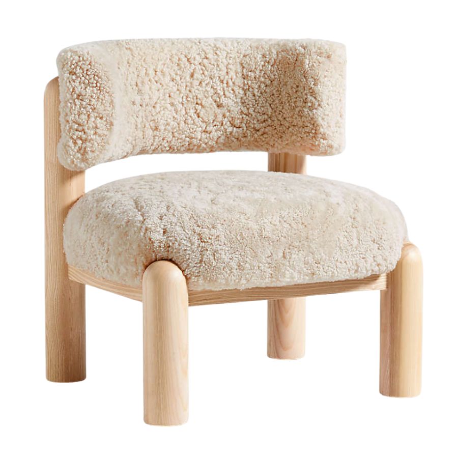
Price: $999.99
Re-imagining the home
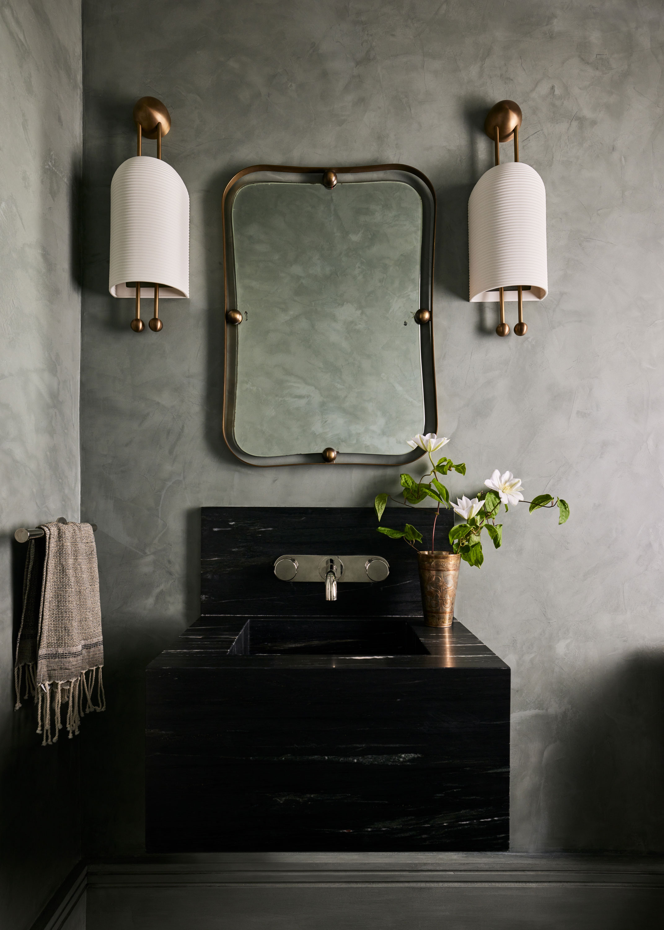
While Kristin had originally interior designed the house with her own family in mind, there was a different approach when designing for her new clients. 'I think my own spaces are largely driven by my collections… art I love and special pieces I integrate into every project,' she says. 'Each client comes with their own version of their favorites and it’s my job to integrate and look through their lens when creating their spaces.'
'This client wanted to start fresh so we worked together to bring in their personality to the spaces and of course create a home that functioned well for their lifestyle,' she adds.
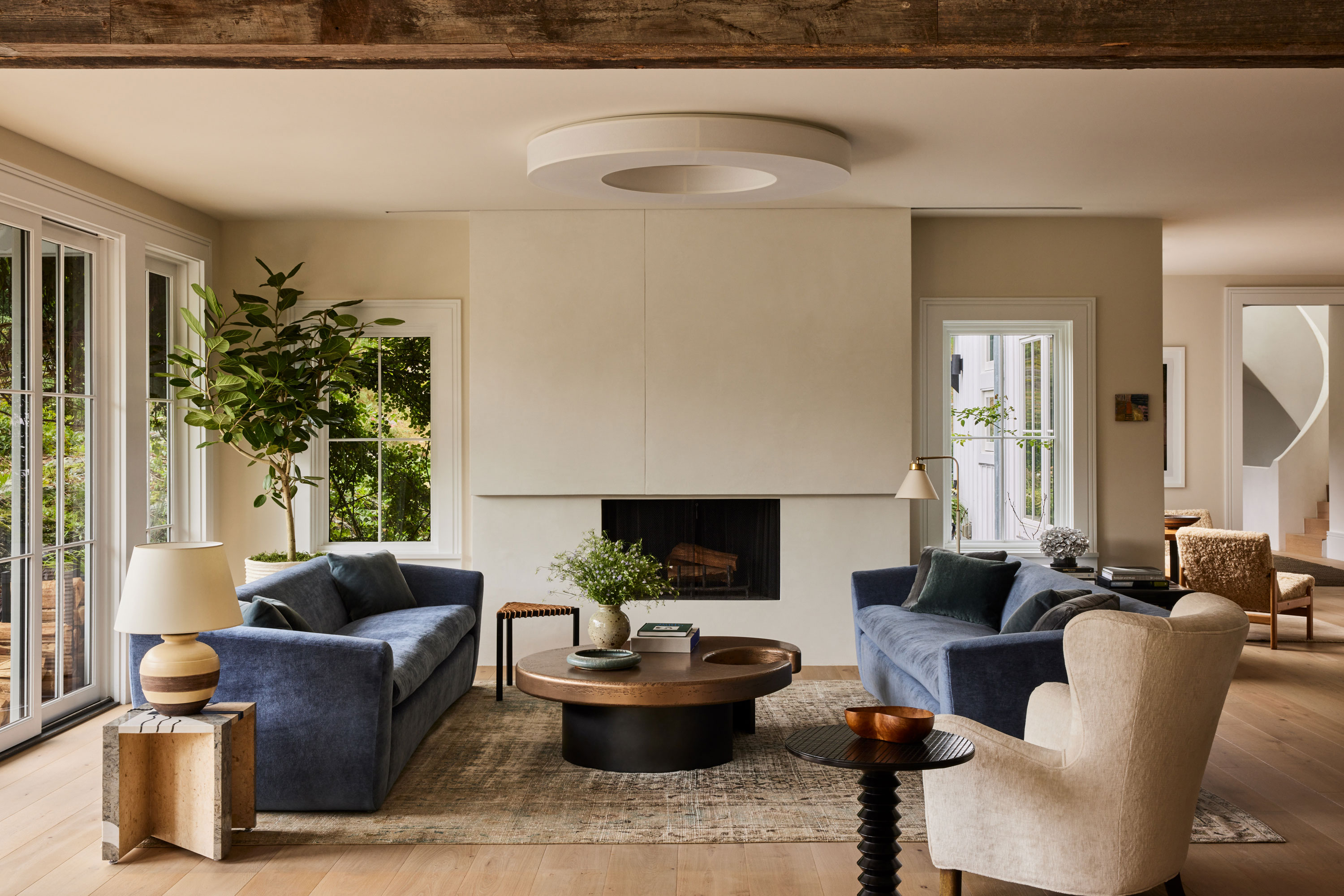
The living room is a perfect microcosm of the house's style as a whole. 'It is a house that is more about texture and layers, visual and physical rather than pattern,' says Kristin. 'After working to enhance natural light, my next focus is bringing interesting lighting to spaces. There are simply so many great options whether new or vintage. The fixture in the living room is by Ozone and it was perfect for this space — warm light when needed and a beautiful sculpture when off.'
It captures Kristin's approach to combining texture and form, too, with its intriguing mix of materials. 'It is a bit of a dance,' she says. 'I like to create some tension between surfaces and shapes. For example, something more reflective with something earthy and textured, making sure there is both new and old and then adding something unexpected whether its art or merely packing with proportion in an unexpected way.'

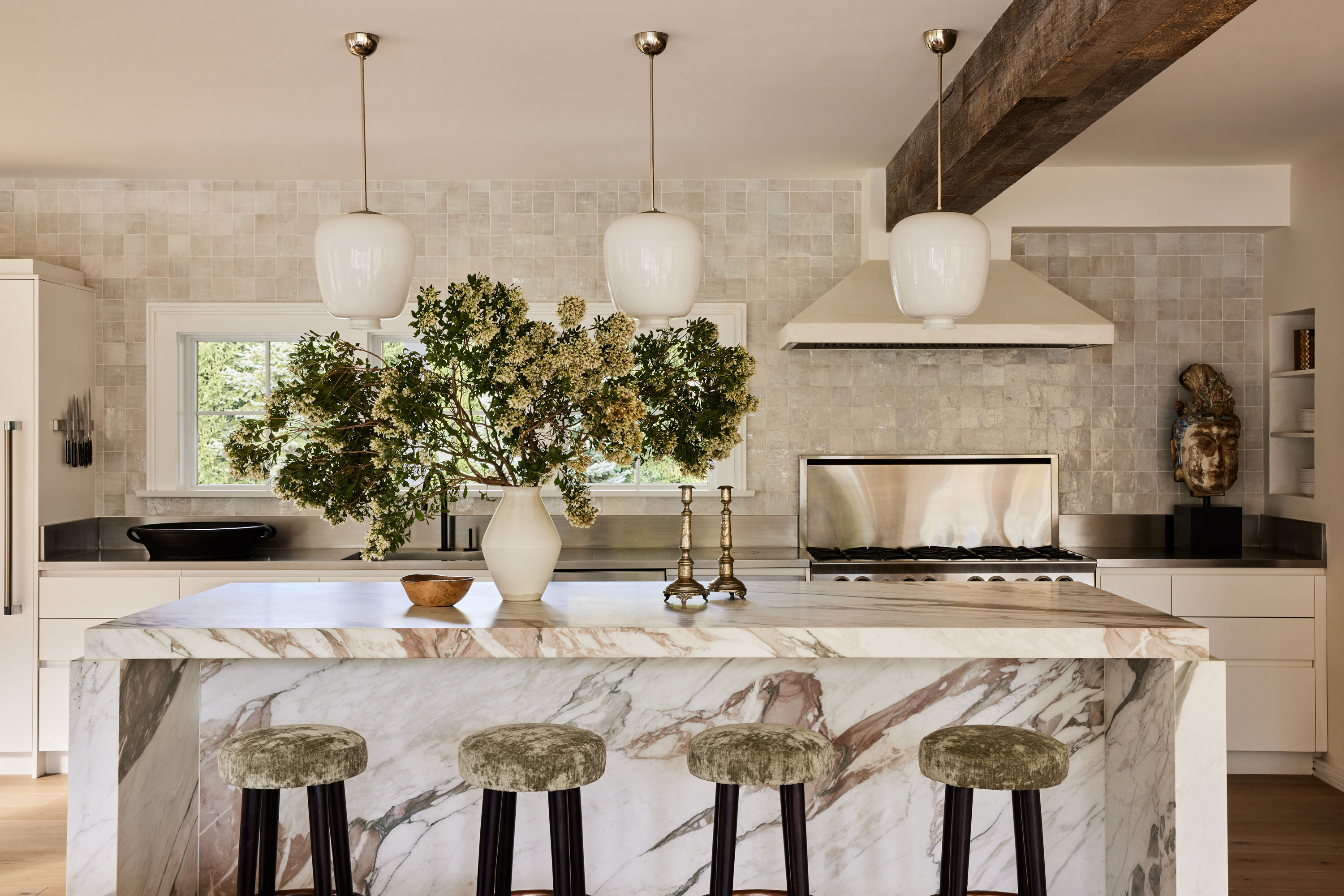
In a space like the modern kitchen, you can see these unexpected combinations play out in full. The zellige tiles from Cle tile bring rustic earthiness in contrast to the bold, luxurious stone kitchen countertop on the island, while a more industrial stainless steel is used for the main run of cabinetry. Then mix in the intriguing kitchen bar stools, and we've got an inspiring and unusual combination of textures: 'This actually was a vintage velvet I found,' Kirstin says. 'I think it brings some softness, some age… a bit of a contradiction and earth to the space. Working with old fabric or materials is always a good idea.'
Throughout the home, the materiality is a feast for the eyes. This background texture — provided by linen, shearling, boucle, stone, timber, mirror, even limewash — all seem to have the same inherent quality. They come alive in the home's natural light, and add real depth that makes this largely neutral home feel rich and elegant.


