Twenty-four thousand, eight hundred thirty-six steps. Approximately 12 miles walked. And 365 photos taken.
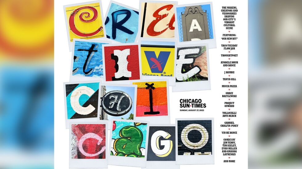
That’s what went into the cover for the Creative Chicago special section the Sun-Times published this summer.
My daily gig consists of designing the front page and a handful of inside news, opinion and/or features pages. But in my early years at the paper, I was designing fancy pages for Sunday Showcase and Movies, our weekly broadsheet entertainment sections — big, blank canvases where I could let my creativity run wild.
The chance to work on the Creative Chicago section — our look at the makers, creators and visionaries shaping our city’s vibrant cultural scene — sounded like a fun return to those earlier, more artistic endeavors.
One issue: What could we possibly put on the section’s cover that would live up to its name?
The editor of the section, Victor Brand, and I wracked our brains and batted around a few impractical ideas, but in the end, we turned to the city itself.
We decided to combine snapshots of the signs, graffiti and public art you might see as you move through the city going about your daily routine. And from those everyday sights, stitch together something vibrant and kinetic that conveys — in bright, bold letters — the creativity that courses through Chicago.
I talked my bosses into letting me spend a shift just wandering the city photographing all the cool typography I could find, and set off from my Logan Square condo the next morning.
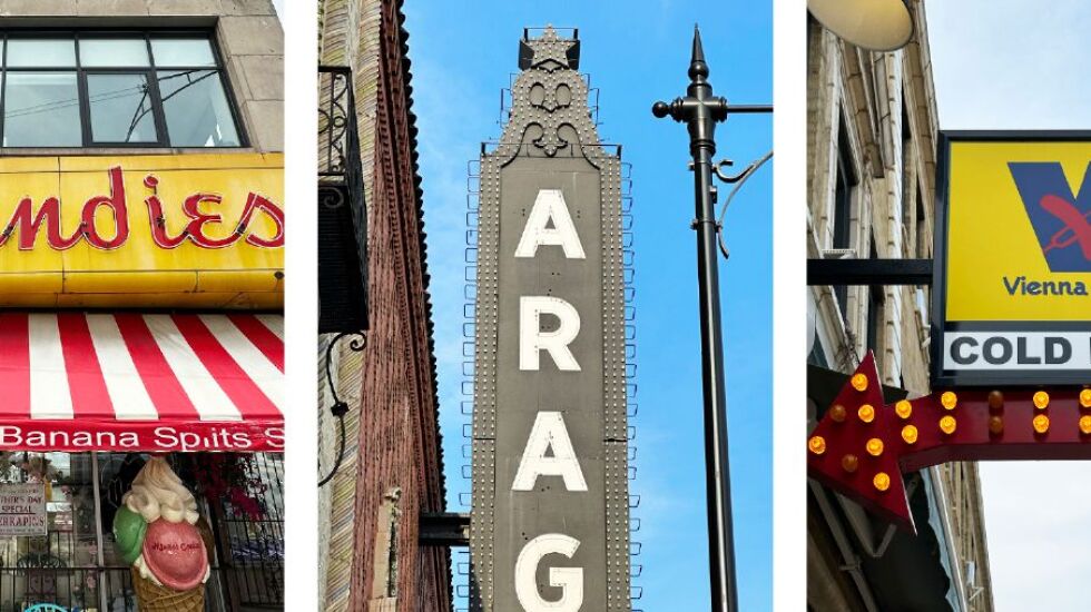
With a checklist of the letters I would need, I paraded up and down Milwaukee Avenue for miles, stopping what felt like every three steps to snap a shot of whatever caught my attention — flyers plastered to a utility pole, a worn mural with its paint peeling from years in the elements, the bespoke lettering of a ritzy cocktail joint’s sign. After a few hours, guided by the Sun-Times’ great “Murals and Mosaics” series that details public art in the city and beyond, it was up to Uptown and down to Pilsen for more exploring.
Twenty-four thousand, eight hundred thirty-six steps (all recorded on my phone’s health app) and 365 photos later, I had the makings of a cover that I think tells our city’s story — and that I’m proud of.

Maybe you’ll recognize a few of the letters. I shot the Margie’s Candies sign in daylight and aglow in neon at night. (Tough choice — both had me drooling in anticipation of a sweet treat.) The Aragon Ballroom marquee took me back to noisy shows I’ve seen there through the years. And is there anything more quintessentially Chicago than a Vienna Beef sign?
My day on the town reminded me how important it is get out and experience your neighborhood. I still work from home the majority of the time, so just exploring and enjoying my community was rejuvenating.
But mostly, it reminded me how inspiring our city is. The creativity overflows; art and expression are everywhere, and if you’re not paying attention, you miss so much.
The little break from my usual day-to-day reminded me to look around, soak it up and bring that spirit to work with me every day.


