Have you been feeling like you could use a brain reboot these past few months? According to some in the travel industry, a colourful adventure trip could be the answer.
Stolen from the fashion industry’s trend for “dopamine dressing”, a new trend for “dopamine travel” is emerging. Essentially this involves a major change of scenery, where you can flood your senses with dramatically colourful, monochromatic or aesthetically pleasing destinations.
Just as the dopamine dressing fashion trend champions wearing bright, often primary, block colours, the travel incarnation is mainly centred around heading somewhere with a uniformly bright landscape. One example is Morocco’s Chefchaouen, also known as the “Blue City”, not far from Tangier, while another might be India’s “Pink City”, Jaipur.
The theory is that certain colours have a strong and immediate effect on people’s mood – such as the striking ice-whites and azure blues of Greece’s Cycladic islands (including Santorini, Milos and Paros), or densely green tropical islands such as Bali, St Lucia and Sri Lanka.
“Colour therapy and chromotherapy have long been of interest to cultures dating back to ancient Egypt and have been integrated into interior and environmental design,” says Maria Costantino, a culture studies lecturer at the London College of Fashion.
“For example, cool hues are used to enhance concentration, or pale green to enhance quietness. Colour is closely associated with emotions; it colours our language – we say we are ‘feeling blue’, ‘seeing red’, ‘green with envy’ or ‘in the pink’.”
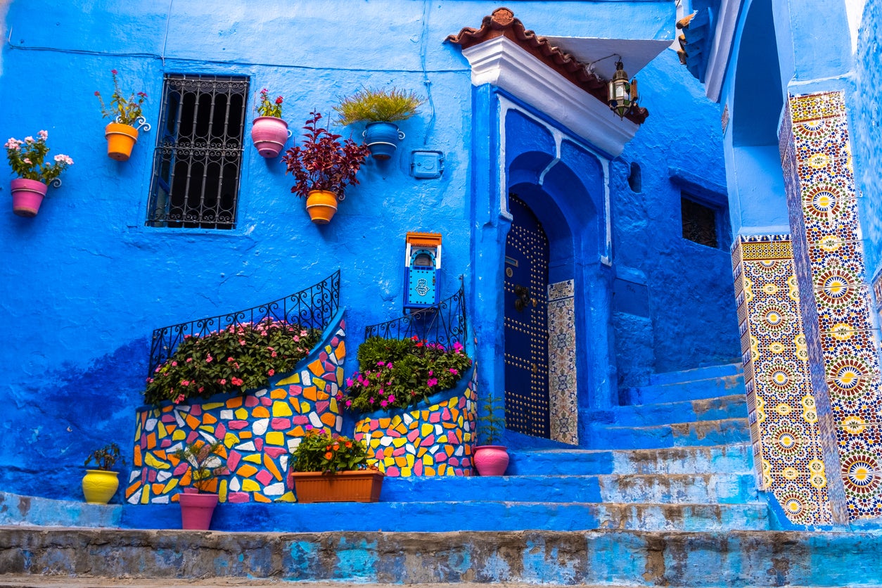
Others have interpreted it as fantastical, multicoloured locations that fill you with a burst of energy simply by being aesthetically pleasing. This approach might take you to brightly-tiled Lisbon; paintbox-varied Oaxaca City, Mexico; the candy-coloured neighbourhood of Balat in Istanbul or the pastel fishing village of Manarola in Italy’s Cinque Terre.
It’s the focus of Original Travel this season, whose founder Tom Barber says it’s all about immersing yourself in a setting that gives you an instant emotional and psychological reaction – be that a spike of happiness, curiosity, or utter calm.
“This year we’re focusing on ‘gratifications’ – everyone deserves a break, quite literally, and it should be as joyful and guilt-free as possible,” Tom tells me. He explains that this trend is all about narrowing down which colours and aesthetics specifically bring you joy.
“I’m rather fascinated by the way colour influences our mood. Carl Jung said that ‘colour is the mother tongue of the subconscious’. But not every colour elicits the same response from everyone.”
We are more visual nowadays, that’s just a fact. Whether that’s your colour-coded bookcase or your Instagram grid— Tom Barber, Original Travel
Tom and his team have put together a range of tours to the likes of Chefchaouen and its surroundings in Morocco; Oaxaca and the Pacific Coast in Mexico (“They get a real kick from colour. Speaking to Mexicans, that’s always been part of the culture,” he says); and Raja Ampat in Indonesia (“There are dives there where you can see over 300 species of brightly coloured fish in one session.”)
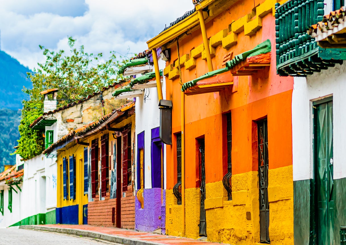
Likewise, Michael Edwards of tour operator Explore recommends the multi-coloured landscapes of “Rainbow Mountain” (or Vinicuna) in Peru or La Candelaria neighbourhood in Bogota, Colombia (“Imagine the colour and energy of Pixar movie Encanto, come to life!”). Meanwhile, Audley Travel’s head of product, Alex Bentley, prescribes a shot of Cape Town’s Bo-Kaap neighbourhood or Buenos Aires’ bohemian La Boca district for what ails you.
Although it’s whimsical, there’s a certain logic to this trend. I think back to coming home feeling creatively stimulated after a visit to India, where I perused bright graphic prints at Kulture in Mumbai’s artsy quarter, Kala Ghoda, sipped bright saffron-yellow mango cocktails against a lush green jungle backdrop in Goa and saw a whirl of crayon-bright saris at Worli fish market.
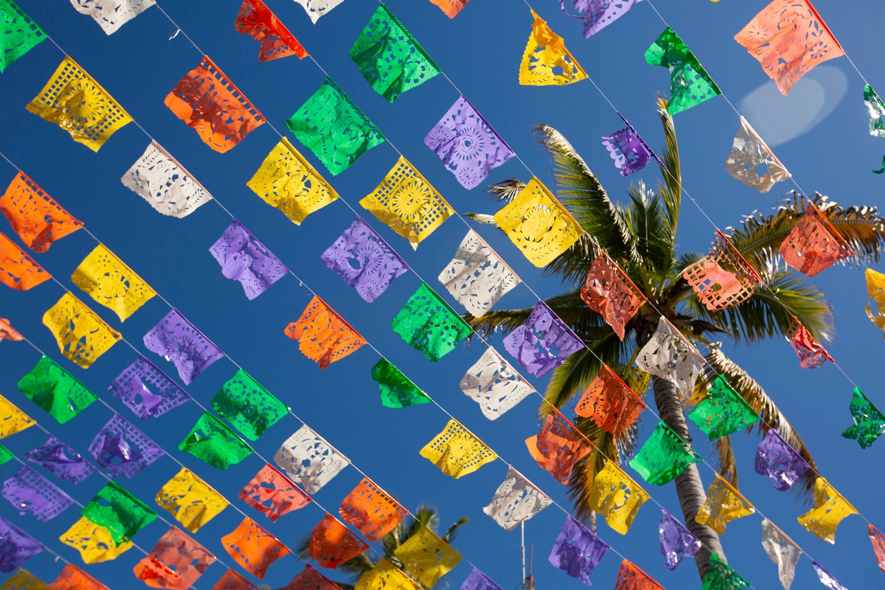
Similarly, I felt infused with colour and sunshine strolling through Oaxaca’s low-rise, brightly painted streets, and passing under neon-coloured papel picado bunting in Mexico’s magical Pacific beach town, Sayulita.
Even your choice of hotel could perk you up: colour-magnets like California’s legendary, kitsch Madonna Inn or Tenerife’s salmon-pink Ritz-Carlton, Abama, for example.
Tom identifies yellows, reds and oranges as the peak “happy” colours, and whites, blues and greens as most calming. He identifies Latin America as a hotbed of colourful scenery and architecture, and Guatemala in particular as an underrated choice.
We discuss how planning and booking travel in general is becoming more aesthetic-driven in the face of the Instagram and TikTok generation. “We are more visual nowadays, that’s just a fact. Whether that’s your colour-coded bookcase or your Instagram grid.”
He points out that, for colourful and photogenic destinations, this can be both a blessing and a curse. “In terms of Chefchaouen – which was quite secret until a few years ago – spreading the tourist dollar beyond Marrakech or Fes can’t be a bad thing.”
However, he fears colourful spots “going viral” could contribute to over-tourism and overwhelm small destinations without the infrastructure for the Instagram crowd.
In the end though, pouring maximum colour into your psyche on your week or weekend off is a positive, practical idea.
Even better, Tom says, “you’re not having to do particularly swanky activities or stay in a very glamorous hotel.
“It’s about places that are big on colour, that you can experience by walking down the street, or sitting on a sand dune.”
For him, it’s simply an extension of why many of us travel – but with a big dose of mindfulness along the way.
“We all travel for pleasure anyway,” he says, “but if you can eke out a bit more pleasure by being conscious of what makes you happy and immersing yourself in it, why wouldn’t you do that?”

