Here at Livingetc, our contributing editor Keith Flanagan keeps his finger on the pulse of what's happening on the US design scene — and reports his findings. Keith is a design expert, an editor with an exceptional eye who has a talent for spotting trends as they happen... and often just before they're about to.
As the center for so many shows, exhibitions, and trade events for the interior design industry, there's no better place to be than New York — as Keith found this month when he went trend-spotting around the city. There's a real mix of exciting new launches for October, from beautiful larger-than-life patterned wallpaper to the at-home ice bath that brings cold therapy to your very own bathroom (if you can fork out the cash, that is).
Read on to check out the latest from the US scene, including the best home decor stores and the new launches setting the tone for this year's biggest interior design trends.
Top shelf
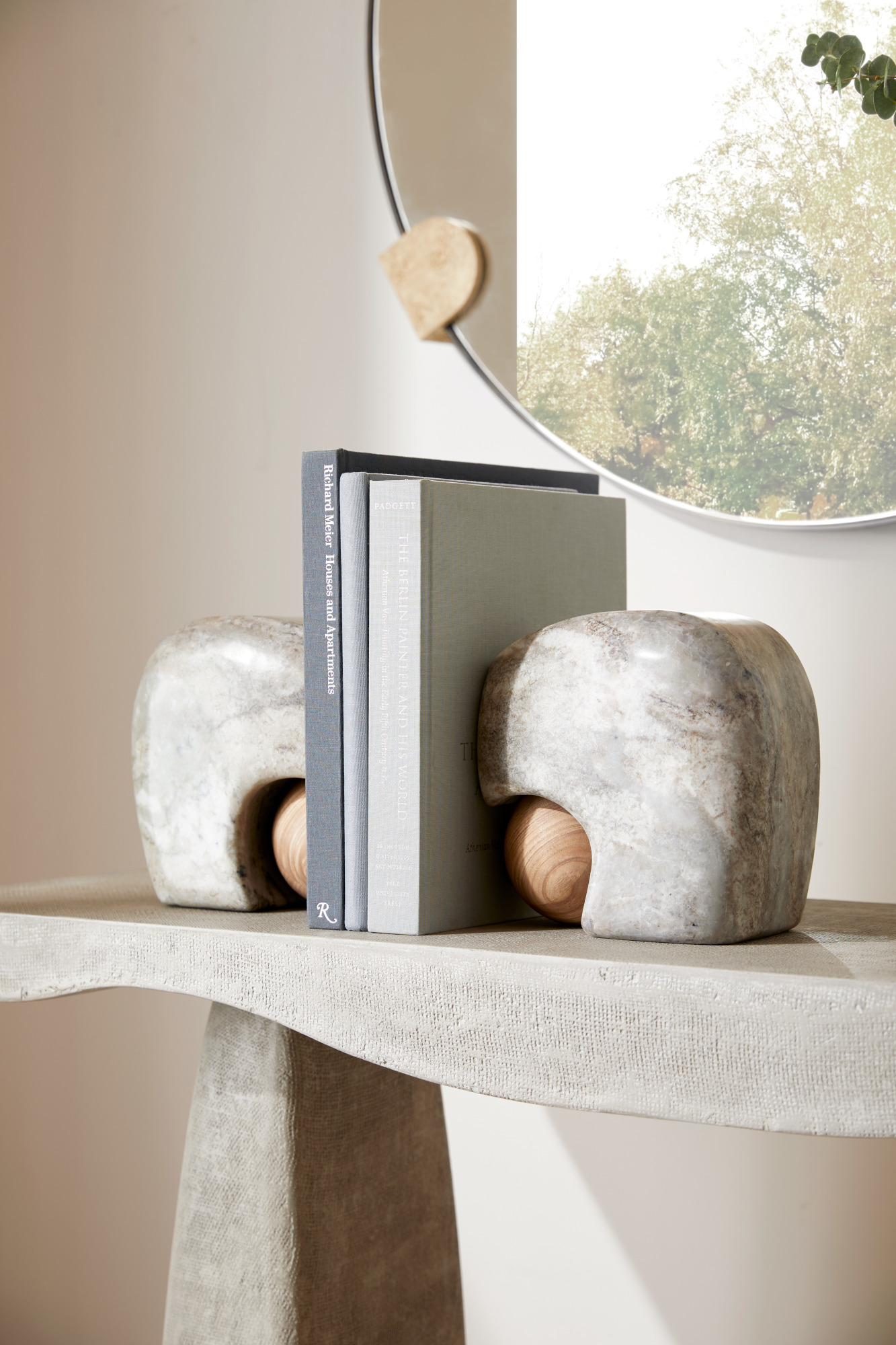
At the New York Design Center’s What's New, What's Next event (an annual showcase of trends and products), these hefty Melt bookends were a surprise hit for me at Arteriors — part of a new collection with design and architecture firm Workshop/APD. As the name suggests, the set looks like smooth marble melted over an oak sphere.
Balancing hard and soft materials, they bring a certain fluidity I’m seeing all throughout design right now (like the organic and sinuous lines of minimaluxe, the design trend we recently coined). They could easily stand alone as sculptural objects — even one on its own would look stunning as a great mantel decor idea — while the pair would add a solid dose of repetition to any space or shelf.
Broad strokes
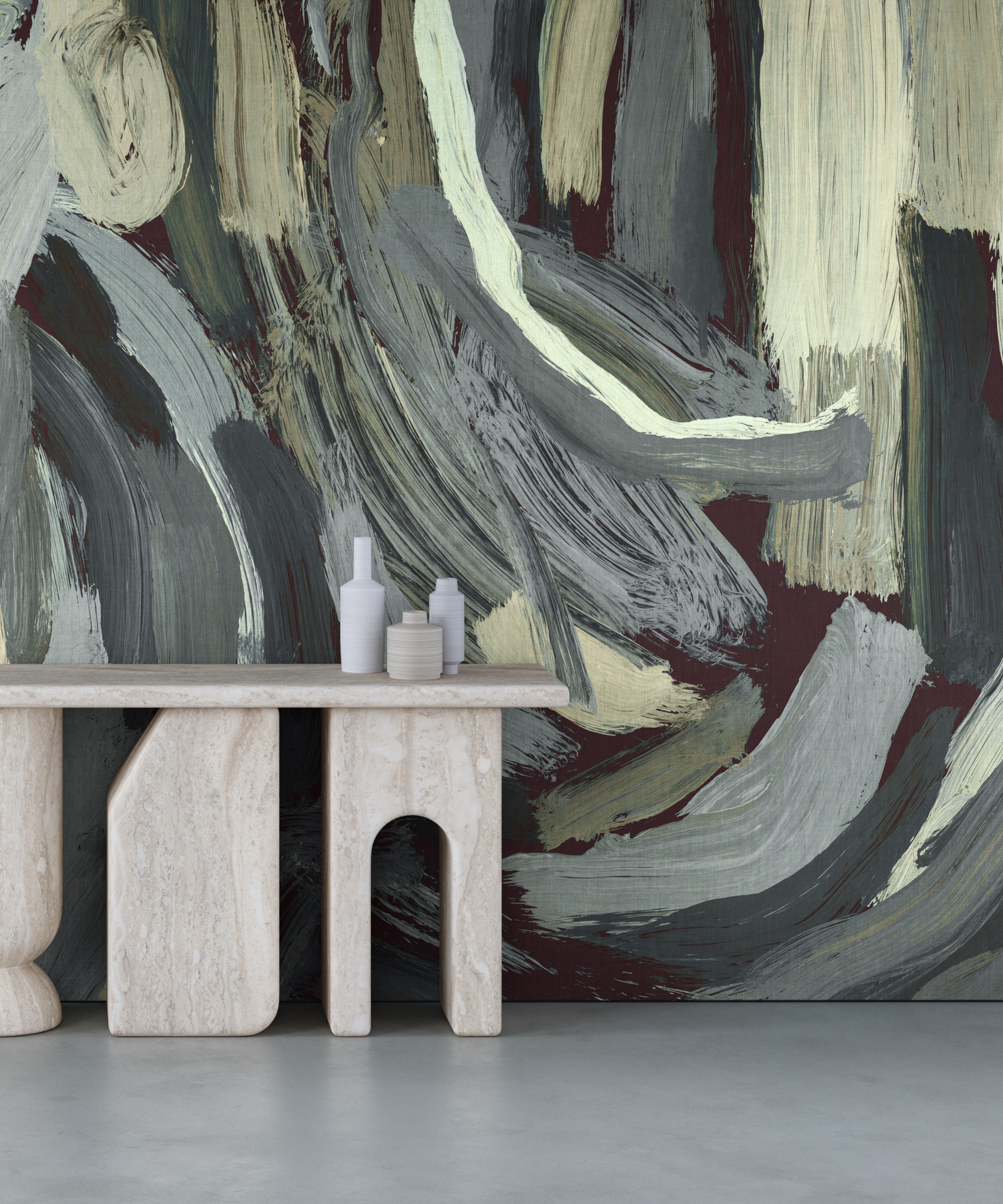
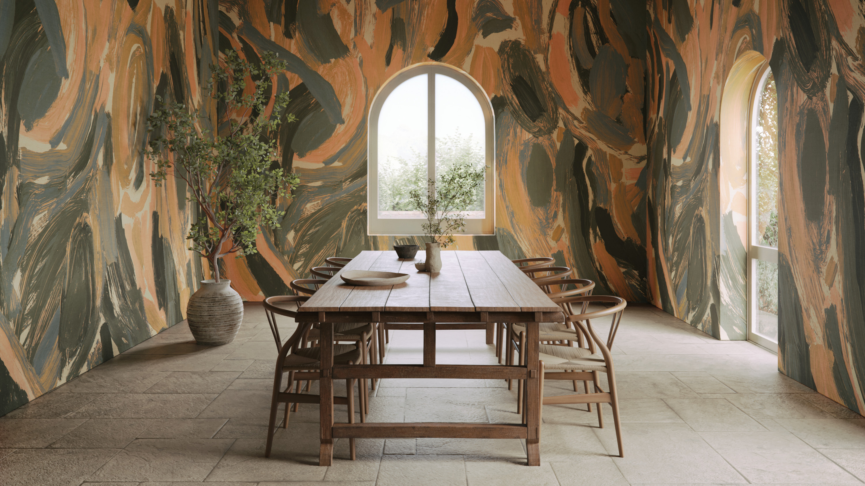
Just weeks ago I ventured upstate to visit Rachel Cope of Calico Wallpaper at her new studio in New York’s Hudson Valley, where the artist dreams up bespoke collections for the coveted wallpaper company. On display was Ensemble, a series inspired by creativity and the boundless imagination (a.k.a. our inner child).
Pulled directly from Rachel’s own artwork, which was scanned and enlarged in dramatic scale, it features massive brushstrokes in unexpected tones, full of visible texture for a mural-style effect that we continue to see in the latest wallpaper trends. Sure to make a statement, the print isn’t for those who simply dabble in pattern — the stylish strokes are oversized and expressive as if a gentle giant painted your walls with an enormous paintbrush. How’s that for using your imagination?
Block party
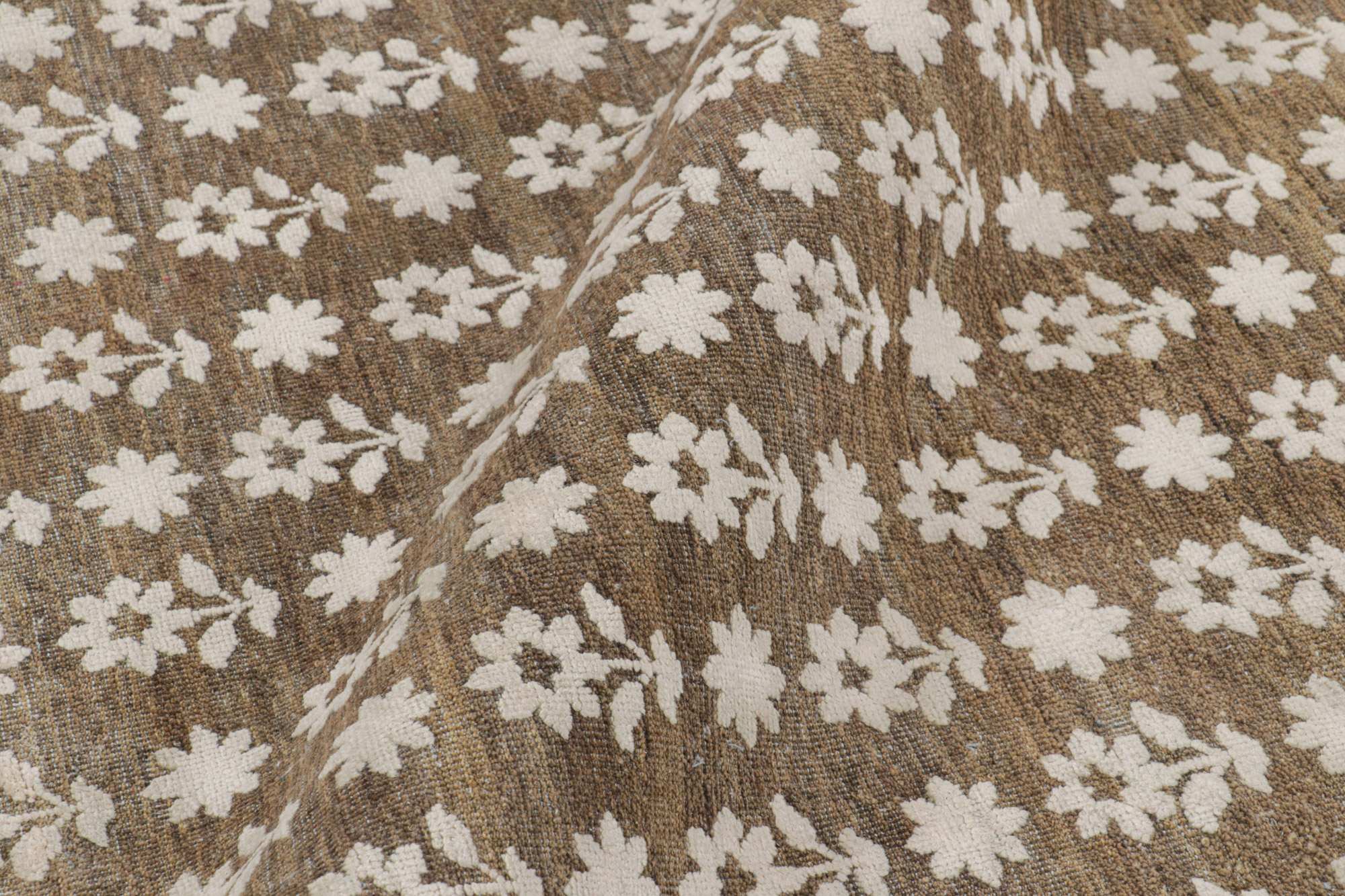
Floral patterns are no stranger to interior design, but they’re not always a shoe-in for contemporary homes (read: they can look a bit too traditional). But this new floral number by New York’s Rug & Kilim — which literally caught my eye from across the room at a recent trade event for handmade rugs — is something of a refresh.
Celebrating the ancient craft of block printing, the bold flowers are simplified and scaled-up versions of intricate patterns once used in 17th-century India’s royal courts — the inspiration behind the rug maker’s new Block Print collection. The subtle pattern is woven with a wool-silk blend in high-low textures, bringing an updated dynamic look to the blocky pattern. I could easily see this pattern in more eclectic spaces (perfect for Urban Aunt trend enthusiasts) that mix modern and traditional furnishing in one scheme — proof that history is worth repeating.
Serious wellness
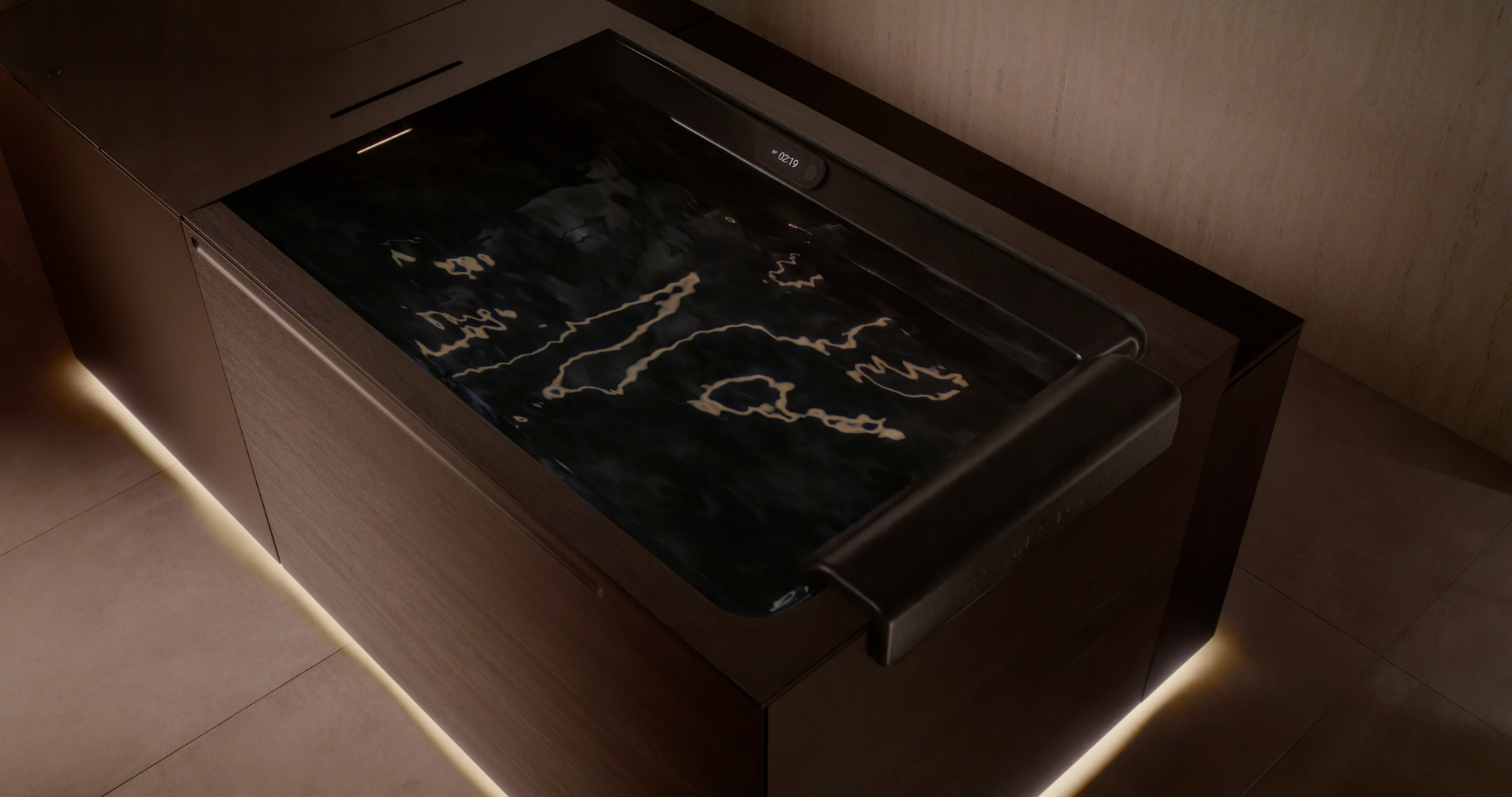
I hadn’t expected to submerge myself for six minutes in 39-degree water last month, but the wild world of wellness-inspired interiors (hello wellness rooms and home saunas) had other plans for this editor. Why the cold treatment? Kohler debuted an at-home ice bath in partnership with Dr. Jonathan Leary, the founder of Remedy Place (a social wellness club known for luxe treatments), that spells a new level of self-care at home.
The icy, pricey bath draws on potential cold therapy benefits (think reduced swelling in muscle tissue and mood-boosting perks) while taking the look up a notch with sleek, dark features that upend clunkier models currently on the market. Is it for everyone? Even Kohler admits it was created for a very, very particular audience. But I’m taking this as a sign that wellness-focused design isn’t just going strong: it’s getting more serious than ever.


