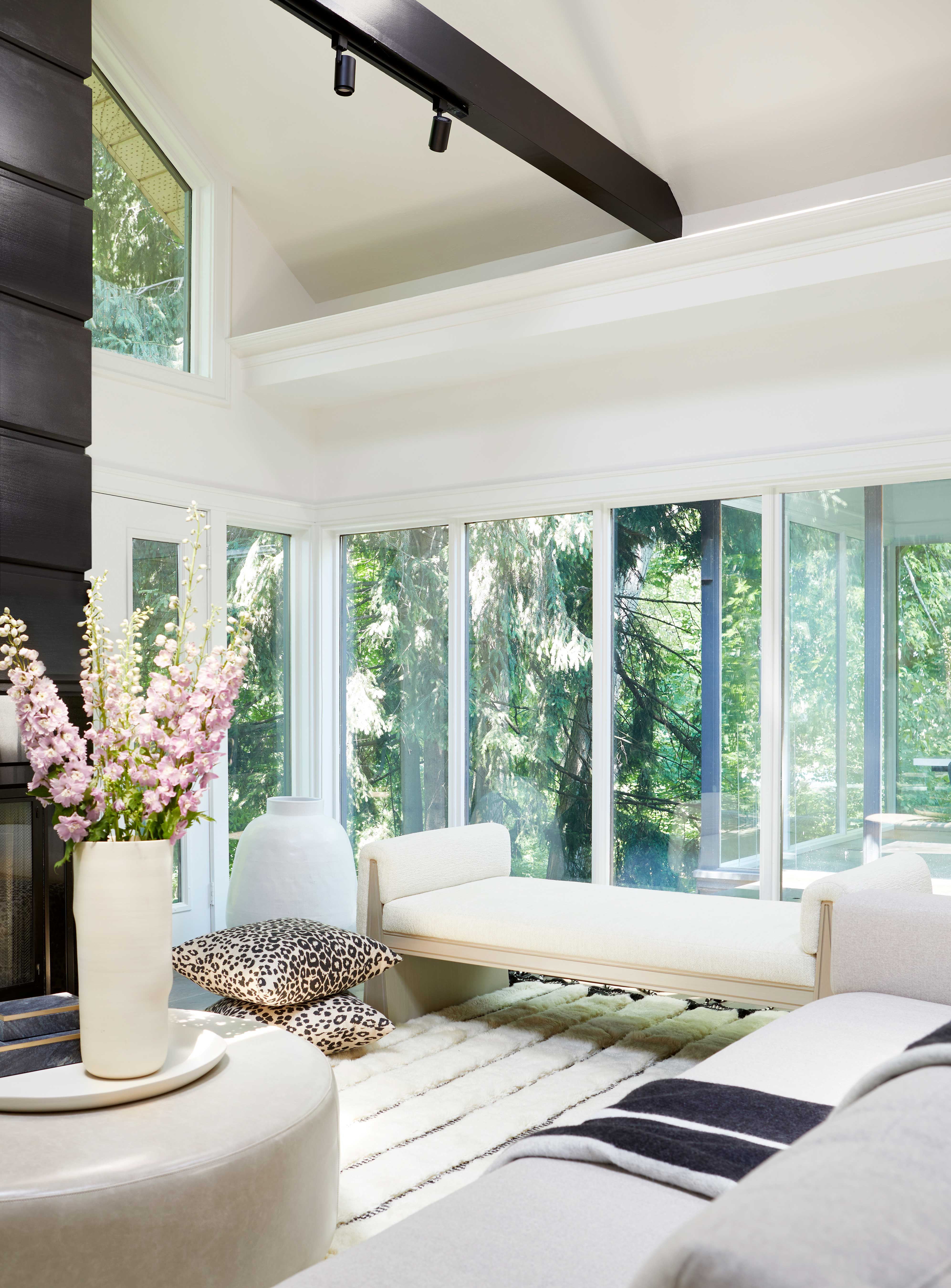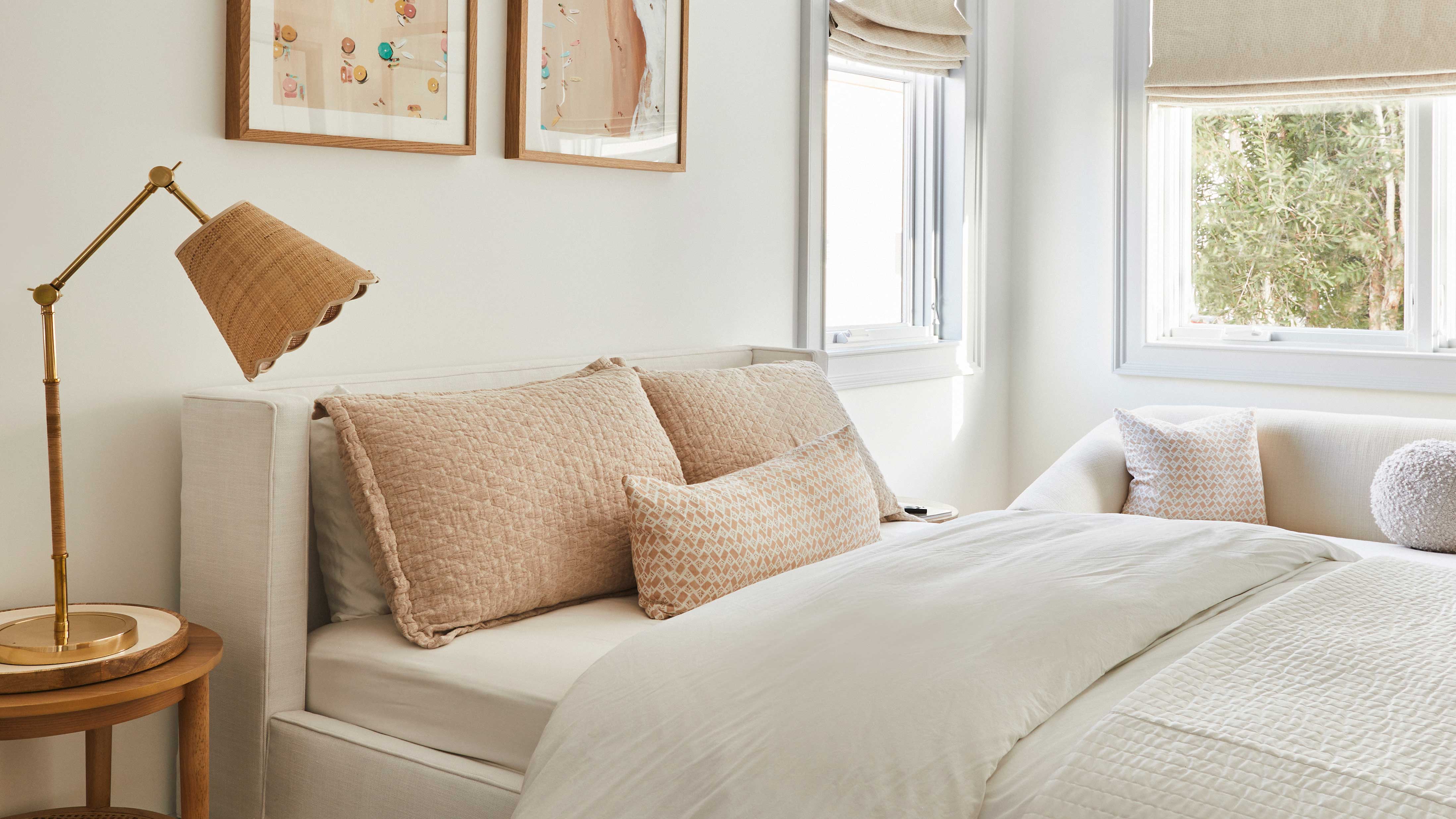
Neutral interiors are timeless but there are certain tones and shades that go in and out of style. More importantly, if you want to design a neutral home, consider the space you’re decorating and try and test what neutral color will work best with what natural light is available.
South-facing rooms will have lots of beautiful natural light flooding in, especially if your home is blessed with big windows, so you can afford to opt for a darker and more cool toned neutral shade. However, rooms that are naturally a bit darker may want to opt for a lighter and more warmer shade to counteract this.
If you’re wondering what the neutral wall color trend is for 2024 then we’ve got you covered. We consulted the experts to see what they had to say.
1. Earthy neutrals
Decorating with neutrals incorporates everything from bright whites to dark moody browns. Every season there’s a new interpretation of the ‘new neutral’ and heading into 2024 is no different. But what neutral color should we be considering for our next decorating project and why?
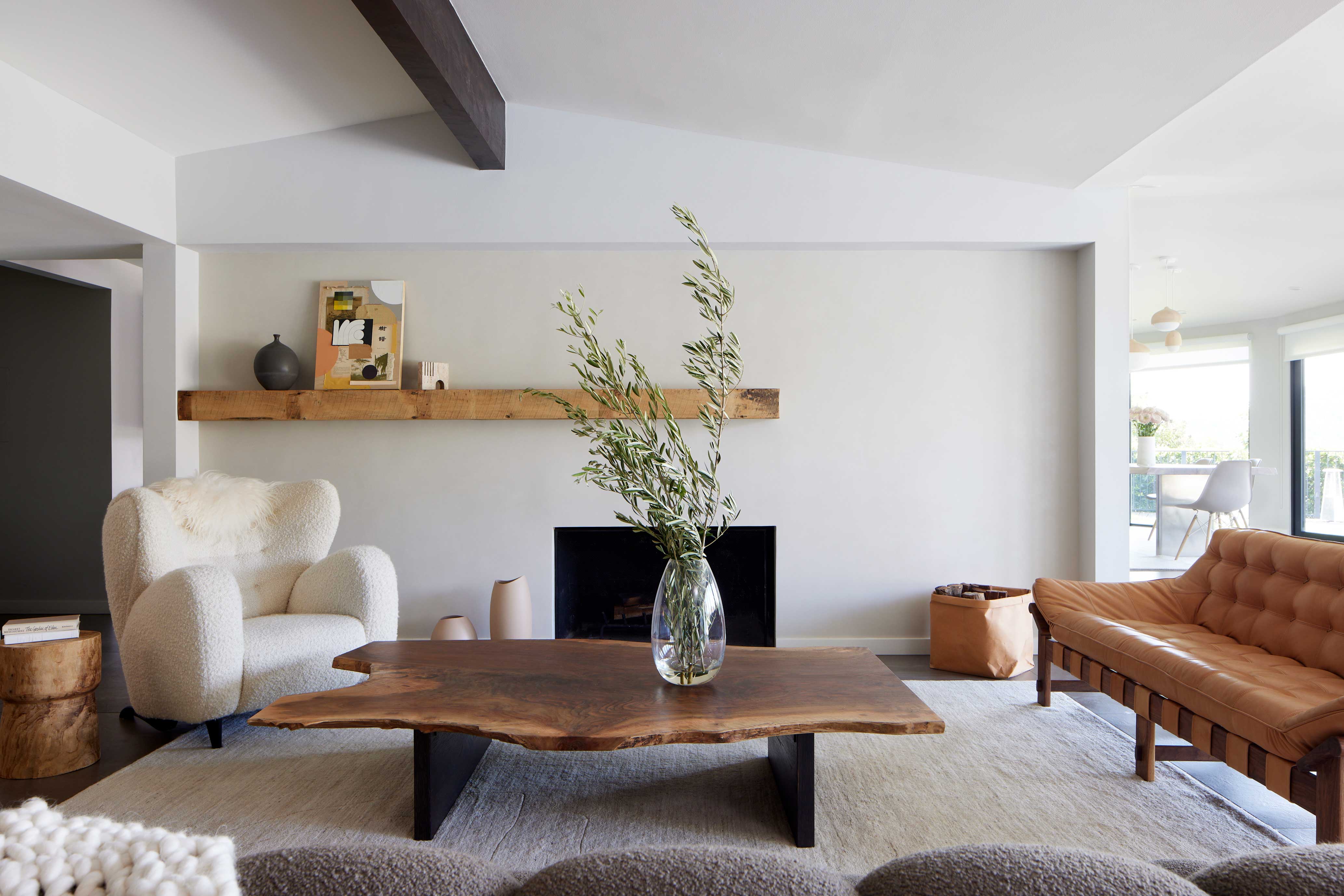
'For a neutral wall I am seeing clients gravitate towards earth-toned textured wall options such as Portola Paint's Roman Clay, like the custom color application we did in the living room of Iliza Schlesinger pictured above,' interior designer Kerry Vasquez explains.
This inclination to lean towards more earthy toned neutrals reflects the need for a closer connection to nature in our homes. This doesn’t have to be an obvious color that’s connected to the earth, it can be subtle. For example, a pale khaki green or a warm-toned greige are great alternatives to a simple cream color.
2. A relaxed neutral color palette
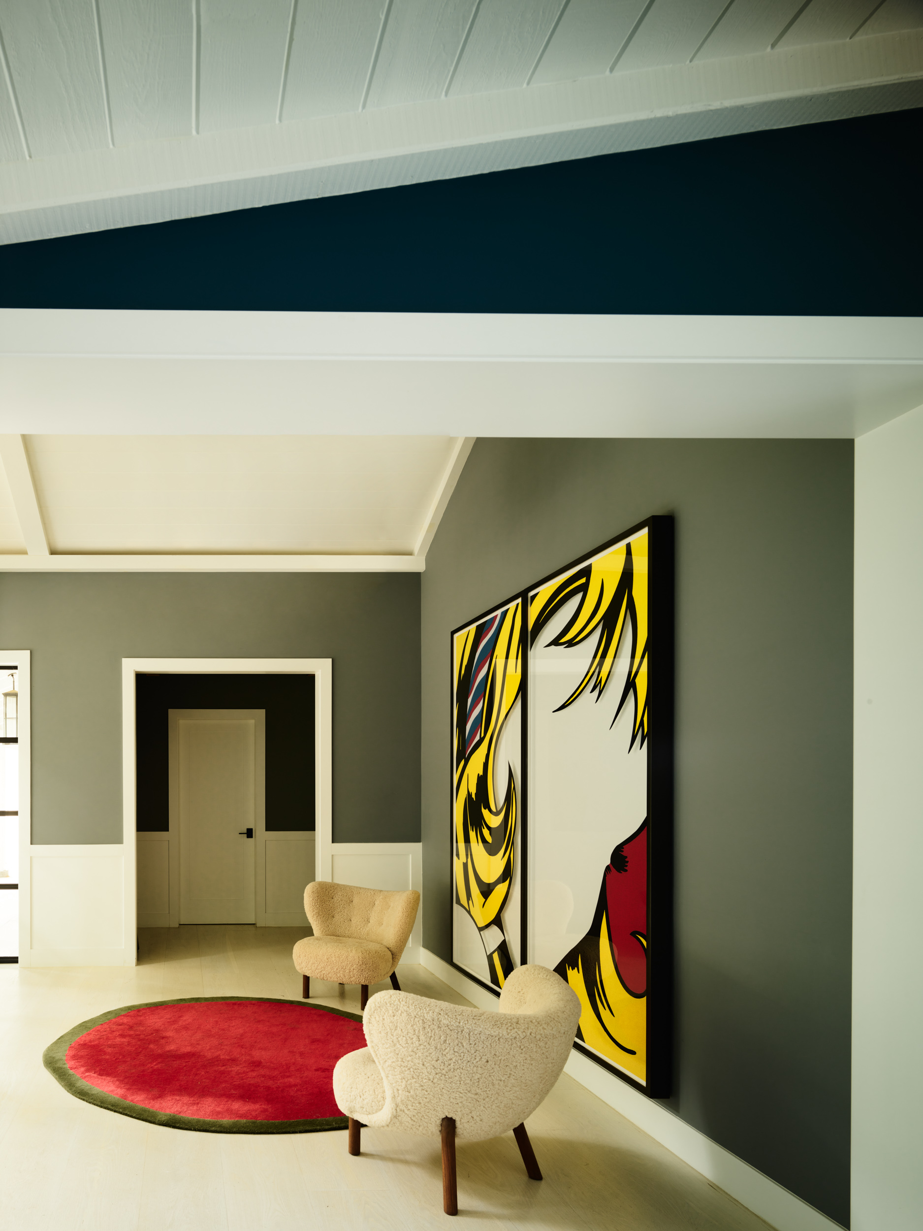
Rather than sticking to one shade of neutral for 2024, a more relaxed approach is favored. ‘The design industry is always several steps ahead of the general public, so all of our efforts to bring comfy neutrals in have been absorbed and are here to stay for the next coming year,' Christine Vroom, founder of Christine Vroom Interiors, says.
‘And by neutral, I don't just mean white and cream - it’s more of a relaxed palette, featuring mellow colors like light rust, olive, warm coral and rich browns’. Adopting this more relaxed outlook will allow your space to flow better and you won’t feel confined to stick to a certain set of ‘color rules’ that you think you may need to follow.
Design your own neutral color palette by picking out three distinct colors that you love and curating your own moodboard to decide on complementary tones, textures and fabrics.
3. Taupe over grey
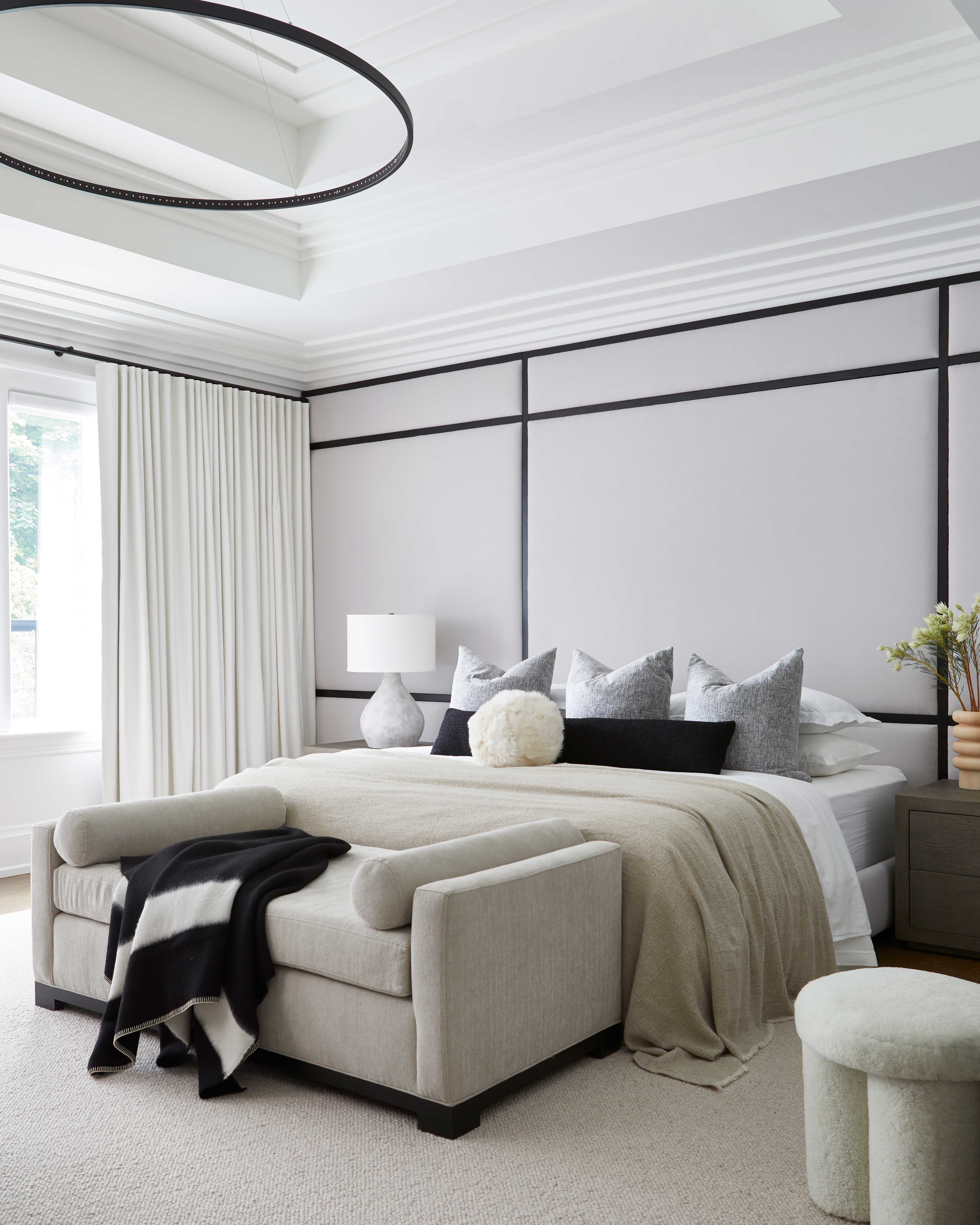
Decorating with grey, especially cool-toned shades often referred to as ‘millennial grey’, has been the subject of controversy in the world of interiors for some time. Due to its cool undertone it can quite easily feel cold and uninviting.
'Taupe is the new grey, gone are the traditional greys,' Monica Breese, founder of The Designed Domicilio tells us. 'Taupe is a neutral tone that is a variation of browns and grey…very earthy! Simple yet chic.'
This warmer take on grey is definitely more versatile and would suit a much wider variety of homes and spaces. Pair a taupe wall color with other earthy neutral tones as suggested above to create your own relaxed neutral color palette.
Are white walls still on trend?
White walls are a staple for creating a blank canvas in the home. Not only that but painting your walls a white or a slightly off-white color immediately makes a room feel light and bright. Avoid a white room feeling cold and clinical by mixing in earthy neutrals to counterbalance it.
You may think white and cream shouldn’t belong in the same space, however mixing up the tones of white and beige as well as complementing them with grounded earthy tones is a match made in heaven. Take inspiration from the living room scheme pictured below designed by Ali Budd and contrast a fresh white scheme with black statement features.
