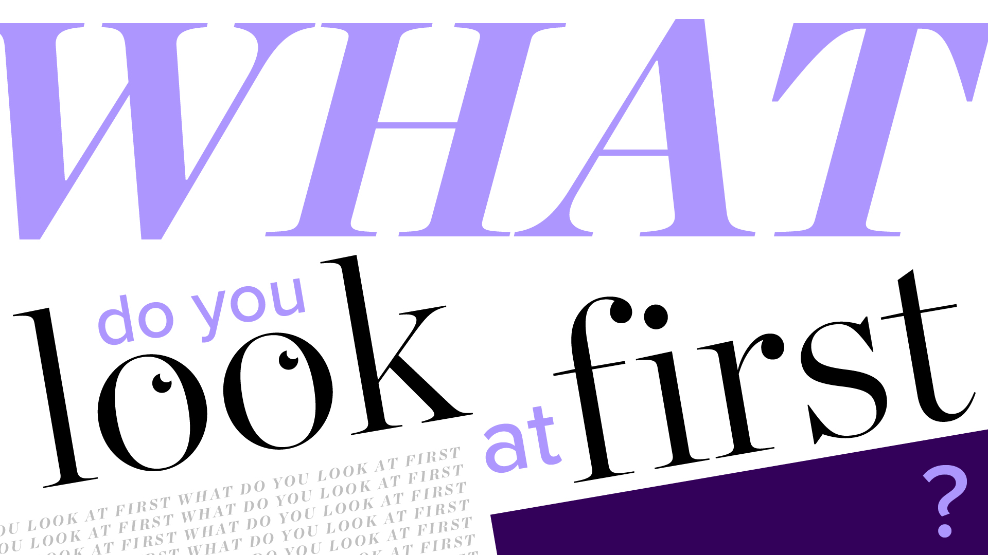
Typography is just one method used to convey information to an end user, while creating typographical contrast helps focus attention and bring balance to an overall composition. At its simplest, graphic design exists as a means for guiding people’s attention to what you want to them to look at – whether it be a print advert, an event poster or a flashing fire exit. Every design is a journey for the user, directing them to a key piece of information in the most efficient and concise way possible. It sounds simple, but far better designers than me have spent lifetimes striving to achieve that point, and companies spend billions to hammer home one specific logo, product name or brand.
Carl Dair was a Canadian designer who operated in 1950s and '60s. He was influential in the world of typography, culminating in the publication of his book Design with Type in 1952. In this, he highlights seven key elements used in combination to create typographical contrast (allowing you to maintain hierarchy, provoke emotions, emphasise information, improve readability and visual appeal). For most designers, these will be intuitive everyday decisions that you adopt without thinking, however it is the skill of an experienced designer to know the right combinations and how to balance them. Here's a closer look at these seven elements. For more on how to use them, see our typography design concepts post and our typography tutorials.
01. Size
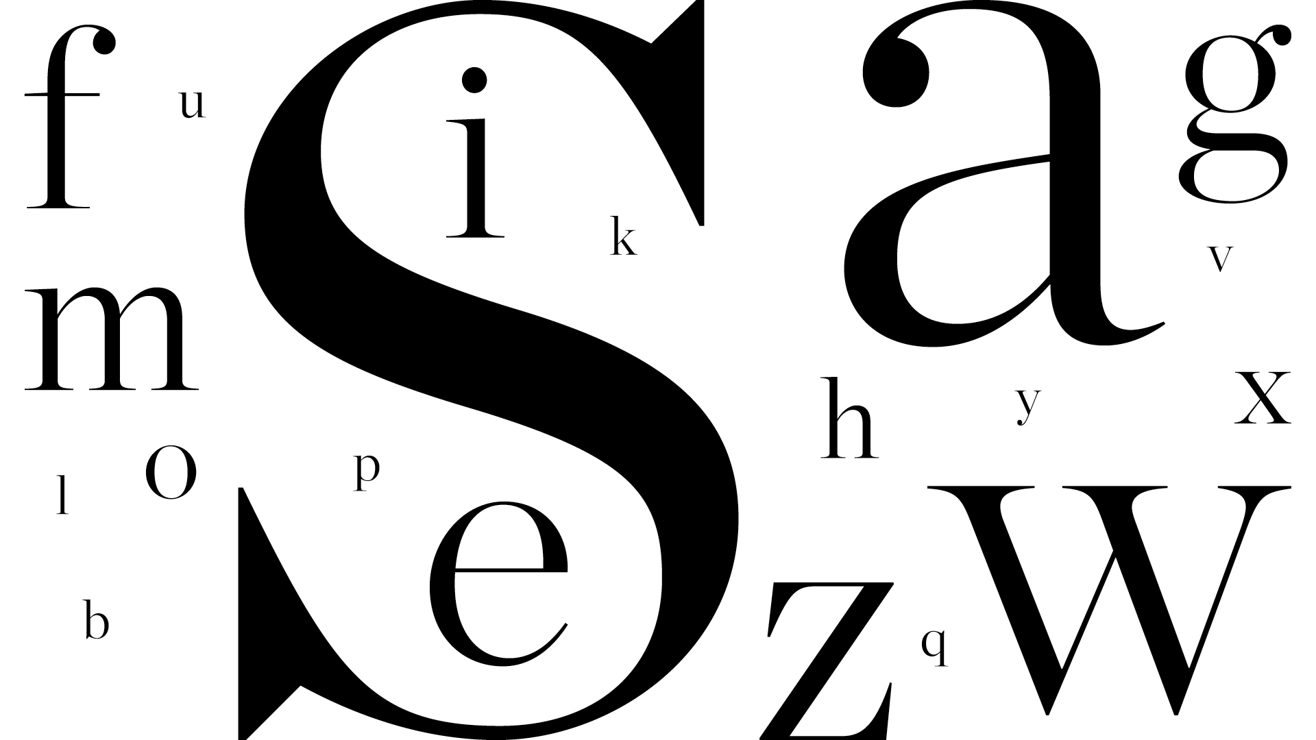
Size is the most obvious and dramatic way of providing contrast – we’re taught to notice larger things from an early age. Consider a typical magazine page, the title is the largest element on the page, followed by standfirst or pull quotes, then the body copy and eventually captions. The designer is creating a journey for the reader’s eye, starting with the bigger text and working their way down the hierarchy of information.
Type is generally measured in points (although you might be more comfortable with ems or px if you design for digital). There are various ratios you can use to set your sizes, eg. around 2.1 for title / body, though significantly different sizes can create visual impact.
02. Weight
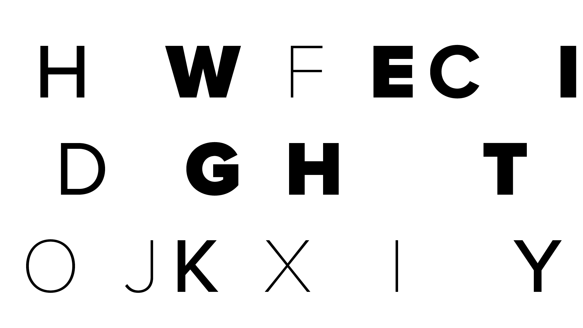
Most reputable font families contain a broad range of weights, varying the thickness or thinness of letterforms. A bolder font indicates impact, placing emphasis on words or passages of text that have key information. The eye is drawn to these ahead of lighter, thinner text. Modern fonts have variable weights, meaning a designer is no longer restrained to the weights designated by the font founder and so can experiment more with creating contrast.
As with all the factors on this list, one must respect readability over visual appeal. At smaller sizes, larger weights tend to blur into each other, while lighter weights can get lost on coloured backgrounds.
03. Form
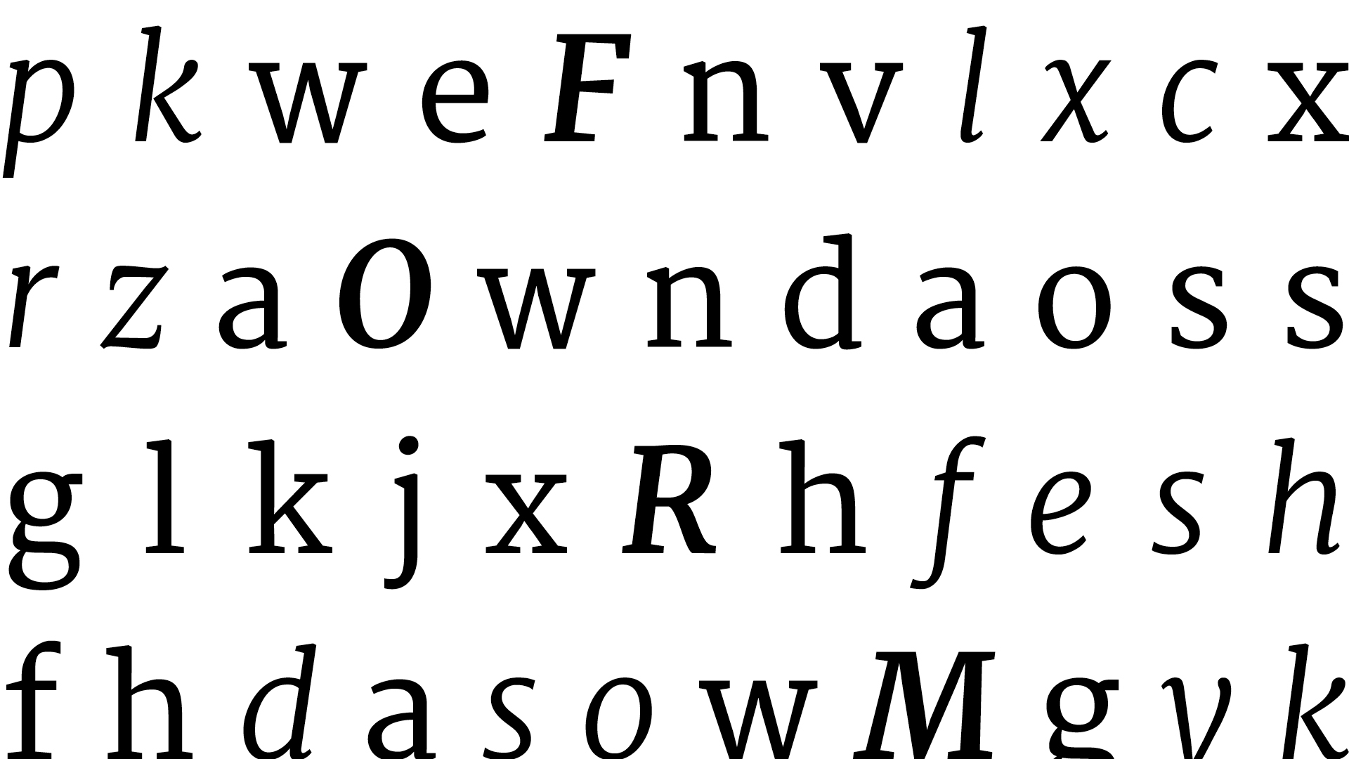
Form refers to the basic shape of letterforms in a single font family. For example the distinction between a capital letter and lower case, condensed and expanded, Roman and italics. Capital letters tend to look more shouty (as anyone discovers after leaving cap lock on), while italics can be seen as sarcastic or pressing. Condensed fonts create hard vertical lines, but can be harder to read and are rarely used for body copy, while lowercase flow across the page and draw the eyes on. All these things need to be considered as you combine different forms to create contrast.
04. Structure
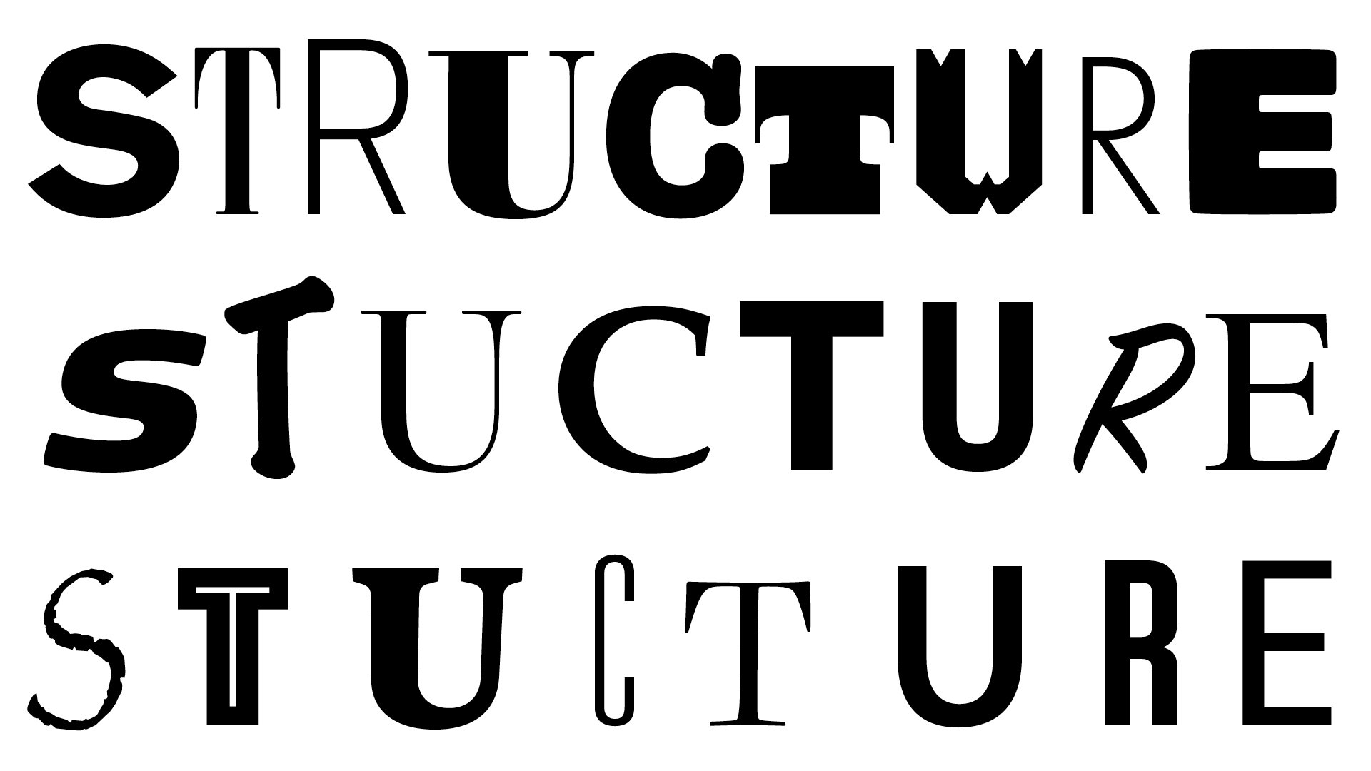
Structure looks at the differences in letterforms between different kinds of typefaces. Carl Dair described this as an orator changing the tone of his voice to suit his words rather than the volume. Many designers will instinctively choose to pair a serif with a sans serif on projects, while you might also see the introduction of slab serif of script.
Traditionally serifs would be used for large bodies of text because of their supposed readability, but in the modern age, sans serif tend to be used more frequently. These decisions can define the mood of a piece – serifs can look traditional and comfortable, while sans serif are modern and sharp, not only because of their inherent letterforms, but also expectation derived from generations of imprinting. For more on this, see our serif vs sans serif explainer.
05. Texture
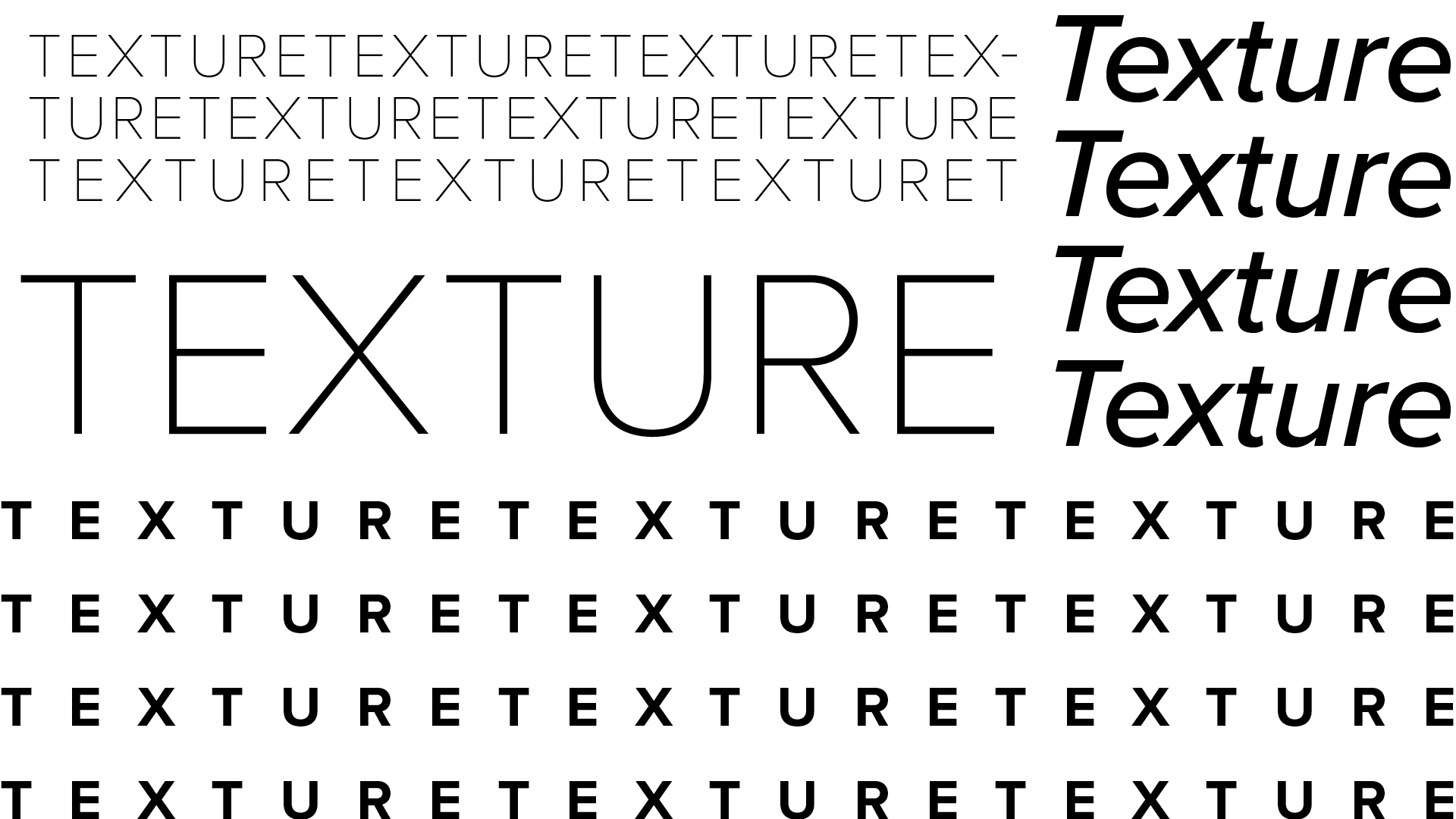
Designers refer to ‘blocking out’ a page early in the design process, where text is viewed in terms of blocks from a distance. This makes it easier to create a general layout without getting bogged down by finer details, but can also be used as a design element, creating texture on the page. Try experimenting with tracking and leading on text to achieve different effects. If these are new to you, learn more typographical terms in our handy guide.
06. Colour
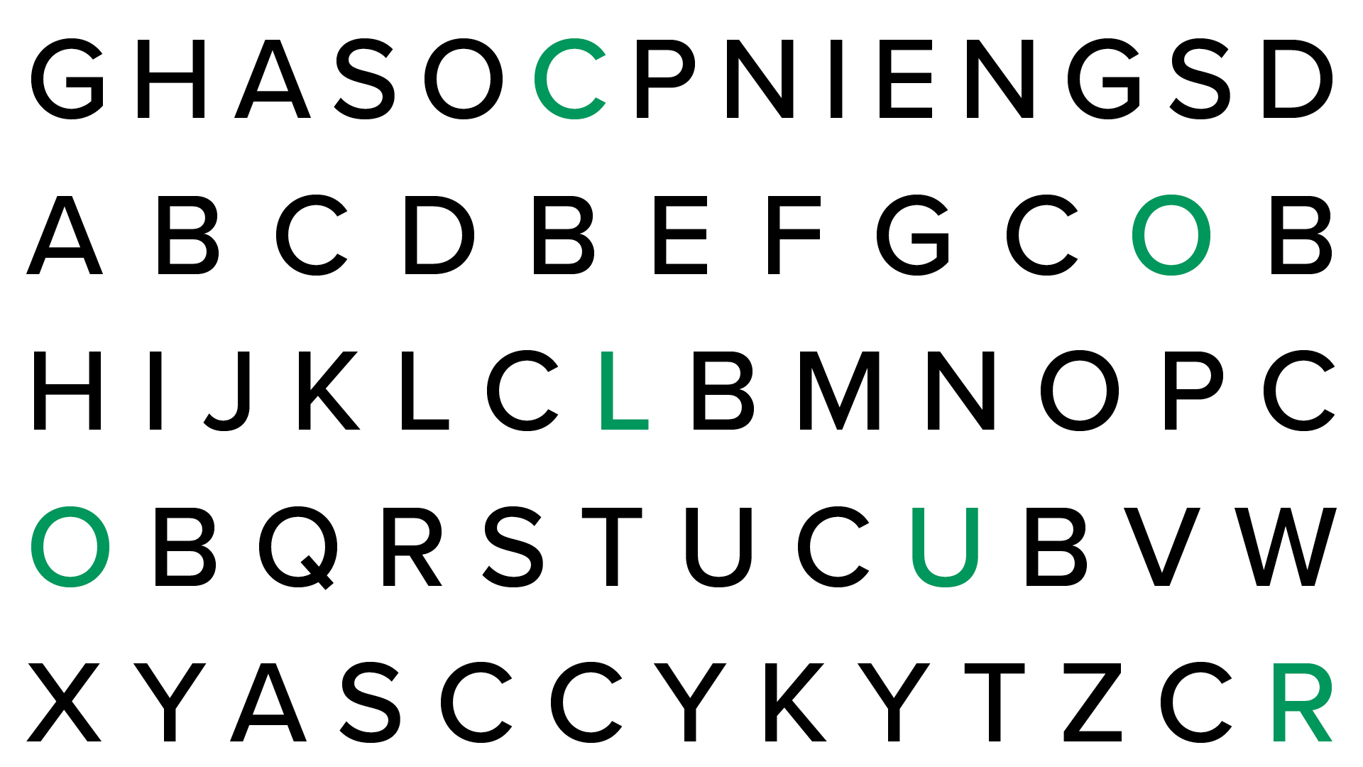
When you think of contrast, you most likely think of colour first. Aside from size, colour is the most obvious way to create contrast and one you can do in even the simplest of design apps (see our colour theory post for more on this). For text, a high contrast between the copy and background colour is necessary for readability. A dark tone on a light background has more contrast than lighter one, so more focus.
When starting a project, it's worth considering optical hierarchy when forming a colour palette. When designing with colour for digital, you should consider accessibility and meeting the WCAG AAA guidelines. Gradients can be used, but add noise and information, so should usually only be used for backgrounds or titles.
07. Direction
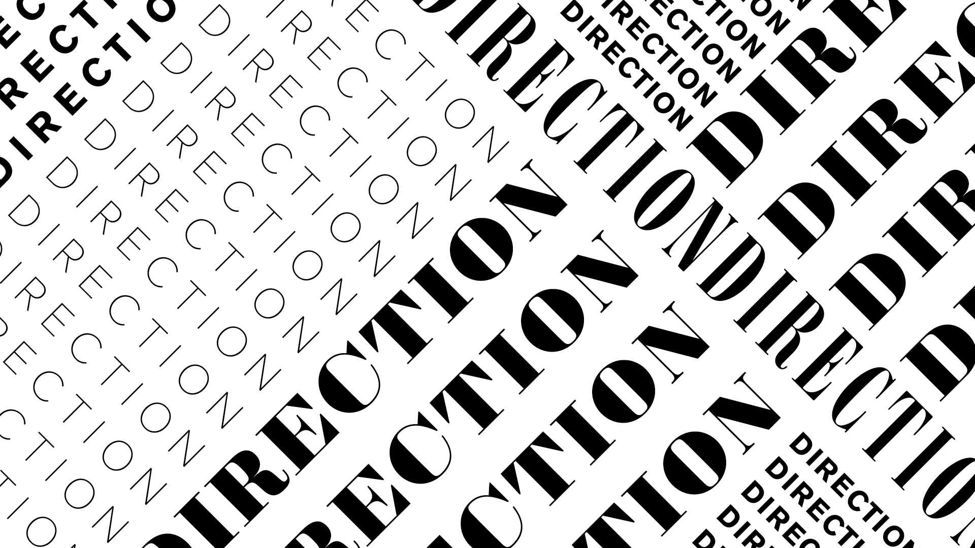
The final way to create contrast is by altering the orientation of text, using the opposition between the vertical and horizontal. It can lend dynamism and energy to your design, but this is the one rule that should be sparingly, as messing around with direction can impact on readability.
For more on type, see our best typography of the decade series, or explore our favourite free fonts.


