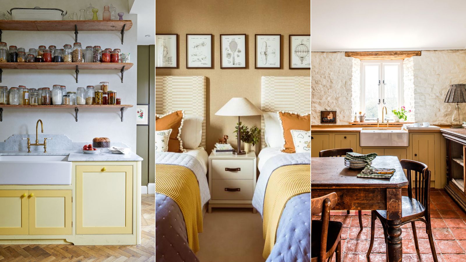
As anyone who has been through the process of searching for room colors will attest, choosing the right color for a room can be a minefield with endless choices and subtle nuances to understand and overcome.
But along with what is the most stressful color?, we are also often asked 'what is the most tiring color? According to color psychologists, the most tiring and fatiguing color is 'bright yellow'.
However, decorating with yellow isn't all bad, especially when used as an accent color in the home. It has many positive connotations, too. Here, color psychologists, decorators, and experts reveal why bright yellow is the most tiring color – and how to decorate with softer yellow in a more pleasing and less stimulating way by using the color wheel to create strong color combinations, using yellow as an accent shade, and what variations to use to create a scheme that won't overwhelm.
What is the most tiring color?
It may come as a surprise to hear that yellow is the most tiring color, but there is a method to the madness. While we are often told that yellow can boost our self-esteem and confidence, the unfavorable effects are, of course, the exact opposite. Yellow rooms can be too visually exhausting and irritating for some people.
'The wrong tone of yellow, or too much, can lead to feelings of irritation, heightened anxiety, nervousness and depression,' says Karen Haller, color psychology specialist, teacher, and best-selling author of The Little Book of Color. 'Yellow is one of the psychological primaries and is related to the emotions of the nervous system. At its very worst, yellow can provoke suicidal feelings.'
But that is not to say that you shouldn't use yellow for your home decor ideas. In fact, the color yellow is enigmatic, and strong, and can be used to great effect. So If you do love decorating with yellow, the key to success is finding the right tone for you, here's how a few of our favorite interior designers use this 'tiring' color in a positive, mood-boosting way.
How to use yellow in the home
Yellow, despite its negative connotations, is the color of sunshine, and sunshine brings happiness. It has a relatively long wavelength and is emotionally stimulating, making us feel positive and optimistic.
1. Decorate with a pale, heritage yellow
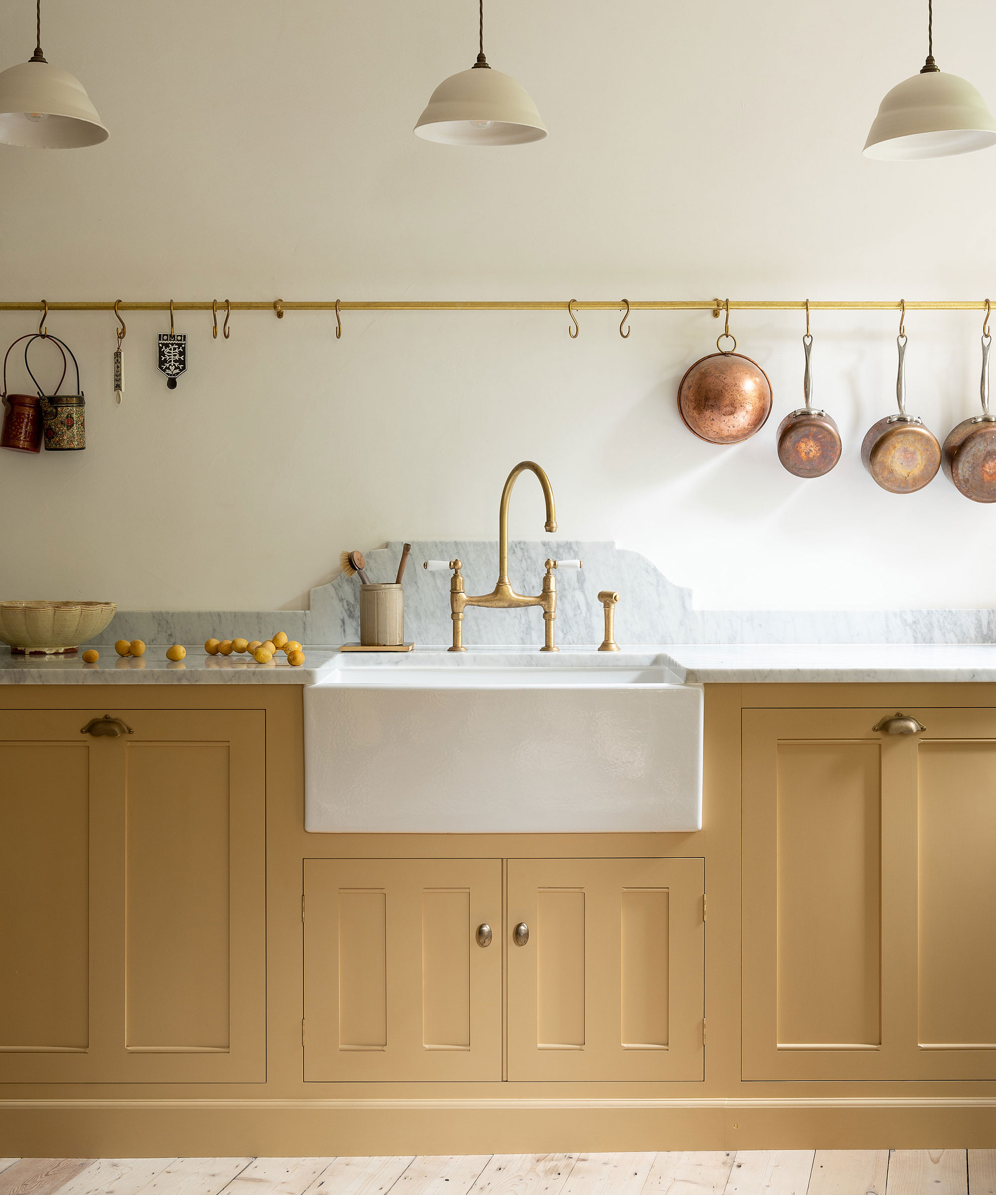
The versatility of yellow makes it a favorite with some of the best kitchen designers. Francesca Rowan-Plowden believes it works perfectly with period features such as old brick and beams.
‘Yellow is a color that people are often scared to use, but it’s a fantastic color to really lift a space and create interest and features. It reflects all lights beautifully and makes a room feel very warm and inviting. It’s known to induce creativity and playfulness, so it’s fantastic for country kitchens.'
As well as considering the style of the room you wish to decorate, you should also think about how you use the space and the energy you wish to evoke. Paler, gentler shades will create a calming atmosphere while stronger sunnier hues offer a more high-octane energy. Tweak that energy further by opting for alternative finishes like chalk or glossy lacquer.
2. Use a contrasting color
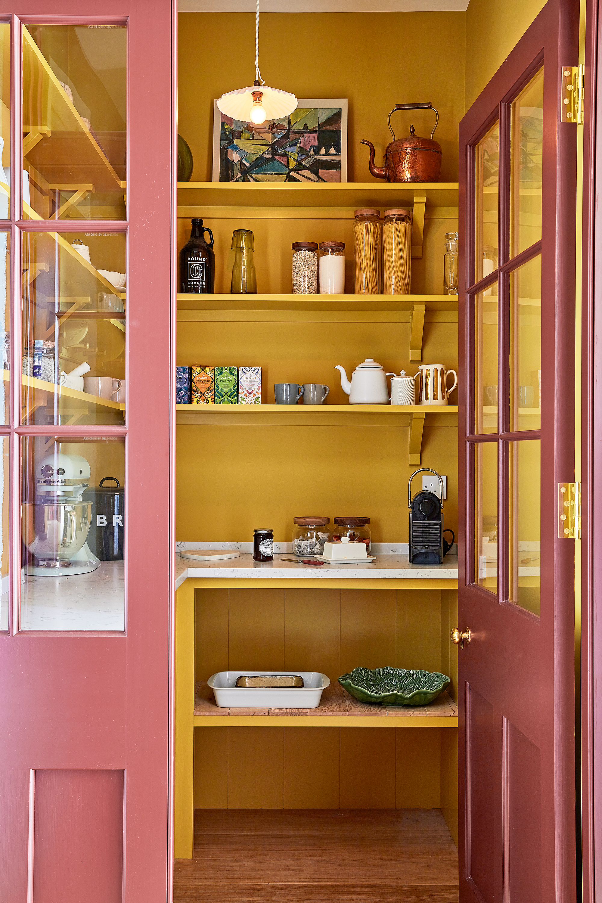
Dispensing with a classic white, the interior of this pantry in the home of interior decorator Sarah Brown almost glows with warmth and the color makes a perfect backdrop for all the packaged goods.
‘Yellow is always a good accent color and using a mustard shade works well inside cupboards or pantries as an uplifting surprise as you open or enter,' says Sarah Brown, founder, of Sarah Brown Interiors. 'It’s easier to incorporate this shade into a scheme if you’re slightly put off by bright yellow paint in your home and it is particularly effective in darker, moodier spaces as it creates a feeling of warmth.’
3. Forgo the rules and go for all-over yellow
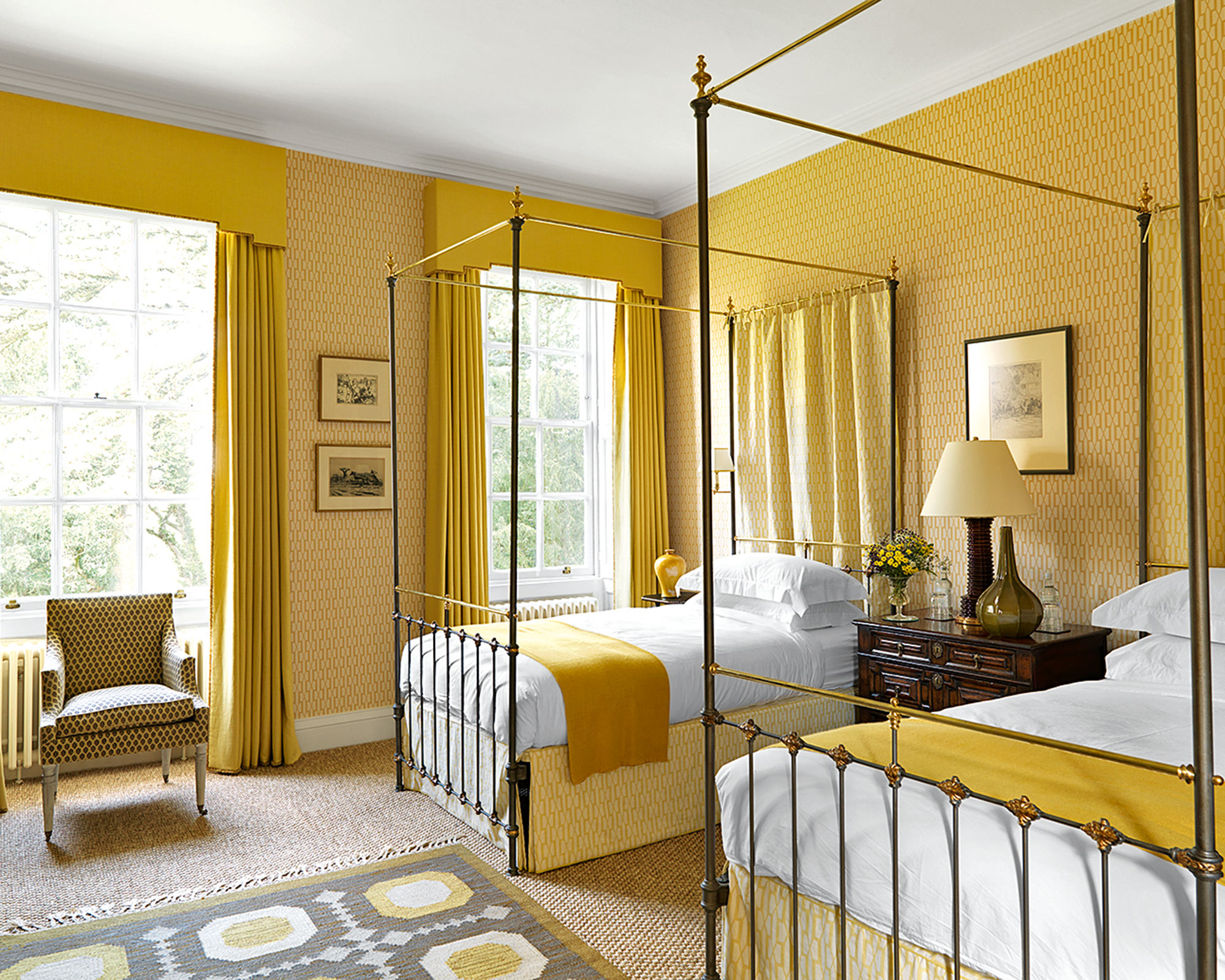
Yellow may be 'tiring' for some, but for others, it can bring joy and playfulness. If you fall into the latter, then go all-out and embrace this happy hue.
In her book, Recipes for Decorating, Farrow & Ball’s color consultant Joa Studholme notes that we are embracing stronger shades when decorating our homes, despite previous advice to stay away. These include the range of hues from reds and pinks to oranges and yellows found on the warm half of the color wheel. Much research has been done into how colors affect our mood. Yellow inspires optimism, creating a summery feel; team it with charcoal and black for a modern look.
‘Current trends show a real shift towards brighter colors with a clean-cut finish,’ says Sue Kim, senior color designer at Valspar. ‘When choosing a paint color, don’t forget to look beyond the walls – consider the ceiling, skirting, window frames, and moldings and how they can be brought into the scheme.’
Here, with this classic scheme in superb sunshine yellows, Veere Grenney provides a masterclass on how to brighten a north-facing room. It features wallpaper, bed curtains and valances in Belvedere in Straw, with curtains in Verandah, also in Straw, both from the designer’s collections.
4. Use yellow sparingly to highly a focal point
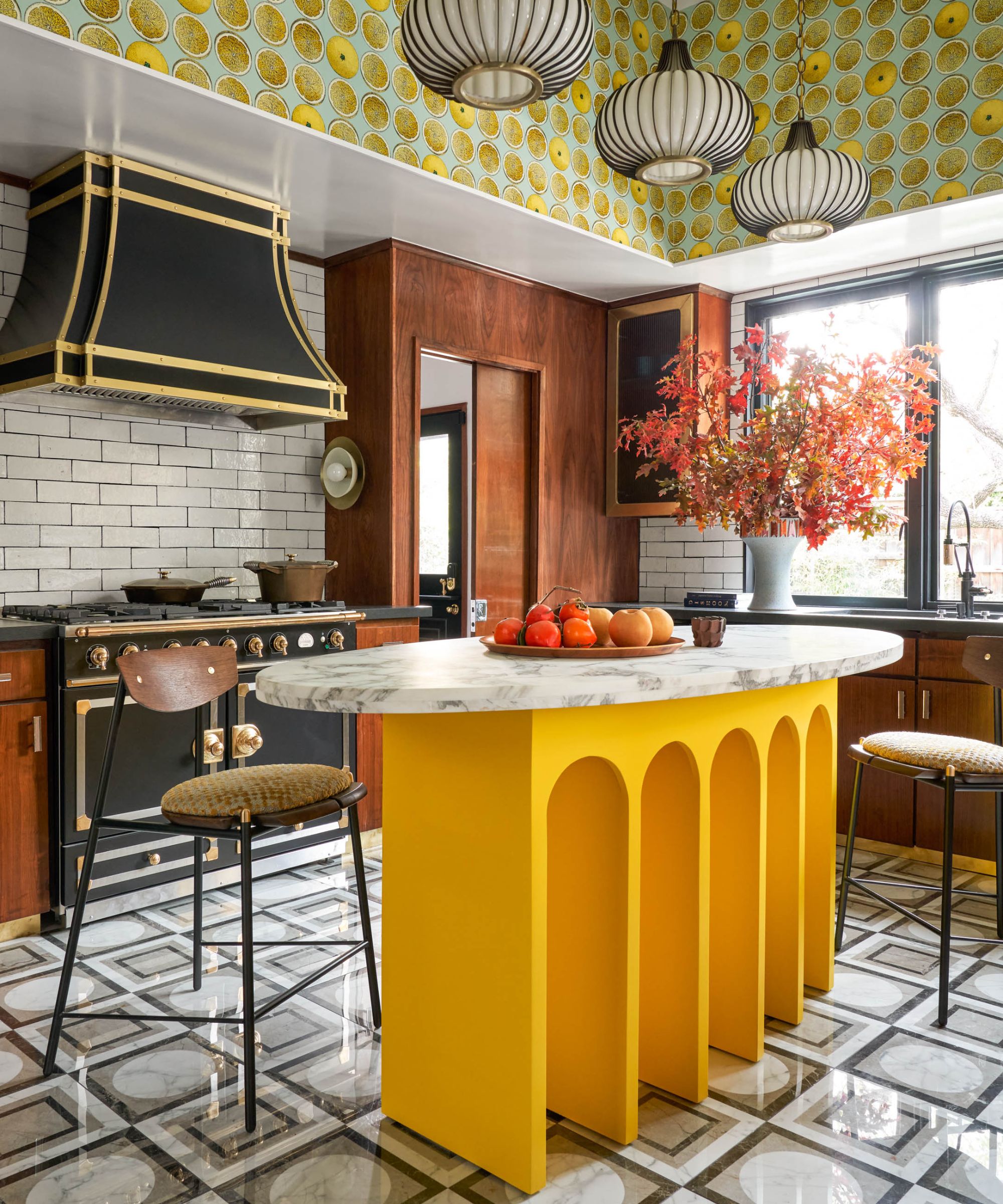
The kitchen, often seen as the heart of the home, is the perfect space to use bolder colors, which will bring joy and create an energetic scheme. If you are going to use bright yellow, despite it being known as a tiring color, use it sparingly.
Yellow is a great accent color for those that are less bold. We love how Maestri Studio has used a vivid yellow to highlight the focal point in this kitchen. Even on gray days, this modern kitchen remains bright and cheerful. Plus, if you do tire of it, you can always repaint.
5. Subdue with paler variations of yellow in a kid's room
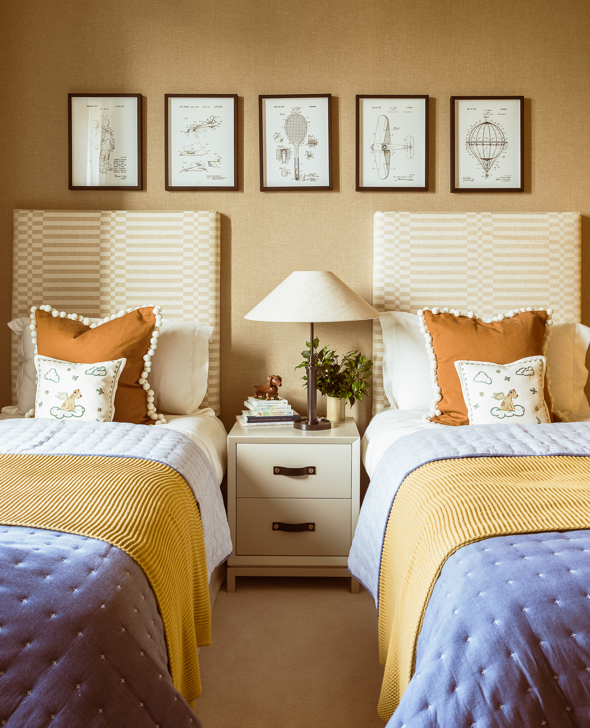
Yellow can be a tricky color to master. For a calming and balanced bedroom scheme, opt for sandy yellows or ochres and pair with blues. ‘As a warm and vibrant tone, yellow creates an emotional response that is both joyful and evokes energy in a space. Blues bring a feeling of tranquillity and when paired with energetic yellows,’ says Camilla Clarke, creative director at Albion Nord.
In a classic pairing, sandy yellow wallpaper by Philip Jeffries is balanced by blue blankets in this bedroom scheme by Albion Nord.
While there are generalities we can make about colors and what people associate with them, colors and our affinity toward them have a lot to do with our environment, personalities and experiences, so it is vital to choose some of the most relaxing colors for a shade that makes you happier at home.


