Despite various colours being called the ‘new neutral’, white remains the undisputed universal go-to neutral colour. But even white is not just white – there are different shades of white and white paint. And based on the colour’s undertones, along with a few other features and properties, there is a different best white paint for different rooms and homes.
When choosing the ideal white paint idea for your space, there are a few factors that need to be taken into consideration. One of the biggest ones to start with is the orientation of the room you’re painting and what kind of light it receives as a result.
‘When choosing a white, first consider the light coming into your room,’ says Patrick O’Donnell, brand ambassador at Farrow & Ball. ‘If it’s a north-facing room, a clean white will feel too chilly, so consider whites that have underlying red or yellow notes through them. Secondly, if using white on your trim and moldings to go with your chosen wall colour, think of a white that has underlying tonal notes of your wall colour as this will create a softer contrast than a “true” white.’
The best white paint
‘White paint is the ultimate classic – it’s fresh, versatile, and makes any space feel bigger and brighter. It acts as a blank canvas, allowing furniture and decor to take centre stage, while also working beautifully in its own right for that crisp, clean aesthetic,’ Victoria Yardley, managing director of Victory Colours, explains the appeal of white-painted walls. ‘It’s the ultimate crowd-pleaser.’
But there are certain white shades that will please a bigger crowd than others as paint and home decor trends affect even what white shades are favoured over others – this year, we’re seeing warmer off-whites replacing brilliant white as people crave cosy homes over clean, minimalist aesthetic.
‘We’ve actually seen sales of these warmer whites increase by 38% this year, while cooler, grey-based whites have declined,’ says Rob Abrahams, co-founder of COAT Paints. ‘The shift is largely about how people want their homes to feel. Grey-led whites can sometimes look stark or flat on the wall, whereas a softer white with beige undertones still feels fresh but far more welcoming.’
1. Best white paint overall
A white shade with a warmer undertone is likely to work pretty much in any room as it creates an inviting atmosphere – and who can say no to that?
‘Our bestselling white at COAT is Mindful, a warm, beige-based white that works beautifully in UK light. What people should really look for is a white with a touch of warmth underneath it. That might be a hint of yellow, red or beige, but just enough to soften the colour without turning it creamy. Colours with warmer undertones help the paint reflect light more gently, which makes the whole room feel more inviting,’ Rob at COAT explains.
But if you want something ‘whiter’ but still warm in tone, it’s no coincidence that Wimborne White is Farrow & Ball’s most popular white shade. It’s one of those universal whites, the softest of creams with a warm yellow undertone which is why it also tends to be interior experts’ white paint of choice.
Our top pick:
As already mentioned, this shade is not only Farrow & Ball's most popular white but also many interior experts go-to white shade. And one that Patrick at Farrow & Ball described as 'the perfect white'.
2. Best for high-moisture rooms
The UK’s regularly wet weather means that many homes end up being very humid. So if that is the case for yours or if you’re looking to paint a room that’s exposed to regular humidity like the bathroom, for example, then this should be reflected in your choice of white paint.
‘Zinsser Perma White Matt is one of our bestselling white paints, simply because it is so versatile, yet affordable,’ says Michael Rolland, managing director at The Paint Shed. ‘This paint is ideal for high-moisture areas, especially in UK homes, where higher humidity levels can make drying clothes indoors challenging. It is resistant to cracks, peeling, and blistering, and happens to be water-based, so it dries quickly. The Perma White range is extremely tough, too, meaning they can be scrubbed without comprising the finish or colour.’
Our top pick:
We're not surprised this is one of the bestselling white paints out there - it's mould-resistant, durable, odour-blocking and self-priming. And for £35 a tin, it's very reasonable!
3. Best for small rooms
If you’re looking for some small living room colour ideas - or any other compact space for that matter - then white can certainly be a wonderful option as it can visually expand the space.
‘For a small living room, light and neutral colours like whites and creams are best as they reflect more light and create an airy, spacious feel,’ confirms Sam Sutherland, Flitch interior stylist.
But rather than opting for a bright, brilliant white, experts recommend an alternative small living room paint idea – going for a more off-white shade to soften the space which most likely lacks in natural light (as small spaces traditionally do). A very bright, stark shade of white is in fact one of the worst colours for a small living room, according to experts.
‘I would recommend using an off-white as its warm hue will give you an inviting sense of peace and calm,’ says Caroline Thornborough, design director of Thorndown.
Our top pick:
An off-white shade is much warmer than bright white and also less clinical. And you can never go wrong with one of of Farrow & Ball's most popular white shades - this creamy, warm off-white.
4. Best for north-facing rooms
North-facing rooms tend to get a lot less sun throughout the day, so are naturally darker and prone to shadows. This means they can reflect back a greater amount of blue and grey tones, so using a pure white or cool-toned white paint can result in the shade looking a lot darker when it's on the walls – and potentially a bit dismal, especially when looking at white kitchen ideas.
'North-facing rooms are the areas in the house that see the least amount of sunlight, so the colours we choose to put on our walls can have a huge impact in how a space looks and feels,' says Marianne Shillingford, creative director at Dulux. 'As the colour that reflects the most light, white can help all rooms to look much more spacious and those with warmer undertones are perfect for north facing rooms because they offer a visual sunlit warmth the room naturally lacks. Dulux Heritage Roman White and Mallow White each have hints of gold and pink that bring a cosy summer glow to even the chilliest of rooms.'
For this reason warm white paints with undertones of yellow or red are generally recommended for north-facing rooms, where they'll look a lot less 'creamy' than they would painted in a room with a south-facing aspect.
Tash Bradley, Lick’s director of interior design and colour psychologist, adds, 'Northern light is the coolest of the lot. It casts a blue hue, so try to avoid cool whites. Instead, look to whites which have warm undertones like Lick White 03.'
Our top pick:
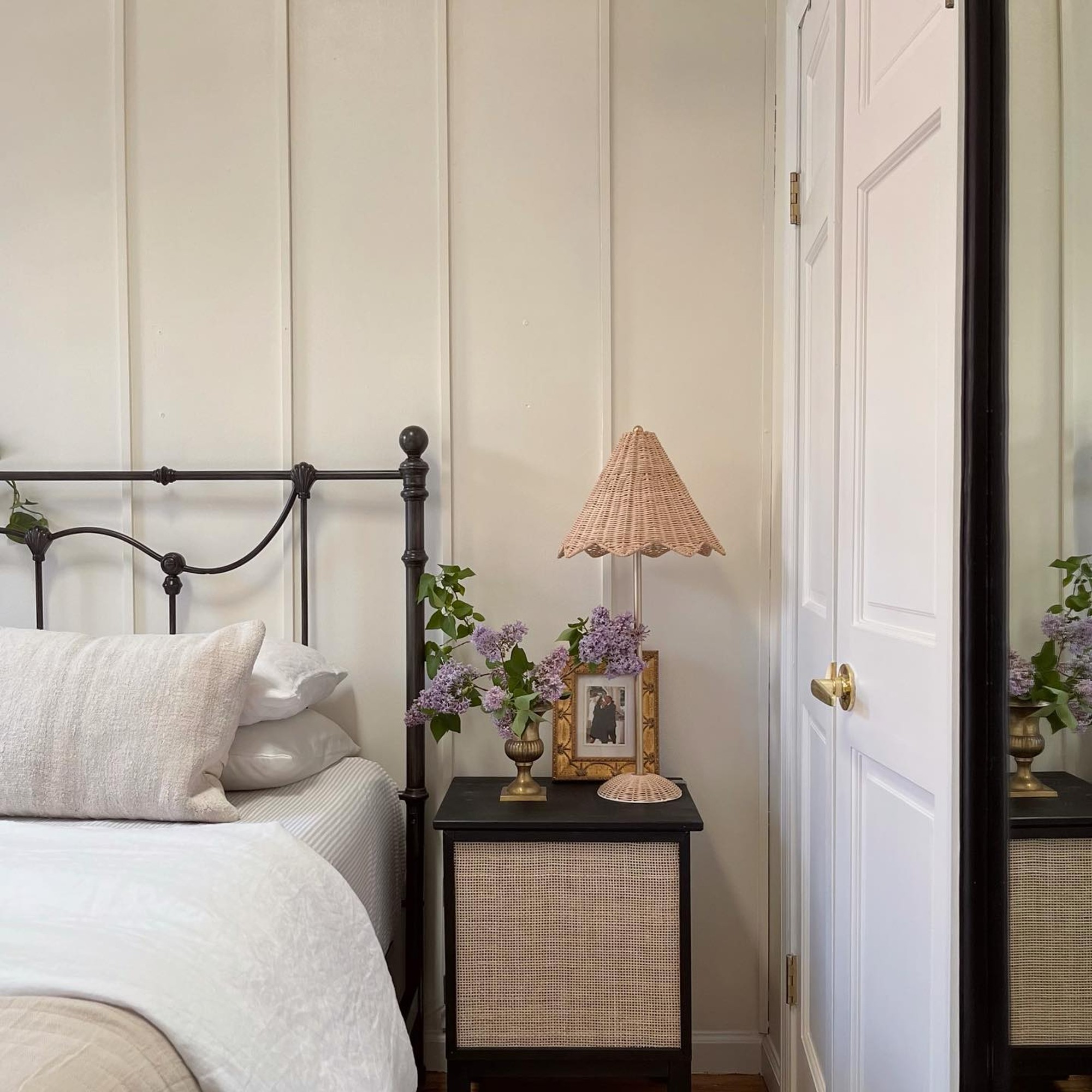
Lick's best-selling white shade, White 03, is loved for its warm, comforting undertones. 'White 03 is a soft, uplifting neutral designed to soak up rays of sun before reflecting them back into the room so you and your space feel lighter and brighter. Its warm undertones make it particularly comforting in a bedroom,' Tash says.
5. Best for south-facing rooms
A south-facing room gets a lot of natural daylight and can often be bathed in golden sunshine for a lot of the day. This means any underlying warm tones in a white paint - like yellow, red or brown - will be amplified, making a seemingly innocuous pale ivory white suddenly look decidedly yellow once on the walls. I'd know as my studio flat is south facing which I absolutely love about it.
But consequently, if you want to achieve the appearance of true white in a south-facing room, it's best to stay on the side of cooler tones which will balance out the warmth of the natural light.
Lucy Steele, paint and interiors expert at Valspar Paint, says, 'South-facing rooms receive the most amount of light, and you don’t need to factor in the sunrise or sunset, as there is a good amount of light exposure for a long period of time. With this in mind, cooler tones, such as Brushed Cotton, work great for a south-facing room. As south-facing rooms tend to have more light, choosing a matt finish is perfect to balance out the brightness and bring a warmer tone. A matt finish is also good if there are any imperfections on the wall that need hiding.'
Our top pick:
This Dulux white paint is the shade currently gracing the walls of my south-facing living space and it works perfectly here as it has the slightest of pale grey undertones that off-sets the yellow glow of sunlight.
6. Best for skirting boards
Even though there are many different skirting board colour ideas that you could go for, whether you opt for the impactful colour drenching or a warmer, neutral shade like taupe, white remains the traditional go-to for this architectural feature.
So if you, too, want to stick with tradition and paint your skirting boards white, contrasting the chosen colour of your walls, paint experts recommend opting for a white shade with an undertone that complements your walls’ colour.
‘One of the biggest mistakes I see is people choosing a brilliant white for their skirting boards, but not looking at the undertones. Undertones are so important when considering a colour for your space, even if it’s a white. When looking at a white, choose a white with undertones that are the same warmth as the colours of your walls or match the tones in your furniture,’ Tash at Lick says.
‘This will create tonal harmony and reduce the stark contrast between the walls and the white. For example, if you have lovely deep red walls and you want to paint your skirting boards white, I’d choose a white with red or pink undertones, like White 06,’ she adds.
Michael at The Paint Shed continues, ‘One common mistake is using non-durable paint for skirting boards. These areas are prone to collecting dirt and grime, so using durable paint is essential for easy cleaning as they can be wiped down frequently without causing damage to the paint. Using oil-based paints should also be avoided as these can yellow over time, making water-based paints a better choice.'
Our top pick:
The Lamb's Wool trim paint by Frenchic is the palest of off-whites and it's the perfect choice for skirting boards as it's durable and water-based. Even though the brilliant Whitey White shade is the brand's bestselling trim paint, we'd go for this one (or one of its many other white shades with various undertones) instead, depending on your room decor.
FAQs
Why does white paint go yellow?
As with anything, there are certain downsides to opting for white walls, too. And the biggest pet peeve when it comes to white paint is that it can turn a bit yellow with time. So why is that? And perhaps more importantly, how can you prevent that?
‘White paints can turn yellow over time due to a few key factors,’ starts Emma Bestley, co-founder and creative director of YesColours. ‘Oil-based paints, for example, are prone to yellowing as they oxidise, especially in low-light areas. Environmental factors like cigarette smoke, cooking fumes, and lack of natural sunlight can also have an impact.’
She continues, ‘To avoid yellowing, opt for high-quality water-based paints, which are much more resistant to discolouration. Ensuring good ventilation, regular exposure to daylight, and using non-yellowing finishes can also help maintain that fresh white look for longer.’
Dulux is one of the most popular paint brands - and the White Cotton shade is one of its bestselling whites. But on top of that, this paint is also water-based so it won't oxidise and turn yellow.
How do I choose the right white paint?
'When choosing a white, always try and get a feel for its undertones, particularly when using with another colour,' says Dominic Myland, CEO of Mylands. 'Even a hint of colour in a white paint can change its feel significantly. If you’ve got other paint colours within the same room, it’s always worth considering how they interact together. One tip is that for south-facing rooms with lots of light, you can get away with pretty much any colour, but for north-facing rooms with less light you should consider opting for warmer undertones to balance the cool light and make the room feel inviting.'
Paint experts also recommend to get swatches of the white shades you're considering and bring them into your home to see how they look on your walls. 'Whites change hugely depending on orientation, time of day and surrounding materials, so sampling on your own walls is the best way to see how it behaves,' says Rob Abrahams, co-founder of COAT.
Ruth Mottershead, creative director at Little Greene, adds, 'Once you’ve selected the shades of white you’d like to consider, order sample pots and paint out large swatches onto A4 pieces of paper. By placing them on different walls throughout the day you will see the impact of the varying natural light on the colour.'
What colour white is best for ceilings?
'When choosing the best white for your ceiling consider which option will coordinate best with your home's interiors, wall colours and furnishings,' explains Dominic Myland. 'Again pay attention to the undertones. Mylands Pure White No. 1 is a great option available in our Marble Matt Emulsions. This is suitable for all interior walls and ceilings, including high traffic areas as they can be re-touched, wiped, washed or even scrubbed with no effect on colour or sheen.'
'For a modern look, you can also move away from the traditional white ceiling altogether and paint the ceiling a statement colour – this could be the same as the walls for a really cohesive feel, or a different tone.'
Hopefully, this should take the guesswork out of choosing the best white paint for you.